
Remember three years ago when the tiny little country of Greece, with a GDP the size of the state of Missouri, was going to bring down the Financial system? Prior to 2010, when you mentioned the word Greece, you were as likely to met with a response “You mean the Movie?” as with a response about the country.
People who never considered Greece within their financial considerations were now looking at the Greek stock market on a daily basis. The panic around Greece, like many panics, turned out to be a buying opportunity as the troubles of this small country pushed the SPX down to around 1100. Eventually there was a statistically significant breakout around 1125 in the summer of 2010 and that trend lasted until the Spring of the following year (as per the SPX Weekly Chart below). The problems for Greece are far from over and their local economy and stock market has crashed.
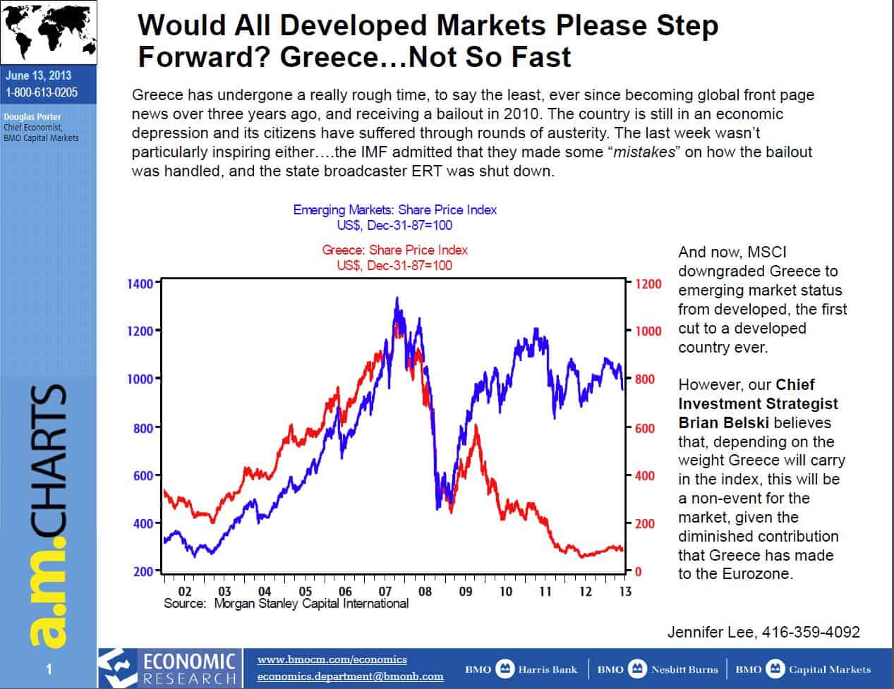
They are no longer considered a developed nation and have been relegated to an emerging nation. But the mob, spurred on by both the media and endless opinions, got caught up in the moment and the usual panic gripped the market. CNBC’s advertisers must have been delighted. Greece is now emerging. It may take a very long time to become a developed nation again. Why? Because as an emerging nation, their economy is worse off than it’s emerging companions. The Chart below shows just how much worse off they are. Before they can ever regain Developed Nation status, they first have to catch up to their emerging neighbors and judging by the chart below, they have a very long way to go.
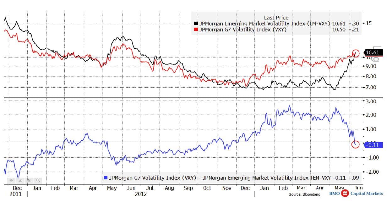
But putting Greece aside, the emerging markets (of which Greece is now a part) are not acting particularly well in recent weeks. They are the canary in the coal mine as they are the most sensitive at the margin. Here I show a succession of three charts on the emerging markets.
The first chart below shows that the volatility of the emerging markets has now risen higher than that of the G7 nations. Rising volatility is eye-catching to be sure – but maybe not in a comfortable way for policy makers. It’s unusual for there to have been a large divergence anyway and so some regression to the mean could be going on. Still, it’s something to watch.
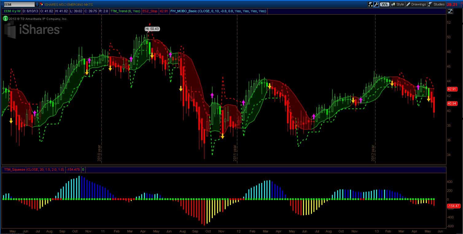
The second chart is of the EEM. We’ve had a meaningful breakdown in the last few weeks and the chart is positioned for further weakness. The previous rally attempt failed and the length of the down bars means that traders were selling first and fast and asking questions later. EEM behaves that way.
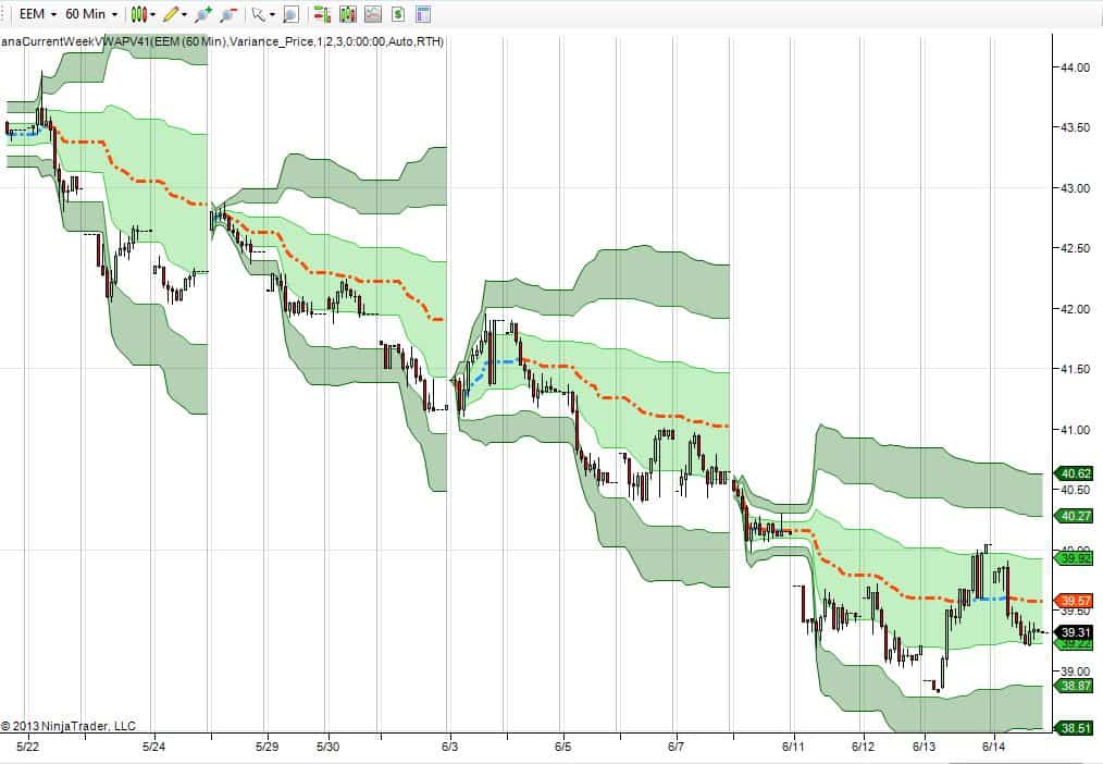
The third chart shows the downward progression of the weekly VWAP over the last four weeks. This is a market that is falling so steadily that it can’t keep up with itself – meaning that visits back to the weekly VWAP have been rare.
So far, the emerging markets are not screaming crisis or anything like that, but the canary is not healthy. Now what does the main market tell us?
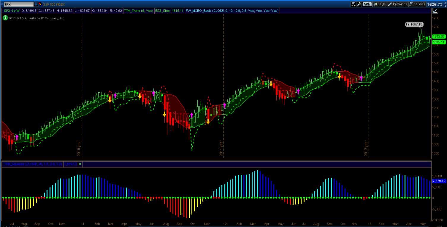
The SPX is still in a technical bull market. It makes me think of the line from the book “Reminiscences of a Stock Operator” where Old Turkey says, “You know, it’s a bull market!” The chart of the SPX below shows several warning signs that I’ve previously discussed. We now have two weeks where the stop has been pierced but not triggered (it needs to be a weekly close below to trigger).
The buying momentum continues to decline forewarning of more downside pressure and worry continues to rise. It normally doesn’t get this exciting! But the 1615 level still holds and the lower breakdown band now sits at 1593. That’s pretty much it. On a weekly chart, not too much has happened.
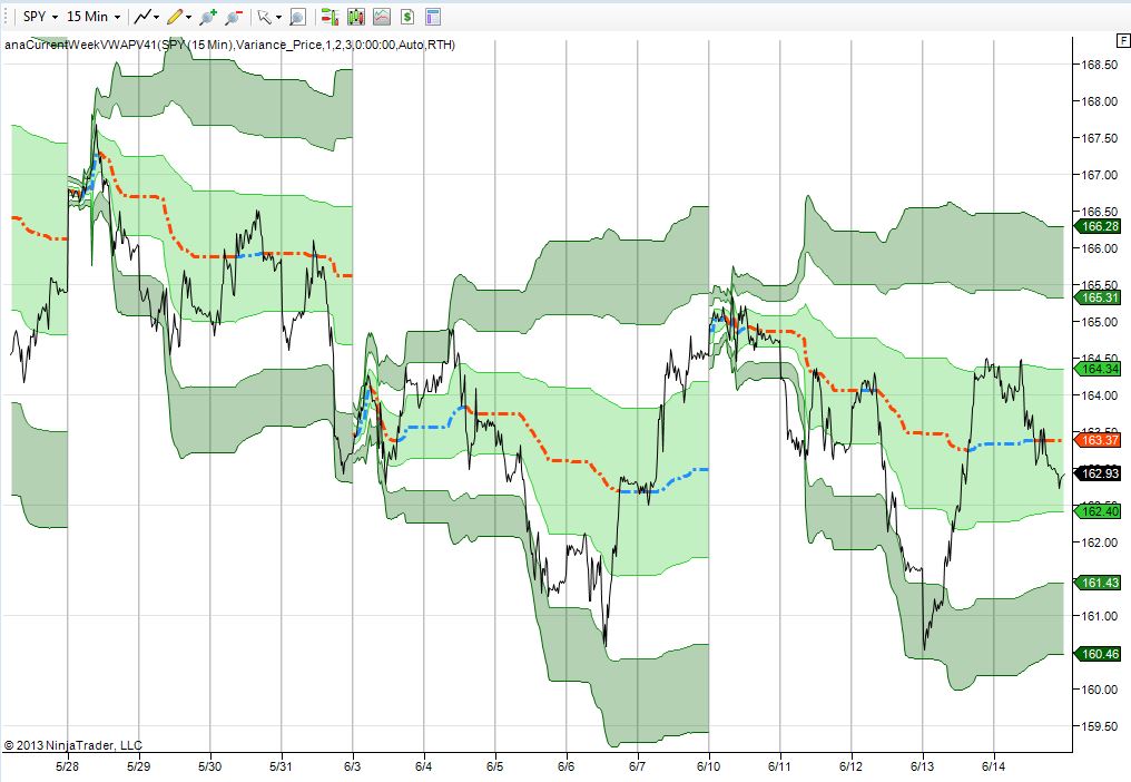
The chart below shows the weekly VWAP for the SPY. I know Thursday was a pretty impressive ramp – for one day. But it didn’t have the volume behind it to move the VWAP much. What we really saw was the market moving around that line and settling in pretty much where it ended the previous week. But the price action makes it a tough ride. The market swoons these last two weeks are scary for the bulls. And the fact that the market has twice rejected those lower prices is disappointing for the bears.
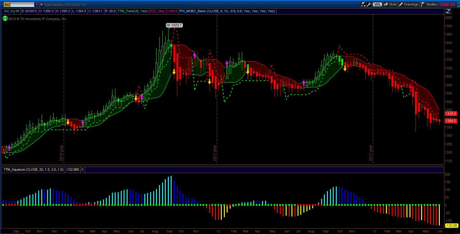
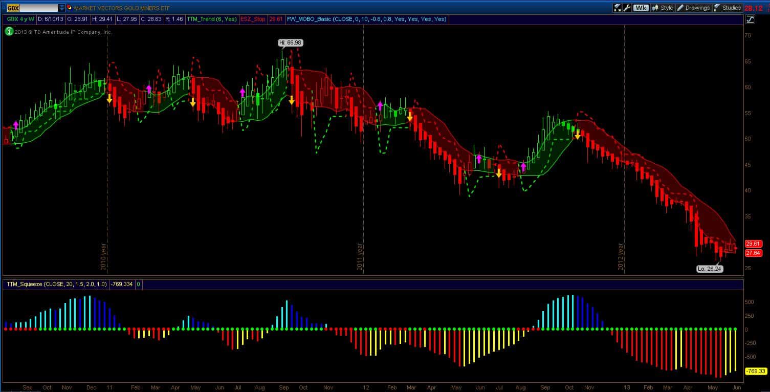
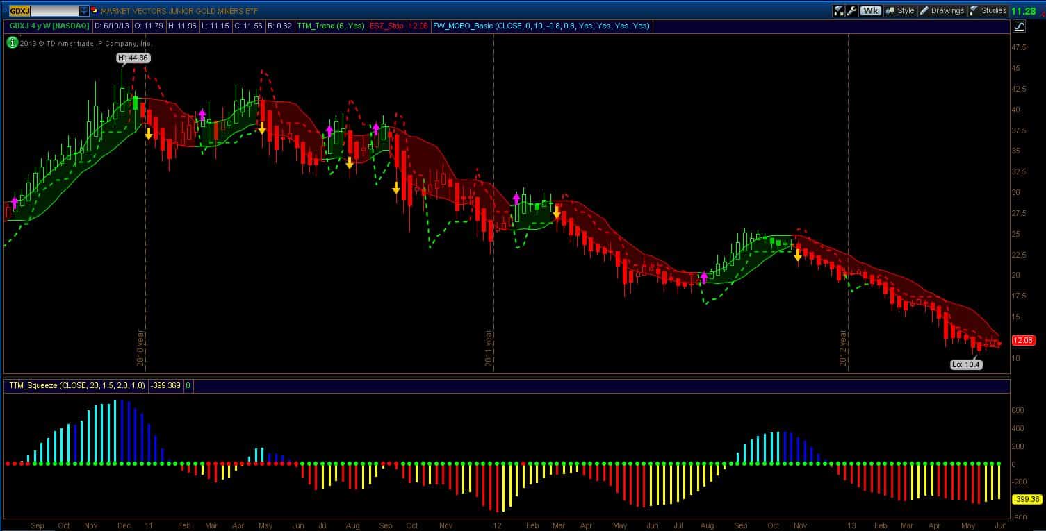
Finally, the three charts below show Gold, GDX and GDXJ. Ain’t nobody happy (expect the bears) on these charts. The miners, including the juniors, are showing signs of pausing their decline and they are certainly close to the short stop line. But there are no buy signals in gold or the miners. Yet anyway.
Good Trading,
-Dr.G
