
The following is excerpted from NFTRH 496‘s US & Global Market Indicators & Internals segment. It took on a life of its own, considering what you see below is not even half the segment, which itself is not usually a primary aspect of the NFTRH service.
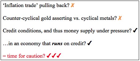
For the last few weeks we’ve used the conditions noted in the graphic below as a guide. Well, the ‘inflation trade’ (IT) popped last week and that included cyclical metals (as well as silver) ramming upward vs. gold and TIP rising vs. TLT & IEF.
As for credit conditions, there is little imminently raising caution flags as commercial lending and risk taking (as indicated by high yield junk bonds) continue apace, but the note still stands on the bigger picture as the credit system and money supply are gumming up with the Fed in quantitative and Fed Funds tightening mode while the velocity of money in the economy maintains a secular downtrend.
As for an economy that runs on credit, the bond market is threatening to do some real tightening in place of the thus far baby-stepping Fed.
It is still a time for caution, but probably not yet in the classic deflationary liquidation sense as per 2008. A question to ask is what kind of caution should we employ at a time when interest rates are rising right along with inflation expectations?
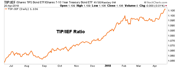
In NFTRH 495 using this chart we noted that inflation expectations were still consolidating as the market correction continued. Last week the market bounced and TIP/TLT (i.e. inflation expectations) bounced.

TIP/IEF had remained elevated but in consolidation. Last week it rammed to a new high for the cycle. This is not deflationary signaling from the bond market.
Here is the St. Louis Fed’s longer-term view of TIP/IEF’s message, the 10yr Breakeven inflation rate. You can see the break to new highs and also the pattern that saw its bottom form in Q1 2016. So often we mention that time when gold and silver bottomed, industrial metals bottomed, stocks bottomed and many boats were lifted on an inflationary tide that is still in force today.

After all, the US and many other governments of developed economies absolutely depend on inflation, right? They depend on their ability to inflate away value for consumers.
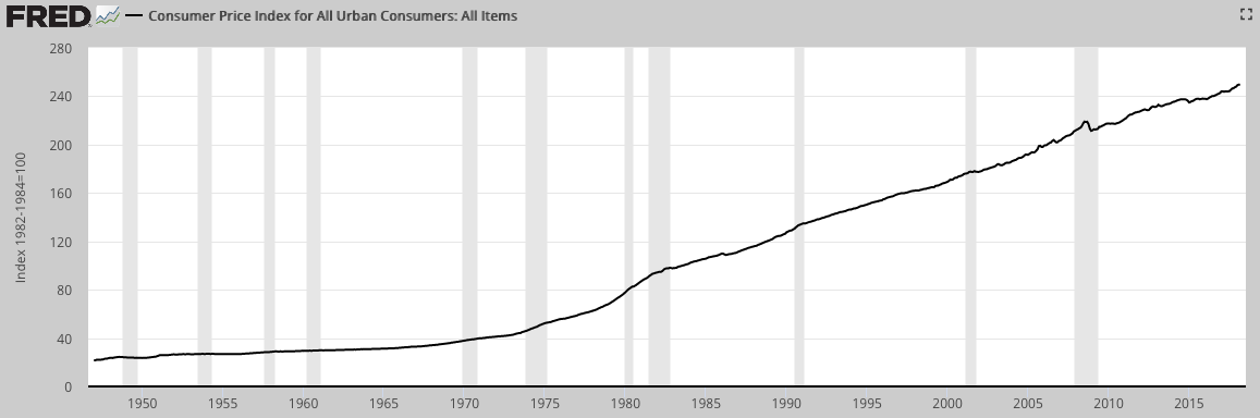
The CPI shows a distinct upturn and secular change to inflation as a necessary component of the modern financial and economic system… right from the time the US dollar was given its final severance from gold in the early 1970s. Not only is inflation desirable to developed economy governments and their central banks, it is absolutely necessary. So is theft of peoples’ purchasing power.
So what is the bond market going to do about it? As the thing in the chart directly above has risen over the decades this thing has gone the other way, apparently unconcerned about inflation because a little inflation is good say the Keynesian economists. Well, it is only good because the alternative is economic destruction in a Keynesian system.
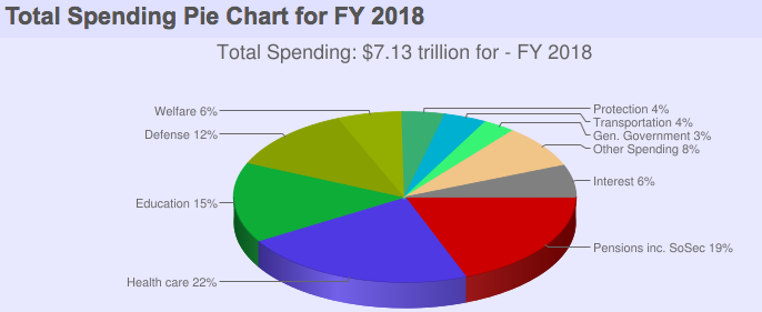
How can it not be in an economy debt-leveraged to the tune of over $20 Trillion? Let’s take another view of it. From USGovernmentspending.com comes this pie chart showing government spending targets. One of the smallest pieces of pie is Interest, at 6%. What will happen if that piece of pie begins growing? It would start crowding out other areas, whether they be Pensions, Healthcare or Education. Defense? That sacred cow can probably be expected to continue as is, but if it were to suffer cuts the defense contractors that lobby Washington 24/7 to keep that slice nice and healthy would be in trouble. They, along with much of the rest of the pie are intimately tied to the economy. Pensions/SS is the conspicuous, non-productive one.
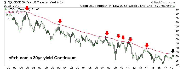
My point here, in a growing segment that may cannibalize other aspects of NFTRH 496, is that the Continuum on the 30yr yield chart above has held like a backbone, signaling that there is no problem whatsoever on the debt and inflation fronts. It’s been glorious business as usual since the early 1980s after Paul Volcker whipped inflation, stuck a “WIN” sticker on the bumper of the Fed’s Clown Car and handed the keys over to Alan Greenspan; who then systematically used this wellspring of monetary goodwill to kick off an era of “Inflation onDemand” ©, feeding off the secular decline in yields.
Yes, I am still here. The Biiwii-come-NFTRH guy with the cute buzz phrases who has, along with all the other fringe lunatics, bided time during the post-2011 landscape of global deflation and a US Goldilocks economy.
A big part of the play for the US was, in my opinion, the routine manipulation of the Treasury bond market. For example, in early 2011 none other than “Bond King” Bill Gross became alarmed about inflationary effects from Fed policy and famously shorted the long bond (in essence, went long the 30yr yield above). So what did Fed Chairman Bernanke then do later that year? Why, he “sanitized” (the Fed’s word, not mine) the bond market by cleaning up inflation signals (selling short-term bonds and buying long-term bonds). Simple. One massively profound macro parlor trick in the books. Great job big-brained Ben!
Speaking personally, I am the same macro viewer I always was although I have had to steer myself and NFTRH through waters so filled with policy crosscurrents [and sharks] it is difficult to quantify and make sense of on a daily basis. It is almost as if we have had to survive and even thrive in the midst of something unreal that goes against your core philosophies and beliefs. But now the implications of a return of inflation and the 30yr and 10yr yields’ rise to important would-be limit points calls us to attention.
I am not talking about those who only want to know about whether stock prices are going to go up or down. Again, I am talking about those who have not lost track of what goes on in the macro economic process behind the scenes. Why do I make such a big deal about the Amigos, 1 (stocks vs. gold), 2 (the above-noted yield continuum) and 3 (the yield curve)? Well, in a word it’s the “debt”.
But this chart of the yield curve implies that a big meltdown is not yet imminent.
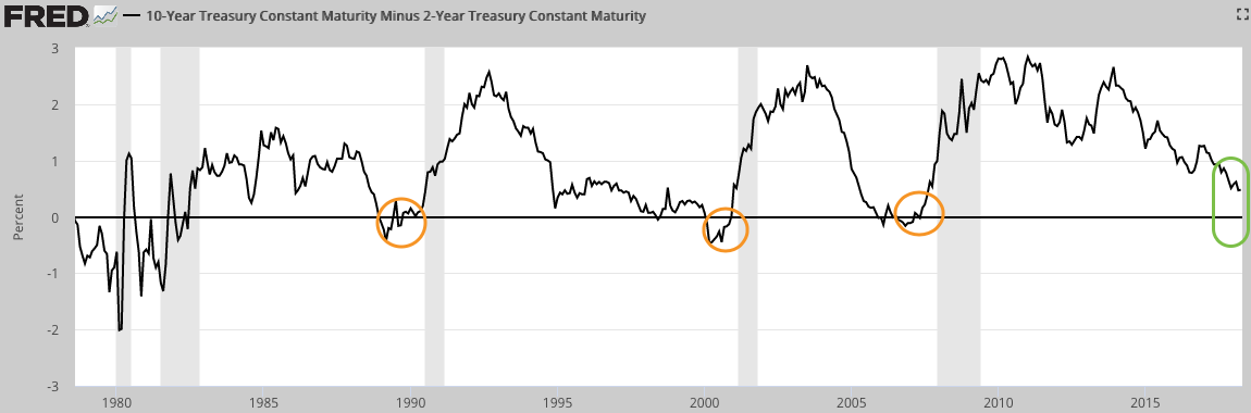
That is not so much because the spread between the 10yr and 2yr yield has not yet inverted as it is that it has not yet begun to turn up. That would be when acute stress on the economy would be indicated. Note the shaded areas (recessions, large and small) above that began after the curve turned up. A caveat against this temporarily happy thought is that the 1980 recession and its ‘double dip’ companion began with the yield curve hard down and inverted. I favor the three later cases because they took place in the Greenspan era, AKA the era of Inflation onDemand.
Before moving on to more standard relative sector views and global stock market to S&P 500 ratios, let’s take a look at this view of an upturn in US monetary inflation from tsiblog.com by way of Biiwii.com.
Steve Saville speculates that the upturn could be due more to the repatriation of corporate profits under the new tax regime than actual monetary inflation that would have meaningful effects on the economy. He goes on to note that the large decline in money supplies would be a real driver, to an eventual economic bust (as in 2008).
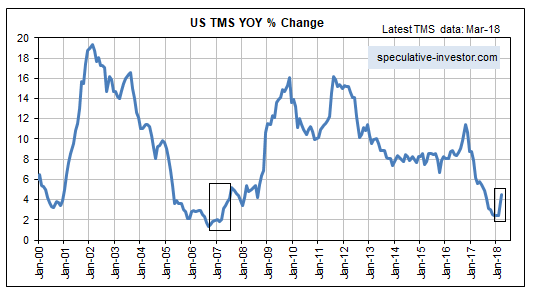
From the article: “In other words, it’s likely that March’s TMS surge was due more to the way that the banking system accounts for existing US dollars than an increase in the total supply of US dollars.”
This could call into question the authenticity of the new ‘inflation trade’ leg that set up last week, at least as a long-term phenomenon.
The segment went on to more strategic market management and NFTRH 496 covered all the usual US and global stock markets, commodities, precious metals, currencies and even found time for some stock charting.
