The Moving Average Convergence Divergence (MACD) is a trend-following momentum indicator that shows the relationship between two moving averages of price. It is used to identify changes in momentum, and it is a significant trading indicator used in technical analysis.
What is MACD?
Moving Average Convergence Divergence (MACD) is a trend-following momentum indicator that is useful for understanding the underlying trends in price movements. It was developed by Gerald Appel in the late 1970s and has become a common tool for identifying current trends, and for generating trading signals for traders today.
How Is The Indicator Calculated?
It is calculated based on two moving averages and is represented on a separate chart. The MACD uses exponential moving averages, unlike many other momentum oscillators that use simple moving averages. The MACD line is calculated by subtracting the 26-period EMA from the 12-period EMA. An additional “signal line” is then plotted on top of the MACD line using the 9-day EMA, which can function as a trigger for buy and sell signals.
When graphed below a security’s price chart, the MACD line is often displayed with a histogram that demonstrates the difference between the MACD and its signal line.
How To Use The MACD Line
The most common use of Moving Average Convergence Divergence indicators is for crossovers, divergences, and rapid rises/falls. Traders will often look at it as a way of indicating if a bullish or bearish price movement is strengthening or weakening. Because the MACD uses exponential moving averages, it is placing more weight or importance on recent data points, making it especially relevant for short-term trend trading.
Many traders using MACD look for instances of crossovers – – that is, instances in which the histogram crosses from beneath the 0-line to above it (indicating the financial instrument is gaining strength and momentum) or crosses from above the 0-line to below it (suggesting loss of strength). The histogram is a “shorthand” way of viewing what is going on with the moving averages with respect to divergence or convergence. For example, a technical analysis trigger for a trader could be to buy when the MACD line crosses above its signal line or to sell when it crosses below its signal line.
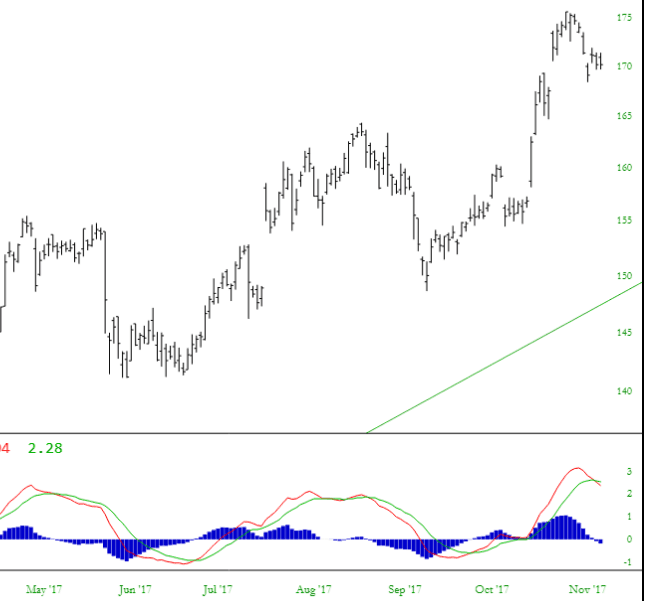
The chart below shows a stock chart with the Moving Average Convergence Divergence indicators beneath. This particular stock has a clean series of generally-uptrending cycles, which is well-reflected in the MACD and its crossovers.
Many technical analysis strategies rely on using multiple indicators to cross-reference and verify signals. Moving Average Convergence Divergence measures the relationship between two EMAs, while the RSI measures price change in relation to recent price highs and lows. The MACD is often used with another indicator, Relative Strength Index (RSI) to provide a larger picture. While MACD compares the relationship of exponential moving averages, the RSI indicator represents the change in recent closing price highs and lows. (Check out our article on RSI for more information about this indicator.)
SlopeCharts Guide to Moving Average Convergence Divergence
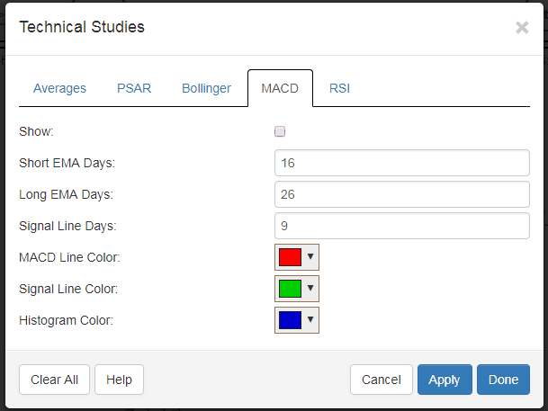
The default settings are adequate for most traders, but if you use the dialog box, you can change (1) how many days are used for the exponential moving averages (2) how many days are used for the signal line (3) the colors that are used for the three elements of the chart.
As with any panes in SlopeCharts, you can change their size by dragging the line dividing the panes, and you can rearrange the panes by holding down the Ctrl key and dragging the panes into the arrangement you want.
Here is an example Moving Average Convergence Divergence chart, expanded vertically for clarity:

The MACD line is shown above in red. The slower-moving “signal” line is shown in green. The histogram, derived from these two lines, is shown in blue.
