Slope of Hope Blog Posts

Slope initially began as a blog, so this is where most of the website’s content resides. Here we have tens of thousands of posts dating back over a decade. These are listed in reverse chronological order. Click on any category icon below to see posts tagged with that particular subject, or click on a word in the category cloud on the right side of the screen for more specific choices.

Whatever

By -

One of the earliest lessons I taught my children was that “whatever” was a much, much worse word than the word “fuck”. I never want to hear it. They know not to say it.

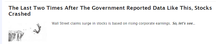
In this instance, though, I’m going to use it. Because there was a time that headlines from ZeroHedge like this one would get me all excited:

0331-laqst

After eight solid years of disappointment, however, one eventually becomes jaded. The central banks of the world aren’t going to suddenly wake up and decide to let the markets actually engage in true price discovery. They are going to keep their hands wrapped around the market’s throat until they can’t do it anymore. It could be years, or decades.

The hilarious aspect of this is shown below, which is a marvelous comment in the same article. It speaks for itself, and the author kindly provides links to every single one:

0331-tyler

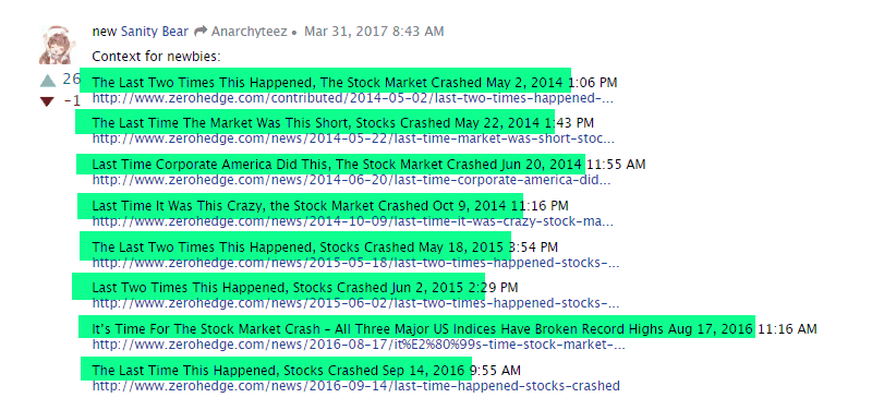
As you can see, ZH has been trotted out these “The last time….…….” articles for years now. I think the best choice is to ignore all of them from now on.

Whatever.

The Steadfast Top

By -

I’m in sort of an odd psychological position, because I have the largest precious metals short I’ve ever taken on in my life (by way of JDST), and yet it seems to be more or less inversely correlated to equities. Thus, if miners are sinking (yay!) then equities are rising (boo!) and vice versa. So I’m never happy. Typical Tim.

Anyway, the equity top seems to be holding up, in spite of the bulls trying all week long to slash my throat again. The Dow Jones Composite, shown below, needs to stay beneath 7180.

0331-comp

Divergences Warn Of Impending Correction

By -

The chart below shows the Nasdaq Composite plotted above the percent of stocks within the Nasdaq Comp trading above their 50-day moving average. The dashed vertical lines show every stock market peak for at least the last 13-years.

Without a single exception, all of those corrections (a drop of 10% or more) and bear markets (20%+ drops) were preceded by clear, multi-month divergences between the Nasdaq Comp & the percentage of stocks trading above their 50-day moving average. Of particular note is the recent plunge in the $NAA50R which virtually mirrors the plunge that preceded the market top in 2015 which was followed by one of the largest corrections throughout current 8+ year bull market.

$NAA50R daily March 30th

(more…)