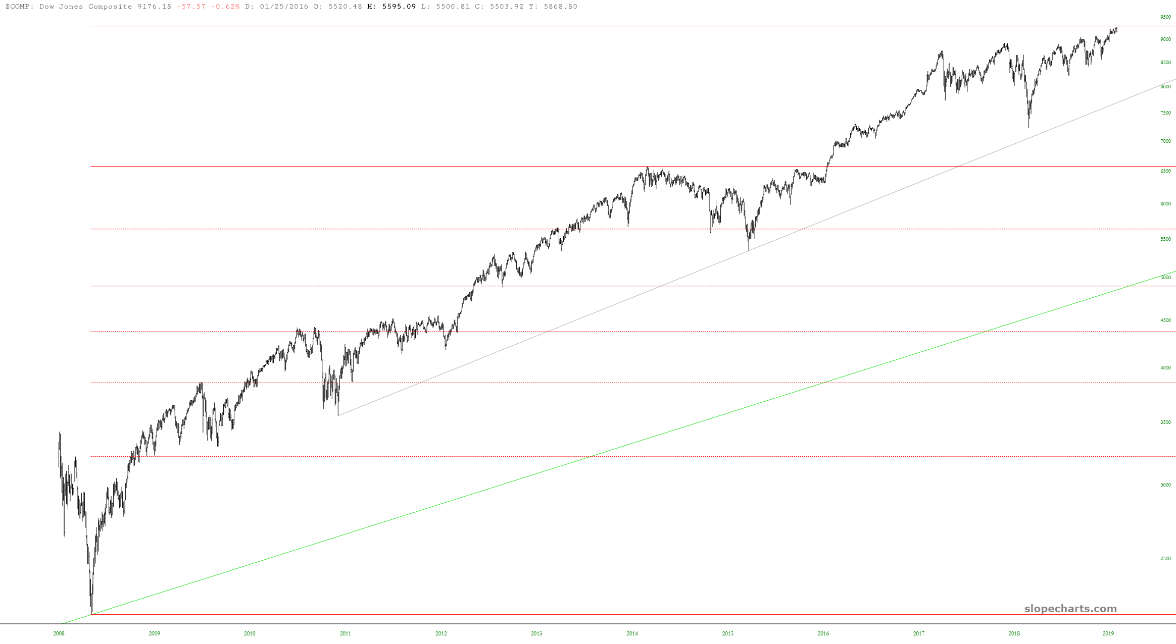
I wanted to share a couple of major U.S. equity index charts with Fibonaccis, since I think they are kind of interesting. Here is the Dow Jones Composite, with anchor points at the bottom of the financial crisis and at the December 2014 peak. Take note of the 161.8% projection (dashed line) and its relationship to recent price activity.
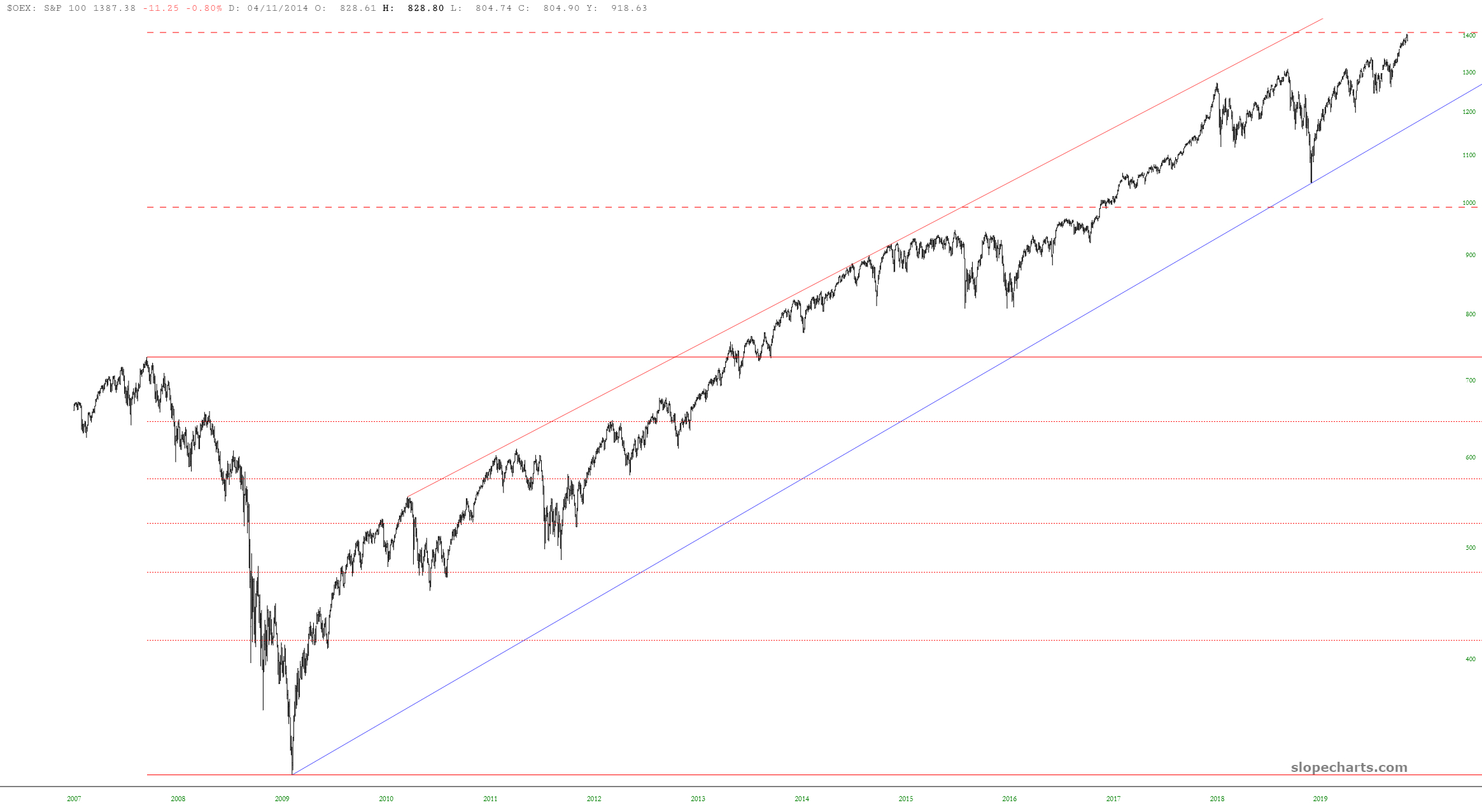
I’ve done the same thing with S&P 100, except this time the anchor points are the peak of the financial bubble and the bottom of the financial crisis. In this case, there are actual two projections drawn: the higher one, 261.8%, was extremely close to the peak last week.