Happy 4th of July to my American Friends!
On this holiday shortened trading week, I want to do a review of where Gold and the SPX stand according to the monthly charts. These charts are principally for investors but traders should consider them for the macro backdrop they represent. I first discussed my thoughts on monthly charts in a previous post. Essentially, they represent long-term trends and changes. In the case of the SPX for example, the monthly charts sync up with the expansion and contraction of the economy.
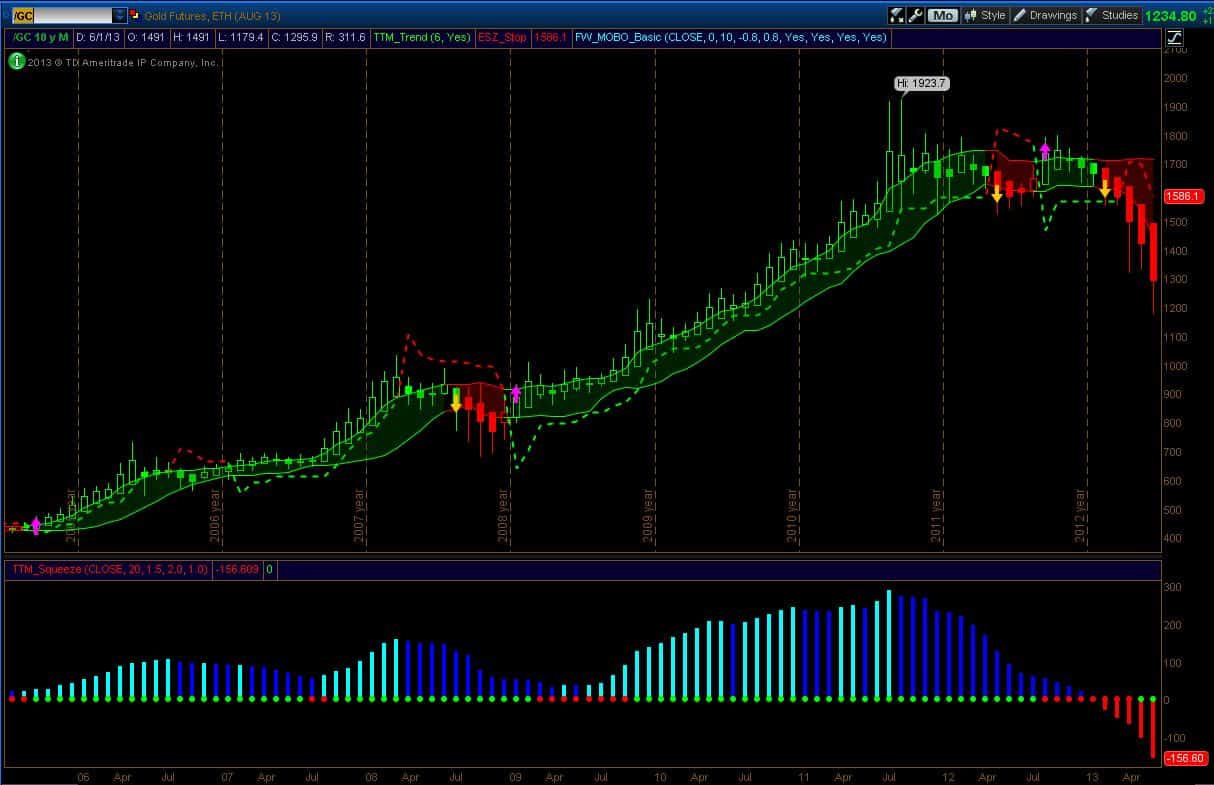
The monthly chart of Gold is shown below. This is a very interesting chart because it shows that the character of gold has changed significantly. After a decade long bull run, we now see considerable weakness. Indeed, we haven’t seen this sort of weakness for a very long time. Here are two current comments from Casey Research:
“Gold took another ugly turn last month, succumbing to several steep declines and ending down 11%. Last Friday marked the largest quarterly decline ever.” (Big Gold, Volume V, Issue 7 / July 2013).
“Gold’s legendary volatility has been on full parade. Especially in recent days and weeks, falling from its interim high of $1,895 on September 6, 2011 to $1,192 on June 28. That’s a 37% correction… the second-largest gold correction ever. The largest? It occurred between 1975 and 1976, when the price of gold fell 44%.” (Casey Research Email, July2, 2013).
(click on image for larger chart)
The monthly sell signal in gold was given 4 months ago and since then gold has declined approximately $400. We have actual selling pressure (negative momentum) which hasn’t been seen at all during the last decade until these last few months. The warning signs were in place for a quite a while with rapidly declining momentum (or buying pressure), and filled Heikin Ashi candles. The “get out of Dodge” signals came with a trend change (Red candles), increased directional volatility (Squeeze going from red to green), a momentum band break down and a long stop violation. The current monthly downtrend is strong with no upper wicks on the HA Candles. We have seen pull backs before, but the pull-backs in 2008 and 2012 were minor compared to what is happening now. So we are seeing behavior that is unusual to say the least.
So what’s next for Gold? There is no way to tell. Technically, the trend is down on both the monthly and weekly charts and so the only targets I have are below current pricing. It may sound obvious but when the trend is down, the targets are down and when the trend is up, the targets are up. So I am only looking down at the moment and I gave reasons for price targets in the $800-$1000 and $600-$650 area in my previous weekly post. I am bearish on Gold only because the charts are bearish. When they go neutral to bullish, I will change my posture. In anticipation of bullishness, I have been building a shopping list for Juniors and Larger-Caps. The seniors are at significant value but the Juniors have been profoundly smashed. Even the index fund GDXJ just went through a 4:1 reverse split. Think about that for a moment. This is like reverse splitting an entire sector through the proxy of GDXJ (note: leveraged instruments always go through reverse splits due to mathematical necessity – GDXJ is unleveraged so a reverse split is significant).
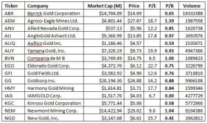
I won’t bring up any Juniors right now but I will highlight some Seniors. I am using the Price-to-Book metric to define value (incidentally, Casey Research also shows this metric in their latest newsletter which isn’t surprising – it’s a common measure of value). The table below shows Gold companies with daily volumes over 1M shares that are now trading near or below their liquidation values (most are below!). I remember a conversation with a broker in 2008 who told me that during a recession, the banks trade down to their book value. Well, they traded below their book values because it was not a normal recession. However, the financials turned out to be a great bargain once the pain was done. I am thinking the Gold sector will be the same. The question of when the pain is done remains open. The charts suggest more pain to come. Personally, I am watching for a historic wash-out where we see 100’s of Juniors wiped out and perhaps even a mid-cap or even a large-cap failure. I am not saying that will definitely happen but the possibility is certainly here during this cycle. But no matter what does or doesn’t happen, I will let the charts guide me.
(click on image for larger chart)
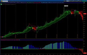
The SPX chart below shows that we are still in the context of a bull market. There has been some uncertainty with the last monthly HA candle being and inside candle (that uncertainty has shown up as an exit signal on the weekly charts). Momentum is still strong and the stop has now moved inside the momentum bands and sits at 1490. Long term investors can consider this level for hedging or exiting positions held in long-term accounts.
(click on image for larger chart)
Have a great holiday week!
-Dr. G