Playing devils advocate. This chart is purposefully deceptive. The 1% lose a percent of net-worth equal to the bottom 50%. But the odd scaling of the chart doesn't convey that. Also the bottom 50% has a very rapid 25% recovery which outpaces every-other group, it would be interesting to see the factors relating to this, and why that recovery didn't stick. I guess and uptick in bankruptcy would reset a good deal of people back to zero NAV so that could be it. The real winners of this chart appear to be the middle 49% as the had the least drop and the quickest true recovery.
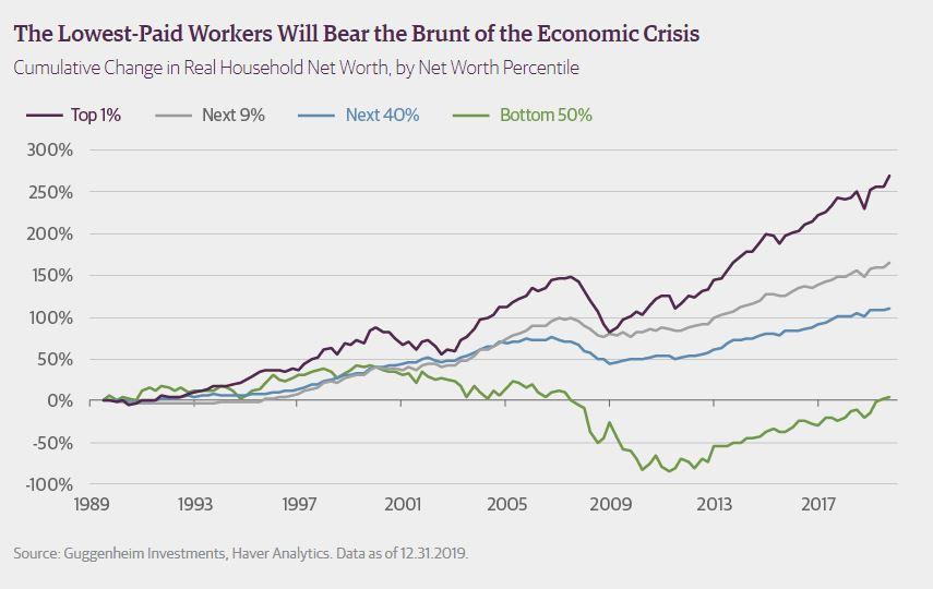

This chart is purposefully deceptive.
The 1% lose a percent of net-worth equal to the bottom 50%. But the odd scaling of the chart doesn't convey that.
Also the bottom 50% has a very rapid 25% recovery which outpaces every-other group, it would be interesting to see the factors relating to this, and why that recovery didn't stick. I guess and uptick in bankruptcy would reset a good deal of people back to zero NAV so that could be it.
The real winners of this chart appear to be the middle 49% as the had the least drop and the quickest true recovery.
4/27/20