The SlopeCharts economic database provides access to an amazing amount of economic data (literally hundreds of thousands of items) that in some cases go back hundreds of years. This feature is available only to Platinum users. You can upgrade your membership to get immediate access by clicking here.
If you would prefer to watch a video about this feature, click here.
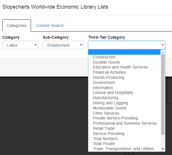
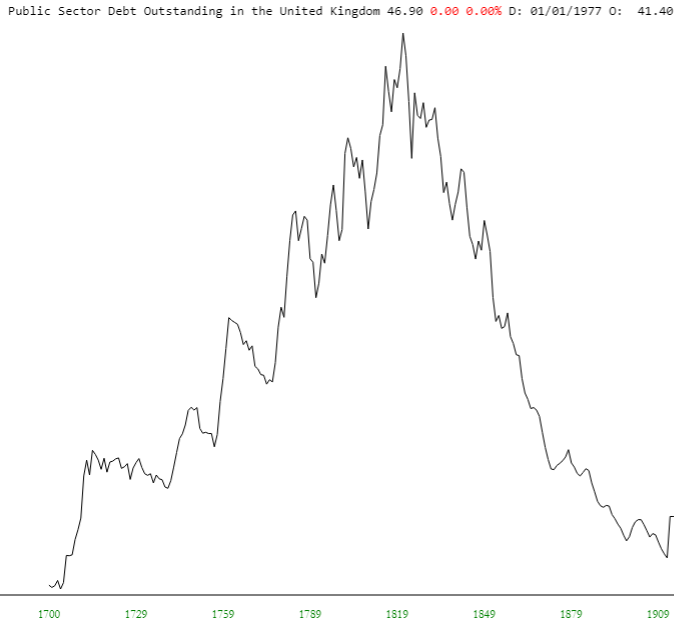
There is an astonishing breadth of data available, including TED spreads, 10s2s, and other things which are just plain fun to look at, like the United Kingdom’s debt load back in the days of the United States Colonies (take THAT, King George!).

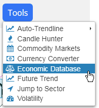
Using the economic database is very simple, and there are two ways to get to the information. One of them is via the Tools menu in SlopeCharts. Choose the Economic Database from it:

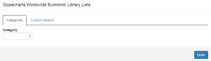
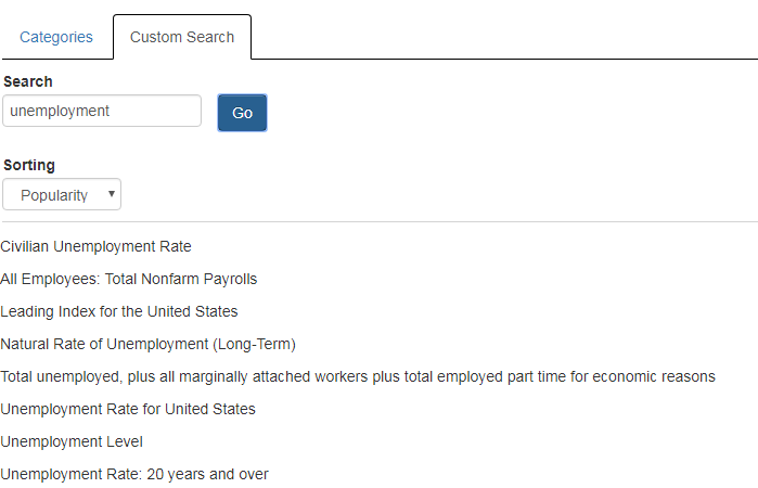
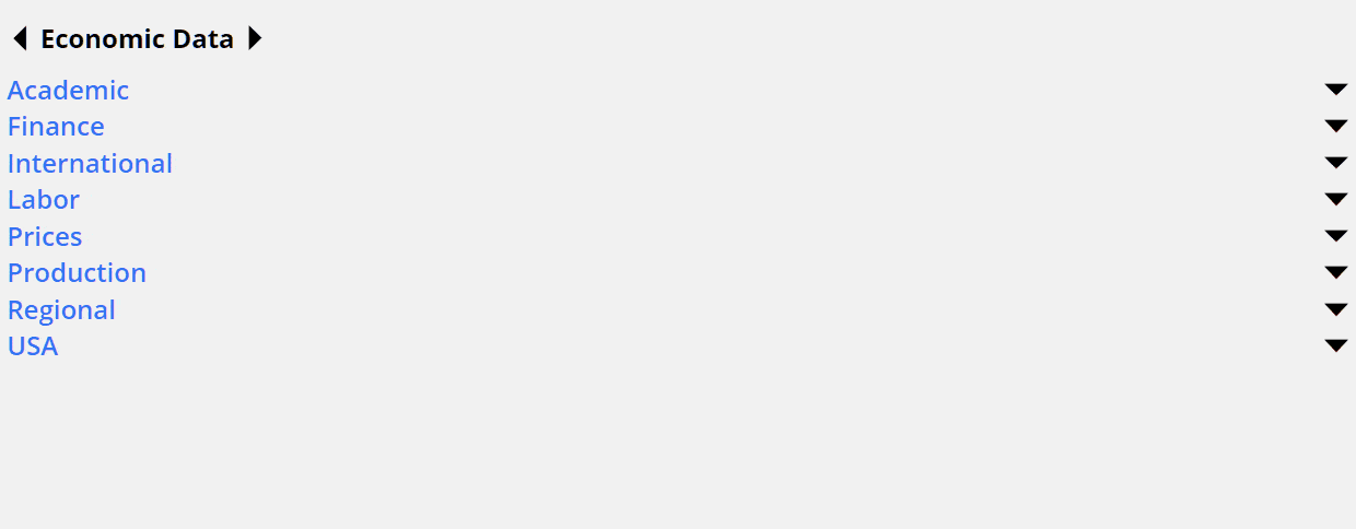
That brings up a dialog box with two tabs – one for Categories and one for a Custom Search.

First choose a category, which will in turn present you a list of appropriate sub-categories. Choose one of those, and you will either be presented with a third tier of categories or, in some cases, a list of data sets you can chart. In this example, a third category is available, which is the most common situation.

You now have a list of items you can chart listed in order of popularity (you can change the dropdown to alter the sorting to be based on the names). Clicking on any of these will bring up the chart. Once you are satisfied with your choice, click the Done button. Of course, you can do all the normal things with this chart you would with any other including, importantly, adding it to a watch list so you don’t have to “drill down” for it again.

The other method, which many users find faster and more direct, is via the Data Panel on the left side of SlopeCharts. Click the left or right arrows at the top of the Data Panel until you reach the Economic Data panel. Once there, you can explore the information in a hierarchical fashion.

We have made some important improvements to the economics database user interface to address these former shortcomings:
- I kept being presented with data series that had been discontinued long ago and were therefore no longer useful (keep in mind, there are literally HUNDREDS OF THOUSANDS of charts available);
- There was no control over granularity so that, for instance, if I really wanted finely-grained daily data, I had no interest in, let’s say, yearly or quarterly data, but I had to hack through it anyway;
- I didn’t have a way to tease out long-term data, which is always my favorite;
- When I made a selection, I had to close the dialog box and see if the graph was useful to me. If I wanted a different graph, I’d have to go through the entire process again with the dialog box of hacking my way through different dropdowns.
We have addressed every one of these problems.
In the dialog box, you will see a new checkbox called Show Filters which gives you more control (the real meat of this project was dealing with the back-end database; the UI fixes were trivial).

If you check it, you will be presented with a variety of important controls. With these new controls, you can:
- Include or exclude Discontinued data;
- Include or exclude a variety of data based on granularity (Daily, Weekly, Monthly, Quarterly, Yearly);
- Sort based on when the data sets Start;
- Sort based on when the data sets End

You will also see a new button, Preview, which lets you see the entire graph for a few moments and then be returned to the dialog box. This lets you get a sneak peek before committing yourself to closing the dialog.
