The Head and Shoulders pattern (also referred to by the moniker H&S) has a funny name but a powerful purpose: to indicate the possible reversal of the security you are charting. It is one of the best-known, easy-to-recognize, and yet most widely misidentified patterns in Technical Analysis. As the name suggests, the H&S pattern looks like a head in between two shoulders, and a completion of this pattern indicates that the security is probably going to head down in price.
Definition of the Pattern
The criteria for this pattern are as follows:
- Left Shoulder: an ascent in price (ideally following a long, major ascent in the stock’s value), a leveling, and then a weakening back to a certain support level known as the neckline
- Head: a further ascent in price, surpassing the high set by the left shoulder, once again leveling off and descending back to the neckline.
- Right Shoulder: a final ascent in price, ideally not going as high as the left shoulder (and certainly not going as high as the head), a leveling off, and a descent back to the neckline, which it breaks beneath on strong volume.
The target price is the value of the price range of the pattern subtracted from the neckline. For example, if a neckline is at $20, and the top of the head is $25, the difference is $5. Therefore, $20 (the neckline) minus the range ($5), equals the target price ($15). This setup anticipates a 25% decrease in stock price.
Figure HS-1 shows an example of a very good H&S pattern exhibited by the now-defunct stock Technical Olympia (symbol TOA). Lines have been drawn on top of the chart to clearly show the shoulders, the head, and the neckline. The circled part indicates where the price broke beneath the neckline, completing the pattern and sending the price sharply downward, as expected.
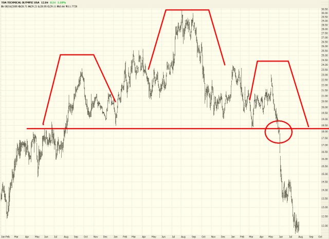
(FIGURE HS-1: The circle indicates the point at which the neckline was broken, and the stock quickly descended immediately afterward.)
Psychology Behind the Pattern
We return to the basic notion that bulls want to see a steady progression of higher highs and higher lows. During the formation of the left shoulder, assuming the stock has been enjoying a consistent run-up in price, the bulls are still satisfied that all is well. The peak of the left shoulder marks yet another high price in the stock.
As the head begins to form, the bulls remain satisfied, because once again they are seeing a higher high in the stock. But something is going wrong, because as the price eases back again, it returns to the same level that the left shoulder was at before (in other words, the neckline). So we no longer have a series of higher highs and higher lows. The lowers are matching one another. But at least, from the bullish point of view, there is still strong support at a given price level (again, the neckline).
When the right shoulder begins to form, the bulls want to see a new high made, exceeding the price just made by the “head” price. (Keep in mind the vast majority of individuals watching the stock aren’t looking at a chart, let alone thinking in terms of heads and shoulders). But not only does the price not exceed that of the head, it doesn’t even match the price made by the left shoulder. So the stock is actually seen as weakening now, and the buying volume dries up as the price comes to rest, once again, at the neckline.
At this point, the market has a decision to make. It can continue to support the price at the equilibrium level it has found. Or the sellers can overcome the buyers, and the neckline will be broken. In the latter case, the H&S pattern is complete, and the stock price is probably in trouble (for the bulls, at least).
There is one more element to this story, however, and that is the retracement. Just as there are retracements with saucer-like patterns, the H&S pattern sometimes sports a retracement as well. In this case, after a brief, quick drop in price, “bargain hunters” come out and temporarily provide support for the stock. If the H&S pattern holds, the price will make its way back up to the equilibrium point (the neckline), but no further. This provides a golden opportunity in the form of a second chance for those wanting to sell the stock short. Because it is likely that once the retracement is complete, the price will begin falling again, and it will fall far past the point where it originally paused.
The Importance of the Neckline
There is no more important feature to the H&S pattern than its neckline, because the neckline defines whether or not the pattern is complete and, therefore, has any meaning. As with other lines in technical analysis, the neckline represents a “line in the sand” dividing bulls and bears. Along the line itself is a sort of equilibrium between buyers and sellers. Trading above the line represents strength and hope. Trading beneath the line represents weakness and fear.
With an ideal H&S pattern, the neckline has five unique “touch points.” The first is on the left side of the left shoulder; the second is at the right side of the left shoulder (which is also the left side of the head); the third is at the right side of the head; the fourth is at the right side of the right shoulder, at which point the price breaks beneath the neckline; and the fifth point (which is optional, in a sense) is when the price retraces back up to the neckline before falling hard once again.
Ideally, the neckline should be horizontal, since price equilibrium should concentrate in a tight, consistent price range. You may allow some leeway for a tilted neckline, however, perhaps as much as ten degrees either upward- or downward-sloping. Those newer to charting often look at any trio of price humps and assume they’ve discovered an H&S pattern, no matter how distorted the pattern or how sharping-ascending the neckline. The higher-quality the pattern, the more reliable it is as a predictive guide.
Once the price has broken beneath the neckline, the H&S pattern has validity only if the price remains below the neckline. (When the price retraces, you may want to allow for a few pennies of “violation” before dismissing the pattern altogether). Just because the price goes above the neckline doesn’t absolutely mean the stock will not fall, but it does indicate strength that is normally not a part of a good, strong H&S breakdown. A pattern with “noise” such as this should be viewed with more skepticism than a pattern absent such noise.
Let’s examine some instances of this important technical pattern.
Example: Hutchinson Technology
We begin with an imperfect example, since the chart in HS-2 has a somewhat roughly-defined neckline at a little under $18. The three elements of this pattern are highlighted with triangle tops, and the range of the pattern – from $17.30 to $43 – is extremely wide. Indeed, the range is so large that the measured move upon pattern completion is a negative number, which is an obvious impossibility. What it does make clear, however, is that a neckline failure suggests a very dramatic move downward, and that prediction was fulfilled with a 93% drop in price.
Although the neckline isn’t perefectly formed, the retracement in this example is excellent. Once the neckline is broken, the price falls to about $12 before recovering to approximately $17. This would make a superb shorting opportunity, since the neckline has already failed, the ability of the stock to fall swiftly has been proven, and you would have a relatively safe stop-loss level of a price just above the neckline. In other words, if you shorted at this level, and the stock pushed up to, say, $19, the pattern would be so compromised that you would have been stopped out of the position.
In retrospect, we can instead see that nothing of the sort took place. After a brief stint pushing back toward the failed neckline, the price plunged rapidly lower. This illustrates one of the great appeals of bear markets (or selling stocks short) – – the moves can be terribly fast. You have probably heard the maxim that stocks climb a wall of worry and slide down a slope of hope. Climbing a wall of worry takes time, because there will always be plenty of doubters to dampen the ascent of a stock’s rise in price. When a stock starts crumbling, however, sellers rush toward the exits, and the selling tends to feed on itself. As with this example, it took only weeks to make a price move that, were the stock going up instead of down, might have instead taken months or years.
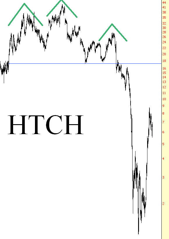
(FIGURE HS-2: Although the neckline is somewhat rough in this example, the retracement and subsequent plunge are picture-perfect)
Neckline: $17.30
Pattern Top: $43.00
Target Price: n/a (negative value)
Target in Percentage Change: n/a
Actual Percentage Change: -93%
Example: Utilities Fund
In contrast to the prior example, figure HS-3 shows an extremely well-defined neckline with no retracement to speak of. The security shown, XLU, is the ETF (exchange traded fund) for utility stocks. The head and shoulders pattern is as “textbook” as you might hope to find in the markets, and the neckline at $32 was in place for nearly two years. It finally cracked, as many stocks did, in September 2008, and although there was a tiny retracement from $30 to $32, there was very little time for bears to get aboard this plunge before the stock lost a third of its value in just a couple of weeks.
One side note to make about stocks like XLU is to take into account the dividend component. When you are long a stock that pays a good dividend, you benefit. When you are short such a stock, you are responsible for paying the dividend out of your own pocket, since the owner of that stock is being denied the dividend that they would normally receive. In the case of XLU, even if the stock price stayed stagnant for a long period of time, you would still lose money, because you would be responsible for the dividend. Those short during the autumn of 2008 need not have worried about such matters, since the collapse in price dwarfed whatever the dividend loss would have been.
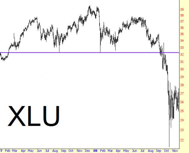
(FIGURE HS-3: This exchange-traded fund constitutes utility stocks, and its fall from $32 to $22 took place in less than a month’s time.)
Neckline: $32
Pattern Top: $39.23
Target Price: $24.77
Target in Percentage Change: -23%
Actual Percentage Change: -36%
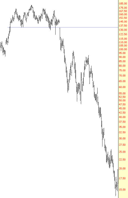
Example: Prologis
The next chart, HS-4, gives us an opportunity to see a more complex pattern in action with extremely dramatic results. First take note of the left shoulder (again, triangle tops denote the three elements of this formation). The left shoulder, at the time, might have been considered an H&S pattern in its own right. It isn’t perfectly formed, but it isn’t bad, and some might have shorted Prologis in 2007 with disappointing results. The stock did fall from about $60 to $45, but it regained its strength and went on to new lifetime highs.
The security went on to form a head, stabilize again at $40.75, formed a right shoulder, and then stalled at the neckline for a couple of weeks. You can see how much “noise” there was in the chart pattern around the neckline, as the stock fluctuated between +5% and -5% around the neckline. This neckline, established over a period of years, represented a criticial equilibrium between buyers and sellers, and the furious tug-of-war that was taking place in September 2008 showed that the integrity of the neckline was fracturing but not yet failing.
Because of the prolonged tension around this neckline, once the selling began, there was almost no stopping it. The stock plunged from $40.75 to less than $3, virtually wiping out all shareholder equity, and then began a furious ascent back above $15. Keep percentages in mind here, since that quick spike higher offered a rare opportunity for over 400% in gains in just a couple of months. Obviously a stock moving like this, however, is loaded with risk.
Imagine, for instance, being on the sidelines and watching PLD at $3, thinking it might be a great buy. Of course, you stand the risk that the stock goes to $0 (or close to it), so that keeps you from buying. The stock moves up to $4, $5, $7.50, $10…….all the way back to $15. You can’t stand watching your “hot pick” go up in price anymore – – after all, it was three times this high in price just recently, and it might get back up to that level, so you finally take the plunge and buy. At that point, the stock reverses and falls back down to $5, wiping out two-thirds of your position.
This is an overly-dramatized example, of course, but the point is that playing either the short or long side of a stock after it has already been thrown into wild gyrations is little better than gambling. Those who recognize the move before it takes places are taking much less risk. If you are short PLD at $45, and it falls to $3, you have plenty of time to make reasonable decisions with very little risk, since it is virtually impossible at that point what you will emerge from the trade with anything but a profit.
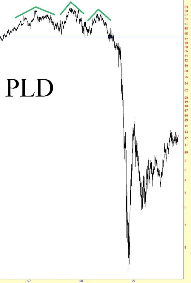
(FIGURE HS-4: Not many stocks were as volatile as Prologis during the financial crisis of 2008)
Neckline: $40.75
Pattern Top: $59.31
Target Price: $22.19
Target in Percentage Change: -46%
Actual Percentage Change: -95%
Example: Russell 2000 Index
Traders have a universe of financial instruments from which they can choose to trade. One of them, of course, is index options, and this example of a head & shoulders pattern in the Russell 2000 index (Figure HS-5) illustrates how an insight about an index’s likely next move can be very profitable.
What’s impressive about this pattern is its uniformity and its length. For three years – 2006, 2007, and 2008 – the Russell 2000 index of small capitalization stocks hammered out a fantastic head and shoulders pattern. Added to this, if you examine the head independently, the portion itself constituted a cruder head and shoulders pattern in its upper half. It is far easier to see these patterns in retrospect, but it is no surprise, given the massive pattern, that one of the largest plunges in financial history was about to take place.
There would have been a number of ways to take advantage of the belief that this index was about to fall. One of the simplest would have been to sell short symbol IWM, which is the ETF for Russell 2000. A more aggressive, more leveraged, and (in this instance) more profitable technique would have been to buy puts on the index. The Russell wind up lolsing about 47% of its value once the neckline was broken, meaning a short position in the IWM would have yielded a return of about 47%, but being long put options would have garnered multi-thousand percent returns. Of course, this kind of excitement only happens once a generation, so this dramatic example should not be taken as the norm.
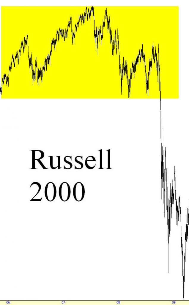
(FIGURE HS-5: Being long put options during the the Russell’s plunge would have yielded astonishing returns)
Neckline: $643
Pattern Top: $856
Target Price: $430
Target in Percentage Change: -33%
Actual Percentage Change: -47%
Example: Broadcom
One of the most remarkable examples of the H&S pattern in action in the U.S. stock market in recent years was Broadcom (BRCM) from 1998 through 2002. By looking at how this stock formed and broke down with the H&S as its reversal formation will yield insight in how to profit from this pattern. Much more importantly, it demonstrates that a pattern can exhibit a false start, or even several false starts, and still manifest itself fully.
Broadcom, over a period of several years, had a remarkable run-up in price, moving from a single-digit stock to one priced over $180. This was during the Internet boom of the late 1990s, and Broadcom, as a major force in network-related semiconductors, was one of the hottest stocks in the U.S. When the NASDAQ stock market began breaking down after March 2000, Broadcom suffered badly, falling from about $160 to about $80, a loss of 50%. But stocks related to network regained their composure, and by the summer of 2000 Broadcom was reaching new lifetime highs.
In retrospect (Figure HS-6), we can see something fascinating happening between July and October of 2000 – the formation of a rather well-defined H&S pattern. This one is a bit unusual in the fact that it has two right shoulders. This is not unheard of, but it suggests a hesitation on the part of the market to push the stock beneath its neckline.
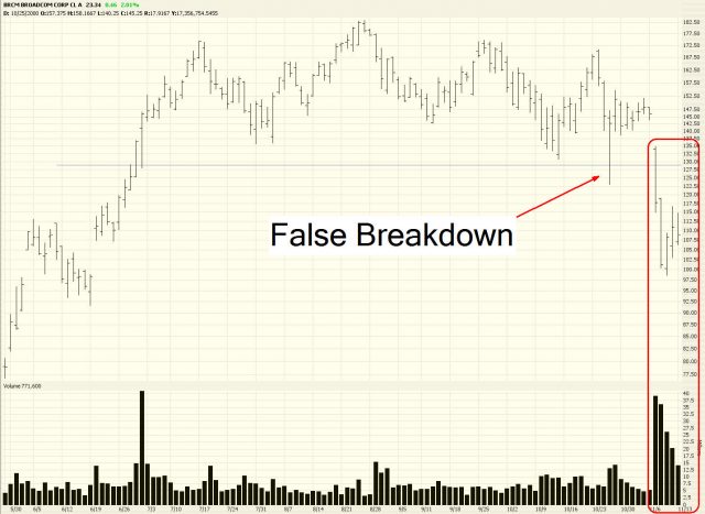
Looking closer at this period where the H&S formed, you can see a clear neckline at about $130. Something rather extraordinary happened on October 26, 2000: the stock pushed below the neckline on strong volume……..and then returned above the neckline again! You can imagine how frustrating this was to the bears on this stock, since the widely-anticipated breakout of BRCM had finally started taken place, only to be cancelled out the very same day.
Eight sessions later, the stock gapped down beneath the neckline, but this time there was no turning back. Even more important, the breakdown in the stock was accompanied by a gigantic rise in the volume as owners of the stock rushed for the exit doors. Even though there had been a false breakdown that had “faked out” many investors, it seemed this second breakdown was authentic.
What happened following this breakdown was extraordinary. From November 7, 2000 through April 4, 2001, Broadcom lost about 90% of its value, all in a span of about five months. And it did so on extremely high volume. The H&S pattern, in spite of its false start, provided an astonishingly prescient prediction of this stock’s direction (Figure HS-7).
After the stock reached its bottom on April 4, 2000, it spent about the next fourteen months bouncing in a huge trading range between $12 and $36. Clearly the investing public had been caught in a horrible tailspin and was trying to establish an appropriate value for the stock. After all this churning, the stock starting losing support again, and it ultimately bottomed at a little over $6 (a little over 3% of its peak price) in October of 2002.
(FIGURE HS-7: As large as this plunge is, it doesn’t even capture the final move, which wiped out virtually the entire capitalization of Broadcom at its nadir.)
Neckline: $134.75
Pattern Top: $181.50
Target Price: $88.00
Target in Percentage Change: -35%
Actual Percentage Change: -66%
Example: Mela Sciences
As was mentioned earlier, the neckline of a pattern doesn’t have to be absolutely flat in order to be valid. Figure HS-8 shows ticker symbol MELA, whose neckline was tilted slightly downward. One could argue that this is actually a positive aspect for this pattern, since it only emphasizes the weakness of the security in question. In ProphetCharts, instead of using the Price Level horizontal line tool, you would use the Trendline tool, since it is important that the touchpoints on the neckline be accurate, even if it is not perfectly level.
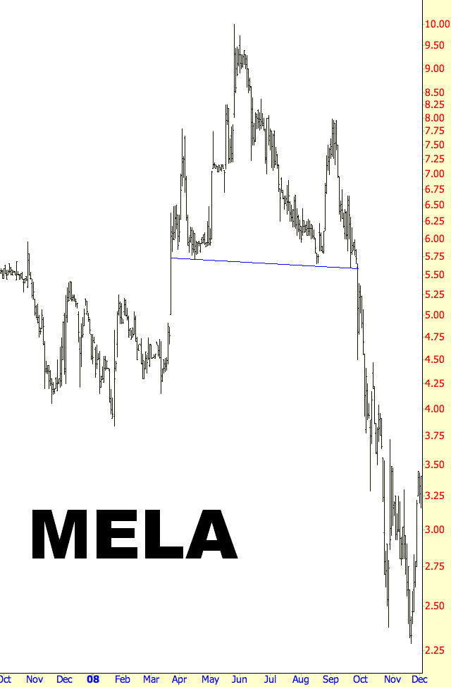
(FIGURE HS-8: The slightly down-sloping neckline on this stock belied the underlying weakness of the security)
Neckline: $5.65
Pattern Top: $9.99
Target Price: $1.31
Target in Percentage Change: -77%
Actual Percentage Change: -59%
Example: MSCI Index Fund
Similar to the example of the Russell 2000 in HS-6, the MSCI Index Fund illustrates how uniformly the broad market fell during the financial crisis of late 2008. The formation of the pattern itself is textbook-perfect; notice how the right shoulder is noticeably lower than the left shoulder, which agrees with the premise that the security is weakening with age. Even though this index represents many hundreds of individual stocks, it lost fully half its value once the neckline was broken.
Neckline: $60
Pattern Top: $77.22
Target Price: $42.78
Target in Percentage Change: -29%
Actual Percentage Change: -50%
Example: Darden Restaurants
The example displayed in Figure HS-10 is unique to this chapter since it shows the stock with not just one but two retracements. The stock sported an ascending neckline, and once it broke the neckline, the price dropped swiftly from about $35 to $20. It turned around almost immediately, zooming back to about $35, giving bears another opportunity to sell the stock short. The stock fell, not as hard this time, and then pushed yet again to approximately the $35 level. Nimble bears got many bites at the proverbial apple, and the stock’s most dramatic plunge commenced after this second retracement.
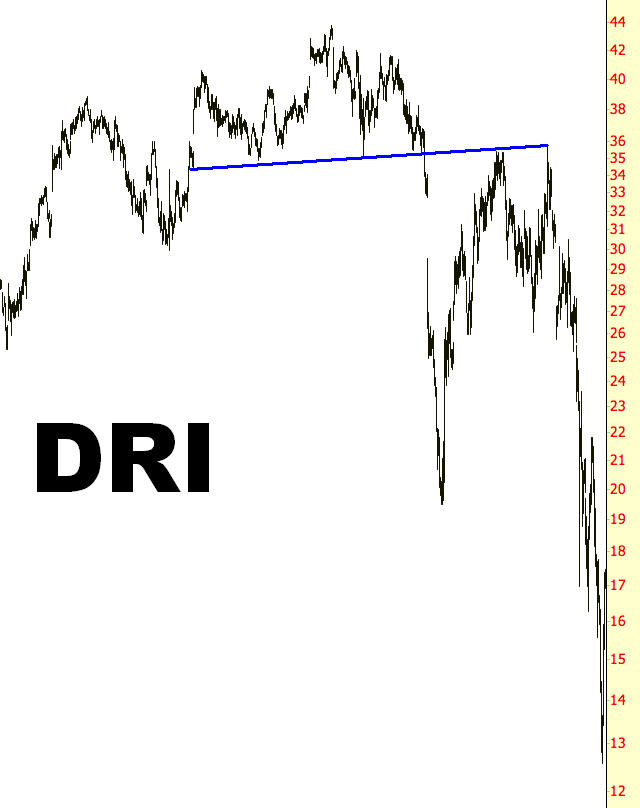
(FIGURE HS-10: Darden’s behavior was somewhat unusual, since it recovered fully not just once but twice, giving bears multiple opportunities to benefit from the stock’s drop)
Neckline: $35
Pattern Top: $43.14
Target Price: $26.86
Target in Percentage Change: -23%
Actual Percentage Change: -65%
Example: Allegheny Energy
A trader may wonder: when is the best time to short a head and shoulders pattern – before it breaks its neckline, or after it retraces? There is no clear answer, but it is almost certainly safer to short a stock when it retraces rather than simply anticipate a neckline break. Indeed, anticipating what might happen with a stock is quite hazardous, since “fake-out” patterns are in great abundance in the markets. Instead, a trader should wait until the neckline is actually broken, even if that guarantees smaller profits, rather than short a stock before the pattern is completed in the hope that it will ultimately break.
As for retracements, those are not guaranteed to happen. A stock may start falling and never look back. The instance in HS-11 illustrates this, since AYE fell from $44 to $24 without interruption. It began to partly fight its way back, getting as higher as the low 30s, but a trader waiting for the price to reclaim the $44 level before shorting would simply never have had the opportunity.
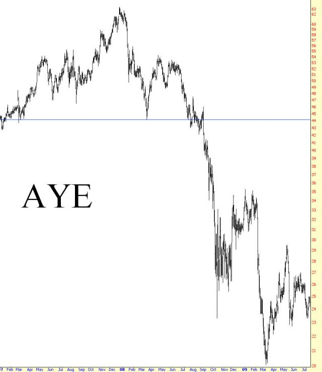
(FIGURE HS-11: The only thing resembling a retracement for this stock took place many months after the neckline break, and even then it only recovered about half of the drop from the neckline)
Neckline: $42.95
Pattern Top: $61.69
Target Price: $24.21
Target in Percentage Change: -44%
Actual Percentage Change: -54%
Example: Isle of Capri Casinos
Just to drive home the point of “retracement not guaranteed”, examine HS-12, a casino stock. The neckline was broken at about $17, and a nimble trader could have shorted at a little lower than this level and still enjoyed plenty of profit. The stock tumbled to nearly $4, recovered partly to about $10, and then resumed its fall, completing with an 88% loss in price. The selling pressure simply didn’t permit a complete retracement to the neckline.
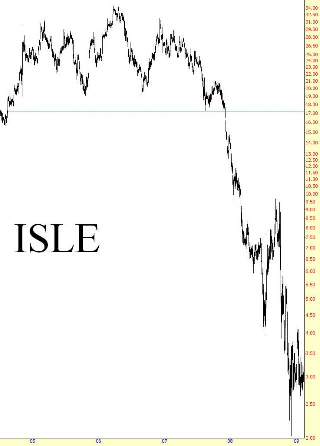
(FIGURE HS-12: Many other casino stocks, such as Las Vegas Sands (LVS), had similar tumbles to Isle of Capri’s)
Neckline: $17.25
Pattern Top: $34.30
Target Price: $0.20
Target in Percentage Change: -99%
Actual Percentage Change: -88%
Example: Morgan Stanley
The investment bank Morgan Stanley had a very dramatic time in 2008, as you can well imagine, but what led up to this movement was equally as interesting. Even though the financial crisis didn’t reach wide recognition until the autumn of 2008, Morgan Stanley spent most of 2007 forming a downward-tilting H&S pattern. Late in the year, it broke beneath its neckline, and it then gently retraced back to the underside of this neckline a number of times. Those long this stock might have imagined the price was stabilizing, but those charting the security knew that something big was likely to happen on the downside.
The stock fell much harder in March 2008 with the Bear Stearns crisis, but since Morgan Stanley isn’t Bear Stearns, the selling abated and the stock recovered to approximately the level of the extended, tilted neckline. The selling continued in relatively gentle up-and-down waves, always tilted down, until September arrived. Once hard selling started, the stock plunged into the single digits (an absolutely unthinkable notion several months prior), and the stock fell over three times more than the projected target price of the H&S pattern.
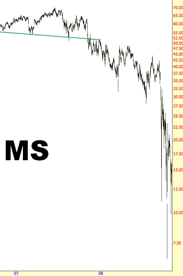
(FIGURE HS-13: Morgan Stanley spent the first three-quarters of 2008 stumbling its way lower, but the real plunge didn’t take place until late September and early October of that year.)
Neckline: $55.00
Pattern Top: $69.91
Target Price: $40.09
Target in Percentage Change: -27%
Actual Percentage Change: -88%
Example: Synchronoss Technologies
Until now, the form of the patterns has been ideal since the right shoulder has been either equal to or lower than the left. This isn’t an absolute requirement, however, as Figure HS-14 shows. The right shoulder is substantially higher than the left (although, critically, it is not higher than the head), and the left touchpoint of the right shoulder doesn’t even come close to touching the neckline. This indicates there is more strength to this security than someone wanting to short this stock might want to see, so it would be especially prudent to wait for a very clear violation of the neckline before entering a short position.
This chart is interesting for another reason, which is that after a fairly robust retracement, the stock gapped substantially lower at the opening bell of one session. Those who had waited to short the stock until this retracement took place surely were thrilled at the nearly instantaneous gratification of seeing the stock drop to new lows without even having to wait for it.
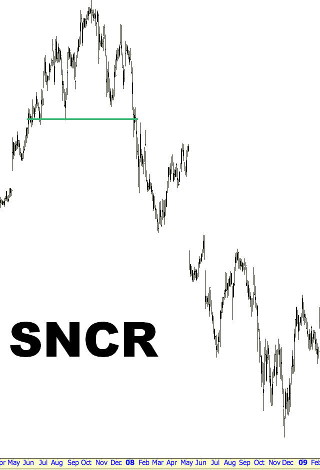
(FIGURE HS-14: This chart features an unusually large gap after its retracement)
Neckline: $25.89
Pattern Top: $48.03
Target Price: $3.75
Target in Percentage Change: -86%
Actual Percentage Change: -79%
Example: Hovnanian Enterprises
Our final example, Figure HS-15, is superb in both its form and its power. Both shoulders are well below the head, and the right shoulder is significantly lower than the left. Once the neckline was violated, the price fell quickly and was only partially retraced. Perhaps most remarkable of all was the movement in price, since this stock lost over 99% of its value from its peak before it finally recovered from its post-crash nadir.
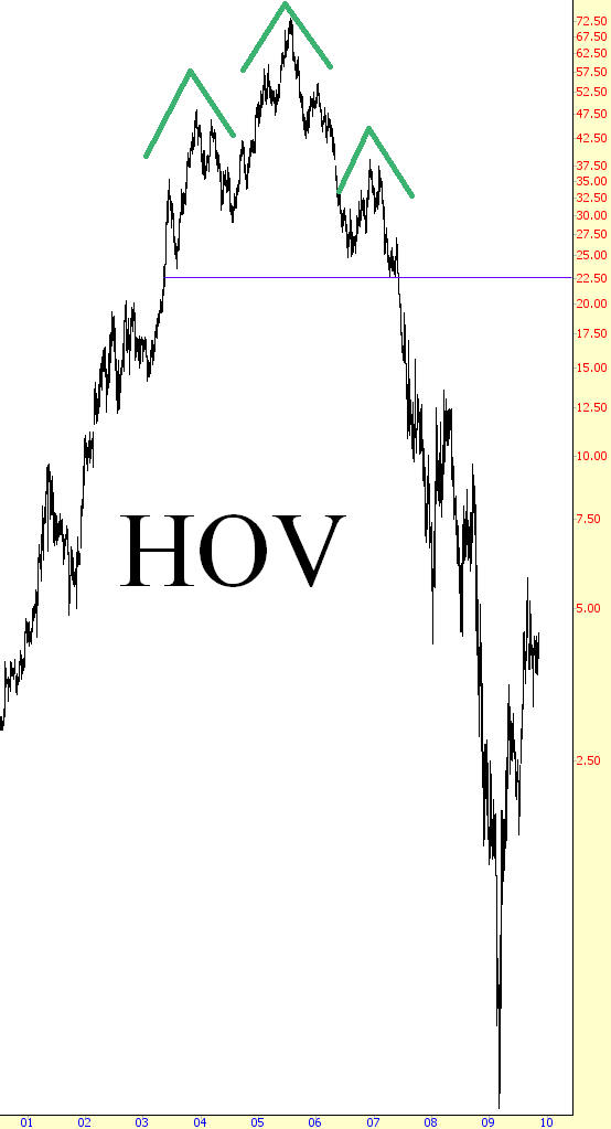
(FIGURE HS-15: The bursting of the housing bubble led to a loss of nearly 100% of HOV’s peak value)
Neckline: $22.59
Pattern Top: $73.4
Target Price: n/a
Target in Percentage Change: n/a
Actual Percentage Change: -99%
Summary
Because it is fairly easy to recognize, the head and shoulders pattern is well-known to even beginning traders. What separates the amateurs from the professionals is being able to distinguish between a legitimate pattern and a distorted one, and understanding the appropriate balance of risk with opportunity. You have seen many examples of this chapter that capture the various nuances among the patterns, including neckline tilt, false breakdowns, and the nature of retracements. Refer to these examples any time you believe there is an H&S pattern present in your own trading, and refine in your mind whether or not what you are observing merits your attention and capital.
