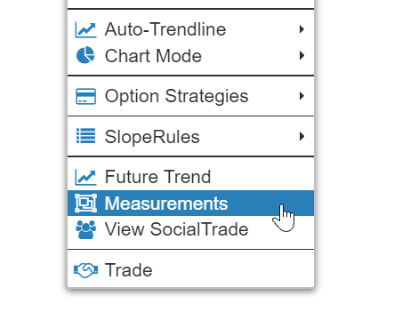
To take a price and time measurement in SlopeCharts, just right-click anywhere in the chart and choose Measurements from the menu which appears:
Click the starting point you want on the chart and drag the mouse to the second data point. As you move, you will dynamically see:
- The rectangle (green if increase in price; red if decrease);
- The number of bars you have encompassed;
- The number of days that have transpired in that time (because markets are not open on holidays and weekends);
- The dollar price change;
- The percentage price change.
The above shows a positive change in price. Here’s a negative change:
Unlike other drawn objects, these measurement rectangles aren’t really meant to be permanent. The assumption is that you just want to do a calculation. However, you can make these calculation rectangles stick around by right-clicking on the rectangle and choosing “Keep This”. You can even change the color of the rectangle, although the red/green usually is best to draw a distinction between decreases and increases.
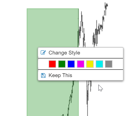
If you don’t choose to “Keep This”, when you enter the next symbol, the rectangle will simply disappear and will not re-appear when you look at the original symbol again.
