Slope of Hope is unique in that it allows you to customize its home page to your liking. We call this technology Slope Tiles, and whatever Tiles you choose to display and the manner you arrange them will be remembered by the system for your next visit.
Each tile provides a quick, intuitive method of accessing the information you want. Please click here to see Tiles in action, and if you like this style of homepage, please bookmark it in your browser so it can be your starting point whenever you go to Slope.
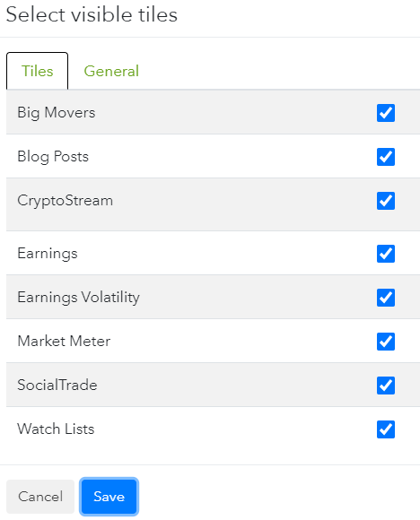
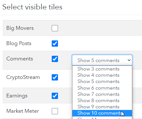
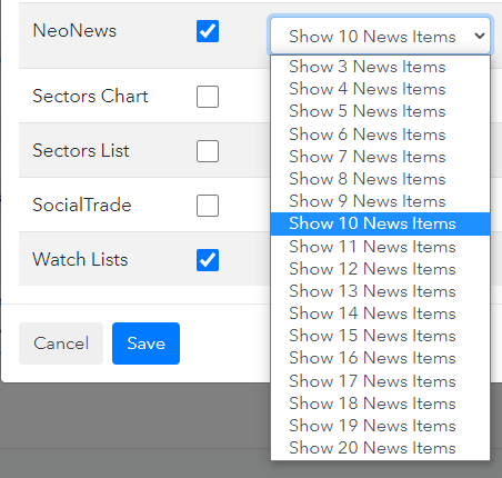
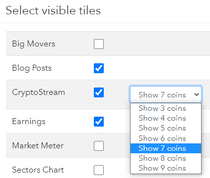
Besides the fact that most of the Tiles on the Slope home page already have data which is unique to your Slope account, there are two ways you can customize the home page. First, you can choose which tiles should be visible, since you may not necessarily want every single tile to be on your home page. To make these choices, click on the Edit Tiles button at the bottom of the home page, and you will be presented this dialog box in which you can uncheck any items you would prefer not to see:
Second, you can arrange the Tiles by dragging and dropping them into any arrangement you like.
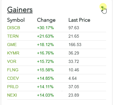
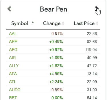
This Tile displays the day’s largest percentage Gainers, Losers, and Volume Leaders. You can click the arrow, as shown below, to move from group to group.
The comments section of Slope has always been its most popular highlight. Now you can see the latest comments – which update live, and in real time! – with this tile. Clicking on any given comment will whisk you off to the original comment, in the context of the normal comments stream, in a new tab.
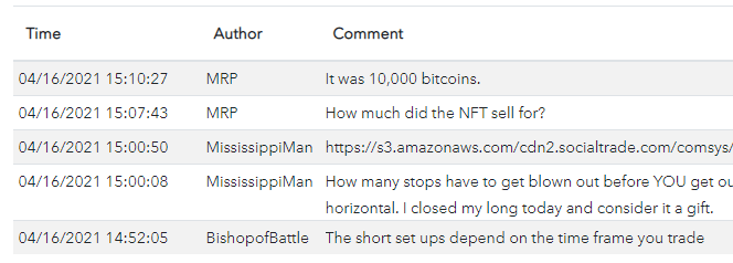
You can also control how many comments are display in this tile with the Edit Tiles button.
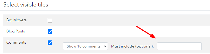
Optionally, you can also restrict the comments shown to only those which contain a given word or ticker symbol that you enter.
There is one special class of comments known as NeoNews, which is similar to the comments tile except that it is drawn specifically from one particular Sloper named RNeo, who keeps the community informed of all the news happening in the world. Like the comments tile, it auto-updates, so at a glance, you can get a sense as to what important developments are taking place in business and news in general.
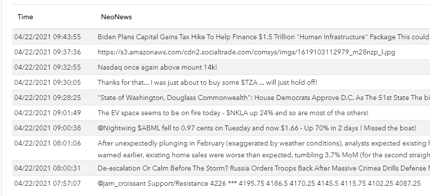
The Edit Tiles section lets you establish just how many of his items you want to see.
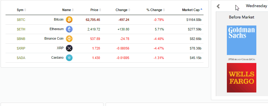
This Tile displays, in streaming real-time, the top crypto coin prices, net change, and percentage change. You can click on any columns to sort based on its content.
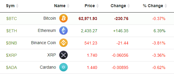
You can also control how many coins are displayed by using the Edit Tiles button. In that dialog box, you can choose the quantity of popular coins you would like shown in this Tile.
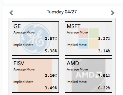
During the earnings season, which tends to heat up several weeks after any calendar quarter ends, the calendar of earnings reports gets very busy. This Tile shows the present day’s earnings announcements, and you can use the right and left arrows to navigate through time. Clicking on a company’s logo will create a new browser tab with the Super Summary for that company.

You can also get a volatility-based view of earnings by way of the Earnings Volatility tile:
The core of any Sloper’s information is their watch lists and the symbols therein. The Watch Lists Tile displays your own lists in alphabetical order, and you can click the left and right arrows to move from list to list. You can also click any of the column headings to sort based on the content of that column, and you can click on a symbol to instigate a new browser tab with the Super Summary for that particular ticker symbol.
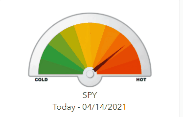
This graphic meter represents how “cold” or “hot” the S&P 500 ETF fund is. Clicking on the meter will animate it, showing you over the past couple of trading weeks how the meter has been moving up and down.
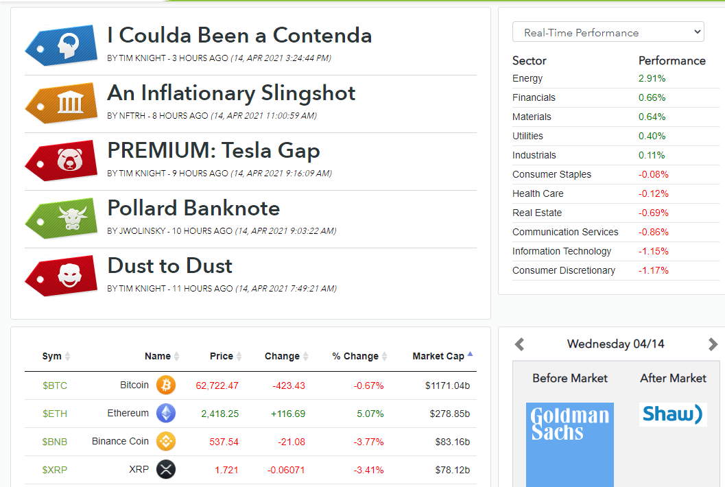
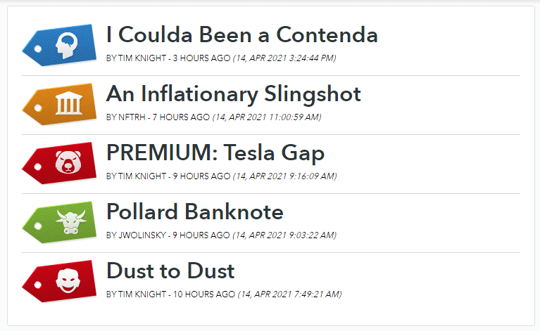
There are tens of thousands of posts in Slope, and new ones are appearing constantly. This Tile shows the most recent posts, and clicking any particular title will take you directly to that article.
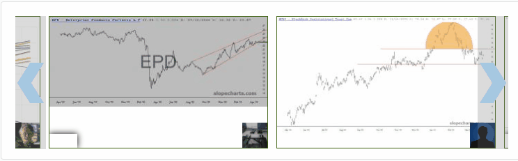
People on Slope stack interesting charts into the SocialTrade system every day. This Tile shows the latest contributions to this crowd-sourced library of financial charts. Click on any one image to see it in a separate tab.
Click here to go to the Tiles home page.
