The three Fibonacci tools are located in the drawing tools icon window on the lower-left portion of SlopeCharts. From left to right they are Retracement, Arcs, and Fanlines.

Even though the tools are quite different, the way you apply them to your chart is identical: you click on two price extremes. That’s easy enough for anyone to do.
The artfulness of using these tools well, however, is (a) choosing appropriate extremes; and (b) assessing whether or not the chart is particularly “Fibonacci friendly” once you have applied the drawn object. That judgment comes from time and experience.
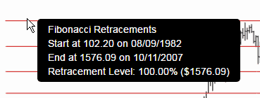
Once you choose a tool, you will then be able to click on your first anchor point, drag the mouse, and then click on the second anchor point. In the case of price retracements, the retracements will be drawn, and a reference line will connect the two anchors.
If you mouse over any of the lines, it will give you details on the two anchor points as well as the value (both in percentage and price terms) of the chosen line.
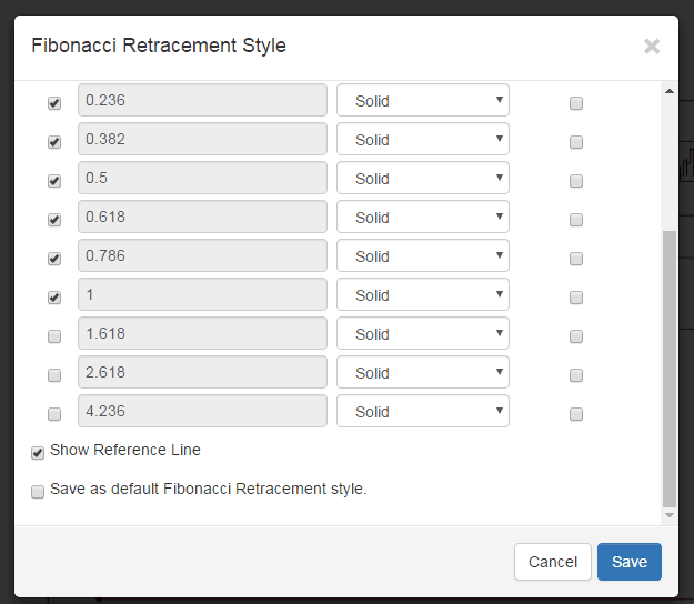
You can also change many elements of the presentation of the retracement, such as its color, opacity, whether or not the reference line is shown, and so forth.
Using the fanlines is done the same way – – with two anchor points, typically on price extremes – – but using them effectively is much trickier than price retracements. Here, for example, is a fan I just drew on top of Alphabet (GOOGL). I’ll use that term again- – Fibonacci friendly – – since it definitely applies here. Notice how “obedient” price levels are with respect to those fan lines, even though the anchor points (tinted in yellow) were drawn many years ago.

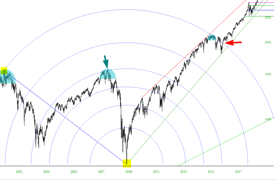
Here is another example, this time with the S&P 500, spanning the post-financial crisis period. The anchor points are, again, shown in yellow tint. Notice what a good job the fanline did in pointing out an critical support level (red arrow).

Arcs, finally, are, in my experience, even trickier to use than the other two. They can be fascinating, however. Take a look at these arcs drawn over a span of decades. One anchor point is the bull market peak in 2000, and the other anchor is the post-financial crisis low.
In retrospect, it’s telling that there was such strong resistance to further price advance back in the year 2007 (see green arrow). In a similar way, prices stalled out in late 2015 and early 2016. Historically, this is where prices “should” have started falling, but instead, there was a breakout above the arc (red arrow) which preceded massive subsequent strength.
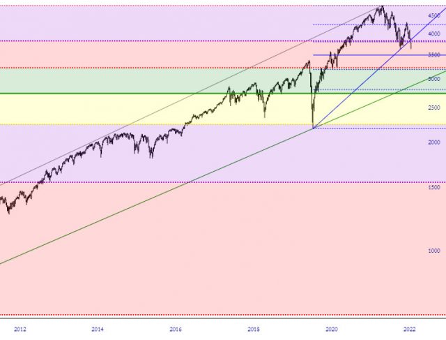
One additional feature available for the Fibonacci Retracement tool is the ability to “tint” between the retracement levels. You can do this by clicking this checkbox in the lower-left corner of the dialog box:
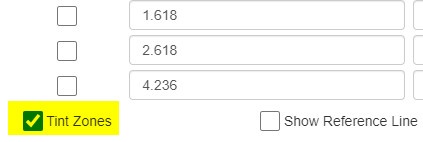
This will color the spaces between the retracements based on whatever colors you have selected for the lines. This can make it much easier to understand price action from one level to the next, due to the color contrast.