The chart formation called the rounded top is precisely what it sounds like – a topping pattern, implying a significant move lower, which is made up of a series of higher highs, and then higher lows, which creates a rounded effect.
Definition of the Pattern
The first prerequisite for the pattern is that it has to be preceded by a sharp rise in price. The point of finding the pattern in the first place is to sell the stock short, close a long position, or buy put options on it – whatever your trading objective might be – in anticipation of a drop in price. Unless the stock has already risen substantially, there will be too much support beneath the price level to create the opportunity for a substantial drop.
Capital One Financial, shown in RT-1, had risen significantly when it started forming its rounded top in early 2003. In 2004, 2005, and the first half of 2006, it made a series of higher highs, but the rate of ascent of those highs diminished each time, forming the beginning of the rounded top you can see drawn here after the fact.
Starting in mid-2006, the stock subtly changed direction and began making a series of lower highs at increasingly sharp angles. This gentle progression of higher highs and then lower highs is the next requirement, because that is the geometric requirement for drawing out the upper portion of the oval shown.
During the creation of the rounded top, a horizontal line similar to the head and shoulders’ neckline is established. If and when this support line is broken, a sell signal is in place, assuming that the rounded top is mature enough to constitute a valid pattern.
Sometimes, but not always, the price will retrace back to the former support line, which represents the lowest-risk opportunity for a person to sell the stock short. There are occasions when the price will exceed this former support level, as it did with the example in RT-1. So long as the price does not violate the progression of lower highs, the pattern is still intact.
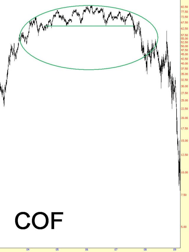
(FIGURE RT-1: Capital One lost 88% of its value after this formation)
Psychology Behind the Pattern
Imagine a stock that has been moving steadily higher for a period of two years, starting from $10 and soaring to $50. Its owners are elated at their gains, and they have grown accustomed to a stock that does little but ascend in value.
The stock reaches a new lifetime high, and some of the holders decide for various reasons to take their profits and exit. Some might think the fundamentals are too rich; others might believe the market in general is headed for a turning point; others might simply want to cash their profits and put it to other uses. The stock sells off some, as it is inclined to do from time to time, and not many take notice of it.
Over the coming months, the stock continues this series of buyers taking control and then sellers taking control, and although the majority of owners continue holding their position, they are getting increasingly nervous each time the stock dips, because the stock seems to be running out of the proverbial gas, failing to move as robustly as it once did.
At some point, unknown to anyone at the time, the stock makes its final high price. The stock moves lower, and then higher again, but this time, it does something it hasn’t done in years – – it fails to get past its former high. It’s not like a panic is taking place – far from it, because the stock is still near the highest price it has ever achieved – but it has stopped short of pushing any higher, establishing its first lower high. A trend change has taken place.
Now as the stock resumes its oscillations downward and upward, the dips get deeper, the lifts don’t get quite as high, and the pace of the decline starts to pick up. By this point, a chartist could see that the top is taking on a rounded shape. If he can determine a price that seems to represent support, he might take note of it, because that is going to be the “break point” that makes when the stock is in dangerous of falling hard. In this case, let us suppose the support level is at $40.
One evening, the company makes its regular quarterly earnings announcement, and it’s a little short of expectations. When the regular trading opens the next morning, the stock opens at $39.50 and spends the day falling, closing finally at $38.73. Owners are increasingly worried that a sea-change has taken place with their former high-flier, and selling intensifies, along with volume.
A few weeks later, the stock hits $34 and begins attracting buying interest. It takes several weeks, but the stock makes its way past $35, $36, $37, and finally reaches $39.50, thanks to a series of analysts re-issuing their “Buy” recommendations on the security. Unfortunately for those long the position, this is as far as the price will get, because the mass of owners who bought above $39.50 just want to get out of this stock, so the overhead supply overwhelms any further attempts buy buyers to push the stock higher.
Selling begins anew, and as people realize their losses on the stock are probably only going to get worse, more and more of them sell out of their position. Now the stock begins a swan-dive, plunging quickly past the recently low of $34 and not finding any real support until $25. The slow and subtle shift which took place with the rounded top has finally expressed itself in a plunge, and the event is over.
Example: Marinemax, Inc.
Beginning in 2004, the chart in RT-2 experienced a substantial and sustained rally that lifted it to a price which would approximate its lifetime high. It sold off and, after a V-shaped bottomed, rallied again to a price just a little higher than the prior high. It sold off again – harder, this time – and enjoyed another rally which took a little longer than before but also carried the price a little higher. So in this case, the stock experienced three slightly higher highs, each of which would be nicely enveloped by the oval that has been drawn on the chart.
When the selling began, it was strong enough to take the stock to a lower low compared to its prior low, and even on the recovery the stock was not able to get back up to the boundary of the displayed oval. The deterioration in price after this point was steady and, although not violent, unrelenting, and after years of consolidating in this range of high prices, it broke support at $18 and pierced the boundary of the oval. There was a modest recovery at this point which, as we would expect, push the price just to the underside of the violated pattern (that is, the oval), and then the price commenced a waterfall decline that erased 93% of its value when the break took place.
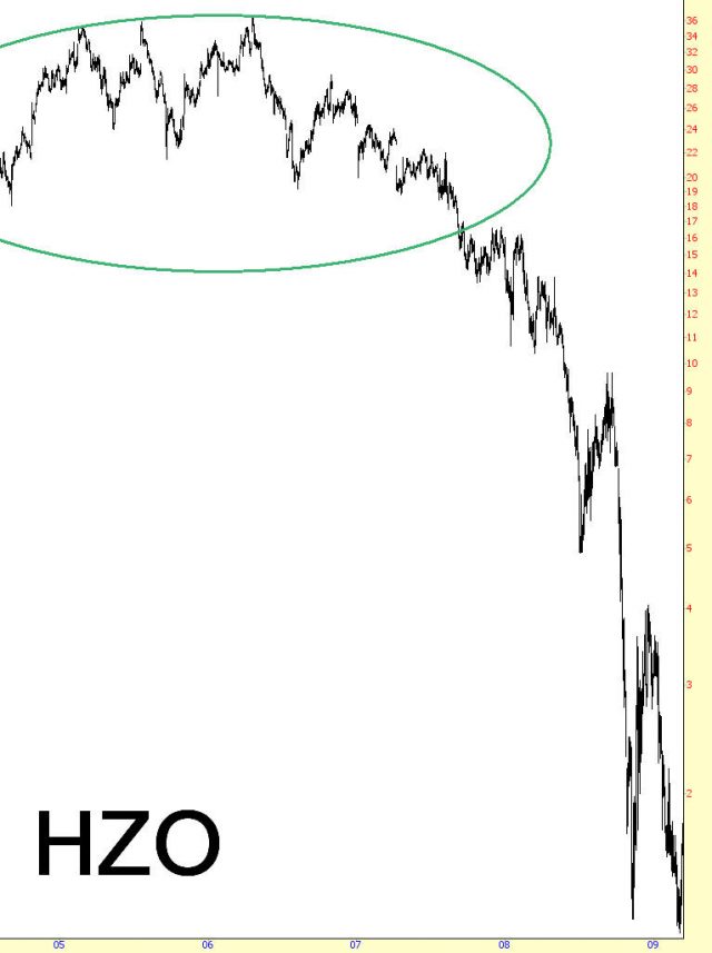
(FIGURE RT-2: The lower highs on this security were much lower than the defining oval since the selling was so strong in late 2006 and early 2007)
Pattern Start: 11/2004
Pattern Break: 8/2007
Price at Break: $18
Post-Break Price: $1.19
Percentage Change: -93%
Example: Greenbrier Companies
One of the fascinating things about these patterns is that, even though the market creating the price action is unaware of consciously “painting” any kind of pattern, it can seem in retrospect that the price is aligning itself to formations that can only be defined after the fact. Of course, the knowledgeable chartist can anticipate these shapes before they complete, or at least before they complete the full potential of their effect.
Figure RT-3 shows a rounded top that spans 2004 through 2008. The support level was at about $24, although as the stock weakened, the lower lows can demonstrably lower. The last lower low, at about $16, touched the inside of the oval perfectly, and something very interesting happened next: to stock rallied to nearly $30 (but did not break the trend of lower highs) and then, when it sold off again, it stalled at the inside of the oval again (which was, by definition, higher in price).
To someone simply looking at the price chart, it would seem that the stock had changed course, since it had stopped falling at a point reasonably higher than the prior low. To a person tracking this formation by means of an oval (which is the most convenient tool for tracking a rounded top), they would recognize that the price was simply hanging on to support within this oval, and a price fissure beneath this level would crack the price like the egg that seemed to be containing it.
And that is precisely what happened. The stock snapped beneath the boundary and began plunging with ferocious speed. Although it briefly consolidated between $5 and $8, forming a flag, it resumed its plunge to beneath $2. It should be noted that this drop was also interesting for those learning about the flag pattern, since the left flagpole and the right flagpole were well-matched.
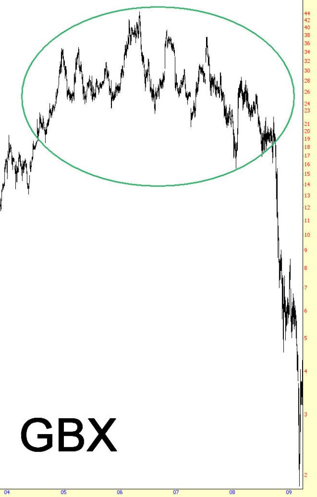
(FIGURE RT-3: One interesting thing about this rounded top is that the oval which defines it also nicely capture its first drop and the resistance before its final plunge commenced.)
Pattern Start: 10/2004
Pattern Break: 6/2008
Price at Break: $23
Post-Break Price: $1.86
Percentage Change: -92%
Example: Abercrombie & Fitch
The clothes retailer ANF, Figure RT-4, illustrates an almost perfect rounded top with a very clean support level at $64. On the left side of the oval, you can see three higher highs, and on the right half, three similar points resembling a mirror image. Indeed, you could fold this chart in half at about September 2007 and see the astonishing symmetry between the rise and the fall.
The comparison ends there, however, because stocks often fall much faster than they rise. Although it is not drawn here, take note of the firm support at about the $64 level. There were four different times that the chart challenged this level, but when it finally broke, it broke hard, lost over $14 within just a few sessions. The buyers mounted a counter-attack and, just as swiftly, pushed the stock back to almost precisely the same level as had formerly been support.
The huge mass of buyers who had accumulated the stock between $64 and $80 were by this point eager to get out, and the sudden recovery from its initial plunge was welcome by a barrage of sell orders, sending the stock into an almost vertical fall. By the time the stock had bottomed, it was worth one-fifth of its price at the break-point.
(FIGURE RT-4: The support level here was at about $62.)
Pattern Start: 9/2006
Pattern Break: 6/2008
Price at Break: $64
Post-Break Price: $13
Percentage Change: -80%
Example: Atlas Pipeline
Let us look at an example where the supporting line has been drawn. Figure RT-5 shows that the $30 price level was the support level for nearly two years. The shape of this chart doesn’t adhere to any other specific topping pattern, such as a head and shoulders, but it does conform nicely to the oval drawn. For a person watching this chart, there are only two things to watch: one, that the pattern of higher highs and then lower highs remains intact; and two, that the supporting price level is steady. If and when that price level is violated is the time when action is required.
As with any pattern, the prospect of a retracement back to the former support level is not assured, and APL had very little in the way of a retracement once $30 was broken. There was a period of several weeks in which at least the price fell gradually, so those seeking to exit the stock or establish a short position had ample time to do so, but the pattern you sometimes see of a sudden drop and a dramatic retracement didn’t happen here.
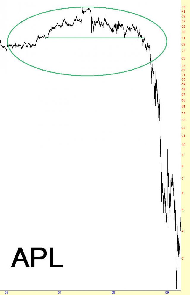
(FIGURE RT-5: Not all rounded tops have a retracement, as is evident here.)
Pattern Start: 10/2006
Pattern Break: 7/2008
Price at Break: $30
Post-Break Price: $2.15
Percentage Change: -93%
Example: Sonic Solutions
In contrast to the prior example, RT-6 has a terrific retracement. There are three reasons that such retracements have so much value: first, they give those who are long the position a much-needed chance to escape at a somewhat better price; second, they give bears who recognize the potential of a much farther drop the opportunity to reduce their risk by shorting at a higher price; and third, it affirms the import of the former support (now resistance) level and, paradoxically for a bearish pattern, the ascent only strengthens the argument that the stock is taking its last gasp of buying strength.
We see after SNIC broke $12.18, its support level, it fell hard to about $7.50 and then rallied precisely to its failure point. The price actually bounced between this $4 range for many weeks, but the initial push higher after the “shock event” of price failure was the best chance for bulls and bears alike to secure such a high price. Later in 2008, the stock sold off terribly, sending it into the realm of penny stocks by 2009.
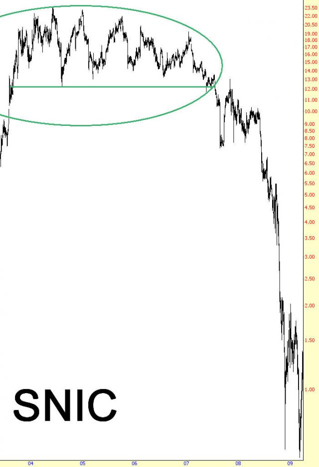
(FIGURE RT-6: This stock retraced very nicely after its first drop, creating a marvelous opportunity for short-sellers or those who didn’t get out in the first place)
Pattern Start: 8/2003
Pattern Break: 7/2007
Price at Break: $12.18
Post-Break Price: $0.57
Percentage Change: -95%
Summary
All of the examples in this section were drawn from the bear market from late 2007 through early 2009. The reason is that the market conditions leading up to 2007 were so strong (but waved in 2007’s summer) and the conditions following the peak gradually deteriorated into an unmitigated collapse. Thus, the formation of the domes – the rounded tops – was just about perfect.
This is not to say that it requires a worldwide financial crisis to form this pattern. Under normal circumstances, formations this clean are infrequent, but if you do see a chart shape resembling the domes you have seen in these examples, take careful note of the horizontal price support so you can be prepared to exploit a potentially profitable trading opportunity; and, if you are long, you should be prepared to make a graceful and rapid exit.
