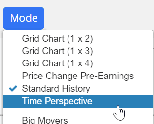
The Time Perspective feature is accessed from within SlopeCharts and is available to all premium members (Bronze, Silver, Gold, and Platinum). You can watch a video about this feature here. To get to this feature, click the Mode menu and choose Time Perspective.
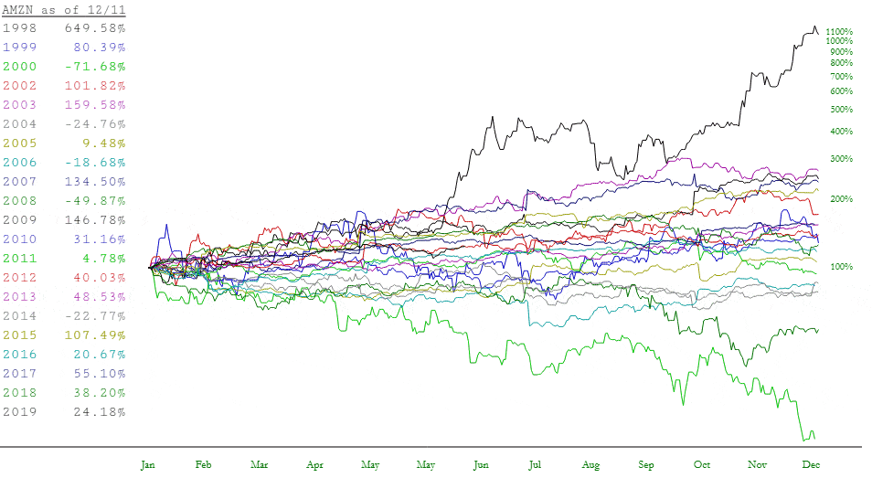
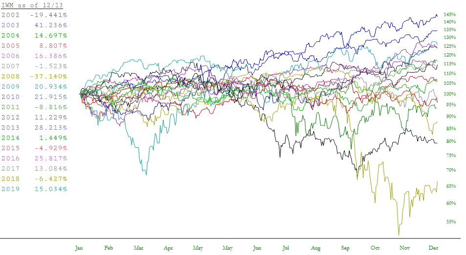
When you change to this mode, your chart will immediately change. Instead of seeing a single chart going from farthest back in time (left side) to most recent (right side), the historical data is chopped up into individual years.
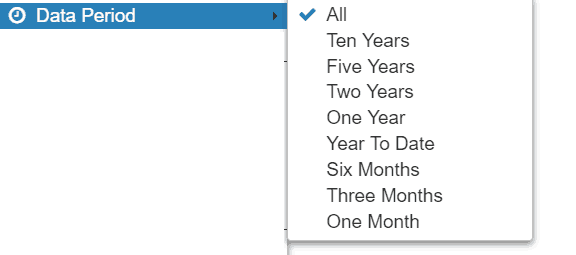
The quantity of years displayed depends on two things: (1) how far back the security goes in time; and (2) how much data you were looking at in the first place. To get the most thorough analysis, stay in “All” data mode (keeping in mind the amount of data you can retrieve is based on your membership level).
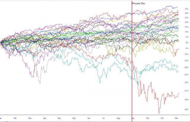
As illustrated here, the Time Perspective chart looks completely different than a normal price chart. Besides the fact that all the years are represented individually, from January through December, they are also shown in terms of percentage change instead of price.
This offers at least two benefits to the viewer: (1) You can assess which years have done worst and best historically; and (2) You can get a sense as to the seasonality, if any, of a particularly security, observing which portions of the year tend to be stronger or weaker based on historical performance.
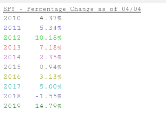
On the left side of the screen is a legend showing the years displayed and the colors used for each year. Importantly, as you move your cursor around the chart, the date you are pointing at is displayed in the legend. In the legend below, the cursor is pointed at April 4 for every year. On top of that, you are provided the percentage change at that point in time for each given year.
If a particular chart is intriguing to you, you can move the cursor to anywhere on the chart, and the year for that specific graph will be displayed, so you can swiftly know which year corresponds to which graph without trying to match the colors.
You can also zoom in to any particular portion of the chart, establishing a start and end date different than January 1 and December 31. This can be extremely useful, because you can focus in on the performance of a specific timespan over a period of many different years. This may help you unveil new trading ideas as you discover instances of seasonal bias.
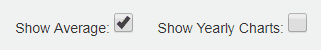
Also notice at the top of the screen is a checkbox called Show Average. It is normally unchecked, but if you check it, SlopeCharts will calculate the daily average of all the years and display, via a thick black line, the overall average, day to day, based on all the years shown.
There are two checkboxes at the top of the chart when in Time Perspective mode. One of them, Show Average, displays a black line showing the average change, day by day, of the chart over all the years for which we have data. The other, Show Yearly Charts, is by default on, since it allows the display of individual years (1979, 1980, 1981, etc.). However, you can turn it off, thus letting only the average line remain.
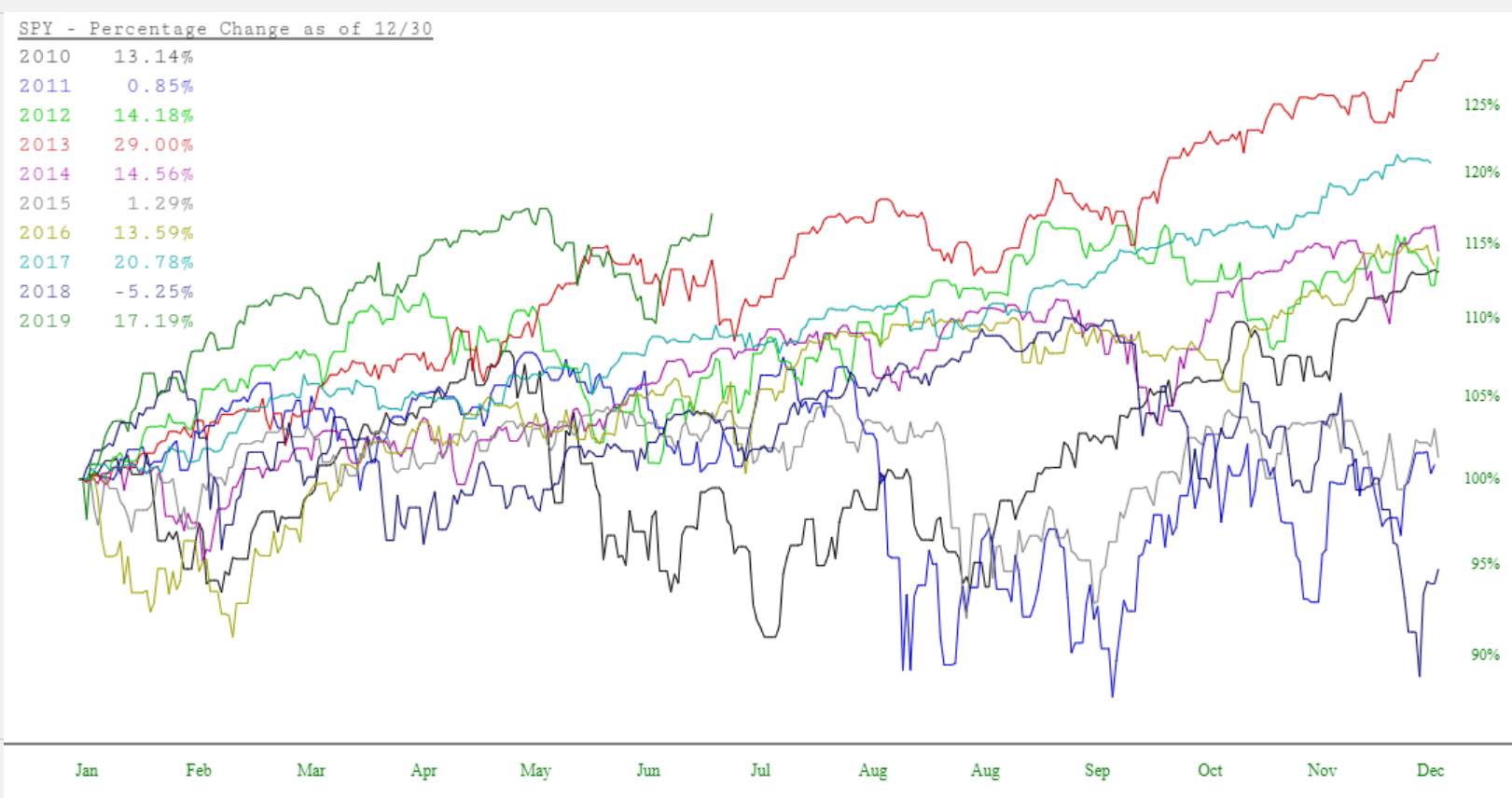
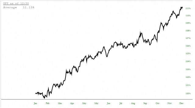
What’s helpful about this, is that you instantly remove all the “noise” from the dozens of individual years and instead can focus strictly on the broad, overall movement of a security, particularly allowing you to hone in on seasonal tendencies. Below, for instance, is the SPY, and you can see the “sell in May and go away” dip, the summer doldrums, and the strong fourth quarter surge that stocks tend to enjoy.
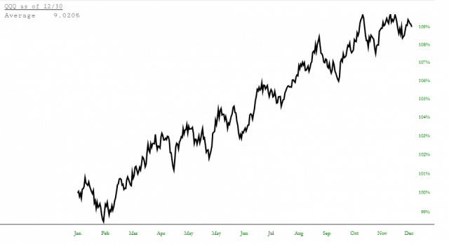
As another example, here is the NASDAQ fund, symbol QQQ, showing roughly the same tendencies, but with a personality of its own.
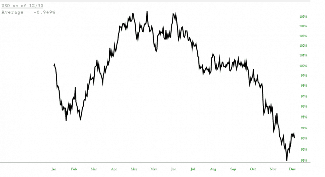
As a vastly different example, here is the crude oil fund symbol USO. We can plainly see a start-of-year dip, a springtime surge, an almost flatline lull late in the summer and early autumn, and then a steady diminishment in the final portion of the year.
There are as many opportunities to find tradeable edges with an examination like this as there are securities available to trade. These simple checkboxes permit you to carve away the data to focus in on precisely what you want.
There is one other checkbox worth noting, which is Show Present Day. If this is checked, a red vertical line will be placed on the chart corresponding to the present day of the year. This is invaluable for assessing, relative to the present, what the trend for the balance of the year tends to be.