The pennants pattern is extremely similar in most respects to the flags pattern except that its lines are convergent rather than parallel. The two lines containing the price bars point toward a common end, and this consolidation pattern typically suggests a continuation of the trend.
Some patterns can be quite long-term, spanning years or even decades. The pennant pattern is nothing of the sort. It is, instead, a rather short-term pattern typically lasting just a few weeks, and it is a continuation pattern, allowing a security to “take a breath” before moving in its dominant direction.
Definition of the Pattern
The first requirement for a pennant pattern is that it be preceded by a strong move in the first place. That move can be up or down, but it must be strong and sharp, since the entire basis for a pennant pattern is that it represents a brief pause in the action of an overall powerful move. Even though prices may form pennant patterns in the midst of markets that are meandering, the fact that they aren’t in the context of a strong move negates their import.
Next, the pennant should be countertrend to the general trend. Because of its countertrend nature, the pennant should be downward-sloping for a bullish move and upward-sloping for a bearish move. It is acceptable for the pattern to be flat, in the form of a symmetric triangle, irrespective of direction. Buying or selling action is supposed to abate during the formation of the pennant – often on dwindling volume – and it makes sense that the dominant direction would be opposed while the pennant is being formed.
The pennant itself is defined as a group of prices that are cleanly bounded by a pair of converging trendlines. If the lines are parallel, the pattern is a flag, which is covered in a different section. The pennant itself shouldn’t be terribly lengthy; a length of three months is probably the longest acceptable timeframe, and a more typical age will be a month or less.
Finally, when the price breaks out of the pennant pattern, that breakout should be accompanied with an increase in volume. The trend is eager to resume itself, and after weeks of waiting, buyers (or sellers, as the case may be) should push the equity back into its longer-term trend with an abundance of activity.
Even though pennants aren’t particularly big patterns, the moves they portend can be substantial. The distance from the beginning of the broad trend (whether up or down) to the beginning of the pennant is sometimes known as the “flag pole” (a bit of a misnomer), and its height is the figure you want to use to compute the measured move. That move is calculated by adding (or, in a downtrend, subtracting) the price value to the end of the pennant pattern.
For instance, if a stock was trading at between $20 and $22 for a long time, and then it suddenly made a rapid ascent from $12 to $20 before starting its pennant pattern, the flag pole would be $8 in height (that is, $30 minus $22, since $22 is the value when the stock changed from trading in a tight range to soaring higher sharply). Let us assume the pennant was formed by a gentle down-sloping pattern lasting three weeks that took the price back down, but then the bulls stepped in again on big volume and broke out of the pennant at $28. The measured target would therefore be $36, since $28 (the breakout level) plus $8 (the flag pole’s height) equals $36.
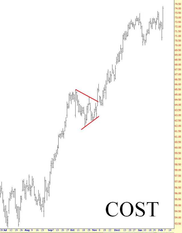
(FIGURE PN-1: The retailer Costco formed a pennant formation at precisely the midway point of its rally.)
Psychology Behind the Pattern
Let’s look at a real-life example of a pennant pattern to understand the thinking behind the crowd trading it. Figure PN-1 shows the “big box” retailer Costco Wholesale. The stock moves from about $54 to $65, and this poke is $11 high, implying that, upon pattern completion, the move will be $11 higher.
The pennant lasts basically for the entire month of October 2010, as bounded by the lines in PN-1. This consolidation lets the weaker hands take their profits on the bullish side. The price launches above the pattern on November 4, and with a price of $63 at the breakout, a target price of $74 is created. It nails this price almost to the penny by January 3, 2011, which is the first time COST encounters any meaningful weakness in its current uptrend.
Thus, the poles on both sides of the pennant – from 54 to 65 and from 63 to 74 – are equal, and this pennant has illustrated its predictive power and has served as a consolidation point exactly midway in the up-move.
Example: Parametric Technology
The next example, PN-2, has a very substantial gain of 74% after its pennant completed. The left pole began at $7.18 and pushed to $12.87, at which point the pennant started forming. The pattern lasted about 6 weeks, and when it completed, a target of $17.69 was implied. It hit this target by March of 2010, about nine months after the pennant finished.
Although the right pole took much longer to complete than the left pole, the target was still met, and there was no meaningful interruption in the series of higher highs and higher lows that transpired upon the pennant’s completion.
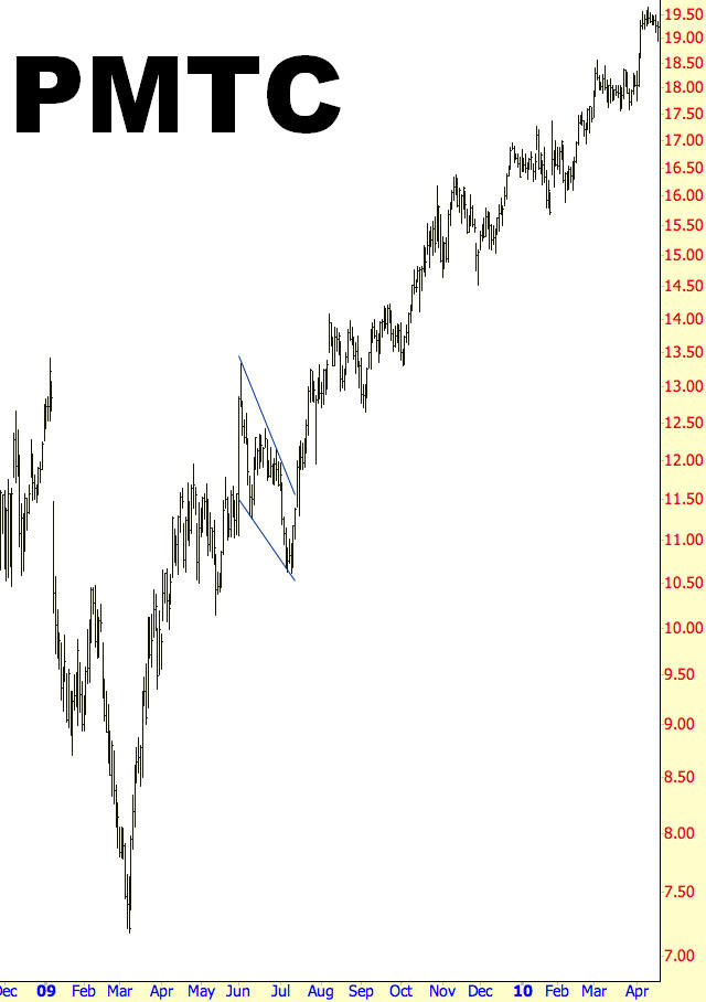
(FIGURE PN-2: The price move after this pennant, 74%, was substantial.)
Pattern Start: 6/1/2009
Pattern End: 7/15/2009
Breakout Price: $11.50
Post-Breakout Price: $20
Percentage Change: 74%
Example: Hanesbrands
Because pennants are countertrend formations, they can suggest to some chartists that something is going wrong with the stock. This is obviously not the case with completed pennants, however, since successful ones break to the upside (in the case of a bullish continuation). Figure PN-3 provides an illustration of this.
Hanesbrands enjoyed a price raise from about $5 to $18, and then its price weakened. Some would have mistakenly assumed that the stock’s rally was through, as it low over 25% of its value. The stock broke out at $14, though, implying a target price of $27 which it nailed almost to perfection by November 9, 2009 (it was a few pennies short of the goal). Interestingly, the stock encountered a bout of weakness almost immediately after its target was reached, dropped almost 30%. This illustrates the value of having a solid target in mind when you base a trade on a pattern.
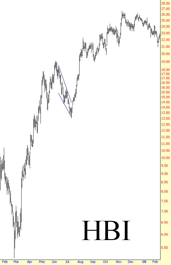
(FIGURE PN-3: The pace of the increase slowed after this pattern, but the target was achieved nonetheless)
Pattern Start: 6/10/2009
Pattern End: 7/14//2009
Breakout Price: $14.20
Post-Breakout Price: $31.45
Percentage Change: 120%
Example: Kimberly-Clark
The value of patterns, besides providing insight to direction and price, is that they can help you attain a good price on a trade in a timely manner before the stock moves too quickly above or below a reasonable entry price. Kimberly-Clark, shown in PN-4, moved from about $40 to $51 over a few months in early 2009, and then it began to consolidate in a pennant formation during all of June and the first half of July.
It moved a little above this pattern on July 15 and pushed demonstrably above it the next day, July 16, which would have been a clear buy signal. The price paid would have been about $51 per share. Just a few days later, on July 23, the price gapped up strongly, climbing about 8% for the day. A person already in position with KMB would have been pleased to see such a strong confirmation of the expected bullish move. A person unaware of the technical event that had just taken place might rush in to buy the security too late, increasing their risk by doing so.
Of course, it would have worked out for this latecomer in any case, as we can see from the chart. However, if the stock had weakened, the person who entered at $54 has to tolerate more risk than the person who entered at $51. In any case, the breakout at $50, added to the prior pole height of $11, yielded a target price of $61. This target was matched by November of that year, and it was even exceeded by a few percent. At this point, the stock sold off and lost about 15% of its value, providing the person who closed the position profitable at the $61 target confirmation that they made the right choice.
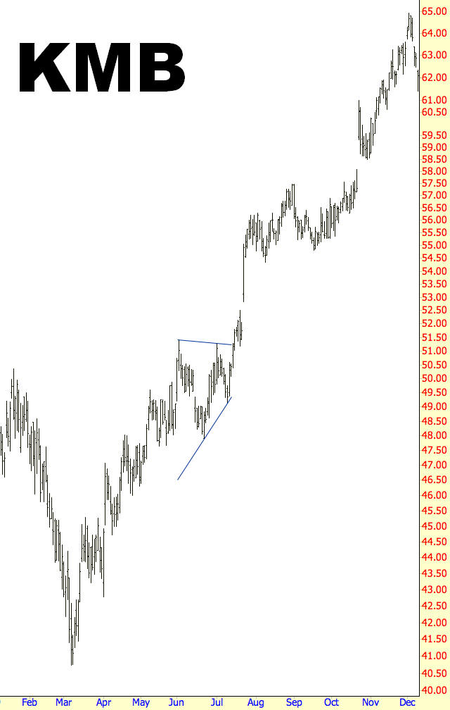
(FIGURE PN-4: Identifying this pennant would have permitted a trader to get into the stock before it made its huge gap higher several days later)
Pattern Start: 6/2/2009
Pattern End: 7/16/2009
Breakout Price: $50
Post-Breakout Price: $65
Percentage Change: 30%
Example: Ralph Lauren
Clothes manufacturer Ralph Lauren, whose chart is in PN-5, exhibited a pennant during precisely the same timeframe as the prior example. The pattern range matches almost to the day, although the percentage gain , 79%, was much more significant than then 30% gain of the last illustration. The reason for this is because the left pole had a large percentage gain, implying an equally large target price.
The left pole spanned from $31 to $59, a difference of $28. The breakout at $53 suggested a target of $81, achieved by November 10. There is some nice time symmetry here as well, since the left pole took a little more than three months to complete, and the right pole also took a little more than three months. The stock continued to be strong until it reached $95.27, well above the target, at which time it lost more than a quarter of its value during some overall market weakness.
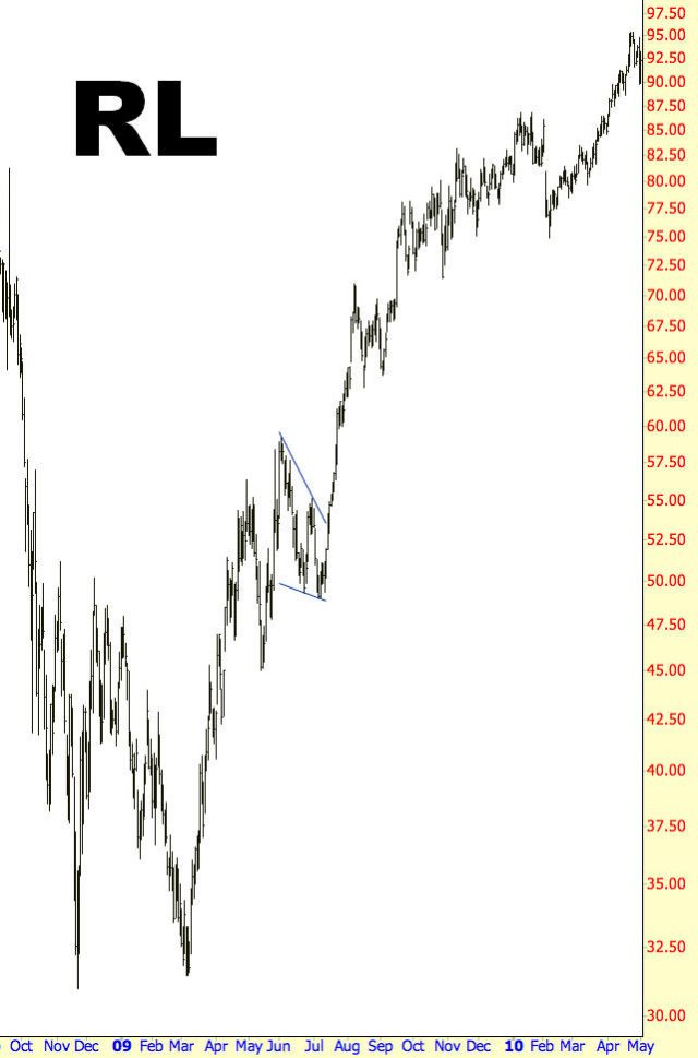
(FIGURE PN-5: The breakout from this pennant was particularly sharp)
Pattern Start: 6/2/2009
Pattern End: 7/15/2009
Breakout Price: $53
Post-Breakout Price: $95
Percentage Change: 79%
Example: Medtronic, Inc.
Our final example of a pennant, PN-6, is in the shape of a symmetrical triangle. The price action preceding this pattern lifted the stock from $23 to $34, an $11 difference, and the pattern was broken to the upside at $34, implying a $45 target price. This target was hit on January 11, 2010.
One interesting footnote to this pattern is that it didn’t exceed this target very much before it began a sustained selloff, losing over a third of its value. By the time the selling abated, the price had retracted the entire gain that Medtronic had enjoyed after its pennant. A person taking a “buy and hold” approach would have seen the entirety of their 37% profit wiped out and would instead be looking at a small loss. We see yet again how valuable it is to have a target in mind, and even if you don’t exit the position completely at the target, at least keep your stop-loss orders tight after the target is achieved.
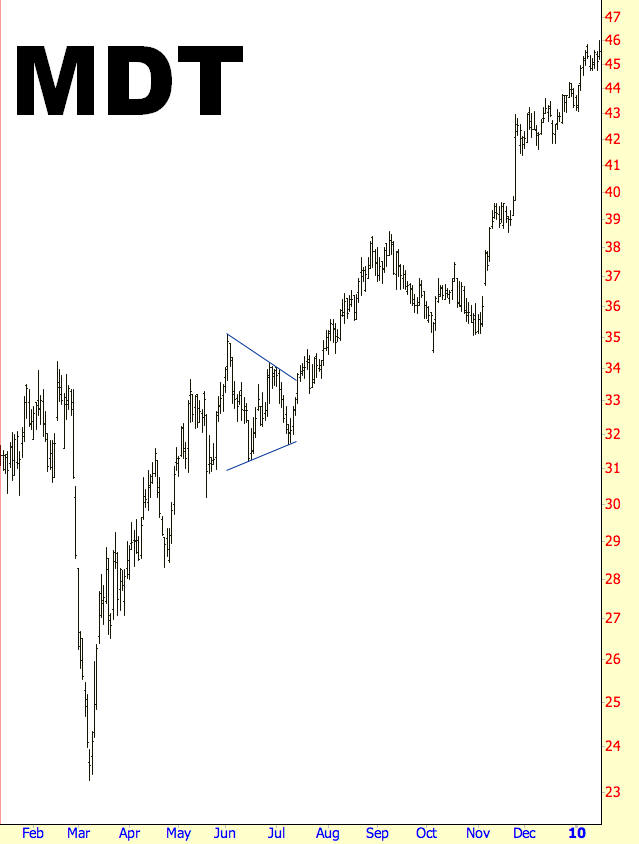
(FIGURE PN-6: Medtronic had a 37% price gain after this pennant completed)
Pattern Start: 6/2/2009
Pattern End: 7/15/2009
Breakout Price: $33.38
Post-Breakout Price: $45.58
Percentage Change: 37%
Summary
The pennant isn’t an easy pattern to spot during the course of real-time trading, and you may find it helpful to use a pattern recognition system (such as Prophet Patterns, which is built into ProphetCharts) to identify these as they are taking shape. The pattern does not form terribly often, but when it does, you can find it a valuable ally in pinpointing a target price and know when – if ever – the pattern has signaled that the trend in progress is about to continue with its second half.
