When a security is ascending in price, forming a series of higher lows (the ascending trendline) and identical highs (the horizontal line above it), and it is already in a general uptrend, it is forming an ascending triangle pattern. This pattern is a continuation pattern – – that is, this pattern is a bullish pattern when formed in the context of an trend that is already bullish.
Definition of the Pattern
The pattern has several criteria, and symbol TDG shown in Figure 1 provides a good example. First, you should have an ascending trendline acting as support; second, you should have a horizontal line representing the overhead supply of the stock which is slowly being eaten away by new buyers; and third, you should have a breakout above the horizontal line.
Volume can play a role too, although it isn’t shown in this example. Volume typically dries up as these patterns progress, because traders are losing interest in the security since it evidently isn’t breaking out but is merely in the slow process of accumulation. If and when a breakout occurs, then volume should spike higher, evident of the fact that the overhead supply (formerly at the horizontal line) has been dispensed with, and a hoard of new buyers (or re-energized former buyers) are sweeping in to purchase the security.
The chart in Figure 1 climbs a hearty 62% after its breakout before it has any meaningful retracement. If you want to establish an estimated target for a stock that has broken out of an ascending triangle, measure the different between the lowest and highest parts of the triangle and add that to the horizontal line. For instance, if the low price was about $25 (as is the case in this example), and the high price was $35, then the target price would be $35 (that is, $35 plus the difference between $25 and $35, $10, which yields $45).
You should also remember this pattern is synonymous with the term right-angle triangle, since you could form a complete triangle by connecting the leftmost points of the two existing lines. The volume doesn’t need to descend for this pattern to be valid, but the uptrend should be establish, because this is a continuation, not a reversal, formation.
Psychology Behind the Pattern
First keep in mind that, as a continuation pattern, a stock forming an ascending triangle is already in an uptrend and, by and large, has a relatively happy population of owners of the stock.
The stock ascends, reaches a certain price level, and backs away. It backs away because the sellers overwhelm the buyers, and the price cannot ascend any farther. These sellers represent either overhead supply (former purchases of the stock at this level that want to get out) or simply want to get out at a price they feel is the highest the stock is likely to achieve in the near term.
The stock ascends again, reaching the same level, and it fades away. Owners and new buyers are getting somewhat weary of the stock’s inability to make them money, but the selling dries up at a price higher than before, establishing a “higher low” for the chart.
Yet again, the stock price moves up to the same level and sells off. Volume is getting lower and lower, because fewer and fewer people are interested in participating in a security that can only seem to reach a certain price level and no higher. However, yet another “higher low” is made, which is constructive.
During the stock’s fourth push higher, it pushes past the horizontal line, and people get excited. Current owners buy more stock, now that it is finally doing something interest. Bystanders who were waiting for a breakout leap in. The volume is much higher, and the stock lurches forward before selling off again. The selling sinks the price, but it reaches approximately the same level as the horizontal line (if not a little bit below) before stabilizing.
Now that the line representing resistance has not transformed into a support line, more buyers accumulate at this price level, and the stock pushes to a new high. Now the pattern is finally complete, those who wanted to get out of the stock has been satisfied, and the current block of owners of this security are happy to finally see their holdings lurching forward in value.
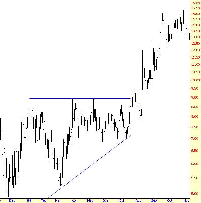
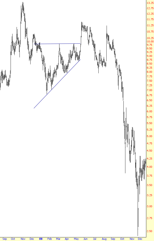
Example: Exide Technologies
Figure 2 shows Exide, symbol XIDE, jump toward $8.40 and then sink away. It pushes higher to the same level and then sinks once again to a higher low. On its third attempt, it pierces the $8.40 level but, importantly, it sinks a little beneath this line in the ensuing two days before gapping higher and starting its trip to a 134% increase in price.
This illustrates the importance of not having overly-tight stops, particularly when a pattern first breaks out. If you are waiting for a break above $8.40, and you buy the stock at $8.45, you don’t need to set your stop at exactly $8.39 just because that’s under the breakout point. You instead might want to put in an initial amount of “wiggle room” – 5%, for instance, would permit the stock to dip to 7.98 without getting stopped-out.

Pattern Start: 10/29/2007
Breakout: 2/1/2008
Breakout Price: $8.40
Peak Price: $19.66
Percentage Increase: 134%
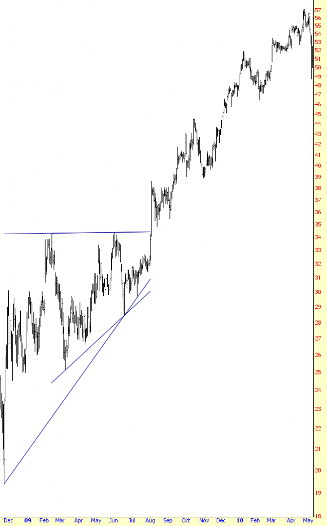
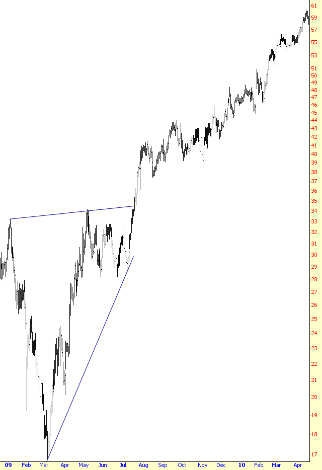
Example: Echelon Corporation
The chart in AT-3 shows that the number of touch-points for the horizontal line and ascending line don’t have to be equal. For this example, the stock makes four failed attempts to cut through the line at $9, but there are only two touch-points on the ascending line. As long as the pattern itself can still be confined to a triangle, the number of points doesn’t really matter (provided, of course, there are at least two of them!)
We also see, as is common, that the initial breakout is followed by a penetration back into the triangle. As long as the price doesn’t actually cut beneath the ascending trendline, the pattern can still be considered intact. If your stops are too stringent, you will get stopped out of opportunities that ultimately move substantially higher in value.
Pattern Start: 1/5/2009
Breakout: 7/20/2009
Breakout Price: $9.00
Peak Price: $15.00
Percentage Increase: 67%
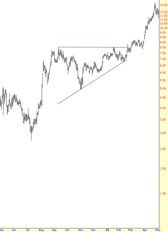
Example: SBA Communications
Utility companies aren’t known for dramatic price moves, but a 37% increase in price in a short amount of time, as shown in AT-4, is still impressive. The target move of $5 was actually achieved twice over, as SBAC moved from $27 to $37.
Pattern Start: 4/9/2009
Breakout: 9/16/2009
Breakout Price: $27
Peak Price: $37
Percentage Increase: 37%
Example: Brookfield Asset Management
For the sake of easy identification and consistency, it is best to look for ascending triangles that have a horizontal line as their top, but as you become more experienced with pattern identifcation, you can allow for some leeway with this rule. In Figure 5, the top line of the triangle is tilted slightly higher. This is actually positive for the stock, since it underscores the positive bias of the price. The drawback to this violation of the pattern’s basic definition is that it undercuts the notion of a strong price breakout once a very clear level of resistance becomes an equally clear level of support.
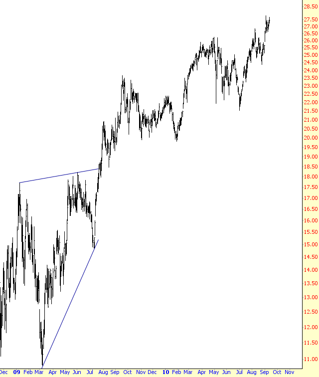
Pattern Start: 1/9/2009
Breakout: 7/23/2009
Breakout Price: $18.50
Peak Price: $23.50
Percentage Increase: 27%
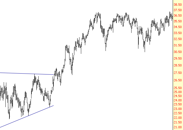
Example: Rockwell Automation
A very clean example is shown in AT-6, which also sports a slightly ascending line for the top. There are a couple of interesting properties to note about this chart: first, it is a very clean breakout without any retracement below the breakout line. Second, although it is a good ascending triangle, it also strongly resembles a cup with handle pattern (covered in a different section of this website). These are both bullish patterns, so they agree that the direction of the stock is going to be higher. The 82% lift in the stock’s price following the breakout affirms the power of both these patterns in this instance.
Pattern Start: 1/6/2009
Breakout: 7/20/2009
Breakout Price: $34
Peak Price: $62
Percentage Increase: 82%
Example: Louisiana Pacific
Both lines in AT-7 conform to the definition of the ascending triangle pattern, as it features a flat line at $8.12 and ascending line with two touchpoints. As is apparent from the examples in this section, the price after an ascending triangle breakout is prone to a modest retracement and penetration back within the pattern. The target price is a little above $11, and the stock pushes above $13 before relaxing. You may find it most profitable in your own trading to close out half the position once the target price is met and retrain the other half (with increasingly tight stops) to enjoy any supplementary profits that might be garnered from better prices.
Pattern Start: 9/11/2009
Breakout: 2/20/2010
Breakout Price: $8.12
Peak Price: $13.44
Percentage Increase: 66%
Example: China Yuchai
It’s been mentioned several times that this is a continuation pattern. Let’s take a look at a very well-formed ascending triangle which takes place in the wrong context – that is, outside the bounds of an upwardly-trending market.
In this case, both the ascending trendline and the horizontal line have four touchpoints, very neatly defining the triangle. In the fifth attempt higher, the stock shoots above the triangle, pushing quickly higher in just two days. Things start going wrong, however. The price sinks beneath the breakout price, and continues to sink, penetrating where the ascending trendline would be if it were extended to the right. After a sharp downturn, it tries again to move higher, but it fails to even meet its recent high, and it begins sinking again, this time dropping below its recent low. The stock continues dropping, and by the time the damage is done, the stock has plunged from about $11.50 to $2.50.
This emphasizes the importance of viewing a pattern in the proper and supportive context. An inverted head and shoulders pattern isn’t very meaningful at the top of a stock chart that has already risen dramatically; a head and shoulders pattern doesn’t mean much if a stock has already plunged from $20 to fifty cents; and an ascending triangle doesn’t really matter if a market has been falling or trading flat for a long time.
Summary
You have learned a number of lessons about ascending triangles that can be applied to most technical patterns: (1) you can allow for some leeway from the rigid definition (2) you can also allow a few percentage points in price movement for the retracement to take place (3) volume during the pattern formation isn’t imperative, but during the breakout, it is quite important (4) for continuation patterns, it is important that the pattern appear within the proper supportive context in order for it to have meaning.
