The channel pattern is one of the easiest to identify, although it is not very common. It consists of a pair of parallel trendlines which confine a stock’s price for a meaningful length of time. One of the interesting things about this pattern is that it can serve three different purposes: it can provide a series of buying and shorting opportunities as it oscillates within the pattern; it can serve as a buy signal when broken to the upside; and it can serve as a sell signal (or short signal) when broken to the downside.
The reason channels are fairly rarely is because a stock’s uptrend or downtrend is usually too random or biased in a particular direction to create a clean trend. Ideally, the price movement between these two trendlines will represent a sine wave, with the price rallying up to resistance, stalling, and then selling off to support. The more times it does this, the more useful it is as a tool for swing trade opportunities, and the more potent it is when it finally does break in one direction or another, as it is bound to do eventually.
Definition of the Pattern
A channel is made up of two trendlines that are more or less parallel. They may be ascending or descending, and if you use a high-end charting program such as ProphetCharts, you can make use of the Channel tool to establish those boundaries with just three data points. Most channel objects can also show the median line (that is, a third parallel line between the other two) and also lines for the 25% and 75% levels (which are, in turn, between the upper and median trendlines and the lower and median trendlines).
The price should have at least two touchpoints on each of the two trendlines in order to qualify as a channel, and the trendlines should be parallel (giving a few degrees of latitude; if it’s much more than this, you are looking at a wedge pattern or a broadening pattern instead). At some point, the price will break out of the channel, because no channel trend lasts forever. When the price finally does this, you may also consider that a buy or sell signal, depending on which side of the channel prices emerge.
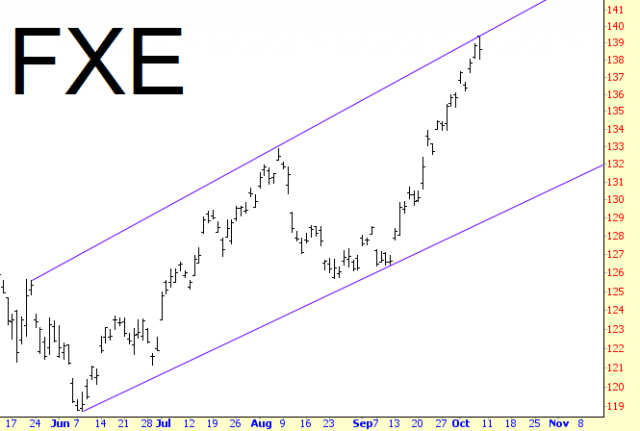
An example of a channel is in CH-1, which shows the price of FXE, the exchange traded fund for the Euro/US Dollar cross-rate. This shows three touchpoints on the top line and two touchpoints on the bottom. Once it is clear that a channel has been establish, you can take advantage of this by going long the security with each instance of prices hitting support and taking your profits when the resistance line is hit. If you want to be particularly aggressive, you can even sell the security short (in other words, reverse your position) at resistance, cover the short at support, and yet again go long the security.
Keeping this kind of trading going can be profitable for a while, but, as has been said, the channel will be guaranteed to break either up or down at some point, and you must be prepared to get out of your “cycle trades” when this happens. Indeed, when the channel is finally broken, you might elect to make a trader of a large size in the direction of the breakout.
Psychology Behind the Pattern
When a security is trading within a channel, there is a tug-of-war taking place between buyers and sellers, and for whatever reason, the party with the most strength keeps changing on a fairly regular basis. For instance, the buyers may be more aggressive for three weeks, and then a certain high price is achieved (which might be a higher high or a lower high, depending on the channel’s direction), at which time the sellers get the upper hand and create more selling pressure than the buyers can handle, thus pushing prices back down to support.
If the channel is ascending, then the stock is generally being accumulated over the long haul, and buyers generally have more strength than the sellers. A break above an ascending channel shows an exceptional amount of buying strength, whereas a break below such a channel illustrates that the buying power is no longer able to sustain the angle of the price’s growth.
A descending channel exhibits a stock that is generally weak but which keeps attracting buyers who believe they are getting a “bargain” of sorts. As the stock falls toward resistance, more nervous owners will decide the risk is not worth it and will abandon the stock, but eventually enough buyers come in to reverse the trend and continue the oscillation of the price to the upside. Prices snapping below a descending channel are giving in to the selling pressure and may be entering a hard fall, whereas prices pushing above and away from the descending channel are signaling a trend change, now that all the weak hands have been cleaned out of the security.
Example: Amazon
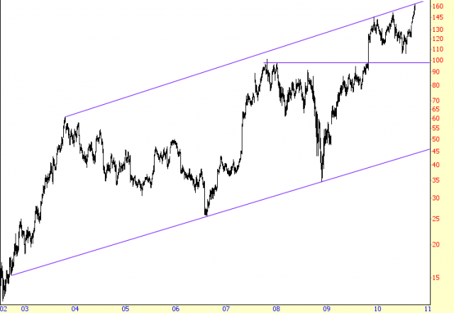
One of the strongest stocks in the first decade of the twenty-first century was Amazon. Of course, Amazon also was very strong during the Internet bubble of the late 1990s, and near its peak, its founder Jeff Bezos was on the cover of Time magazine as their man of the year. As the stock plunged during 2000 and 2001, the cover story was pointed out as a contrarian indicator, and some people felt that Amazon might go the way of Pets.com and simply plummet into oblivion.
Clearly, this was not the case, as Amazon had real staying power, and the stock found stability by 2002. Beginning in that year, the stock established its first touchpoint on the line which would later be recognized as its supporting trendline. It moved steadily from $15 to about $60, establishing the first point of its resistance line, sold off for two and half years to about $25, stabilized, and then started a new uptrend.
This up-and-down pattern lasted for an entire decade, and even during those individual up and down cycles there were smaller up and down cycles that traders may have exploited as well. But the extraordinarily wide, broad uptrend was the safest way for more conservative traders to use AMZN as a vehicle for profits.
Suppose, for instance, a person in 2008 wanted to own Amazon, but he didn’t know what would represent a good buying price. After all, the stock was falling, like most other stocks, in late 2008, and those not equipped with charts or the requisite knowledge would have no idea where Amazon would find support, except for a guarantee that it would not go below $0.
This channel pattern, however, indicated that a price close to $35 would be a touchpoint on the ascending trendline. If it broke this line, the long position should be abandoned, and a trader might want to instead wait for $25, which was the prior major low. This was not necessary, however, because the stock formed a V-shaped bottom and moved up, almost uninterrupted, to a quadrupling of price.
There’s another interesting aspect about this chart, and that is the horizontal line shown in CH-2. This line, at about $100, seemed to represent resistance for the stock, particularly since it was the former high price. A surprisingly good earnings report blasted the stock above this zone, and within a few weeks, the price perfectly touched the resistance trendline. It continued to make small pushes down and up, but always above the horizontal line (its former resistance) and below the upper trendline (resistance for many, many years).
It’s worth pointing out that a person going long or short a stock, even exactly at one of the trendlines, isn’t guaranteed a profit. Imagine a person selling AMZN short late in 2009 at about $145, which was the point reached soon after the tremendous push above that horizontal line. The stock did indeed fall, but then it reversed and went on to a higher high. It fell again even further, but once more pushed to an even higher high. A person holding this short position, hoping the stock would obediently fall back to the lower support line would have been frustrated and disappointed. Indeed, although this chart does not show it, the price wound up pushing above this decade-long channel, illustrating that Amazon was even strong than this broad uptrend suggested.
Example: Harris Corp
Besides taking advantage of the ups and downs of price action within a channel, you can also make use of a breakout. One of the more potent forms of breakout is from within the confines of a descending price channel. This stock, symbol HRS, was in a very long-term downtrend, lasting from 1978 to 1992 – a decade and a half.
There were a couple of great buying opportunities of HRS during the downtrend in 1982 and 1990, but these were within the bounds of the channel. When the price made its fifth and final assault on the resisting trendline in 1992, it emerged from its fifteen-year price prison and commenced a climb of over 300%. Analyzing this “signal” would be simple for someone following this channel, simply because an emergence from the channel above resistance (especially for such a long-term chart) was a clear buy signal. It stair-stepped its way to a series of higher highs and higher lows for years to come.
When looking at the big picture, you can see the trend of this stock actually changed late in 1990, two years before the breakout. But that would have been impossible to know at the time. A more conservative trader looking for confirmation of a trend change would have taken his que from the penetration of the long-standing resistance line, even though the stock had already doubled by the time the breakout took place.
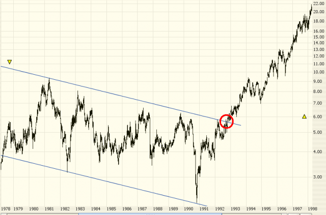
Pattern Start: 5/9/1978
Pattern Break: 10/20/1992
Break Price: $4.65
Post-Break Price: $19
Percentage Change: 309%
Example: Citi Trends
The chart of symbol CTRN, shown in CH-4, is another instance of a breakout providing a buy signal, but this one would require a bit more intestinal fortitude since the breakout was followed by a rather large retracement before it finally moved higher.
The breakout took place at $14.50 on February 1, 2008, and the stock moved to $17. It dipped back to the breakout price, moved to $17 again, and then fell to just beneath $13. Whether or not a trader stayed with this position would depend on where they stop-loss was placed (assuming they had one). A good position for a stop-loss in this instance would have been the most recent “higher low” which had taken place before the breakout, which was at about $12.50. The fact that the price stayed well above this level meant that another higher low being established, which is constructive to a bullish breakout.
By April, the stock had not only recovered by had also provided a handsome gap up in price, which was another confirmation of the new bullish direction. CTRN enjoyed a 93% gain before its next significant weakness.
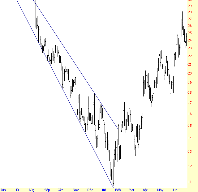
Pattern Start: 8/9/2007
Pattern Break: 2/1/2008
Break Price: $14.50
Post-Break Price: $28.93
Percentage Change: 93%
Example: iShares Brazil
A price break beneath a channel is just as actionable as a price break above, and CH-5 illustrates this point with a long-term graph of EWZ, which is the exchange-traded fund for Brazilian stocks. The ascending channel was in place for six years, with an unbroken string of higher highs and higher lows. The final higher high took place in the first half of 2008, and the stock descended to the supporting line.
A trader looking at the chart at this time would naturally and correctly assume a buying opportunity was at hand. After all, the stock was in a very long-term uptrend, and past instances of prices that approached support had provided excellent returns on long positions for six years running. That same trader, assuming his stop-loss order was in place, would have been taken out of the position at a loss, since EWZ broke its long-term support at the point which is circled.
The same trader could make two decisions at this point. He could either step aside, remaining unaffiliated with the stock, since there was no actionable bullish trade. He could also decide it was a good opportunity to sell the stock short, since the failure of such a sizable pattern implied the potential for a big move downward.
The price fell from $63 at its break to $23 at its bottom, a 63% decline. An even more aggressive trader might have purchased some long-term puts on EWZ, yielding a much more substantial percentage gain (naturally with an equal amount of added risk).
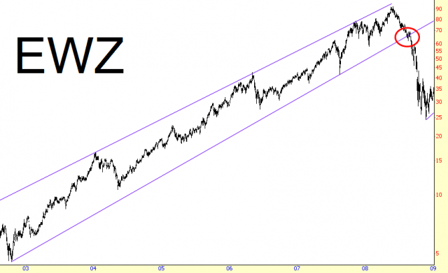
Pattern Start: 6/20/2002
Pattern Break: 8/12/2008
Break Price: $63
Post-Break Price: $23
Percentage Change: -63%
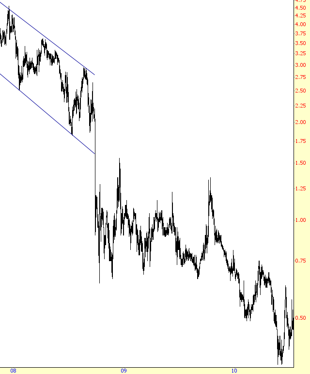
Example: Incyte Corporation
Downward breakouts can be meaningful with both ascending channels, as shown in CH-5, and descending channels, as illustrated by CH-6. The stock, INCY, had been in an uptrend in 2007 and early 2008, but it began reversing and established a descending channel with three touchpoints on each of its channel’s trendlines. The big break came on December 6, 2007.
When a stock breaks above a pattern, it can retrace back to the breakout point and below. For similar reasons, a stock that drops beneath a pattern can recover its immediate losses and provide a second chance for (a) those in long positions to escape; or (b) those wishing to go short the stock a chance to get into the position. We see this take place with INCY, as its plunge beneath $4 was quickly followed by a list in price to the point precisely beneath where the lower trendline would be touching. This was the last chance for longs to get out and for bears to get on board, as the drop was much faster afterward.
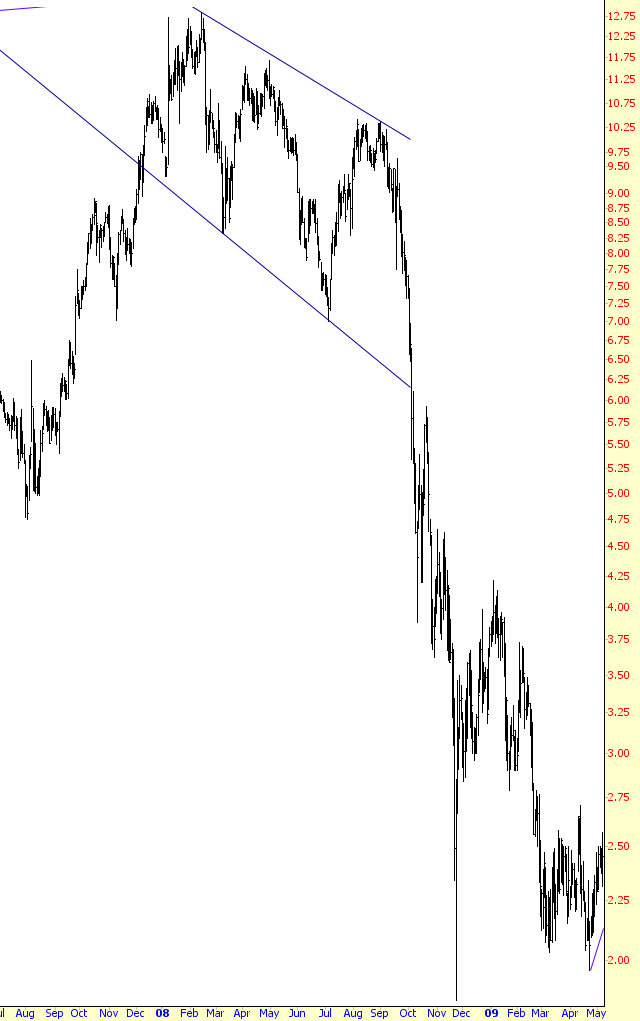
Pattern Start: 12/6/2007
Pattern Break: 10/6/2008
Break Price: $6.15
Post-Break Price: $1.96
Percentage Change: -68%
Example: Louisiana Pacific
There are countless instances in technical analysis where you can observe a given technical object change roles from support to resistance or vice versa. The chart of LPX shows a channel pattern that highlights this phenomenon.
Observe the higher trendline of the channel. For many months, it provided support to the prices above it. Although it is not drawn here, if there were a third parallel line drawn above the present upper line, it would fit the price bars above it to show there was another descending channel (with a smaller range) preceding this one.
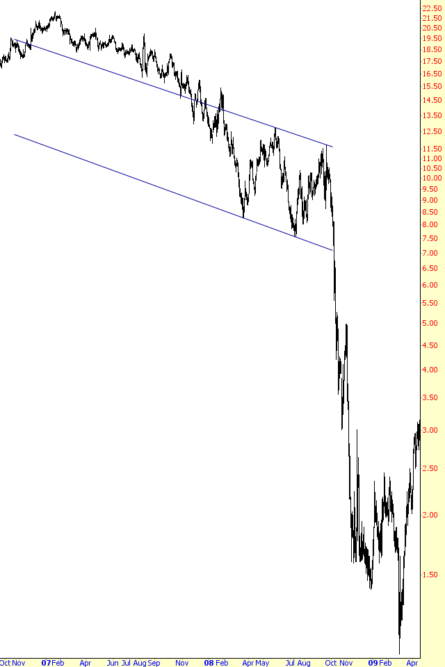
Pattern Start: 2/4/2008
Pattern Break: 10/7/2008
Break Price: $7.12
Post-Break Price: $1
Percentage Change: -86%
Example: Nuveen Multi-Strategy
Symbol JPC, the Nuveen Multi-Strategy security, was in a gently-descending channel for about a year before its prices fell steeply below the pattern. There are two interesting actions that took place following this break: the first is that that was, in spite of the sharp drop, a powerful recovery back to the $6.60 price level from where the pattern had failed; and second, the price lingered at this level for a surprisingly long time, two months, before it began to fall in earnest.
Of course, when trading within the benefit of knowing the nature of future price bars, it is impossible to know what is next. Whether a retracement takes place or doesn’t, whether that retracement takes the price well into the pattern again, and whether a recaptured price will remain intact for many weeks (as it did here) are all speculative when you are actually trading. The important thing that can be known from a chart like this is that, provided a stop-loss order is in place and that order is seto to a sensible price level based on the chart, a trader can stay in position irrespective of the length of time a price may dawdle at a certain level.
Stocks maintain a state of equilibrium when neither buyers nor sellers are able to push it in their direction. The fact that JPC broke its pattern, recovered, and then was able to tread water for a number of weeks is rather unusual, but it is clear that owners of the stock were not spooked enough by the recent drop to sell in quantity. The pattern break did signal something was wrong, however, and that signal’s strength was finally known once the security took a 57% drop in the coming months.
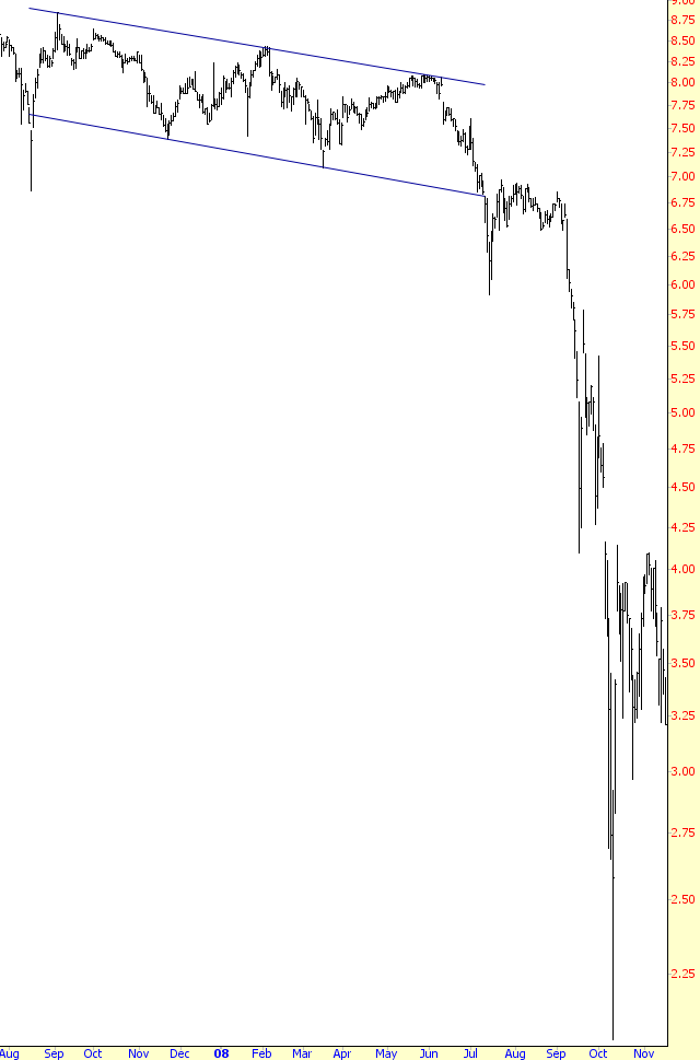
Pattern Start: 8/17/2007
Pattern Break: 7/10/2008
Break Price: $6.60
Post-Break Price: $2.86
Percentage Change: -57%
Example: Plug Power, Inc.
There are several things that can be learned from this chart, which is yet another example of a stock’s weakness following the price break beneath its channel.
The first is that a stock whose price is falling doesn’t necessarily have to fall as hard and fast as some of the other examples shown earlier. This stock takes its time – nearly two years – to finally reach its bottom. Unless the stock you are short pays a meaningful dividend, it is not costly to simply hold on to a position like this as long as it has not broken its downtrend (that is, unless it starts making higher highs, which PLUG does not do here).
Another observation is how support once again has become resistance. The lower trendline is only drawn as far as the channel, but if you mentally extend that line to the remainder of the chart, you can see that almost all the price bars remain beneath that level. When you are basing a trade based on a pattern, it can be helpful to extend that pattern’s defining lines to look for crucial turning points in the future.
The final point about this graph is about retracement. This stock’s fall was so rapid in late 2008 that someone wanting to sell it short would not have had a good chance to do so. It would have been more prudent to simply step aside and wait. This patience would have been rewarded, because by early 2009, the price had stabilized and climb back up to the underside of the channel’s support line, providing a good second chance to sell the stock short. The amount of price activity above this breakdown level was enough to suggest a significant amount of overhead supply, which would act as a protective barrier against the price going much higher.
Pattern Start: 10/19/2007
Pattern Break: 9/26/2008
Break Price: $1.59
Post-Break Price: $0.36
Percentage Change: -77%
Summary
The wonderful thing about channels is their versatility. They are useful to bulls, bears, and swing traders alike. They are relatively easy to identify, because parallel trendlines are simply to lay down, and it’s a cinch to ascertain whether or not the prices are confining themselves to those boundaries. If they are, you may have uncovered a good (albeit temporary) way to take advantage of regular price swings.
