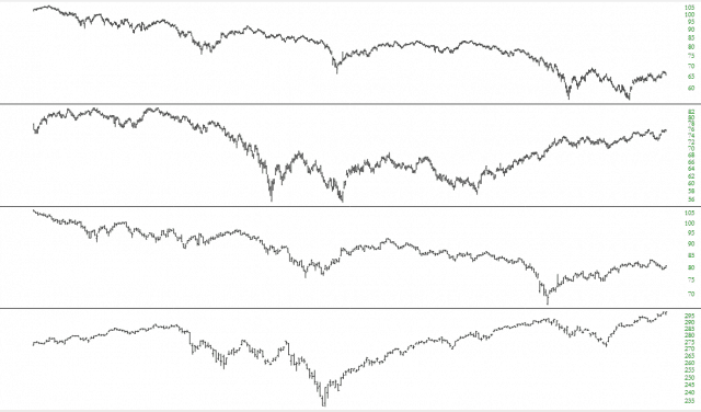
Grid charts allow you to display a given financial instrument not just once but two, three, or four times. The charts will be stacked on top of each other vertically, and you can zoom in and and interact with each pane independently.
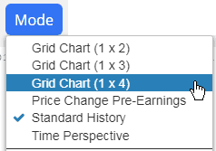
To access grid charts, choose the style you want from the Mode menu. There are three different choices, allowing you to stack two, three, or four charts on top of each other.
When you create a grid chart, whatever symbol you are looking at will be duplicated on all the charts. At first, each chart will look identical. However, you can interact with each of these panes independently. Specifically, you can:
- Zoom in by swiping;
- Unzoom by double-clicking the chart you want unzoomed;
- Change chart types; and
- Perform all the standard “social” functions (download, send to comments, send via email, Tweet the chart, stack it to SocialTrade)
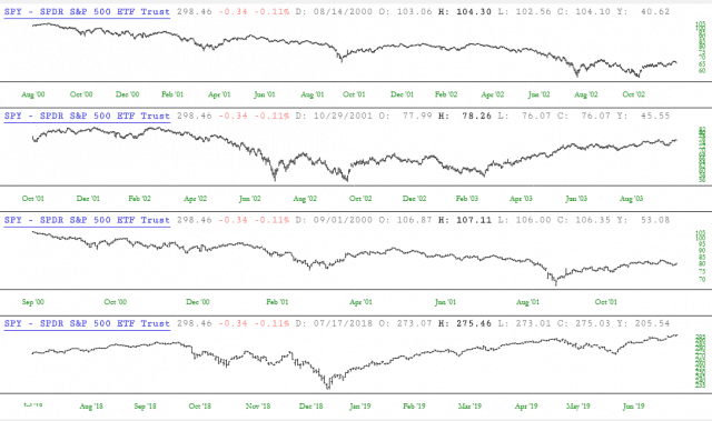
Here, for example, is a 1 x 4 grid chart. Different portions of the chart have been zoomed into, which is why the charts look different from one another, even though it is all the same symbol, SPY.
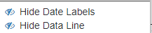
In order to clean up and simplify the appearance of the chart, you can also choose to hide the date labels or the data line with the menu choices here:
Hiding both of these, for example, makes the chart above look like this:
You can zoom within panes independently and also right-click to get menu choices for each and every pane. You can also change the size of each pane by dragging the separator bar.
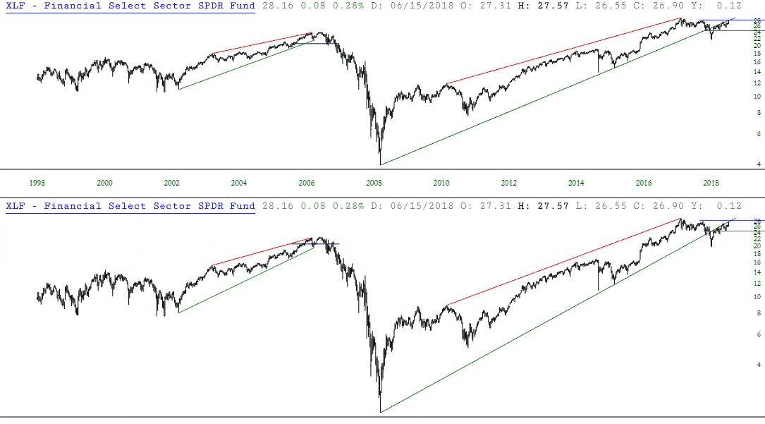
Let’s take a real-life example to show how grid charts might be useful to you.
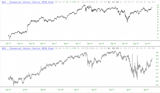
The exchange-traded fund for financial stocks, symbol XLF, appears to be repeating its behavior that it had in the 2005-2007 time period. Looking at the chart below, it seems there are some interesting similarities.
However, there is limited utility in glancing back and forth to different portions of a chart. It is hard to truly compare discrete time periods, because the segments are on different parts of the chart, and you are having to mentally put the pieces together in your mind’s eye. It’s clumsy and ineffective.
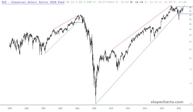
Far easier is it to be able to hone in on the specific subsets of this historical chart and truly see how these two periods “stack up” against one another.
Thus, using a 1 by 2 grid chart, we take XLF and zoom in on recent history (top chart) as well as the relevant period of 2007. As you can see below, the similarities are striking, and we can more confidently confirm our supposition that there was analogous price behavior in these two different portions of financial history. What was once a hunch is now more clear.