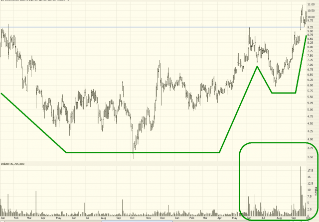
The cup with handle pattern is one of the most recognizable and popular patterns in technical analysis. As the name suggests, the pattern looks like a cup and handle as viewed from the side. That is, a rounded “saucer” shape followed by a much smaller saucer (approximately even with the upper levels of the big saucer) and finished with a breakout to higher prices.
Definition of the Pattern
The criteria for this pattern are as follows:
- Prior Uptrend – since this is often a continuation pattern, it is most desirable for their to be an uptrend preceding the pattern, although this is not a requirement, as examples in this section will show.
- U-Shaped Cup – the “cup” portion of the pattern should be relatively smooth and round, as opposed to a sharp V-shaped pattern.
- Similar Highs – the highs on the left and right sides of the cup should be roughly equal, and these highs in turn should be equal to the highs of the handle.
- Partial Retracement by Handle – the drop in price contained within the handle should be only a modest part of the range between the cup’s high and low. In other words, if the cup spans a range of $10 to $16, the handle shouldn’t dip very much below the high price of $16. A good rule of thumb is no more than 1/3 of the range, which in this example would suggest a handle no lower than $14 in price.
- Breakout – the price should break out above the top of the handle and continue on to its target price.
The target price is the value of the price range of the pattern added to the price level at the time of the breakout. For instance, if the pattern spans $25 to $30, then the target price would be $35 (that is, the high price of the pattern – $30 – added to the range of prices in the saucer – $5 – equalling $35).
Here is an example of a cup with handle pattern with additional lines drawn for emphasis. Take note how the volume shrinks as the handle is being formed and then subsequently surges higher on the breakout – this is a good sign with such a pattern, as the strong volume affirms the importance of the breakout.
Psychology Behind the Pattern
Let us consider a stock that has already been climbing steadily. Let’s assume it has risen from $20 to $30. Owners of the stock are very happy with the performance, and the stock peaks at $30. This is the left edge of the cup that will be formed.
Now the price starts to gently fall. Some owners of the stock get nervous and want to lock in profits, so they start selling. The stock descends to $29, $28, $27, and on down to $25. At this point, selling dries up, as does volume, and the price flattens out at about $25 for a while.
Now that the stock is stable, new buyers start to enter the market and slowly bid the price up. The price moves back up through $26, $27, $28, all the way back to $30. It has now matched its former high, and over the couple of months that the stock descended and ascended, there is a saucer-shaped pattern in the price which constitutes the cup of this pattern.
Now the price starts slipping again, and a small number of owners once again get nervous that the stock is unable to get above $30. They think perhaps a double top is in place, and they sell. This time, the stock’s drop is more modest and shorter-lived. It falls down to $28.50, stabilizes, and pushes up again to $30. Now the handle is complete, and the market has a decision to make – whether to push the stock up past $30 or give way to sellers and fall hard.
If the handle doesn’t complete and the price simply keeps falling, a double top will indeed be in place, and more serious selling may ensue. In this example, however, there are more buyers than sellers, and the price finally cracks above the $30 level, having paused there for both sides of the saucer as well as the handle. Now that a new high is finally reached, buyers pile into the stock, soon pushing it to its target price of $35 (which is the sum of the former high, $30, plus the pattern’s range, $5). The pattern, and its target, are now complete.
Below is an idealized experience with the cup and handle pattern. Note particularly the surge in volume once the breakout is underway.

Example: SM Energy Company
Here is SM Energy Company from the mid-1990s. You can see the especially smooth saucer pattern followed by a handle which retraced about 40% of the saucer. After the breakout, it met and exceeded its target price.
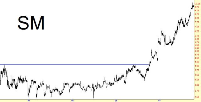
Cup Timespan: June 1993 to June 1996
Handle Timespan: June 1996 to October 1996
Price Range: $2.5 to $4, providing a target of 5.50, which was met December 1996
ProphetCharts Pointer – Because the high prices of the saucer and handle are close to even, the horizontal line tool is the most straightforward way to mark this pattern. If the prices instead tilt either slightly up or down, the trendline tool will provide a more accurate mark. Whatever of these two drawn objects you use, you will probably want to turn the Extend feature off, since there is no reason the line should extend infinitely into the future. You simply want to mark the high points of the saucer and its handle.
Example: Schnitzer Steel
From 1998 to 2003, Schnitzer Steel hammered out a saucer in a very wide $2 to $7 price range. This shows the very modest drop that comprised the handle, followed by a multi-hundred percentage point surge.
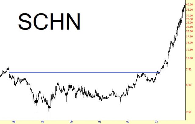
Cup Timespan: November 1997 to July 2002
Handle Timespan: July 2002 to January 2003
Price Range: $2 to $7 for a $12 target, reached June 2003
Example: Peabody Energy
This chart is somewhat unusual in that the pattern actually began its formation starting with the company’s initial public offering in 2001. Three years later, its pattern was complete, and it doubled in price shortly thereafter.
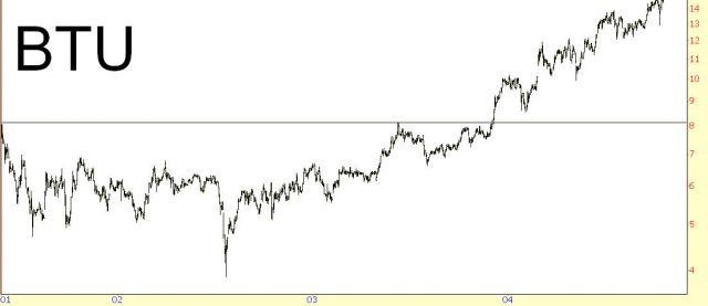
Cup Timespan: May 2001 to June 2003
Handle Timespan: June 2003 to December 2003
Price Range: $4 to $8 for a $12 target, reached June 2004
Example: Franklin Resources
The chart shown illustrates that it is not essential for the high prices on both sides of the saucer to be perfectly even. The left side of this pattern is somewhat lower than the right (which is actually a good thing, since that suggests strength in the price). In this instance, Franklin Resources took only about eight months to reach its target price, having formed the pattern over a six year period.
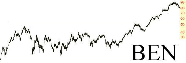
Cup Timespan: April 1998 to January 2004
Handle Timespan: January 2004 to November 2004
Price Range: $20 to $55 for a $70 target, reached July 2005
Longer-Term Examples
Some technical analysis books suggest that the cup with handle pattern shouldn’t span more than a few months. However, plenty of chart examples illustrate that charts spanning longer than that – even as long as a decade – can still be useful harbingers of future price direction. This illustrates a cup with handle pattern spanning more than a decade which preceded a mult-thousand percentage increase in price. The remaining examples in this section will show similar long-term patterns.
Example: Manitowoc Company
The target price was reached quickly – in under a year – and even though the price softened up somewhat years later, it went on to multi-hundred percent gains in the years that followed.
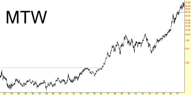
Cup Timespan: July 1981 to December 1993
Handle Timespan: December 1993 to January 1996
Price Range: 0.65 to 1.95 for a target of 3.25, reached December 1996
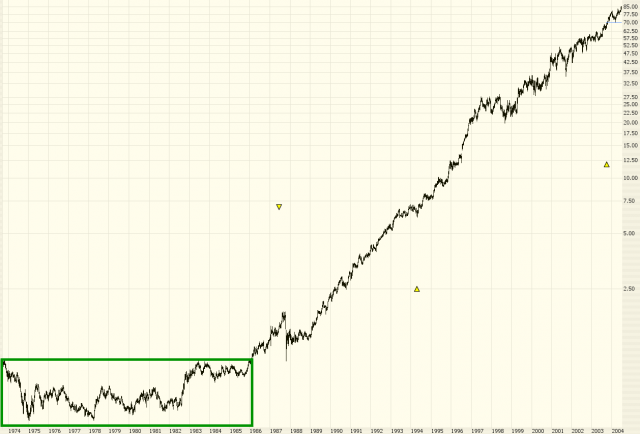
Example: 3M Company
The stock MMM, 3M Company, is one of the most amazing performers of the late 20th century. The saucer is enormous, spanning a decade, and the handle covered 1984 and 1985. What’s interesting about this breakout is that the crash of 1987 hit this stock, but even with that severe a correction, the price did not descend beneath the horizontal line representing the breakout. After surviving the crash of 1987, the increase in MMM was nothing short of extraordinary, climbing thousands of percent.
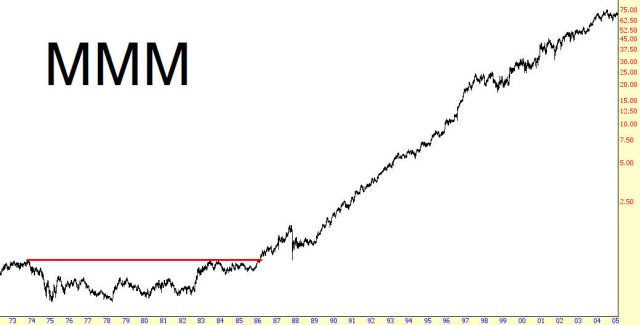
Cup Timespan: October 1973 to June 1983
Handle Timespan: June 1983 to December 1985
Price Range: 0.45 to 0.90 for a target of 1.35, reached January 1987
Example: Becton Dickinson and Company
One of the cruder (that is, less smooth and well-defined) examples is shown to illustrate that not all cup with handle patterns are as picture-perfect as the prior examples. The saucer, which also roughly resembles and inverted head & shoulders pattern, was followed by a handle that pierced rather deeply into the range of the saucer (approximately 50%). The slightly-ascending trendline that defined the top of the pattern was finally penetrated early in 1986, and the stock enjoy sensational gains for the rest of the decade and into the 1990s.
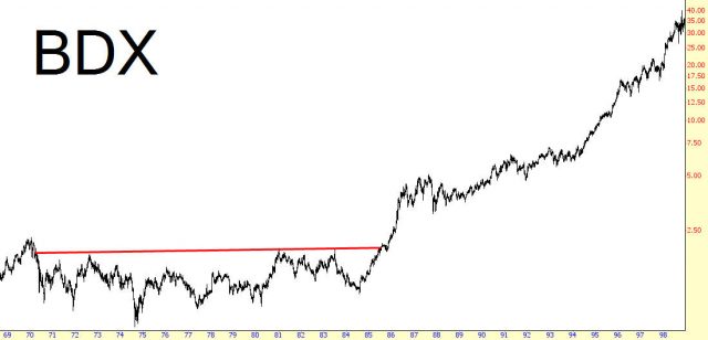
Cup Timespan: December 1969 to December 1980
Handle Timespan: December 1980 to August 1985
Price Range: .75 to 2.00 for a target of 3.25, reached August 1986
Example: Chevron
As with the prior example, the chart below features a handle which retraces deeply into the saucer’s price range. Given the tremendous rise which took place afterwards ,you can see how important it is not to dismiss a pattern merely because the handle dipped more than the modest amount suggested by the parameters at the beginning of this chapter. Of course, if the price descends beneath the low price of the saucer’s range, the cup with handle pattern is definitely invalidated.
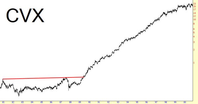
Cup Timespan: December 1980 to July 1987
Handle Timespan: July 1987 to April 1989
Price Range: .20 to .45 for a .70 target, reached December 1989
Example: EMC Corporation
We see EMC Corporation’s stock price, which was one of the most dramatic and consistent of the 1990s tech boom. The pattern was somewhat long, traversing four years, but the moved that was sustained after the completion of the pattern was many times this length.
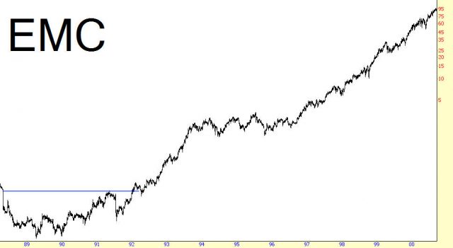
Cup Timespan: April 1988 to May 1991
Handle Timespan: May 1991 to December 1991
Price Range: 0.06 to 0.26 for a target of 0.46, reached November 1992
Summary
The illustrations in this section appear very similar because the rationale and psychology behind the price action of a cup with handle pattern is very consistent. Understand that this pattern can span anywhere from a few hours to many years, and that both the volume surge on the breakout and the length of the original pattern are both important elements of how high the pattern will ultimately push the price.
