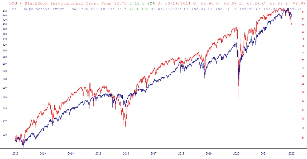
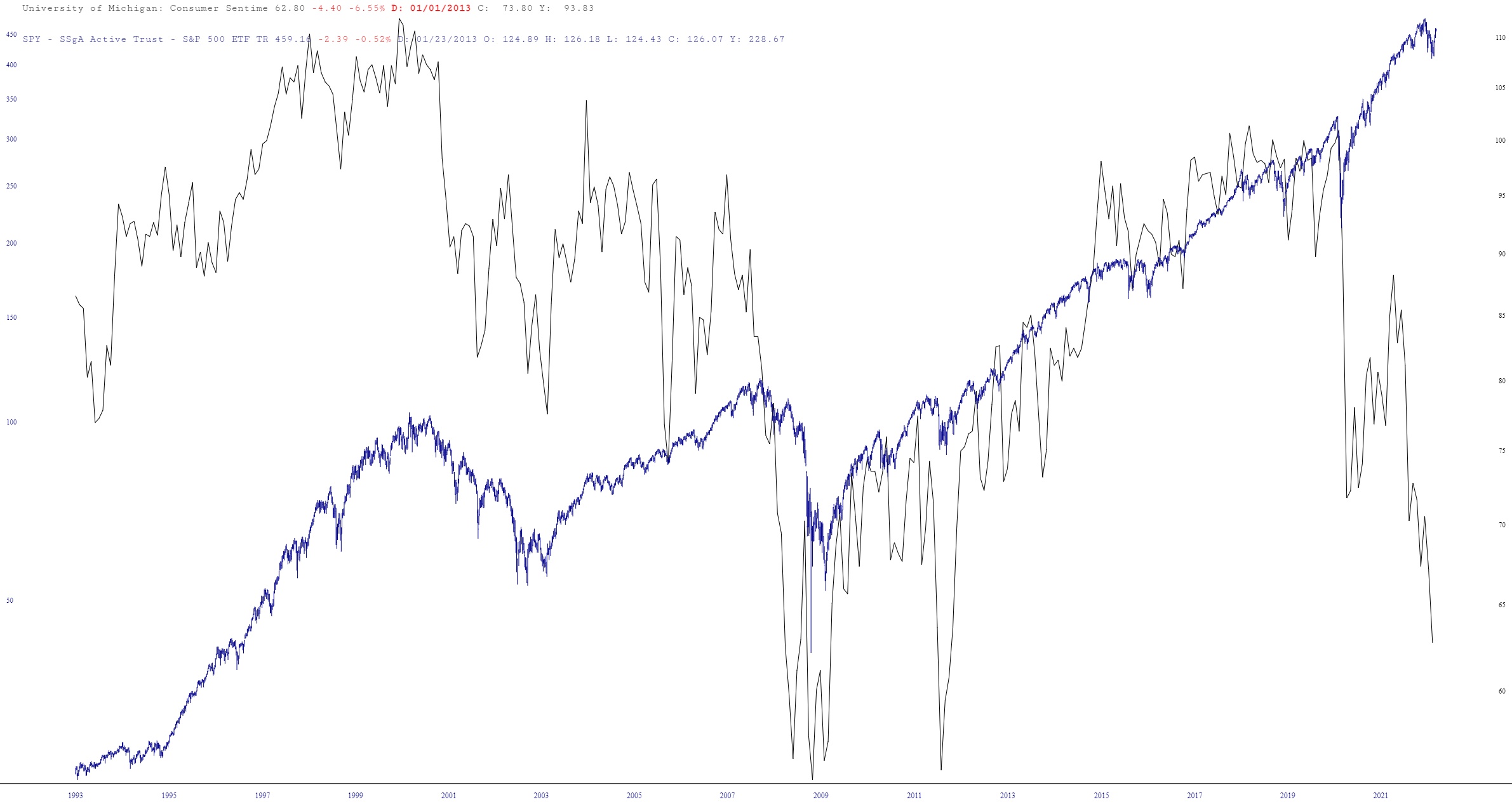
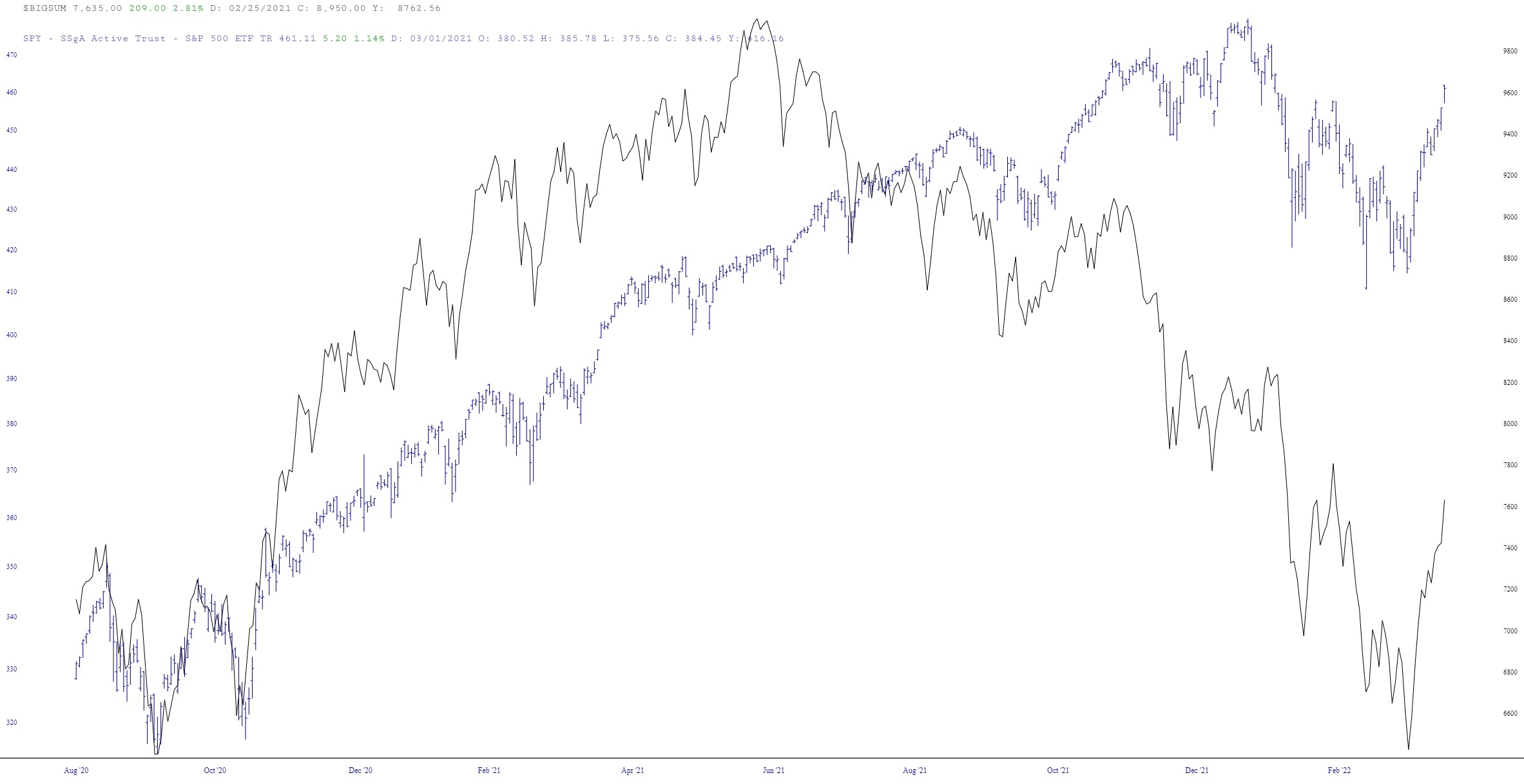
The ability to “layer” charts is a unique and powerful feature in SlopeCharts exclusively available to Gold and Platinum premium memberships. At first glance, it may seem to be just an other form of comparison charts, but it is much more flexible and sophisticated than that. This feature allows you to combine charts in ways that are simply not possible with standard comparison charts.
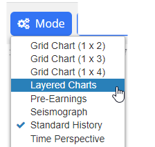
To access this feature, choose Layered Charts from the Mode menu in SlopeCharts.
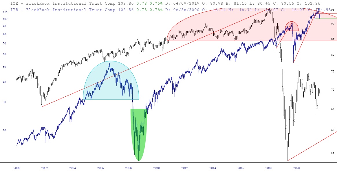
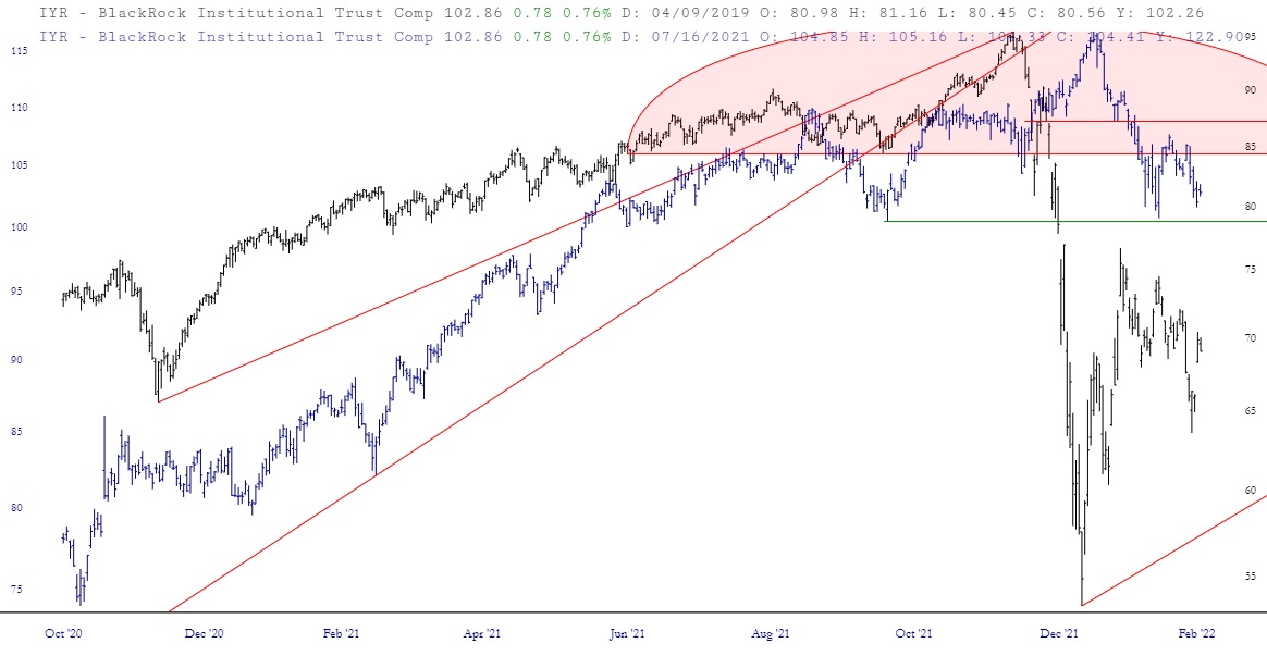
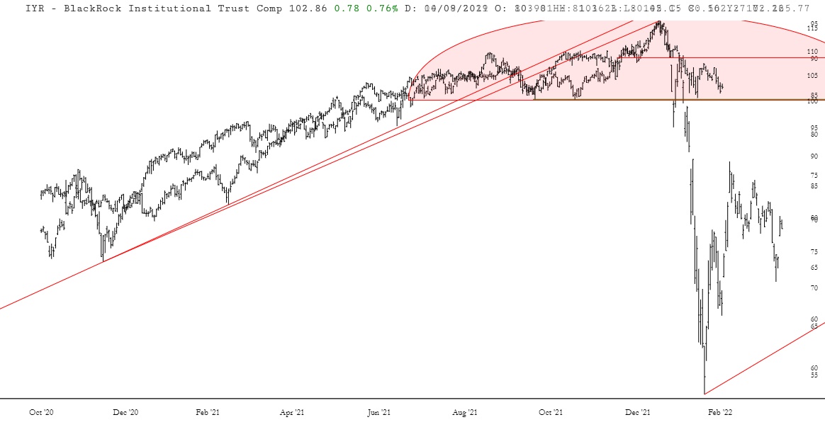
The SlopeCharts screen will change somewhat to accommodate the features in this mode. The most obvious change will be the presence of a row of controls at the top, the leftmost portion of which lets you switch from one layer to the other.
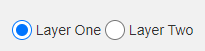
Here is what each of these items does:
- Layer One: this is the default chart. The layered chart has two elements – chart one and chart two – and when you are in a certain layer, you can manipulate that chart (and only that chart) is the same way you normally do in SlopeCharts. You can zoom in, zoom out, resize it, flip it upside down, add studies, clear studies, drawn objects, hide objects, and so on. As you work with each layer, you will see the faint image of the other chart in the background, so you can see how they relate to one another.
- Layer Two: this is simply the second chart, or second “layer” in the combined chart you are creating. You can freely flip back and forth between layers to manipulate each layer to your satisfaction.