Wow. I have something exceptionally cool to share with you. Something so cool, it might even compel some of my thriftier readers to get a crowbar out, crack their wallet open, and become a Gold or Platinum member. Even in the midst of my zany travel schedule, I wanted to write up this post and tell you about what I managed to figure out on a delightfully rainy Sunday morning.
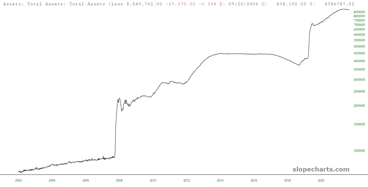
Specifically, it has to do with taking this chart……….
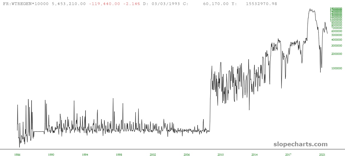
……and this one………..
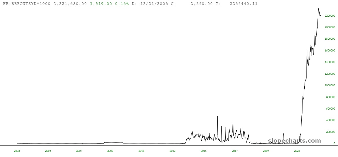
…….and this one……….
……and, implausibly, coming up with a chart that has the amazing ability to look two weeks into the future with, over the past two years, 95% accuracy.
I know this sounds like some come-on from one of those tacky long-form marketing emails, but honestly, if I was any good at marketing, I would have WAY more subscribers than I do (which reminds me, once again, to ENCOURAGE YOU TO SIGN UP – – you’ve waited long enough! Seventeen years of work should be worth SOMETHING to you!) The rest of this post, all paying members can see………hang on to your hats:
It all began when one of you was thoughtful enough to email me a Twitter thread that was intriguing. I get a lot of emails, and some of them I just glance at, but this on in particular caught my attention. I read the entire Twitter thread, which can be seen in shorthand form by clicking here. It’s written by the chap shown below, who doesn’t at first glance seem to be someone to heed when it comes to financial advice………

But, I dunno, judging from his Instagram, he’s doing all right for himself………..

But let’s get back to Federal Reserve data, shall we? (And if any of you thought “back data“, shame on you).
The aforementioned Mr. Anderson offers up a simple formula:
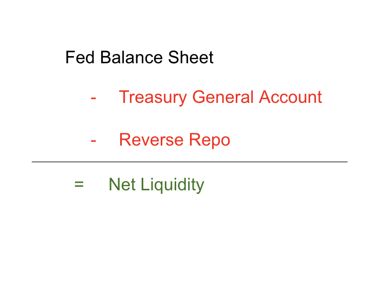
Which, once all the numbers are crunched, yields this amazing chart.
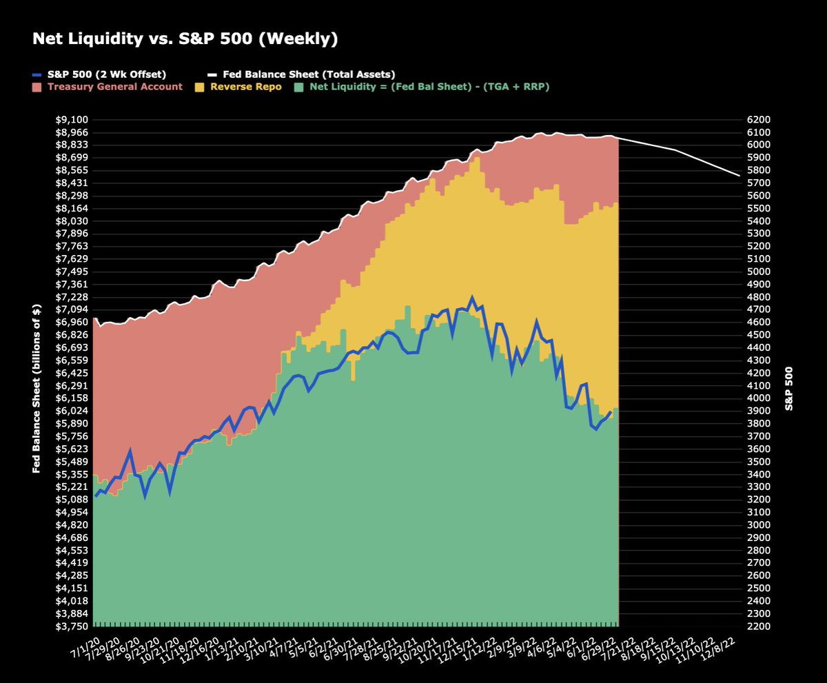
It’s the green histogram and the blue line you need to look at closely. The green histogram shows the result of the simple formula mentioned above, and the blue line is the S&P 500, shifted by two weeks.
Of course, here on my beloved Slope, we have two features that speak directly to this:
- Layered charts, and
- A very deep economic database.
It let me to spend the dark hours of early Sunday morning cobbling together this mess in Notepad:
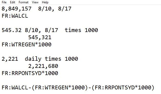
Yes, that godawful thing at the bottom is, in fact, the “symbol” I am using in SlopeCharts to create this bit of magic.
Then I took the next step and used Layered Charts to overlay it with the S&P 500 and push the Federal Reserve data backwards two weeks. The results were eye-popping:
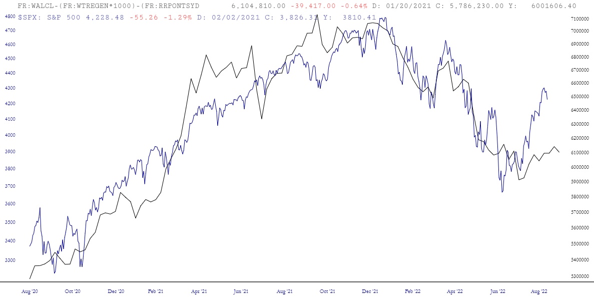
I think it’s pretty obvious that the Most Important Chart Ever title has been violently reclaimed by this sucker. Please note that only Gold and Platinum members can access any of these features, so if you are, the crazy symbol you can cut and paste is:
FR:WALCL-(FR:WTREGEN*1000)-(FR:RRPONTSYD*1000)
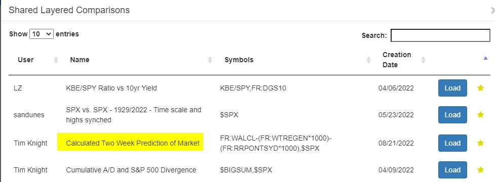
And for those of you who aren’t, here is my helpful link to the membership page. Incidentally, if you premium folks don’t want to bother with monkeying around with this directly, you can use the Browse feature in Layered Chart mode to just grab what I’ve already made.
Anyway, this chart also absolutely shrieks the fact that the explosive move higher on the S&P in recent weeks has been completely wrong-headed. Just look at the spread between the blue line and the black line. If you’ll examine the chart, which geos back a full two years, any divergence between these two lines is resolved in short order. Simply stated, the market is clearly overvalued right now, based on this spread.
My only regret in this is that the granularity of two of these three data points is weekly, not daily. The latest data point is Wednesday, August 17th, so the next point plotted on this chart will appear late on Wednesday, August 24th.
All the same, I will happily live with that! I honestly have had no idea – – NONE – – what on Earth to do with things like the Reverse Repo data or the Treasury Balance Sheet data until now. By combining these three data points in the way described, it apparently provides a breathtaking insight into how the Fed’s shameless manipulation of our economy ripples out into equities.
