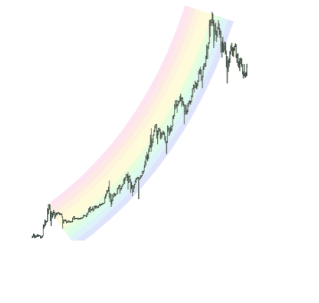
There is one drawn object in SlopeCharts whose equal cannot be found anywhere else: the rainbow curve. This unique element may seem fanciful and fun, but its purpose is quite serious: it allows you to create a smooth arc from one point to another and see where overbought and oversold zones are by way of evenly-separated color segments. Financial instruments rarely follow a smooth arc up or down, but when they do, this curve can be invaluable.
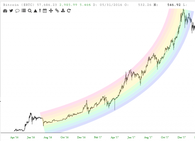
Here, for example, is the rainbow curve applied to a portion of Bitcoin’s history. As can be seen, the ascendency of $BTC was relatively smooth, and the price action tended to bounce from one extreme to another. Having the insight of this rainbow overlay would have provided valuable information about the relative strength of weakness of Bitcoin at any time along the arc.
Drawing the rainbow is just like drawing the quadratic curve. After you have drawn the object, there are four anchor points available to you, which you can use to reposition and stretch the drawn object to your liking.