About half the users who visit Slope are on mobile devices, and we have made a point of ensuring that SlopeCharts on mobile is as useful and productive as it would be on a desktop computer. Here are some special remarks about using charting in your mobile browser, be it a phone or a tablet:
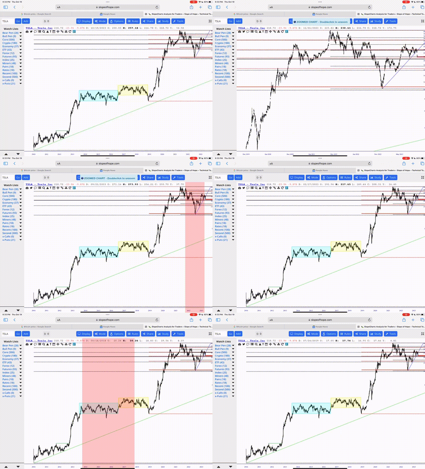
Zoom and Unzoom
Want to zoom in to a particular portion of a chart? Swipe your finger across it. Want to unzoom? Double-tap anywhere on the screen.
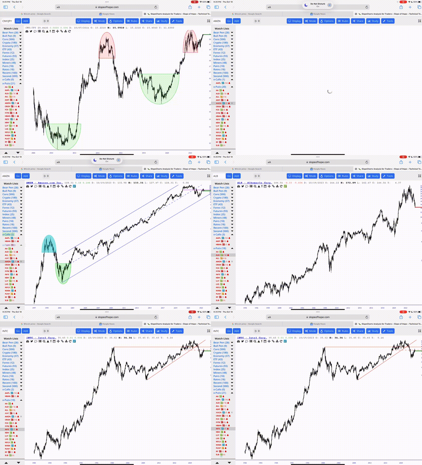
Drag and Drop Symbols
This operates just like dragging and dropping in desktop SlopeCharts, except that you do it with your finger. You can drag and drop from one list to another, or from any list to the chart area itself (which will invoke the chart).
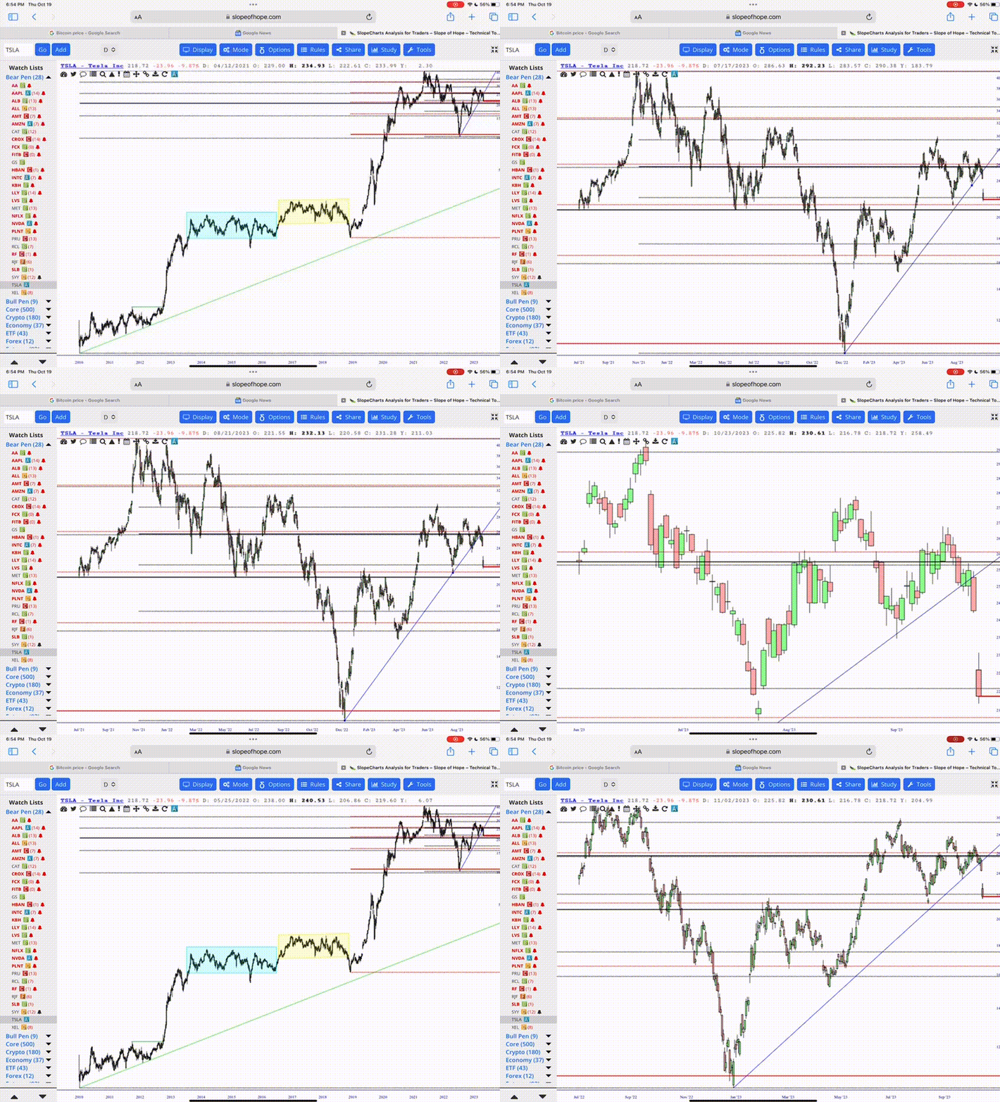
Draw and Modify Objects
Now you can place drawn objects, such as trendlines, horizontal lines, rectangles, or anything else you want, onto the chart with your mobile device. You can also modify any object. If you want to reveal other modifications you can make to an object, just tap-and-hold onto the object with your finger, and a sub-menu will reveal itself.
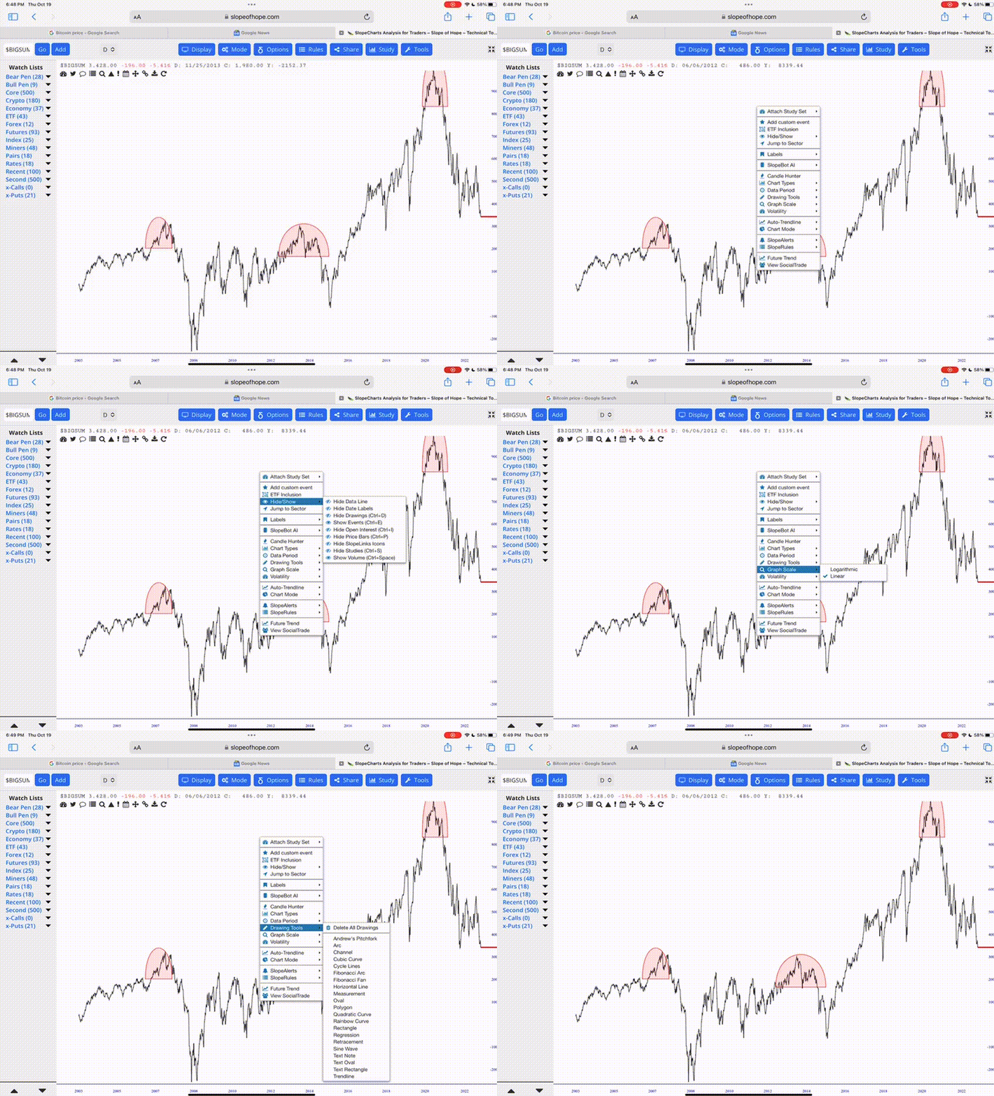
Functioning Menus!
For years, tapping on a menu in SlopeCharts on a mobile device made it appear for a fraction of a second and then vanish. This rather useless behavior has been replaced with the ability to just touch on any menu or sub-menu to reveal its contents which, in turn, allows you to choose any menu item you want to use.

The Right-Click Chart
Obviously there is no mouse, not to mention no right-click, when you’re on mobile. However, the “right-click” menu within the chart area has many useful functions, and you can access this by double-tapping anywhere in the blank space of a chart. (Note: if you are zoomed in, double-tapping will un-zoom the chart, but in regular, un-zoomed mode, it will instead present you the menu).
Navigating Watch Lists
If you have many watch lists, you may find that your screen (especially on a phone) isn’t big enough to show them all. Just scroll the watch list names up and down to find the one you want.
Up and Down
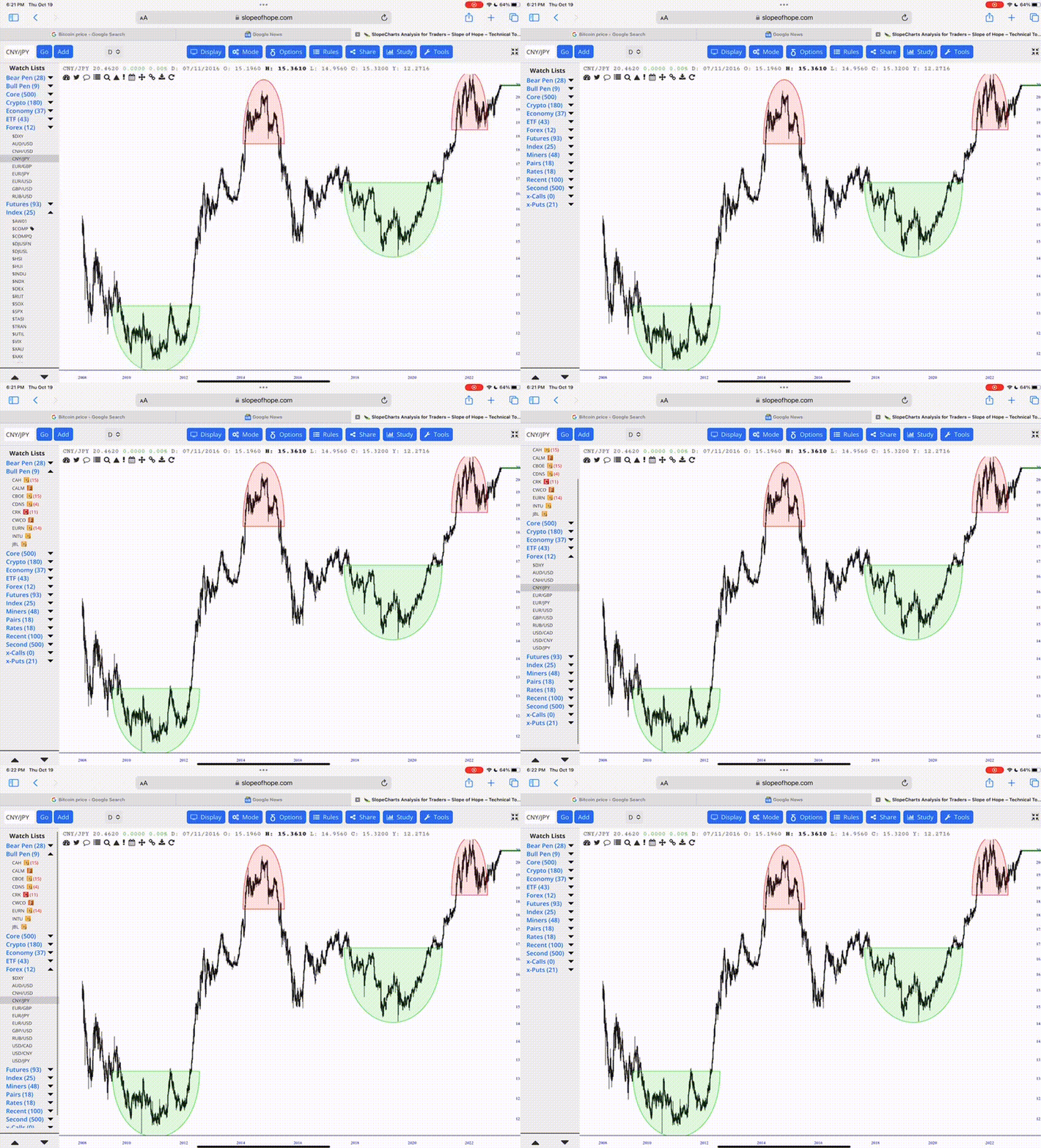
These two buttons are exclusive to the mobile experience, and they appear when a mobile device is detected to accommodate the fact that you do not have a keyboard. The up and down arrows, located in the lower-left corner of the screen, let you move up or down one symbol at a time. This is most useful when you want to thumb through the contents of a given watch list, and you can just keep tapping either up or down to navigate from chart to chart. As you reach the beginning or ending of a list, pressing an arrow again will jump to the next list, if there is one “above” or “below” it.
The Left Data Panel
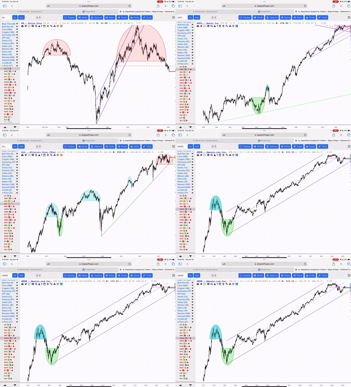
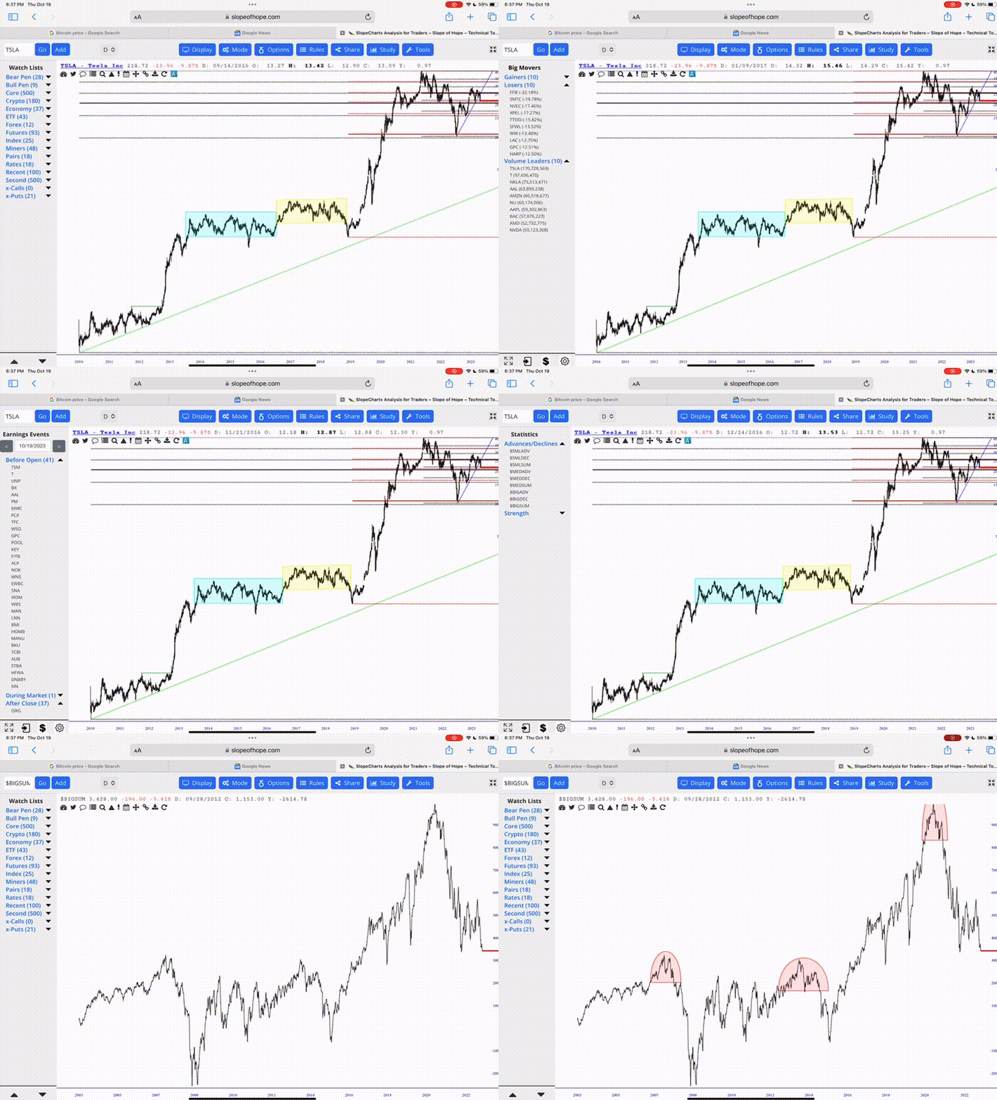
Finally, the leftmost column in SlopeCharts isn’t just for watch lists. It also contains a wide variety of other information, such as the day’s big winners and losers, market statistics, earnings events, and so on. To move from panel to panel, just swipe left or right at the very top (where the “Watch Lists” header text is) and you can move from one class of content to the next.
Keep in mind that if you are using the Slope of Hope mobile app, SlopeCharts is available within it and behaves the same way as described above. The only difference is that, within a mobile browser, you get a little more room since there is no “frame” around the chart as there is within the mobile app. Either way, SlopeCharts acts in the same fashion.
