As with the mineral found in the earth, diamonds are rare and precious, and instances of this pattern can be some of the most powerful predictors of price movement in the realm of technical analysis. This chapter will be rather short, because there are not many good examples of diamond patterns to present, but the four bearish and two bullish charts shown will give you a good idea what to seek.
Definition of the Pattern
A diamond pattern is formed on the left side by a series of higher highs and lower lows and, once past the midpoint, a series of lower highs and higher lows. The security loses its ability to trend (becoming increasing wide in its range) and then begins tightening its range up again, suggesting that it is losing its moorings. This inability to sustain a clear trend is why this kind of pattern often accompanies a reversal, and it is more common for the reversal to happen at a market top instead of a market bottom.
One way to think of a diamond pattern is as a head and shoulder with a v-shaped neckline (for a top) or an inverted head and shoulder with a a-shaped neckline (for a bottom). Although most patterns require a discerning eye that has been trained by experience, diamonds require even more of an “eye”, since they are rather difficult to spot, particularly without the benefit of significant hindsight.
Diamonds which are sloppily-formed generally aren’t worth your attention. As with other patterns, the cleaner the pattern is and the wide a timespan it traverses, the more potent it is as a predictive tool. Measuring the price movement potential of a diamond consists of measuring the spread between its highest and lowest points and then adding that value to the price point where it breaks outside the diamond. Thus, if a diamond spans from $60 to $70, and it breaks down at $65, then you can target $55 for the price movement downward.
For diamond tops, volume usually increases substantially during the formation of the pattern, largely because the amount o f “churn” increases as the bulls and bears struggle over the direction of the stock. One of the benefits of a diamond, as opposed to a head and shoulder pattern (of either variety) is that the signal tends to come earlier. This is because of simple geometry: a price will break below an ascending line (or above a descending line, as the case may be) much sooner than a horizontal line, so the amoun tof move that you can “capture” is that much larger.
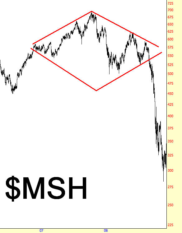
Starting with the example here, the pattern starts forming in May 2007. This chart, of the Morgan Stanley Technology Index, is so strong that it hardly touches any points of the lower trendline. The stock peaks and actually forms a very nice head and shoulders pattern with a neckline beneath $600. The index falls hard, as might be expected with an H&S pattern, and then recovers strongly, climbing back over the neckline (which is not denoted here, as the focus is on the diamond pattern).
Volatility is strong in 2008, as the index dips down hard, recovers partially again, then resumes its weakness. It is at this point that the price level finally pierces the ascending trendline of the right half of the diamond. It does not take the index to lose over half its value, as the $MSH starts plunging with hardly any interruption.
Psychology Behind the Pattern
The psychology of a diamond pattern is best expressed with the idea of a “changing of the guard”. The broadening price action indicates that there is a loss of control of whoever formerly was in control, and the power struggle will either resolve itself as a continuation of the past trend (in which case the diamond will be distorted beyond usefulness) or will consolidate into a decision in the form of a “break” one way or another. The reason the fall from a diamond top is so dramatic is that so many parties have been involved in the maelstrom contained within the increasingly-broad price action, and frustrated bulls will succumb en masse to the price failure.
Example: Oil Services ETF
One of the most widely-traded exchange-traded funds is symbol OIH, which contains oil service companies. The diamond represents a top that marked the peak of the commodities crazy of the first half of 2008 (in which crude oil was about $150 per barrel). Take special note that, once the diamond was broken, the price briefly regained strength and approached the underside of the violated trendline. This is common with patterns, although it only happens a portion of the time. As with other pattern examples, shorting on a retracement (or going long, if the breakout is to the upside) is a more conservative move than going “all-in” during the initial piercing.
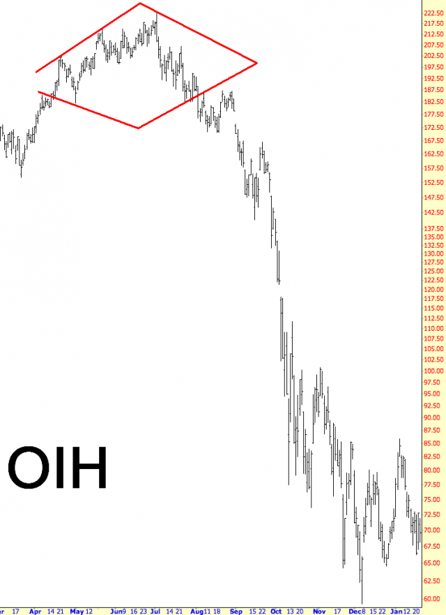
Diamond Start: April 2008
Diamond Break: September 2008
Break Price: $186
Post-Break Price: $59
Percentage Change: -68%
Example: Alpha Natural Resources
Here is remarkable for a couple of reasons: first, the depth of the plunge; and second, the consistency of the price drop. The descent in price takes place with virtually no interruption, making for some very happy bears and some very disconcerted bulls. It also is a poignant example of the importance of having stop-loss orders in place, since convincing yourself that the price is bound to “come back” is often a tempting bit of self-talk.
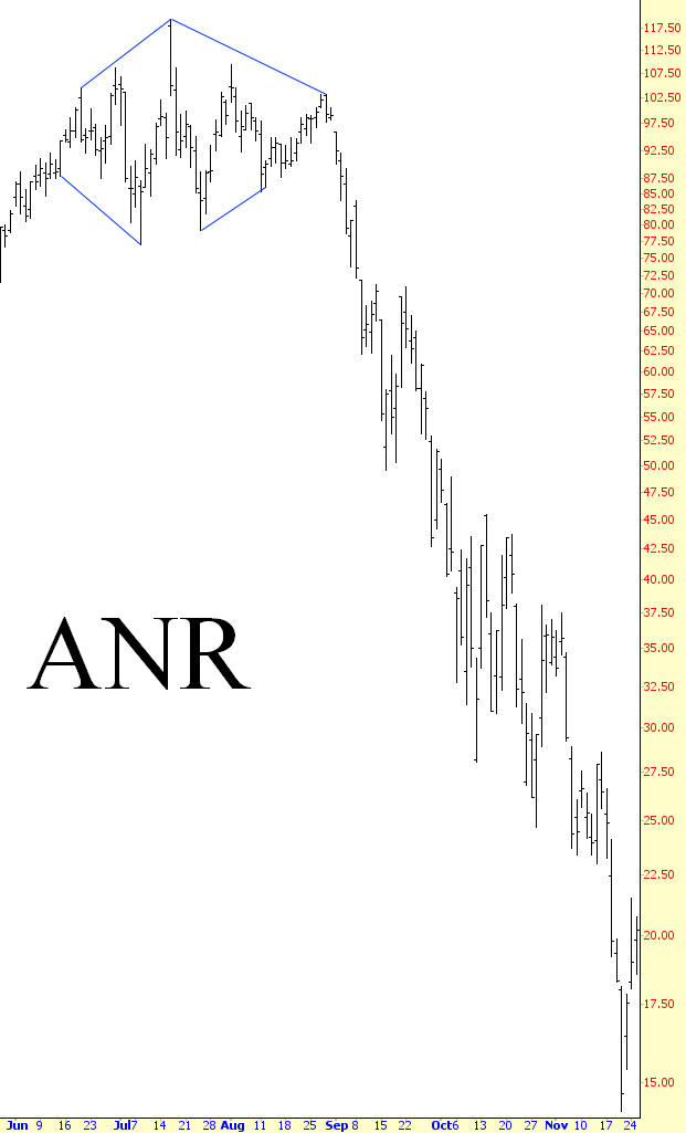
Diamond Start: June 2008
Diamond Break: August 2008
Break Price: $103
Post-Break Price: $14
Percentage Change: -86%
Example: MIPS Technology
Although many of the examples shown are drawn from the period 2006-2010, this example predates this range by a year. The diamond shown is unusually large and has a remarkable number of “touch-points” on the four defining trendlines. The diamond itself is tilted somewhat downward, which is not only acceptable but, in the case of a market top, somewhat agreeable, since the foundation of the stock price is deteriorating, thus providing worse footing for the right side of the diamond.
Also take note that the price had a very clean retracement after the price break. Because of the length, height, and cleanness of the pattern, a person monitoring this chart would have had a very tempting opportunity to sell the stock short (or buy puts on it) at this retraced price level. This example also provides an especially clear demonstration of how the diamond pattern is a close cousin of the head and shoulders pattern, except that it has an angled neckline.
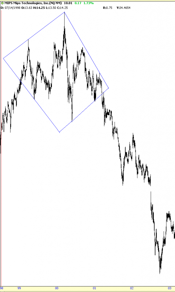
Diamond Start: August 1998
Diamond Break: May 2001
Break Price: $33
Post-Break Price: $1.33
Percentage Change: -96%
Example: S&P 500 Index
This shows an index, the always-important S&P 500. Although divining the direction of a non-tradeable cash index can yield specific ideas which are in fact tradeable (such as buying index options), knowing the likely direction of a broad direction is just as valuable for informing your general disposition.
In other words, if you ascertained, based on this chart, that the S&P 500 was going to head higher, you might not even decide to trade the S&P at all. You instead might use this insight to construct a very bullish portfolio, since a broadly-rising tide tends to lift all boats (and, for bears, the diminuition of security prices makes for a more short-friendly environment). This is also an important example since it shows a diamond bottom, as opposed to the diamond top pattern of the prior four graphs.
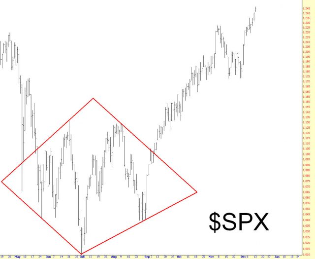
Diamond Start: April 2009
Diamond Break: October 2009
Break Price: $1105
Post-Break Price: $1220
Percentage Change: 10%
Example: Brigham Exploration
We close with another diamond bottom, Brigham Exploration. The rise following the breakout above this diamond is an impressive 60%. The “midline” of the pattern – that is, the imaginary line separating the upper and lower halves – is almost perfectly flat, affirming the cleanness of the pattern, and although volume isn’t shown here, the volume picks up appreciably during and after the breakout, confirming the influx of buying power.
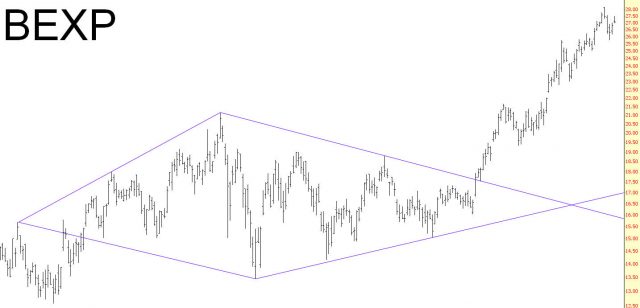
Diamond Start: January 2010
Diamond Break: September 2010
Break Price: $17.75
Post-Break Price: $28.39
Percentage Change: 60%
Summary
The sample set of diamonds in the market is small, but these examples hopefully should be plain enough to make identifying your own patterns possible. The rareness of this pattern is important to keep in mind, since you don’t want to misinterpret normal price fluctuations as a diamond that simply doesn’t exist. The important thing to remember is that if you do indeed find a diamond pattern, pay very close attention to it, because its strength is a welcome counterbalance to its infrequency.
