This section is going to be somewhat different than others since Fibonacci studies – in this instance, Fibonacci fans – are more about finding important support and resistance levels rather than finding a projected target price. Fans are also somewhat challenge since they require a good “eye” to find appropriate charts for their application. Attaining this skill comes with experience, but hopefully the many examples provided in this chapter will provide some of that training.
Definition of the Pattern
Setting down Fibonacci fans on a chart is the easy part: all you need to do is choose a high and a low point for the reference line. The charting program you use will draw the fan lines for you, and it is up to you to decide if those lines are useful to you in your trading or not. I sometimes use the term “Fibonacci-friendly” to state whether or not a given price chart happens to agree with a particular Fibonacci drawn object.
The way the charting program draws these lines is useful to understand. Imagine a reference line being drawn on a chart with the low price at $10 and the high price at $20. Think of this as one line of a triangle. Now imagine a horizontal line projecting from the point at $10 off to the right; this is the second line of the triangle. Finally imagine a vertical line being drawn straight down from the $20 point of the first line; this is the third line of the triangle.
The charting program draws lines, in this instance, from the $10 point to various points on that third line, the vertical line, based on certain Fibonacci numbers. One of the points on the vertical line will be at the 50% point (that is, $15); another will be at the 38.2% point; another will be at the 61.8% point. Most charting programs let you change these values, although it is best just to stay with the default values.
As you are laying down the fan lines, take not whether or not those fan lines seem to have any meaning with respect to the historical price bars. If the prices repeatedly pierce the fan lines and seem to offer little in the way of support or resistance, then the fan lines are not useful to you; they will just be extra noise on the chart that makes your job harder. On the other hand, if you find the prices repeatedly bouncing between the fan lines, you are probably looking at a Fibonacci-friendly chart.
Whether your reference line is ascending or descending depends on the general trend of the chart. If you are working with a broad downtrend, you probably want to start your reference line at a high price and end it, later on the timeline, at a low price. The reverse applies with a stock in a general uptrend. You will see examples of both uptrends and downtrends in this section.
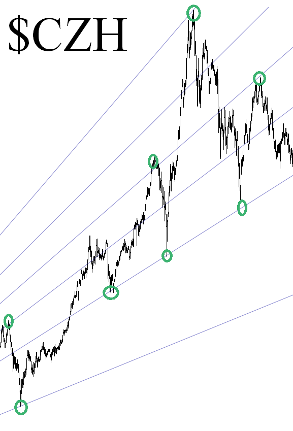
This chart provides a good example of a very Fibonacci-friendly chart. This symbol, $CZH, is the China index, and as you can see from the many circled point, this index had a great amount of respect for the otherwise invisible fan lines. Over and over, in spite of wild fluctuations, the index stopped hard at various fan lines and reversed direction. The starting point for the reference line is much earlier than this graph shows, indicating how long-lived the impact of fan lines can be.
Psychology Behind the Pattern
This is a difficult subject to address for anything using a Fibonacci study. Some believe that numbers associated with Fibonacci, particularly the Golden Ratio, have great import in nature and social dynamics, whether the individual participants are aware of it or not. Others believe that these studies are self-fulfilling prophecies, since enough traders are watching the same pattern that they create the buying and selling pressure necessary for prices to “obey” the pattern. I personally dismiss this theory, since the percentage of traders in a particular security that are (a) using a Fibonacci pattern as the basis of their decision (b) are using it properly (c) are using the same pattern as a large number others is going to be minute and inconsequential to trading at large.
Whatever the basis, the fact is that it probably doesn’t matter why it works when it works. The key is to be able to discern where the pattern has meaning and where it is simply cluttering up a chart that shouldn’t have a fan drawn on it in the first place.
The examples in this chapter will contain information on just the starting and ending dates for the high and low points, and nothing else. There will be no price projections, percentage changes, or any other irrelevant data. The dates are provided simply so you have the option of drawing the same patterns on your own chart and interacting with the historical events on your own.
For clarity’s sake, the highest line (in the case of ascending fan lines) or lowest line (for descending patterns) will be called the reference line. The one next to it will be called the second line; the next one will be called the third; and so forth. Therefore, in an ascending fan line, the second-highest fan line will be called the “second”, whereas in a descending pattern, the second-lowest line will be called the “second”.
Example: Eurodollar
The chart of the Euro (more specifically, the ratio of the Euro to the US dollar, which is the most widely-followed and heavily-traded of all the currency pairs) is shown with its reference line spanning from late 2000 to early 2005. Although the price pierces the reference line (which is the highest one) several times, it reverts to the second-highest line repeatedly.
Take note of what happens in 2005 as the EUR/USD begins falling. Although it has been supported by the second line repeatedly, once it breaks that line, it moves rapidly to the third. At that point, it stabilizes, illustrating the value of this pattern (since it would provide a signal for a person to go long). The price crawls along this third line but, a few weeks later, fails that line as well and drops to the fourth. At this point, EUR/USD starts a steady climb, moving to the highest levels of the chart.
Much later, by 2008, the Euro is so strong that it manages to get above the third line again. It remains there for a couple of months and then dramatically plunges back through this line back to the fourth line.
The fascinating thing about this chart – – and this happens frequently with good fan lines – – is how the prices stay confined between lines. A person who went long the Euro in early 2006, based on support at the fourth fan line, would have enjoyed a long bull market in this currency. Indeed, even with the big plunge at the right extreme of this chart, there was no real violation of the uptrend.
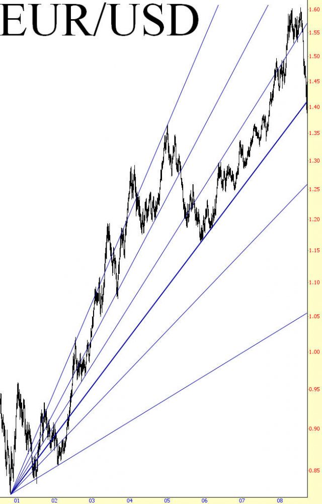
Pattern Start: 7/5/2001
Pattern End: 12/29/2004
Example: American Electric Power
This is a close-up view of symbol AEP showing the oft-seen behavior with fan lines of the prices “clinging” to each line before slipping to the next level. Fan lines can behave as support and resistance, but they can also behave like magnets to nearby prices.
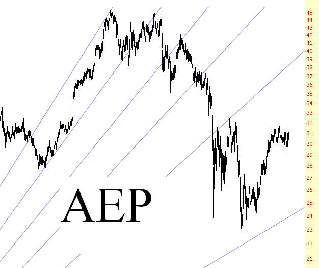
Pattern Start: 10/10/2002
Pattern End: 4/25/2007
Example: Gold Bugs Index
Even during dramatic changes in price, fan lines can serve as important markers of turning points. In 2008, precious metals fell in value across the board, and the widely-watched gold bugs index, shown fell from 519 to 150 in a matter of months. As you can see in the future, the lowest point in this plunge was almost perfectly stopped at the lowest fan line. There were only three days – October 24, 27, and 28 – in 2008 in which the price managed to get below that line even a little, and the amount it penetrated was so small as to be inconsequential.
What’s particularly remarkable about this is that the starting point for this set of fan lines was nearly eight years before this free-fall even took place. The two price points in late 2001 and early 2008 (the low and high price extremes, respectively) were all that was required to establish these lines which eerily confined the price plunge to the lowest fan line.
Added to this, although it is not shown in this graph, the 4th and 5th fan lines acted as solid boundaries for $HUI for years to come after the price recovered.
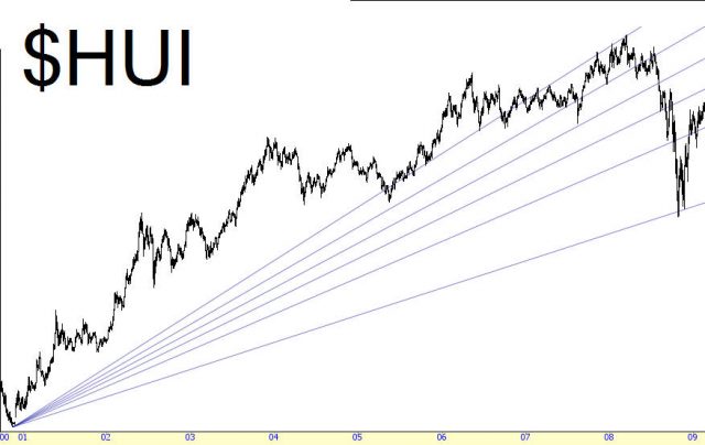
Pattern Start: 11/13/2001
Pattern End: 3/17/2008
Example: Dell, Inc.
Up to this point, the examples have been of ascending fan lines. This shows instead a series of descending fan lines whose reference line ranges nearly a decade, from early 2000 to early 2009. This chart shows Dell in a very broad downtrend, and these lines would be useful to (a) bulls looking for an opportunity to “escape” the stock at a better price; (b) bears looking to short the stock upon its reach the underside of any given fan line. Although it has not happened in this graph, it would also be a good way to watch for a fundamental shift in the stock’s direction, in case the prices start piercing successfully higher fan lines.
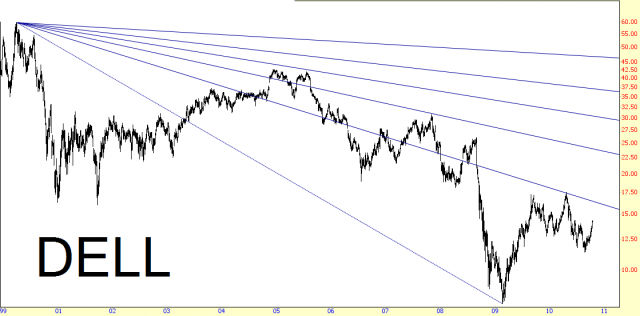
Pattern Start: 3/22/2000
Pattern End: 2/20/2009
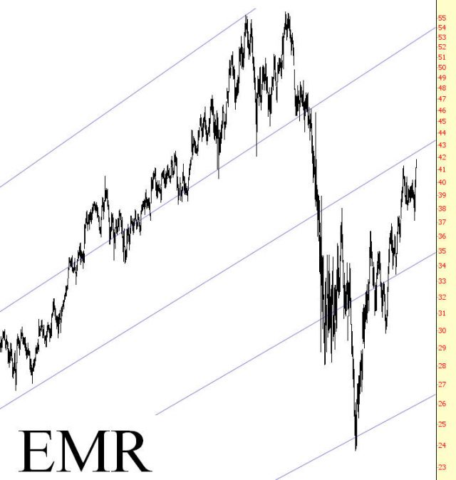
Example: Emerson Electric
There are a number of examples in this section which will be shown in pairs – the first graph being a long-term view, and the second being a closer, shorter-term view.
Emerson Electric in a very long-term uptrend.
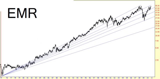
In spite of this uptrend, the stock is obviously prone to occasional bouts of weakness. Well-drawn fan lines can give those interested in owning the stock at more attractive prices an objective means to assess when the stock is relatively “cheap”. The stock cuts through three fan lines before finally coming to rest at about $24, which marks an important low.
Pattern Start: 10/4/1974
Pattern End: 12/4/2007
Example: Caterpillar
One of the challenges in using fan lines when trying to find buy and sell points is that you do not know which line, if any, will create enough support or resistance to stop the price. In EMR’s case, it stopped short of the lowest fan line, whereas in Caterpillar’s case fell, for the first time, to this lowest level.
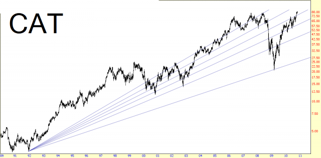
Looking closer, you can see how Caterpillar did try to find support at the second-lowest line; it double-bottomed in this vicinity, climbed to the underside of the fan line immediately above, and then fell hard to the lowest line without even pausing. Here again, though, we see the remarkable sway these fan lines can have over prices; there was only one day – March 3, 2009 – in which prices descended beneath the lowest fan line, and that was by mere pennies. This marked the very lowest level for CAT, which made a V-shaped bottom and went on to a 350% gain in the coming two years.
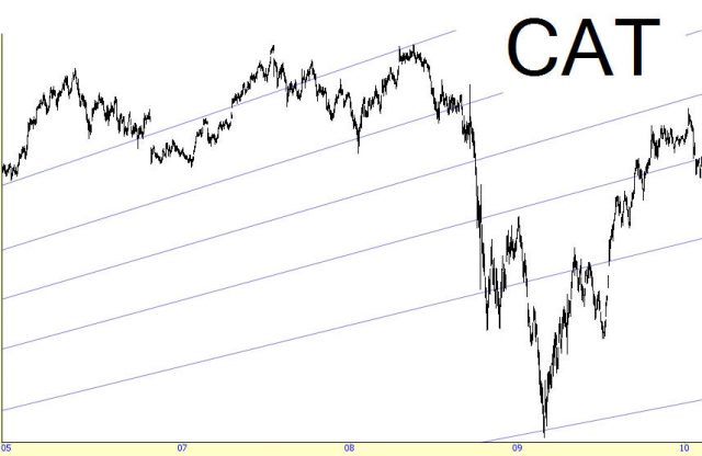
Pattern Start: 11/26/1991
Pattern End: 5/19/2008
Example: Cubic Corp.
Whether a stock is moving up or down, its fan lines can offer you key support and resistance points irrespective of the stock’s current direction. This shows the price chart for Cubic Corporation
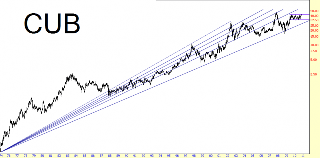
The stock pushed strongly higher up to May 2002, then it began drifting sideways for many years. Upon drawing of this fan line set, you would see the many instances of the prices bouncing off the lines (particularly the 5th line, which behaved as strong resistance from 1998 through 2001. As the stock moved sideways, this same line behaved in the role of support, and it was finally violated late in 2004. It’s evident from a chart like this how indicative well-placed fan lines can be for traders.
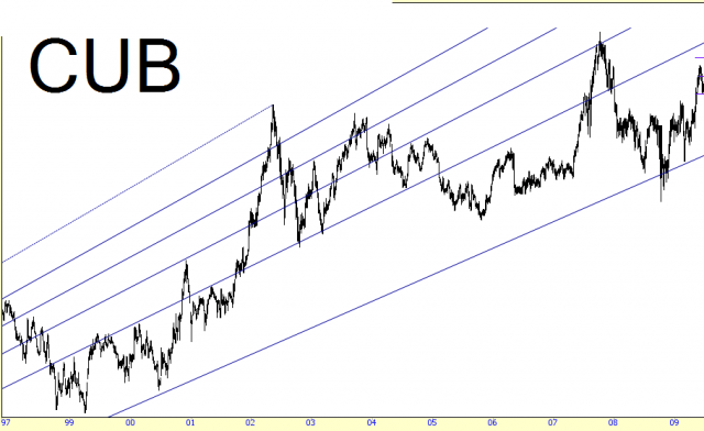
Pattern Start: 12/30/1974
Pattern End: 5/14/2002
Example: Essex Property
Symbol ESS combines both fan lines and a descending trendline. There is, of course, no reason not to use multiple drawn objects on a chart to give you guidance as to where key levels of support and resistance will be. Simpler charts tend to be better, but if adding additional embellishments to the graph can give you helpful insight in your trading, there is no reason to leave those extras out.
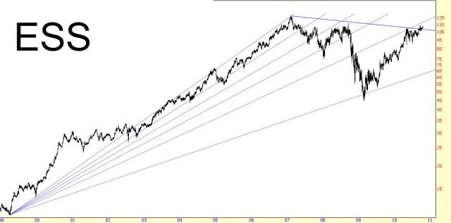
Pattern Start: 3/26/1999
Pattern End: 2/8/2007
Example: Federal Realty Investment Trust
One of the peculiar features of fan lines is that even when they confine prices during long uptrends, they also often provide insight to important price levels when the stock turns downward. See a fine example of this. From 1999 to 2007, symbol FRT steadily moved higher, and in the final several years of its bull run, its price bounced magnificently between the reference line and the second line.
After February 2007, the stock began a steady downward path, and the fan lines (which would have been available to a trader at this time, since the starting and end points of the price extremes were already established) served as superb support levels, over and over again. It would have been hazardous to buy such a stock during a downtrend this long-lasting, but these support levels would have been helpful to bears in a couple of respects: one, they would have suggested good prices at which the stock could be sold short; and two, they could have provided important signals when the price movement was going to accelerate downward, as successive fan lines were violated.
Most important of all, once the lowest fan line was touched, the price had bottomed out and started moving smartly higher. Take a moment to consider how remarkable this is – – fan lines, drawn on two points in 1999 and 2007 – – “predicted” almost to the penny where a stock would turn around two years later.
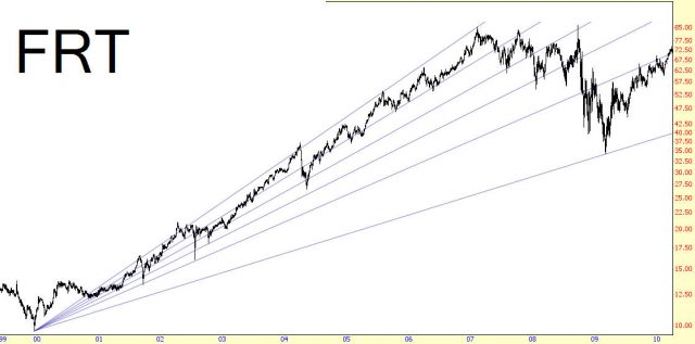
Pattern Start: 12/15/1999
Pattern End: 2/7/2007
Example: Goodrich Corp.
The tire manufacturer Goodrich bounced its way from a top to a bottom, as illustrated . From the peak in late 2007, the price swept down to its 3rd fan line, bounced up to the underside of its 2nd; it then fell to its 5th fan line, bouncing to the underside of its 4th; it finally fell to the lowest fan line, bounced to the underside of the 5th, and fell again hard, dropping slightly beneath the lowest line. This illustrates that the stock price may not stop hard precisely at the line, but even if it does so, that suggests a situation so oversold that the price is almost certain to make a rebound soon, as it did here.
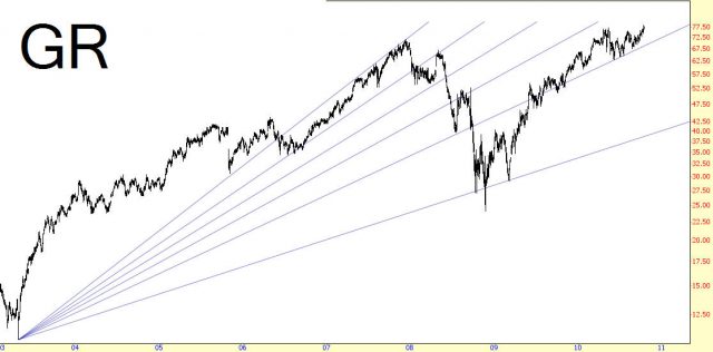
Pattern Start: 4/28/2003
Pattern End: 12/11/2007
Example: Apple Inc.
The stock of Apple was one of the most remarkable turnarounds in recent stock market history. From a low in April 2003, the stock produced a gain exceeding 5,000% over the next eight years, and during that entire time, the stock was remarkable well-confined to its fan lines.
For those who felt they had missed out on an amazing opportunity by not buying it in 2003, the financial crisis gave them an excellent second chance, aided by fan lines. In March 2009, the price came within a dollar of the lowest fan line. This was a strong signal that the price was probably about as low as it was going to go, and even if it did fail this lowest line, the prudent trader who had bought AAPL based on this low line would have known that something core had changed about the stock and it was time to sell the long position at a modest loss. He would not have faced this, however, as the price ascended hundreds of percent once that line that been threatened.
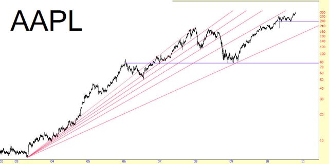
Pattern Start: 4/17/2003
Pattern End: 12/27/2007
Example: Alexandria Real Estate
There have been a number of examples of prices bouncing hard off low fan lines, but this surely it not always the care. Alexandria Real Estate’s stock (with the exception of one unusual spike higher) meandering around its lowest fan line. Buyers accumulating at this level must have had to practice a lot of patience in order to stay with the position. The fan line, however, did act as a very strong magnet, even though month after month of frustrating price inaction was taking place.
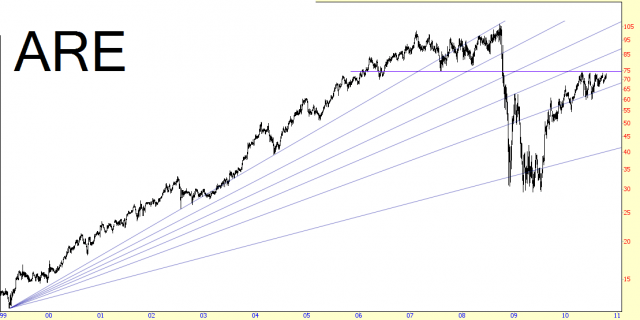
The good news for those owners was that at least the price never fell away from this line, and finally by July 2009 it was on its way higher, as shown.
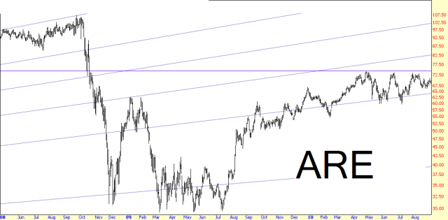
Pattern Start: 3/26/1999
Pattern End: 9/19/2008
Summary
Fan lines are fascinating almost to the point of seeming magical, at least for the charts where the price action seems to conform to the lines. If you encounter a chart which has multiple instances of the lines providing support and resistance, you probably will find that future price action will likewise do the same.
Many charts have little relationship with Fibonacci fans, and the tool won’t provide you any additional insight. For charts that are meandering either broadly higher or lower over long stretches of time, however, you should try to lay down a fan line based on the lower and upper price extremes to see if you can identify how “friendly” the chart is to the pattern. It may seem an unusual way to go about things, but this trial-and-error method is effective when dealing with something this esoteric and unusual.
This section has given you a number of caveats with respect to fan lines; among them:
- Pay special attention when a price is at the same price as a fan line; it is either prone to changing direction at that point, or it is threatening to violate that level, implying a strong move in that direction;
- Don’t hestitiate to try two or three fan patterns on a chart, usng different extremes of highs and lows; you may find some interesting relationships among these patterns;
- When the price action violates the fan lines too often – in other words, if prices seem to pay no heed to the lines – it may be time to delete the object, simply because it has lost its meaning and effectiveness on the chart.
Not many people are able to use fan lines effectively, but by carefully studying the examples in this section (and, if you have a charting tool equipped with this object, trying out these examples on your own), you will help train your eyes and your mind to discover new instances in your own trading.
