Probably the simplest, cleanest, and easiest-to-identify pattern in technical analysis is the rounded bottom (also called the saucer bottom). As the name suggests, this patttern indicates the price action has a curve at the bottom of a price decline, setting up for a reversal to the upside. Some of the most powerful and long-lasting price movements take place after a rounded bottom, and they usually represent relatively safe trades since the market has spent so much time hammering out a bottom and clearing bears and nervous holders out of the security.
Definition of the Pattern
At the risk of oversimplifying, the definition of a rounded bottom is a price pattern which gradually decreases in price, stabilizes for a while, gradually increases in price, and then finally breaks above resistance on strong volume. Figure RB-1 provides an example with the security RAX (Rackspace Hosting, Inc.). The price slowly moved from about $22 to $16 over a period of half a year, then reversed and started slowly moving higher. In September, the stock overcame resistance at the $22 level on strong volume and went on to a 50% price gain over the coming several months.
This example shows the two core elements of this kind of pattern – – a clean, well-defined base that resembles a relatively smooth saucer, and a “punching through” of the price on hearty volume. This volume surge affirms renewed interest in the stock, since all recent buyers are now enjoying a profitable position.
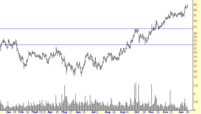
(FIGURE RB-1: Strong volume on the breakout isn’t required, but it greatly increases the chance of good profits later.)
Psychology Behind the Pattern
The psychology behind a mass of buyers holding a security at a particular price is important, and in a way it is the very basis of technical analysis. Generally speaking, traders prefer profits to losses. Owners of a security whose price moves higher will feel increasingly positive about that stock and will be compelled to buy more, because their profits are increasing. If there is a large mass of such buyers, this kind of buying can feed on itself.
A stock which has been trapped within a small price range for a long term will have two important ingredients for a potential upside move: (1) a large quantity of buyers within that price range, eager to add to their position if the stock breaks out of the range, and (2) a strong support level at that price range, which will create a firm floor for prices if an initial breakout weakens. If a stock breaks above its price range and then starts sinking, that same mass of owners of the stock is going to be reluctant to sell their holdings as the price softens, which will cause the price to firm up as sellers dry up. This group of security owners within that price range is a potent force for both pushing the stock higher as well as protecting the stock from falling through the well-established price range.
One nice feature of breakouts is that they often give traders a second change to get in after the breakout. This temporary softening in prices after the breakout is known as a pullback, and it is caused by a portion of the owners of the stock anxious to bank their modest profits on their stock’s newfound price activity.
Imagine a hypothetical group of 1,000 people, each of whom owned shares in a company that had been trading between $10 and $12 for years. If the stock finally breaks out and hits $15, you can understand the excitement of these owners, since they have been holding a do-nothing stock for years which is finally showing signs of life.
Although most of these owners may be patient enough to let their profits build, there is going to be a subset of this group that will want to get out of the stock immediately and take their gains. The psychology behind this group is understandable too – after all, their stock has done absolutely nothing, and now it is giving them an opportunity to get out with some extra cash. So some people – let’s say 100 out of the group of 1,000 – immediately places orders to sell the stock at the current market price.
This influx of selling is going to cause the price to soften, at least temporarily. It usually will head back to the upper end of its former trading range, at which point selling will dry up since any newfound profits the group enjoyed have now vanished, eliminating the compulsion to sell the stock for a quick profit. It is important that the price remain above the breakout level, since doing otherwise invalidates the pattern’s integrity.
This temporary softening of prices is the pullback, and those people watching the stock chart closely can take advantage of this by acquiring the stock at the “pre-breakout” price. It is an especially attractive opportunity since the stock has, in a manner of speaking, tipped its hand about its price direction since it has finally broken out of its price range.
Example: Cal-Maine Foods
The examples in this section sometimes represent patterns that span years. By no means does this suggest that rounded bottoms need to be in place over very long stretches of time. The visual aspects of the pattern should be roughly the same whether you are looking at price action over a ten-year or a ten-minute span of time.
The first example, Cal-Maine Foods, belongs to the “multi-year” category. The saucer spans over six years (the chart in RB-2 shows only the rightmost half of it). The stock meandered for year after year, but when it finally broke above $2.65, volume picked up appreciably. By way of example, a typical day for this stock was June 25, 2003, when it traded 7,600 shares. By December of the same year, there were days when nearly 5 million shares were being traded.
The price itself had a fantastic run-up before easing back, climbing 646% by February 2004, which was only eight months after the breakout.
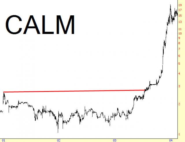
(FIGURE RB-2: Cal-Maine enjoyed a gigantic, triple-digit percentage runup in just eight months after breaking out from a six-year long saucer pattern)
Pattern Start: March 1997
Pattern Breakout: July 2003
Breakout Price: $2.65
Post-Breakout High: $19.96
Increase in Value: 646%
Example: Mechel Oao
The next chart, RB-3, is a good lesson in considering how tolerant to be of pullbacks. The saucer pattern spanned more than a couple of years, and finally, on April 4, 2007, the price broke above the horizontal line representing resistance. The problem, though, is that the price kept moving above and below this line repeatedly until June 13, at which time it broke higher again, this time to a new high by July 12, and then it started softening again. By August 16, it was yet again below the breakout line, having lost about 30% of its peak value.
Those who had bought the stock on the initial breakout and used a conservative stop-loss level would have been stopped out of the position promptly. Those who kept trying to get into the security, only to be stopped out repeatedly, would be generating little more than commissions for their broker and losses for themselves while the stock oscillated around the important $11.36 price level.
Looking back, we now know that the August 16 low was the bottom price for the stock as it began its true ascent, quintupling in price by May 2008. The vital lesson to take away from this is that nowhere is it written that once a pattern is complete that its price will absolutely not going beneath that breakout level again, only to ultimately fulfill its potential. There’s no question that the saucer pattern of MTL was well-defined and, with hindsight, we know it was terribly profitable. What must have been maddening for those trying to trade this, however, was that the stock spent April through August noodling around its breakout price and confounding bulls and bears alike.
The solution to this problem , which is to use much wider stops, carries with it a cost, since there is also no guarantee that having liberal stop-loss levels will ultimately reward you with a good price. After all, MTL’s drop beneath its breakout level could have been a signal that the price was heading down to $7 again. The prudent thing to do is respect the price line, but there’s no harm in continuing to monitor a chart like this on a regular basis to see if, as in MTL’s case, it eventually shakes off the selling and begins steadily moving in the intended direction.
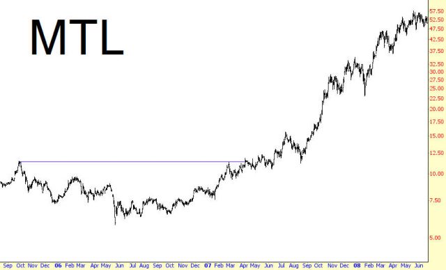
(FIGURE RB-3: Mechel Oao providing a confusing period for traders as it kept violating its breakout level for months before finally pushing higher.)
Pattern Start: October 2005
Pattern Breakout: March 2007
Breakout Price: $11.36
Post-Breakout High: $57
Increase in Value: 402%
Example: Sina Corporation
In sharp contrast to the prior example, Sina Corporation (symbol SINA, shown in Figure RB-4) broke above its saucer on October 28, 2002, and never came close to violating its breakout level. A convincing argument in favor of owning this stock was the volume increase on that day. The prior trading day, October 25, there were 56,000 shares traded. On October 28, the breakout day, 1,111,000 shares traded.
The cleanness of the pattern and the surge in the volume after the breakout were very positive signs for the bulls, and this is one of the more extraordinary examples of how much a stock can moved based on these advantages. Between October 2002 and January 2004, SINA moved up an incredible 1,736% before it began to retrace any meaningful portion of its gains. This is the kind of eye-popping return that can make technical analysis so exciting.
(FIGURE RB-4: This is an exceptionally clean saucer bottom)
Pattern Start: February 2001
Pattern Breakout: October 2002
Breakout Price: $2.56
Post-Breakout High: $47
Increase in Value: 1,736%
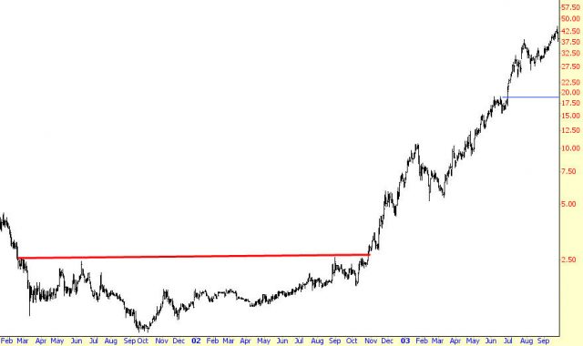
Example: Agrium
Agrium, shown in RB-5, is a bit unusual in that its breakout line is tilted. An upward-tilting line is not only not a problem for a saucer; it’s actually a positive, because it suggests subtle strength underneath the stock that is easing prices higher even while the pattern is being formed.
As with RB-3, however, AGU generated the same challenge for traders, since between April 29, 2004 and May 19, 2004, it dipped below its breakout level. Had a person been stopped out of their position, they would have had a small loss, but once the stock regained its footing later in 2004,it would have been acceptable to re-enter based on the renewed breakout.
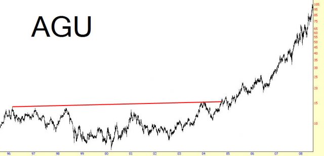
(FIGURE RB-5: The slightly upward-tilting breakout line is bullish for the stock)
Pattern Start: February 1996
Pattern Breakout: October 2003
Breakout Price: $13.25
Post-Breakout High: $105
Increase in Value: 692%
Example: Gold
The exchange-traded fund for gold, symbol GLD, was introduced to the market in November 2004, and since that time is has become one of the most consistently- and widely-traded financial instruments in the United States. Funds such as this provide a highly liquid mechanism for participating in commodities markets without actually dealing with the peculiarities and leverage of the futures markets.
The saucer itself began forming almost immediately after the initial public offering, and as shown in RB-6, the breakout occurred on September 15th with a healthy increase in volume. GLD pushed a little higher, then it eased gently back down to its breakout level again on November 4. This represents an ideal opportunity to buy, because the stock has already demonstrated its ability to move higher (in this case, to lifetime highs) on stronger volume, and it is affirming its support level, thus giving you a safe stop-loss price. Even though the initial gain of 27% for GLD isn’t as eye-popping as some of the other examples in this chapter, it only took a few weeks to get to that level, and gold itself went on to much, much higher prices in the years that followed.
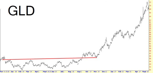
(FIGURE RB-6: This is a very clean retracement back to the breakout line)
Pattern Start: December 2004
Pattern Breakout: September 2005
Breakout Price: $45
Post-Breakout High: $57
Increase in Value: 27%
Example: Illinois Tool Works
Symbol ITW, shown in a multi-decade chart in RB-7, sports a 479% rise in price after its saucer breakout. What is especially interesting about this instance is how much farther the stock went in the years to come. The gains from the initial rise are measured only until 1987, since a significant drop in the market represented the first meaningful downturn in price for ITW (even though the position was still very profitable). As impressive as the quintupling in price was, the stock went on to repeated that performance several times more through the 1990s, as its percentage change entered the quadruple digits.
The main point in this example is that rounded bottoms are not only valuable for the short- and mediumn-term gains they provide, but they are often harbingers of the kinds of generation-long uptrends that can turn a portfolio from simply profitable to life-changing.
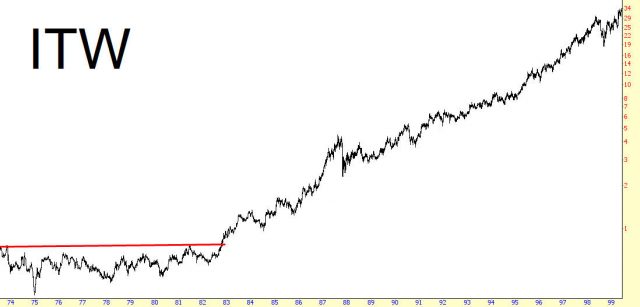
(FIGURE RB-7: This very long-term pattern illustrates that even a decade-old saucer can have tremendous power)
Pattern Start: March 1973
Pattern Breakout: October 1982
Breakout Price: $0.75
Post-Breakout High: $4.34
Increase in Value: 479%
Example: Merck
It took several attempts for Merck to exceed its $1 (split-adjusted) resistance level – the summer of 1981, 1983, and then – at last – 1985. It may seem hard to believe, but this breakout presaged an era for this security that saw its price rise over sixty-fold by its peak in 2000. On a much shorter timeline, it made a 343% move by September 1987, which was the first time it experienced anything that might have been considered a pause in its ascent.
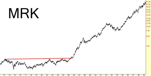
(FIGURE RB-8: The stock went on to much greater gains than the 343% rise of the first wave higher)
Pattern Start: February 1973
Pattern Breakout: March 1985
Breakout Price: $1.00
Post-Breakout High: $4.43
Increase in Value: 343%
Example: Murphy Oil
The other examples in this section exhibit fairly good symetry between the left and right halves of the saucer. This is not a requirement, however, as RB-9 illustrates. In this instance, the climb higher for prices was a slow, arduous affair. What’s more important than the length of time it took is fact that the $5.64 price level was respected as a resistance level. Although this saucer could have broken up much earlier, such as 1990, and still have been a perfectly good saucer pattern, it took an additional six years to hammer out a meaningful base.
It should also be mentioned that, even after the breakout, the stock experience a substantial drop in 1998, but this drop never sent prices beneath the breakout price. The price levels you use as your stop-loss prices are on a chart-by-chart basis, so it is unknown whether your own position would have “survived”such a serious dip in prices. But a person willing to stay in the position, so long as prices were above the initial breakout level, would have held on to this security for the long haul.
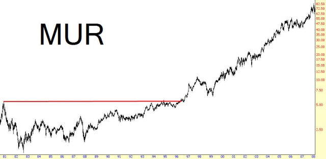
(FIGURE RB-9: This stock had a substantial pullback in the late 1990s, but the price still did not dip below the initial breakout level)
Pattern Start: November 1980
Pattern Breakout: April 1996
Breakout Price: $5.64
Post-Breakout High: $87.5
Increase in Value: 1,451%
Example: Whole Foods Market
The organics-oriented grocery chain Whole Foods Market came public in 1992, and from 1998 to 2001 it formed a well-defined saucer pattern which took more time moving up (1999-2001) than it took going down in the first place (1998). The interesting thing about this breakout was the length of time that the retracement took.
The initial breakout gave the stock about a 44% increase in price within eight months, but then it started succumbing to overall stock market weakness and hit a bottom on July 24, 2002, having lost all of its post-breakout gains. What’s amazing is that it retraced to its breakout point perfectly, even though it did so many months after the fact. This provided a superb opportunity for newcomers to the stock to enter a long position and – for those fortunate enough to have made money on the initial 44% climb – to take the proverbial second bite at the Apple. By retracing, but not violating, this line, the stock affirmed the importance of that price level as support.
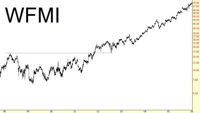
(FIGURE RB-10: Here is another example of an almost perfect touchpoint on the breakout line)
Pattern Start: March 1998
Pattern Breakout: October 2001
Breakout Price: $16.70
Post-Breakout High: $74.00
Increase in Value: 343%
Summary
Of the many patterns described, the rounded bottom is one that deserves more attention than most of the others. It is easy to identify, provides a clean stop-loss level, and can precede some dazzling price performance. Keep in mind also that this pattern doesn’t necessarily have to appear at the bottom of a long bear market. It can serve as a continuation pattern as well (that is, an ascending stock can pause for a while as it shapes a saucer before continuing higher). Lastly, pay close attention to volume; nothing affirms a breakout better than a large number of traders piling on board.
