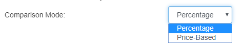
SlopeCharts not only has comparison charts, but it has two distinct styles of comparison charts, each with their own purpose and value. One style is percentage-based (which can compare as many symbols as you like) and the other is price-based (which lets you compare two symbols, each of which will have its own independent price axis). You can choose what style you would like from the Preferences menu, in the Appearance tab:
We will examine each comparison style separately, beginning with the percentage comparison, With this, you can easily compare two, three, four, or five different symbols to one another simply by entering whatever you wanted to compare, separated by commas. You can watch a video about this feature by clicking here.
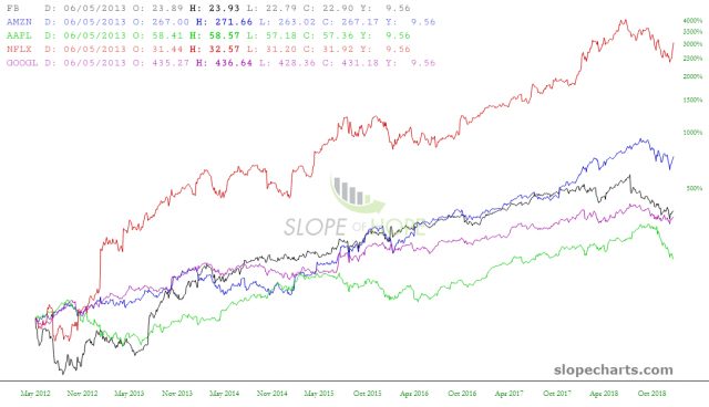
For instance, perhaps you would like to examine the relative price performance between the “FAANG” stocks, so you would enter FB,AMZN,AAPL,NFLX,GOOGL in the symbol entry and click Go.

After you have done so, SlopeCharts will present to you, on a percentage change basis, each of the symbols, each one differently-colored. A key showing which symbol matched which color will be displayed, and as you move the cursor, you will be shown the percentage change on each particular date for every symbol displayed.
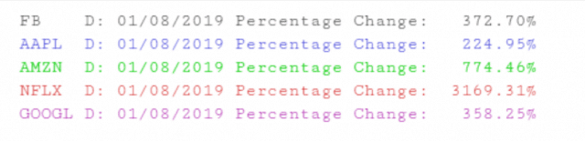
Here is a closer look at the percentage key:
Just as you can save individual symbols to watchlists, you can also save groups of symbols. You save the bundle of compared symbols the same way as a regular symbol, just by clicking the Add button and choosing in which watchlist you’d like to store the symbols.
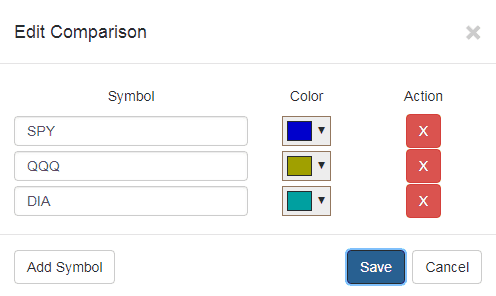
A dialog box will appear allowing you to do four different things: alter the symbols used, change the color for each symbol, delete any symbol, or add new symbols. Once you are finished with any changes, click Save (or just click Cancel to change nothing).
The other style is Price-Based, and it is altogether different than Percentage. With this style, each chart is presented independently, yet overlaid. One chart will adhere to one y-axis (that is, a price axis) on the left side, and the other will have its own y-axis on the right side. The colors of the lines and axes will correspond to one another so you can easily identify which is which.
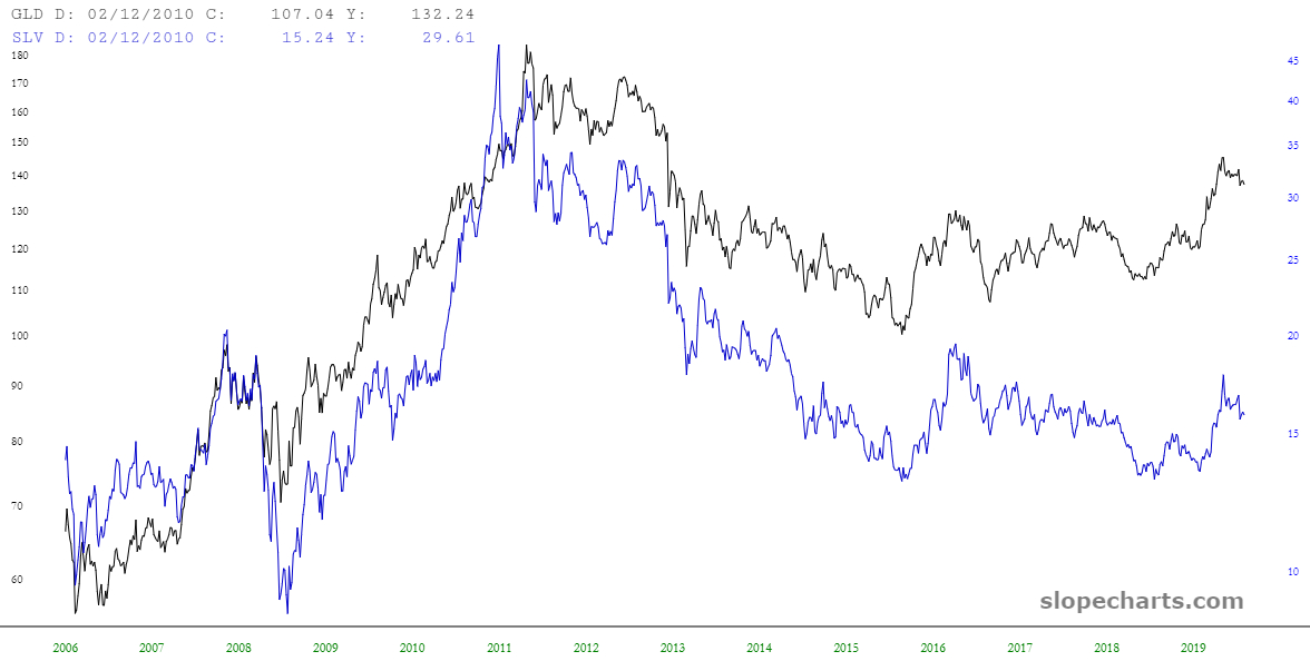
Below is an example, comparing gold with silver (via the funds GLD and SLV). Although these financial instruments have vastly different prices, they are overlaid with separate axes, making them easy to compare. You can seek out divergences, convergences, discrepancies in direction, and so on. To get this chart, you would simply enter “GLD,SLV” into the SlopeCharts symbol entry, so long as your Preferences are set properly for price comparison.
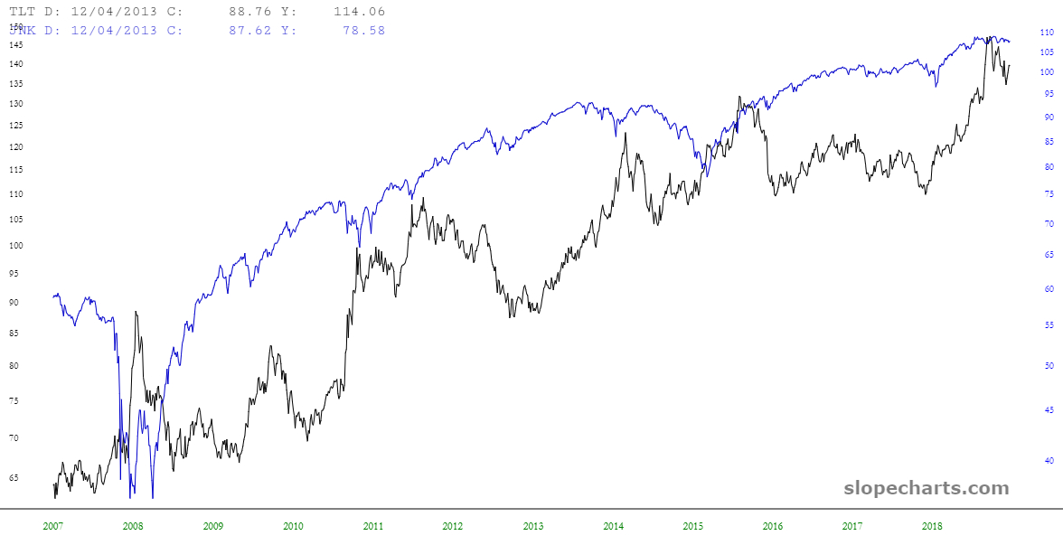
Here is another example, this time using symbols “TLT,JNK” (thus comparing high-quality treasury bonds and a fund comprised of “junk” bonds). Notice how, over many years, these two instruments diverge and then converge. Taking note of this relationship might lead to some interesting trading ideas, based on the assumption that this pattern continues into the future.
One final note with respect to this feature is that, even if you are in Price-Based mode, SlopeCharts will accept three symbols or more as a request for percentage-based charts. The reason is that there can only be two symbols for a price comparison, so your entry of three or more symbols is accepted as the alternate style of comparison.
