Price cones are an integration of price data and volatility data to illustrate the market’s perception of a financial instrument’s likely future price range over the next 30 days. Uniquely to Slope, this cone can be displayed as a static image or as a moving, animated representation.
This feature is available only to Platinum users. You can upgrade your membership to get immediate access by clicking here. To display price cones, choose this menu item, which toggles between “Show” and “Hide”, depending upon the state of the price cone.

When you choose to show price cones, all of the charts for which we have volatility data will be augmented with a price cone at its terminus illustrating, based on implied volatility, the prospective price range (based on one degree of standard deviation) over the next 30 days. Here, for instance, is the SPY:
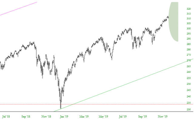
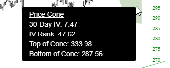
As with drawn objects in SlopeCharts, you can point to the price cone to get very specific data about what it is expressing:
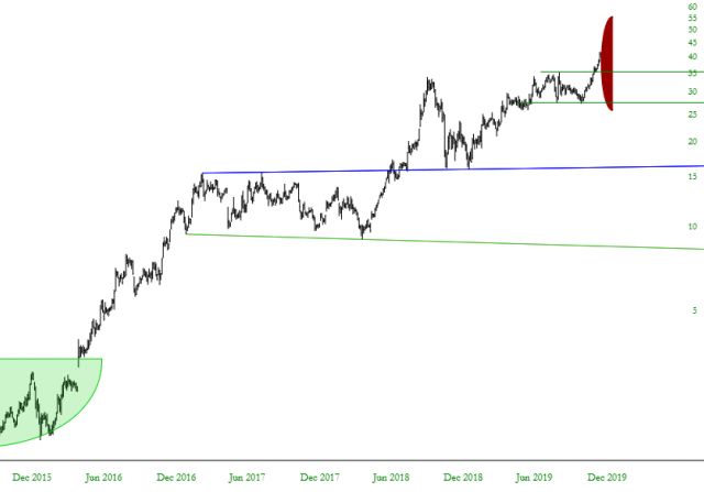
Besides the placement and size of the cone, and the tool tip data, there is another element of expression, which is the color itself. The greener the cone is, the more subdued its IV Rank. The more red a cone is, the more “red hot” the IV Rank is. For example, if a stock had recently been exceptionally volatile relative to its own history, it would have a price cone displayed as bright red:
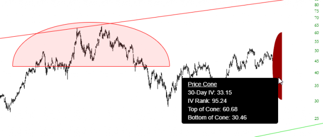
Mousing over the cone itself, we can see that the IV Rank is a sky-high 95.24.
The beauty of the price cone is that it is, by definition, a context-sensitive representation. You can witness directly on an given chart, based on that instrument’s own implied volatility, a representation of the market’s agreed-upon price projection with far more richness and clarity than a raw number could ever provide, which is particularly valuable for options traders.
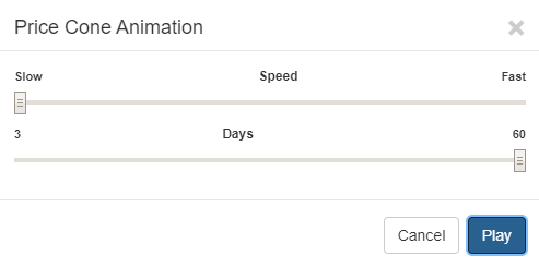
There is another means by which you can examine the price cone, and that is via animated presentation. At the bottom of the informative tool tip, there is a hyperlink titled Animate This Cone.

If you click this link, a control panel will appear. You can click Play immediately if you simply want to see the price cone “travel” through recent history, or you can adjust the slider bars. As shown below, the top slider bar controls the speed (from Slow, on the left, to Fast, on the right) and the bottom slider bar controls how many days of history you would like to see animated (as few as 3 to as many as 60).
Here, for example, is a 60-day animation of the price cone during the exceptionally volatile period of February and March 2020.
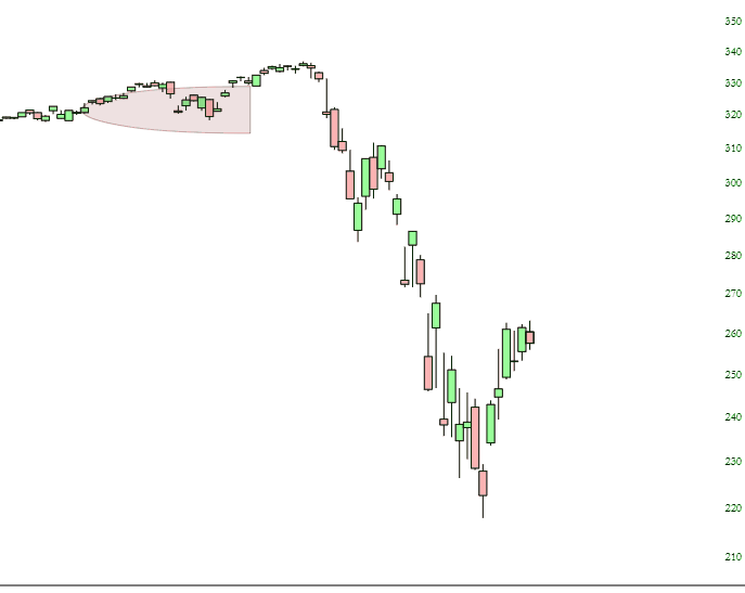
Just by watching this finance-oriented “movie”, you can see:
- The cone actually change gradations of color, from green (low IV rank) to red (high IV rank);
- The height of the cone change from short (low expected price movement in the future) to tall (very wide expected price movement);
- You can also get a sense as to how accurate the price cone was in anticipating future price movement. In other words, did the premium being paid for options properly anticipate the future volatility? In the example above, the answer is in many cases decidedly “no”.
