When a security is ascending in price, forming a series of higher lows (the ascending trendline) and identical highs (the horizontal line above it), and it is already in a general uptrend, it is forming an ascending triangle pattern. This pattern is a continuation pattern – – that is, this pattern is a bullish pattern when formed in the context of an trend that is already bullish.
Click here to see examples of this pattern users have stacked into SocialTrade.
To watch a brief video with real-life examples of this pattern, click here.
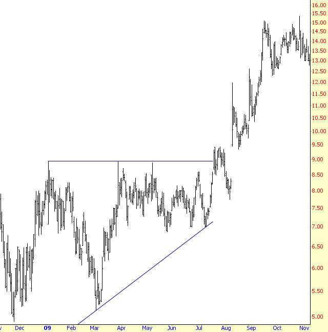
First, you should have an ascending trendline acting as support; second, you should have a horizontal line representing the overhead supply of the stock which is slowly being eaten away by new buyers; and third, you should have a breakout above the horizontal line.
Volume can play a role too, although it isn’t shown in this example. Volume typically dries up as these patterns progress, because traders are losing interest in the security since it evidently isn’t breaking out but is merely in the slow process of accumulation. If and when a breakout occurs, then volume should spike higher, indicating that the overhead supply (formerly at the horizontal line) has been dispensed with, and a hoard of new buyers are sweeping in to purchase the security.
You should also remember this pattern is synonymous with the term right-angle triangle, since you could form a complete triangle by connecting the leftmost points of the two existing lines. The volume doesn’t need to descend for this pattern to be valid, but the uptrend should be established, because this is a continuation, not a reversal, formation.
First keep in mind that, as a continuation pattern, a stock forming an ascending triangle is already in an uptrend and, by and large, has a relatively happy population of owners of the stock.
The stock ascends, reaches a certain price level, and backs away. It backs away because the sellers overwhelm the buyers, and the price cannot ascend any farther. These sellers represent either overhead supply (former purchases of the stock at this level that want to get out) or simply want to get out at a price they feel is the highest the stock is likely to achieve in the near term.
The stock ascends again, reaching the same level, and it fades away. Owners and new buyers are getting somewhat weary of the stock’s inability to make them money, but the selling dries up at a price higher than before, establishing a “higher low” for the chart.
Yet again, the stock price moves up to the same level and sells off. Volume is getting lower and lower, because fewer and fewer people are interested in participating in a security that can only seem to reach a certain price level and no higher. However, yet another “higher low” is made, which is constructive.
During the stock’s fourth push higher, it pushes past the horizontal line, and people get excited. Current owners buy more stock, now that it is finally doing something interest. Bystanders who were waiting for a breakout leap in. The volume is much higher, and the stock lurches forward before selling off again. The selling sinks the price, but it reaches approximately the same level as the horizontal line (if not a little bit below) before stabilizing.
Now that the line representing resistance has not transformed into a support line, more buyers accumulate at this price level, and the stock pushes to a new high. Now the pattern is finally complete, those who wanted to get out of the stock has been satisfied, and the current block of owners of this security are happy to finally see their holdings lurching forward in value.
When price bars are confined by an ascending trendline below and another trendline above, and these lines converge on the right side, this is called an ascending wedge. The pattern highlights price action which, although moving higher, is becoming increasingly confined. Because the lower trendline is the most vulnerable to being violated, this pattern is a reliable bearish indicator when and if the price bars slip beneath support. This pattern has a close relative in the form of the Descending Wedge, which is covered in another section.
Click here to see examples of this pattern users have stacked into SocialTrade.
The pattern requires just two lines: both of them are ascending, but they are not parallel. Instead, they converge on the right side, although the price bars may break beneath the lower trendline well before this intersection.
Because the prices are generally ascending during the formation of an ascending wedge, holders of the stock are increasingly optimistic and bullish about its prospects. The nature of this pattern, however, is one in which the strength of the movement higher loses energy until such time as the supporting trendline can no longer bear the “weight” of those who want to sell the stock.
The tell-tale sign of this pattern is the upper trendline, because the distance between the “higher lows” of the lower trendline and the “higher highs” of the upper trendline becomes more and more narrow. Buyers simply are unable to give the stock as much lift with each successive push higher, and once the price breaks beneath the lower trendline, the mass of buyers (who until this time were happily watching their profits increase) may make a rush for the exits by way of sell orders.
Even if such a stampede doesn’t take place the fact is that the cleanly-defined uptrend has been broken, and the stock is vulnerable to a sell-off, since those following the trend no longer have a rational technical reason to hold on. This temptation to sell can become widespread, and if people start acting on that temptation, then the selling can feed on itself.
The channel pattern is one of the easiest to identify, although it is not very common. It consists of a pair of parallel trendlines which confine a stock’s price for a meaningful length of time. One of the interesting things about this pattern is that it can serve three different purposes: it can provide a series of buying and shorting opportunities as it oscillates within the pattern; it can serve as a buy signal when broken to the upside; and it can serve as a sell signal (or short signal) when broken to the downside.
The reason channels are fairly rarely is because a stock’s uptrend or downtrend is usually too random or biased in a particular direction to create a clean trend. Ideally, the price movement between these two trendlines will represent a sine wave, with the price rallying up to resistance, stalling, and then selling off to support. The more times it does this, the more useful it is as a tool for swing trade opportunities, and the more potent it is when it finally does break in one direction or another, as it is bound to do eventually.
Click here to see examples of this pattern users have stacked into SocialTrade.
To watch a brief video with real-life examples of this pattern, click here.
A channel is made up of two trendlines that are more or less parallel. They may be ascending or descending, and if you use a high-quality charting program such as SlopeCharts, you can make use of the Channel tool to establish those boundaries with just three data points. Most channel objects can also show the median line (that is, a third parallel line between the other two) and also lines for the 25% and 75% levels (which are, in turn, between the upper and median trendlines and the lower and median trendlines).
The price should have at least two touchpoints on each of the two trendlines in order to qualify as a channel, and the trendlines should be parallel (giving a few degrees of latitude; if it’s much more than this, you are looking at a wedge pattern or a broadening pattern instead). At some point, the price will break out of the channel, because no channel trend lasts forever. When the price finally does this, you may also consider that a buy or sell signal, depending on which side of the channel prices emerge.
Keeping this kind of trading going can be profitable for a while, but, as has been said, the channel will be guaranteed to break either up or down at some point, and you must be prepared to get out of your “cycle trades” when this happens. Indeed, when the channel is finally broken, you might elect to make a trader of a large size in the direction of the breakout.
When a security is trading within a channel, there is a tug-of-war taking place between buyers and sellers, and for whatever reason, the party with the most strength keeps changing on a fairly regular basis. For instance, the buyers may be more aggressive for three weeks, and then a certain high price is achieved (which might be a higher high or a lower high, depending on the channel’s direction), at which time the sellers get the upper hand and create more selling pressure than the buyers can handle, thus pushing prices back down to support.
If the channel is ascending, then the stock is generally being accumulated over the long haul, and buyers generally have more strength than the sellers. A break above an ascending channel shows an exceptional amount of buying strength, whereas a break below such a channel illustrates that the buying power is no longer able to sustain the angle of the price’s growth.
A descending channel exhibits a stock that is generally weak but which keeps attracting buyers who believe they are getting a “bargain” of sorts. As the stock falls toward resistance, more nervous owners will decide the risk is not worth it and will abandon the stock, but eventually enough buyers come in to reverse the trend and continue the oscillation of the price to the upside. Prices snapping below a descending channel are giving in to the selling pressure and may be entering a hard fall, whereas prices pushing above and away from the descending channel are signaling a trend change, now that all the weak hands have been cleaned out of the security.
The cup with handle pattern is one of the most recognizable and popular patterns in technical analysis. As the name suggests, the pattern looks like a cup and handle as viewed from the side. That is, a rounded “saucer” shape followed by a much smaller saucer (approximately even with the upper levels of the big saucer) and finished with a breakout to higher prices.
Click here to see examples of this pattern users have stacked into SocialTrade.
To watch a brief video with real-life examples of this pattern, click here.
The criteria for this pattern are as follows:
⦁ Prior Uptrend – since this is often a continuation pattern, it is most desirable for their to be an uptrend preceding the pattern, although this is not a requirement, as examples in this section will show.
⦁ U-Shaped Cup – the “cup” portion of the pattern should be relatively smooth and round, as opposed to a sharp V-shaped pattern.
⦁ Similar Highs – the highs on the left and right sides of the cup should be roughly equal, and these highs in turn should be equal to the highs of the handle.
⦁ Partial Retracement by Handle – the drop in price contained within the handle should be only a modest part of the range between the cup’s high and low. In other words, if the cup spans a range of $10 to $16, the handle shouldn’t dip very much below the high price of $16. A good rule of thumb is no more than 1/3 of the range, which in this example would suggest a handle no lower than $14 in price.
⦁ Breakout – the price should break out above the top of the handle and continue on to its target price.
The target price is the value of the price range of the pattern added to the price level at the time of the breakout. For instance, if the pattern spans $25 to $30, then the target price would be $35 (that is, the high price of the pattern – $30 – added to the range of prices in the saucer – $5 – equaling $35).
Let us consider a stock that has already been climbing steadily. Let’s assume it has risen from $20 to $30. Owners of the stock are very happy with the performance, and the stock peaks at $30. This is the left edge of the cup that will be formed.
Now the price starts to gently fall. Some owners of the stock get nervous and want to lock in profits, so they start selling. The stock descends to $29, $28, $27, and on down to $25. At this point, selling dries up, as does volume, and the price flattens out at about $25 for a while.
Now that the stock is stable, new buyers start to enter the market and slowly bid the price up. The price moves back up through $26, $27, $28, all the way back to $30. It has now matched its former high, and over the couple of months that the stock descended and ascended, there is a saucer-shaped pattern in the price which constitutes the cup of this pattern.
Now the price starts slipping again, and a small number of owners once again get nervous that the stock is unable to get above $30. They think perhaps a double top is in place, and they sell. This time, the stock’s drop is more modest and shorter-lived. It falls down to $28.50, stabilizes, and pushes up again to $30. Now the handle is complete, and the market has a decision to make – whether to push the stock up past $30 or give way to sellers and fall hard.
If the handle doesn’t complete and the price simply keeps falling, a double top will indeed be in place, and more serious selling may ensue. In this example, however, there are more buyers than sellers, and the price finally cracks above the $30 level, having paused there for both sides of the saucer as well as the handle. Now that a new high is finally reached, buyers pile into the stock, soon pushing it to its target price of $35 (which is the sum of the former high, $30, plus the pattern’s range, $5). The pattern, and its target, are now complete.
The rules that apply to the ascending triangle – covered elsewhere in this patterns guide – can simply be turned upside-down in order to understand the nature and parameters of the descending triangle, its opposite. This pattern is defined as having a horizontal line, representing the supporting price level, and a descending trendline, which constitutes the top line of the triangle. As with its twin, the descending triangle is also known as a right angle triangle, since a line connecting the leftmost points of the existing lines would complete the three sides, and a right angle would exist in the lower-left corner of the formation.
Click here to see examples of this pattern users have stacked into SocialTrade.
To watch a brief video with real-life examples of this pattern, click here.
As with the ascending triangle, the descending triangle is a continuation pattern, meaning that it is effective in a market that is already in a downtrend. It is a bearish pattern, so it must be used within the confines of a bearish trend. For the purposes of measuring a target, you can take the height of the triangle and subtract it from the lower line (which is the supporting horizontal line). Thus, a triangle ranging from $50 to $40 has a height of $10 and thus a target price of $30 (the horizontal line, $40, minus the triangle height, $10, yields the $30 target).
As a continuation pattern, a stock forming an descending triangle is already in an downtrend and will have a relatively nervous and uncomfortable group of owners (excepting, of course, those already short the stock).
The stock descends, reaches a certain price level, and moves higher. The point where it stopped falling is a support level, and it will be the first touch-point of the horizontal support line that will later become clear. The bounce higher is substantial, as buyers rush in to buy a stock that now seems “cheap.”
The buying dries up, and the stock starts selling off again, once again reaching the support level. Buyers once again enter the picture (or frustrated short sellers decide to cover), and the price again moves higher, but not as high as the last time. We have our first “lower low” of the descending resistance line. The stock is slowly weakening.
For a third time, the price drops to the support level. Owners of the stock are getting increasingly uncomfortable. Their stock is threatening to break support, and when it gathers its strength, it is doing so with diminishing gusto. The price pushes higher, going up only slightly this time, not even managing to reach the descending resistance line.
At last, the stock pierces support. A few bargain hunters jump in, pushing the price above the line for a few days, but the selling pressure overcomes these buyers, and the stock begins falling in earnest. The selling picks up speed, as frustrated owners throw in the towel and add to the selling pressure.
Usually when a person is watching a stock’s price steadily sink, the assumption is that the stock must be in trouble. This is sometimes the case, but there are some instances where the stock is in fact creating a very bullish pattern known as the descending wedge.
Just as an ascending wedge (discussed in another section of this guide) is a bearish pattern, the descending wedge is a bullish pattern. It consists of two non-parallel lines which, if extended, will meet on the their right side. As the price bounces up and down between the two extremes, the price action becomes more compressed as the bullish and bearish reactions drawn the lines closer together. If and when the prices break the upper trendline, the descending wedge pattern is complete, and the stock should move higher in price.
Click here to see examples of this pattern users have stacked into SocialTrade.
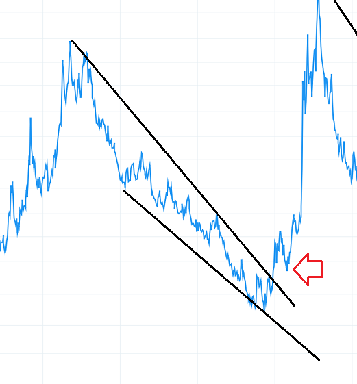
The descending wedge is bounded by these two lines. As long as the price bars between the lines are moving lower (hence “descending”) and the lines are angled such that they will eventually converge on their right side (hence “wedge”), the pattern is valid. Whether or not the stock is in a general uptrend or downtrend doesn’t matter. If the stock is in a broad uptrend, the descending wedge is a continuation pattern; if the stock is in a broad downtrend, the descending wedge is a reversal pattern. In either case, a breakout from above the descending wedge is considered bullish.
Whether the overall direction of the stock is bullish or bearish, the descending wedge behaves as a “clearing out” of the owners of the stock that are not inclined to hold on during a downturn. Those that remain are either more patient with the stock’s downdraft or simply acquired the stock at a newer, lower price.
Each drop down to the supporting trendline acts to scare out the weaker hands of the security, and each push higher to the resisting trendline acts to give owners of the stock hope that things are going to turn out. With each successive dip and rise, holders of the stock are on a roller coaster that alternates between despair and hope, and the volume typically will try up as fewer and fewer people are interesting in hang on to a stock going through these gyrations.
The big change takes place when the resisting trendline is at last broken. For those who bought during the most recent dip, they are suddenly in the happy position of having a profitable stock, and for longer-term purchasers, their losses have at least trimmed down and they see that the stock may have finally changed from a downtrend to an uptrend. A big increase in volume is particularly encouraging here, since it accentuates the fact that the withering volume was a symptom of the stock’s former weakness and not a persistent loss of interest in the stock by the market. Now that the security has found its footing, buyers are willing to participate on a broader basis.
If the stock moves higher and sinks back to approximately the breakout point, it is simply finding its new equilibrium point where those nervous about undergoing another hard dip down want to sell, balanced by those who believe the stock has fundamentally changed its overall direction. A successive push to a new recovery high validates the view of this latter group, and the stock then has the opportunity to truly make a big move higher.
As with the mineral found in the earth, diamonds are rare and precious, and instances of this pattern can be some of the most powerful predictors of price movement in the realm of technical analysis.
A diamond pattern is formed on the left side by a series of higher highs and lower lows and, once past the midpoint, a series of lower highs and higher lows. The security loses its ability to trend (becoming increasing wide in its range) and then begins tightening its range up again, suggesting that it is losing its moorings. This inability to sustain a clear trend is why this kind of pattern often accompanies a reversal, and it is more common for the reversal to happen at a market top instead of a market bottom.
Click here to see examples of this pattern users have stacked into SocialTrade.
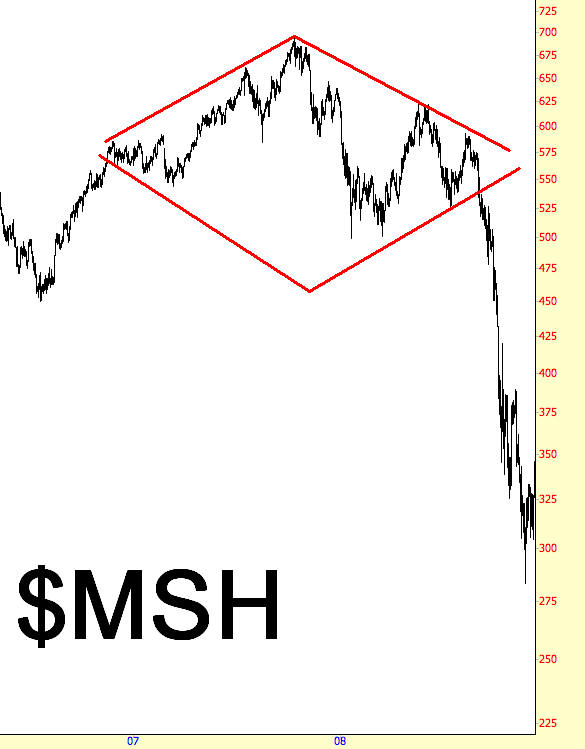
One way to think of a diamond pattern is as a head and shoulder with a v-shaped neckline (for a top) or an inverted head and shoulder with a a-shaped neckline (for a bottom). Although most patterns require a discerning eye that has been trained by experience, diamonds require even more of an “eye”, since they are rather difficult to spot, particularly without the benefit of significant hindsight.
Diamonds which are sloppily-formed generally aren’t worth your attention. As with other patterns, the cleaner the pattern is and the wide a time-span it traverses, the more potent it is as a predictive tool. Measuring the price movement potential of a diamond consists of measuring the spread between its highest and lowest points and then adding that value to the price point where it breaks outside the diamond. Thus, if a diamond spans from $60 to $70, and it breaks down at $65, then you can target $55 for the price movement downward.
For diamond tops, volume usually increases substantially during the formation of the pattern, largely because the amount o f “churn” increases as the bulls and bears struggle over the direction of the stock. One of the benefits of a diamond, as opposed to a head and shoulder pattern (of either variety) is that the signal tends to come earlier. This is because of simple geometry: a price will break below an ascending line (or above a descending line, as the case may be) much sooner than a horizontal line, so the amount of move that you can “capture” is that much larger.
The psychology of a diamond pattern is best expressed with the idea of a “changing of the guard”. The broadening price action indicates that there is a loss of control of whoever formerly was in control, and the power struggle will either resolve itself as a continuation of the past trend (in which case the diamond will be distorted beyond usefulness) or will consolidate into a decision in the form of a “break” one way or another. The reason the fall from a diamond top is so dramatic is that so many parties have been involved in the maelstrom contained within the increasingly-broad price action, and frustrated bulls will succumb en masse to the price failure.
Setting down Fibonacci fans on a chart is the easy part: all you need to do is choose a high and a low point for the reference line. SlopeCharts will draw the fan lines for you, and it is up to you to decide if those lines are useful to you in your trading or not. I sometimes use the term “Fibonacci-friendly” to state whether or not a given price chart happens to agree with a particular Fibonacci object.
Click here to see examples of this pattern users have stacked into SocialTrade.
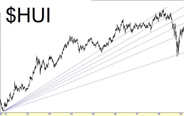
The way the charting program draws these lines is useful to understand. Imagine a reference line being drawn on a chart with the low price at $10 and the high price at $20. Think of this as one line of a triangle. Now imagine a horizontal line projecting from the point at $10 off to the right; this is the second line of the triangle. Finally imagine a vertical line being drawn straight down from the $20 point of the first line; this is the third line of the triangle.
The charting program draws lines, in this instance, from the $10 point to various points on that third line, the vertical line, based on certain Fibonacci numbers. One of the points on the vertical line will be at the 50% point (that is, $15); another will be at the 38.2% point; another will be at the 61.8% point. Most charting programs let you change these values, although it is best just to stay with the default values.
As you are laying down the fan lines, take note whether or not those fan lines seem to have any meaning with respect to the historical price bars. If the prices repeatedly pierce the fan lines and seem to offer little in the way of support or resistance, then the fan lines are not useful to you; they will just be extra noise on the chart that makes your job harder. On the other hand, if you find the prices repeatedly bouncing between the fan lines, you are probably looking at a Fibonacci-friendly chart.
Whether your reference line is ascending or descending depends on the general trend of the chart. If you are working with a broad downtrend, you probably want to start your reference line at a high price and end it, later on the timeline, at a low price. The reverse applies with a stock in a general uptrend. You will see examples of both uptrends and downtrends in this section.
By far the most popular and easiest to interpret Fibonacci study is the retracement. The retracement study is performed by drawing a line between two extreme points on a graph (a significant high point and low point) which then creates the drawing of a series of horizontal lines set at key Fibonacci ratios (23.6%, 38.2%, 50%, 61.8% and 100%). These ratios represent a certain proportion of the vertical distance between the extreme high and low you have identified.
Click here to see examples of this pattern users have stacked into SocialTrade.
The impact of these levels on a financial chart can be profound, since they represent significant areas of support and resistance. In many instances, you will see a stock price bounce off these lines until it penetrates one of them, only to behave the same way with the next line. The predictive power of retracements is that you can anticipate levels of support and resistance where prices will tend to cling.
It should be stated early on that not all charts are “Fibonacci-friendly.” Some charts perform better with Fibonacci studies than others. Luckily, there is a fairly easy way to determine whether a stock is Fibonacci-friendly or not, and that is to lay down the study and examine whether past price behavior seems to comply with the study or not. If it does, chances are that it will continue to do so.
Some of the patterns in this guide can be quite long-term, spanning years or even decades. The flag pattern is nothing of the sort. It is, instead, a rather short-term pattern typically lasting just a few weeks, and it is a continuation pattern, allowing a security to “take a breath” before moving in its dominant direction
The first requirement for a flag pattern is that it be preceded by a strong move in the first place. That move can be up or down, but it must be strong and sharp, since the entire basis for a flag pattern is that it represents a brief pause in the action of an overall powerful move. Even though prices may form flag patterns in the midst of markets that are meandering, the fact that they aren’t in the context of a strong move negates their import.
Click here to see examples of this pattern users have stacked into SocialTrade.
Next, the flag should be counter-trend to the general trend. Because of its counter-trend nature, the flag should be downward-sloping for a bullish move and upward-sloping for a bearish move. After all, the buying or selling action is supposed to abate during the formation of the flag – often on dwindling volume – and it makes sense that the dominant direction would be opposed while the flag is being formed.
The flag itself is defined as a group of prices that are cleanly bounded by a pair of parallel trendlines. If the lines are converging, the pattern is a pennant, which is covered in a different section. The flag itself shouldn’t be terribly lengthy; a length of three months is probably the longest acceptable time-frame, and a more typical age will be a month or less.
Finally, when the price breaks out of the flag pattern, that breakout should be accompanied with an increase in volume. The trend is eager to resume itself, and after weeks of waiting, buyers (or sellers, as the case may be) should push the equity back into its longer-term trend with an abundance of activity.
Even though flags aren’t particularly big patterns, the moves they portend can be substantial. The distance from the beginning of the broad trend (whether up or down) to the beginning of the flag is sometimes known as the “flag pole”, and its height is the figure you want to use to compute the measured move. That move is calculated by adding (or, in a downtrend, subtracting) the price value from the end of the flag pattern.
For instance, if a stock was trading at between $10 and $12 for a long time, and then it suddenly made a rapid ascent from $12 to $20 before starting its flag pattern, the flagpole would be $8 in height (that is, $20 minus $12, since $12 is the value when the stock changed from trading in a tight range to soaring higher sharply). Let us assume the flag was formed by a gentle down-sloping pattern lasting three weeks that took the price back down, but then the bulls stepped in again on big volume and broke out of the flag at $18. The measured target would therefore be $26, since $18 (the breakout level) plus $8 (the flag pole’s height) equals $26.
A gap in the price of a security takes place when there is a large amount of empty vertical space between price bars, representing a sudden (and usually unexpected) rise or fall in price. Many things can cause a price gap, such as surprisingly good earnings, surprisingly bad earnings, FDA approval (or disapproval) of an important drug at a pharmaceutical company, a takeover of a company, and so on. Usually, something has taken place between market sessions that compels much more buying and selling pressure than would be experienced by the same stock on an ordinary day.
Click here to see examples of this pattern users have stacked into SocialTrade.
This is one reason that, while stop-loss prices are very helpful, they are not a guarantee of safety. If you are long a stock you bought at $10, and you have a stop-loss at $9.99, you are not assured that, no matter what happens, any loss you experience will be minuscule. The company might announce that it has been fabricating its accounting for the past five years, and it opens the next day at a bid of $2, which is the price you’ll probably get (if you’re lucky). Such a shock-event would be a gap.
The simplest definition of a gap is a positive difference in price between one days’ maximum value and the next day’s minimum value (or vice versa). If Monday’s highest price is $15 and Tuesday’s low price is $16, that would be a gap. If Thursday’s lowest price was $14 and Friday’s highest price was $13.75, that would also be a gap (albeit a small one).
The gaps of concern are usually more dramatic than twenty-five cents; they are usually very easy to spot in a chart, and plenty of free scanning services on the Internet will provide you a list of the day’s up-gaps and down-gaps so far. If you have read about gaps, you have probably encountered various terms for different flavors, such as exhaustion gaps, common gaps, runaway gaps, and so forth.
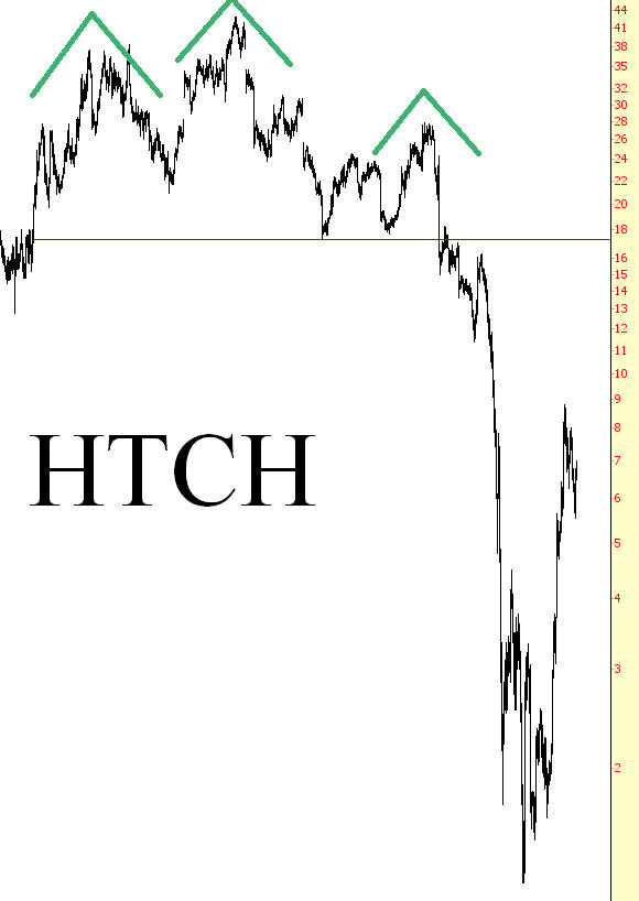
The Head and Shoulders pattern (also referred to by the moniker H&S) has a funny name but a powerful purpose: to indicate the possible reversal of the security you are charting. It is one of the best-known, easy-to-recognize, and yet most widely misidentified patterns in Technical Analysis. As the name suggests, the H&S pattern looks like a head in between two shoulders, and a completion of this pattern indicates that the security is probably going to head down in price.
Click here to see examples of this pattern users have stacked into SocialTrade.
To watch a brief video with real-life examples of this pattern, click here.
The criteria for this pattern are as follows:
⦁ Left Shoulder: an ascent in price (ideally following a long, major ascent in the stock’s value), a leveling, and then a weakening back to a certain support level known as the neckline
⦁ Head: a further ascent in price, surpassing the high set by the left shoulder, once again leveling off and descending back to the neckline.
⦁ Right Shoulder: a final ascent in price, ideally not going as high as the left shoulder (and certainly not going as high as the head), a leveling off, and a descent back to the neckline, which it breaks beneath on strong volume.
The target price is the value of the price range of the pattern subtracted from the neckline. For example, if a neckline is at $20, and the top of the head is $25, the difference is $5. Therefore, $20 (the neckline) minus the range ($5), equals the target price ($15). This setup anticipates a 25% decrease in stock price.
We return to the basic notion that bulls want to see a steady progression of higher highs and higher lows. During the formation of the left shoulder, assuming the stock has been enjoying a consistent run-up in price, the bulls are still satisfied that all is well. The peak of the left shoulder marks yet another high price in the stock.
As the head begins to form, the bulls remain satisfied, because once again they are seeing a higher high in the stock. But something is going wrong, because as the price eases back again, it returns to the same level that the left shoulder was at before (in other words, the neckline). So we no longer have a series of higher highs and higher lows. The lowers are matching one another. But at least, from the bullish point of view, there is still strong support at a given price level (again, the neckline).
When the right shoulder begins to form, the bulls want to see a new high made, exceeding the price just made by the “head” price. (Keep in mind the vast majority of individuals watching the stock aren’t looking at a chart, let alone thinking in terms of heads and shoulders). But not only does the price not exceed that of the head, it doesn’t even match the price made by the left shoulder. So the stock is actually seen as weakening now, and the buying volume dries up as the price comes to rest, once again, at the neckline.
At this point, the market has a decision to make. It can continue to support the price at the equilibrium level it has found. Or the sellers can overcome the buyers, and the neckline will be broken. In the latter case, the H&S pattern is complete, and the stock price is probably in trouble (for the bulls, at least).
There is one more element to this story, however, and that is the retracement. Just as there are retracements with saucer-like patterns, the H&S pattern sometimes sports a retracement as well. In this case, after a brief, quick drop in price, “bargain hunters” come out and temporarily provide support for the stock. If the H&S pattern holds, the price will make its way back up to the equilibrium point (the neckline), but no further. This provides a golden opportunity in the form of a second chance for those wanting to sell the stock short. Because it is likely that once the retracement is complete, the price will begin falling again, and it will fall far past the point where it originally paused.
Something very unusual about the head and shoulders pattern is that it has a doppelganger called the inverted head and shoulders pattern. While the H&S pattern ideally precedes a top, the IH&S precedes a bottom. This bottoming pattern quite literally turns everything about the H&S pattern on its head, since the direction is the opposite but all the other rules are the same.
Click here to see examples of this pattern users have stacked into SocialTrade.
To watch a brief video with real-life examples of this pattern, click here.
The criteria for this pattern are as follows:
⦁ Left Shoulder: a descent in price (perhaps following a long, major drop in the stock’s value), a leveling, and then a strengthening back to a certain support level known as the neckline. The trading volume during this period should ideally increase notably.
⦁ Head: a further descent in price, dropping beneath the low set by the left shoulder, once again leveling off and ascending back to the neckline.
⦁ Right Shoulder: a final descent in price but on lower volume, ideally not going as low as the left shoulder (and certainly not going as low as the head), a leveling off, and a ascent back to the neckline, which it finally breaks above on strong volume.
The target price is the value of the price range of the pattern added to the neckline. For example, if a neckline is at $20, and the bottom of the head is $15, the difference is $5. Therefore, $20 (the neckline) plus the range of $5, equals the target price ($20+$5=$25). This hypothetical setup therefore anticipates a 25% increase in stock price.
As with the H&S pattern, the neckline defines if the pattern is complete and, therefore, whether it has any meaning. As with other lines in technical analysis, the neckline represents a “line in the sand” dividing bulls and bears. Along the line itself is a sort of equilibrium between buyers and sellers. Trading above the line represents strength and hope. Trading beneath the line represents weakness and fear.
With an ideal H&S pattern, the neckline has five unique “touch points.” The first is on the left side of the left shoulder; the second is at the right side of the left shoulder (which is also the left side of the head); the third is at the right side of the head; the fourth is at the right side of the right shoulder, at which point the price breaks beneath the neckline; and the fifth point (which is optional, in a sense) is when the price retraces back up to the neckline before falling hard once again.
Ideally, the neckline should be horizontal, since price equilibrium should concentrate in a tight, consistent price range. You may allow some leeway for a tilted neckline, however, perhaps as much as ten degrees either upward- or downward-sloping. Those newer to charting often look at any trio of price humps and assume they’ve discovered an H&S pattern, no matter how distorted the pattern or how sharply-ascending the neckline. The higher-quality the pattern, the more reliable it is as a predictive guide.
Once the price has broken above the neckline, the pattern has validity only if the price remains above the neckline. (If the price retraces, you may want to allow for a few pennies of “violation” before dismissing the pattern altogether). Just because the price goes below the neckline doesn’t absolutely mean the stock will not rise, but it does indicate weakness that is normally not a part of a good, strong breakout. A pattern with “noise” such as this should be viewed with more skepticism than a pattern absent such noise.
The pennants pattern is extremely similar in most respects to the flags pattern, discussed in a different section of this guide, except that its lines are convergent rather than parallel. The two lines containing the price bars point toward a common end, and this consolidation pattern typically suggests a continuation of the trend.
Some of the patterns in this guide can be quite long-term, spanning years or even decades. The pennant pattern is nothing of the sort. It is, instead, a rather short-term pattern typically lasting just a few weeks, and it is a continuation pattern, allowing a security to “take a breath” before moving in its dominant direction.
Click here to see examples of this pattern users have stacked into SocialTrade.
The first requirement for a pennant pattern is that it be preceded by a strong move in the first place. That move can be up or down, but it must be strong and sharp, since the entire basis for a pennant pattern is that it represents a brief pause in the action of an overall powerful move. Even though prices may form pennant patterns in the midst of markets that are meandering, the fact that they aren’t in the context of a strong move negates their import.
Next, the pennant should be counter trend to the general trend. Because of its counter trend nature, the pennant should be downward-sloping for a bullish move and upward-sloping for a bearish move. It is acceptable for the pattern to be flat, in the form of a symmetric triangle, irrespective of direction. Buying or selling action is supposed to abate during the formation of the pennant – often on dwindling volume – and it makes sense that the dominant direction would be opposed while the pennant is being formed.
The pennant itself is defined as a group of prices that are cleanly bounded by a pair of converging trendlines. If the lines are parallel, the pattern is a flag, which is covered in a different section. The pennant itself shouldn’t be terribly lengthy; a length of three months is probably the longest acceptable time frame, and a more typical age will be a month or less.
Finally, when the price breaks out of the pennant pattern, that breakout should be accompanied with an increase in volume. The trend is eager to resume itself, and after weeks of waiting, buyers (or sellers, as the case may be) should push the equity back into its longer-term trend with an abundance of activity.
Even though pennants aren’t particularly big patterns, the moves they portend can be substantial. The distance from the beginning of the broad trend (whether up or down) to the beginning of the pennant is sometimes known as the “flag pole” (a bit of a misnomer), and its height is the figure you want to use to compute the measured move. That move is calculated by adding (or, in a downtrend, subtracting) the price value to the end of the pennant pattern.
The chart formation called the rounded top is precisely what it sounds like – a topping pattern, implying a significant move lower, which is made up of a series of higher highs, and then higher lows, which creates a rounded effect.
The first prerequisite for the pattern is that it has to be preceded by a sharp rise in price. The point of finding the pattern in the first place is to sell the stock short, close a long position, or buy put options on it – whatever your trading objective might be – in anticipation of a drop in price. Unless the stock has already risen substantially, there will be too much support beneath the price level to create the opportunity for a substantial drop.
Click here to see examples of this pattern users have stacked into SocialTrade.
To watch a brief video with real-life examples of this pattern, click here.
Imagine a stock that has been moving steadily higher for a period of two years, starting from $10 and soaring to $50. Its owners are elated at their gains, and they have grown accustomed to a stock that does little but ascend in value.
The stock reaches a new lifetime high, and some of the holders decide for various reasons to take their profits and exit. Some might think the fundamentals are too rich; others might believe the market in general is headed for a turning point; others might simply want to cash their profits and put it to other uses. The stock sells off some, as it is inclined to do from time to time, and not many take notice of it.
Over the coming months, the stock continues this series of buyers taking control and then sellers taking control, and although the majority of owners continue holding their position, they are getting increasingly nervous each time the stock dips, because the stock seems to be running out of the proverbial gas, failing to move as robustly as it once did.
At some point, unknown to anyone at the time, the stock makes its final high price. The stock moves lower, and then higher again, but this time, it does something it hasn’t done in years – – it fails to get past its former high. It’s not like a panic is taking place – far from it, because the stock is still near the highest price it has ever achieved – but it has stopped short of pushing any higher, establishing its first lower high. A trend change has taken place.
Now as the stock resumes its oscillations downward and upward, the dips get deeper, the lifts don’t get quite as high, and the pace of the decline starts to pick up. By this point, a chartist could see that the top is taking on a rounded shape. If he can determine a price that seems to represent support, he might take note of it, because that is going to be the “break point” at which the stock is in danger of falling hard. In this case, let us suppose the support level is at $40.
One evening, the company makes its regular quarterly earnings announcement, and it’s a little short of expectations. When the regular trading opens the next morning, the stock opens at $39.50 and spends the day falling, closing finally at $38.73. Owners are increasingly worried that a sea-change has taken place with their former high-flier, and selling intensifies, along with volume.
A few weeks later, the stock hits $34 and begins attracting buying interest. It takes several weeks, but the stock makes its way past $35, $36, $37, and finally reaches $39.50, thanks to a series of analysts re-issuing their “Buy” recommendations on the security. Unfortunately for those long the position, this is as far as the price will get, because the mass of owners who bought above $39.50 just want to get out of this stock, so the overhead supply overwhelms any further attempts of buyers to push the stock higher.
Selling begins anew, and as people realize their losses on the stock are probably only going to get worse, more and more of them sell out of their position. Now the stock begins a swan-dive, plunging past the recent low of $34 and not finding any real support until $25. The slow and subtle shift which took place with the rounded top has finally expressed itself in a plunge, and the event is over.
Probably the simplest, cleanest, and easiest-to-identify pattern in technical analysis is the rounded bottom (also called the saucer bottom). As the name suggests, this pattern indicates the price action has a curve at the bottom of a price decline, setting up for a reversal to the upside. Some of the most powerful and long-lasting price movements take place after a rounded bottom, and they usually represent relatively safe trades since the market has spent so much time hammering out a bottom and clearing bears and nervous holders out of the security.
At the risk of oversimplifying, the definition of a rounded bottom is a price pattern which gradually decreases in price, stabilizes for a while, gradually increases in price, and then finally breaks above resistance on strong volume.
Click here to see examples of this pattern users have stacked into SocialTrade.
To watch a brief video with real-life examples of this pattern, click here.
The psychology behind a mass of buyers holding a security at a particular price is important, and in a way it is the very basis of technical analysis. Generally speaking, traders prefer profits to losses. Owners of a security whose price moves higher will feel increasingly positive about that stock and will be compelled to buy more, because their profits are increasing. If there is a large mass of such buyers, this kind of buying can feed on itself.
A stock which has been trapped within a small price range for a long term will have two important ingredients for a potential upside move: (1) a large quantity of buyers within that price range, eager to add to their position if the stock breaks out of the range, and (2) a strong support level at that price range, which will create a firm floor for prices if an initial breakout weakens. If a stock breaks above its price range and then starts sinking, that same mass of owners of the stock is going to be reluctant to sell their holdings as the price softens, which will cause the price to firm up as sellers dry up. This group of security owners within that price range is a potent force for both pushing the stock higher as well as protecting the stock from falling through the well-established price range.
One nice feature of breakouts is that they often give traders a second chance to get in after the breakout. This temporary softening in prices after the breakout is known as a pullback, and it is caused by a portion of the owners of the stock anxious to bank their modest profits on their stock’s newfound price activity.
Imagine a hypothetical group of 1,000 people, each of whom owned shares in a company that had been trading between $10 and $12 for years. If the stock finally breaks out and hits $15, you can understand the excitement of these owners, since they have been holding a do-nothing stock for years which is finally showing signs of life.
Although most of these owners may be patient enough to let their profits build, there is going to be a subset of this group that will want to get out of the stock immediately and take their gains. The psychology behind this group is understandable too – after all, their stock has done absolutely nothing, and now it is giving them an opportunity to get out with some extra cash. So some people – let’s say 100 out of the group of 1,000 – immediately places orders to sell the stock at the current market price.
This influx of selling is going to cause the price to soften, at least temporarily. It usually will head back to the upper end of its former trading range, at which point selling will dry up since any newfound profits the group enjoyed have now vanished, eliminating the compulsion to sell the stock for a quick profit. It is important that the price remain above the breakout level, since doing otherwise invalidates the pattern’s integrity.
This temporary softening of prices is the pullback, and those people watching the stock chart closely can take advantage of this by acquiring the stock at the “pre-breakout” price. It is an especially attractive opportunity since the stock has, in a manner of speaking, tipped its hand about its price direction since it has finally broken out of its price range.
