View: Treasuries Can Keep Rising | Dragonfly Capital
Treasuries Can Keep Rising | Dragonfly Capital
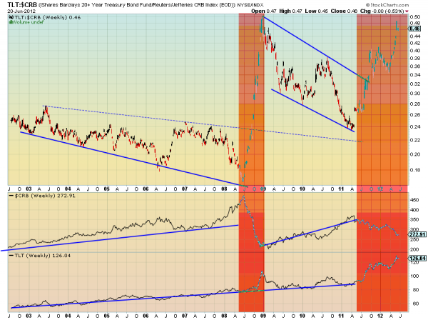
The ratio chart of the iShares Barclays 20+ Year Treasury Bond Fund, $TLT, against the Reuters/Jefferies CRB Index, $CRB, over the last 10 years shows 4 very distinct areas. There are two long sections where the $TLT and $CRB have been correlated and moving higher and then there are two orange areas where the they diverge when the ratio has skyrocketed. In these areas the $CRB has fallen and the $TLT has its best performance. We are in one of those areas now. As long as it continues the $TLT is free to continue higher. There are signs that turn may be coming, but nothing solid yet. Keep an eye on the $CRB for a turn higher as another sign of when the $TLT might come back to earth or at least stop rising.
If you like what you see above sign up for deeper analysis and trading strategy by using the Get Premium button above. As always you can see details of individual charts and more on my StockTwits feed and on chartly.
The information in this blog post represents my own opinions and does not contain a recommendation for any particular security or investment. I or my affiliates may hold positions or other interests in securities mentioned in the Blog, please see my Disclaimer page for my full disclaimer.
View the discussion thread.Comments
No comments yet.


