Browse Symbol Stacks: XRT: dshort Featured Charts
dshort Featured Charts
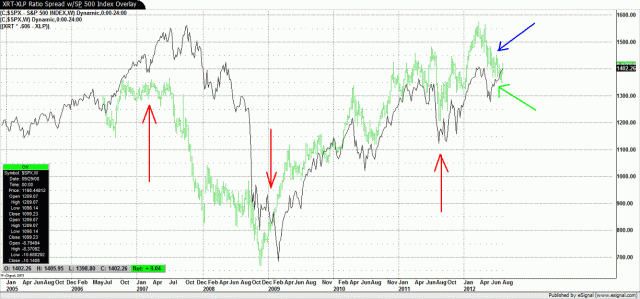
The red arrows depicted in the chart below are referenced and explained in the February article. As you can see in this current chart, the same type of divergence that was present in 2007 is presenting itself again. The ratio spread, shown as a green bar chart, has since late March begun to move lower. That means that the retail sector as measured by the XRT has underperformed the staples sector as measured by the XLP.
Comments
 lovebob
...


