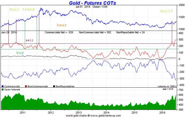
Browse Symbol Stacks: $GOLD: GOLD_COT.jpg
GOLD_COT.jpg
This is free chart from www.sharelynx.com
It represent COT data for GOLD.
IF gold is in bull trend then horizontal green line represent time to buy, dark-red line represent time to sell. If gold still in bear trend, green line is not appropriate to buy, it's more likely time to sell :)


Here's the charts that I have. The bottoms of the blue line on my charts correspond to the red line peaks/vertical red lines on your chart. In the bull market, it looks like selling on those triggers got you out WAY early, at best. I don't see a useful correlation during a bull market, but my chart is a much bigger picture, less detailed one.
Chart explanation:
Here's the COT charts during a bull market (left) and a bear market (right). This is for silver, but the gold chart is essentially the same. The blue line is the commercial net position, which offsets the managed money position. During a bear market, when the commercials are extremely short (managed money extremely long), a top was imminent, and vise versa for bottoms.
Looking at the bull market chart, there is no significant correlation.
http://cdn.socialtrade.com/comsys/imgs/gold-COT_pMzLa0_m.png