User: Brian Ripley: CAD Economy: Beveridge Curve 2000-2013
Beveridge Curve 2000-2013
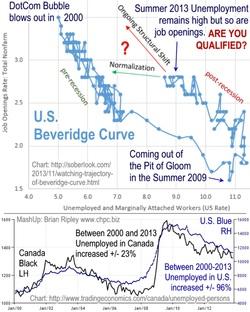
This chart mashup shows the Beveridge Curve which is the inverse relationship between the unemployment rate and the vacancy rate. It demonstrates that since the Pit of Gloom in 2009, the unemployment rate has been falling while job vacancies have been rising, BUT the counter-clockwise outward shift indicates a higher unemployment rate along the job openings curve. Employers cannot fill job vacancies either because labour is unwilling or untrained. The longer the unemployed remain so, the less likely they will fit the demands of the employer; hence the question "Are you qualified?". Can you retrain while you are idle? Can you move to where the demand for labour is? Employers are increasingly free to locate near or attract high skill low cost labour from a giant "free trade" low barrier pool. More at www.chpc.biz


$15 / hr offered up North of me in Washington passed because a person cannot survive on anything less. 11/27/13