User: Brian Ripley: U.S. Economy: Picture
Picture
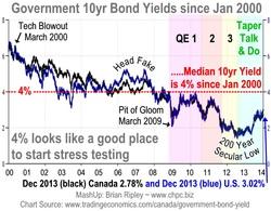
Look at a long term chart of the comparison between Canadian and U.S. Treasury 10 year yields and they move in the same direction sometimes over or under lapping each other depending on differences between national GDP, CPI, exchange rates and perceptions of market risk; but they track. The last 14 year interval produces a 4% median yield (dotted red line) and it looks like the market wants to hit it again in 2014 (the last time was 2010). Since the start of QE in late 2008, 4% has acted as resistance but for 6 years prior to QE, 4% was support and the last bounce off of the 4% red line began in 2006-07 when the U.S. housing crash picked up momentum (head fake). Now we are getting a spike up off the more recent 200 year secular low. Is that from taper talk alone or is the U.S. housing rebound out of the 2009 pit of gloom fading as well? More at www.chpc.biz
Comments
No comments yet.