Date: June 30, 2012

The following fascinating chart from Tableausoftware shows the history of US unemployment by state since 1976, and specifically the difference from historical averages. What the chart shows is that as more and more people have migrate...
The History Of US Unemployment By State, And A Surprising Observati...

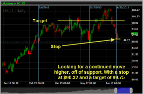
UnderArmor UA

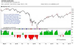
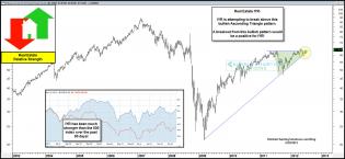
SPY ETF RTTtrendStatus

6

Distressed vs non-distressed market
difference between drop in price: distressed vs. non-distressed


modified loans
% of defaulting remods

Market Crash - www.wyattresearch.com
Monthly DJIA from 1880 - long term trend


European Reality
A picture of Europe
1

Steve Jobs

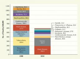
causeofdeath

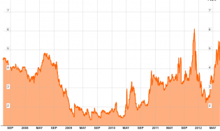
Spanish 2YR
Spanish Bond Yields...Best Day Since 1993

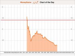
Spanish 2YR
Spanish Bond Yields...Best Day Since 1993
Spanish Bond Yields...Best Day Since 1993
CHART OF THE DAY: Spanish 2-Year Yields Fall After EU Summit - B...
Spanish Bond Yields...Best Day Since 1993
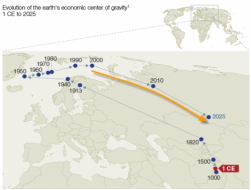
Journey To The Economic Center Of The World | ZeroHedge
world's economic center of gravity
http://blog.kimblechartingsolutions.com/wp-content/uploads/2012/06/...
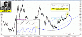
US Dollar Index and Sentiment (Kimble Charting Solutions 6/28/12)
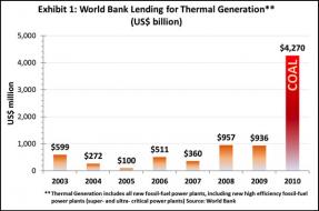
Guest Post: Coal - The Ignored Juggernaut | ZeroHedge
The World Bank is investing $4 trillion a year in thermal generation?
http://blog.kimblechartingsolutions.com/wp-content/uploads/2012/06/...
Real Estate ETF - IYR

http://blog.kimblechartingsolutions.com/wp-content/uploads/2012/06/...
Australian Dollar vs. S&P 500 (Kimble Charting Solutions)

http://blog.kimblechartingsolutions.com/wp-content/uploads/2012/06/...
Australian Dollar vs. S&P 500 (Kimble Charting Solutions)
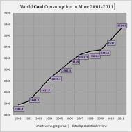
Guest Post: Coal - The Ignored Juggernaut | ZeroHedge
world coal consumption

http://1.bp.blogspot.com/-SKh2__x2qQo/T-4qG8LyKSI/AAAAAAAAC1E/lh_I1...
Aussie Dollar vs SPX
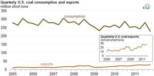
Guest Post: Coal - The Ignored Juggernaut | ZeroHedge
us coal consumption

http://2.bp.blogspot.com/-VQss82G3oN4/T-20SQdB3tI/AAAAAAAAC0k/_9Jri...

http://www.mcoscillator.com/data/charts/weekly/DXY_vs_FedFunds.gif
Fed Funds vs. US Dollar

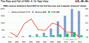
rim-10y-years.gif (610×294)
The rise and fall of RIMM - a 10 year view
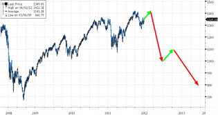
20120629_janjuah.png (720×383)
Bob Janjuah on The S&P Trek From 1,400 To 1,000 To 800 - it's not clear to me how good the predictions from this f...
2

NYSE Short Interest_1.jpg (1199×757)
Short interest on the NYSE has been pushing much higher
Robots 3.jpg (1238×1550)
Where are some of those manufacturing jobs going? Robots!

image
A pretty amazing correlation between jobless claims and the stock market.
pics 078.png
While relaxing on a Saturday afternoon, doing some market related work, I thought I would pass this on to my fellow traders on The Slope.A while ago, I listened in on a video done by Tim? Bourquin who has interviewed hundreds of succ...
31 Habits Of Wealthy Traders (by Market Sniper) | Slope Of Hope