Source: advisorperspectives
Below are all items from advisorperspectives.

dshort Featured Charts
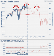
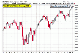
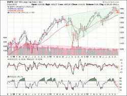
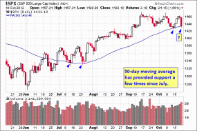
This week, the S&P 500 resumed its ascension, on strong momentum but on below-average volume (short week). ROC & R...
1

dshort Featured Charts
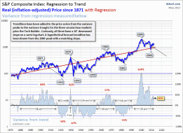
The Three Great Bubbles of our lifetimes
6

dshort Featured Charts
Psychology and the Market
3

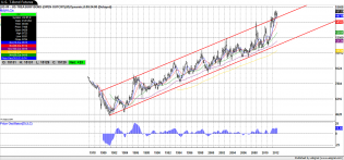
Dow Jones Industrial Average Drops Again
Point and figure of Dow Industrials with target
dshort Featured Charts
The longer that an advance occurs in the market, the more complacent that investors tend to become.
Click to View
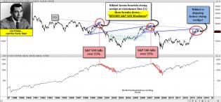
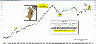
This is an AMAZING chart and just happens to be precisely what I speculated in my post today what might happen next.
1
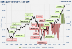
No One Will Ring The Bell At The Top
There was never a clearer sign of excessive bullish optimism than what is currently found within the levels of mar...
4
dshort Featured Charts
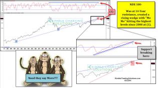
Chris Kimble

dshort Featured Charts
Nikkei and SP500
2
dshort Featured Charts
Weekly Bearish Harami in Major Indices
2
dshort Featured Charts
Long Term Resistance
1

dshort Featured Charts
My Unique Dow Chart w/ Commodities and My I. P. Counts

dshort Featured Charts
The flat-line chart shows that job growth has paced population growth and little else.

dshort Featured Charts
The Fed sucks whale: The poll also showed this is still the single worst economic recovery ever.
1

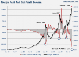
Stock Margin Debt Reaches Record-High, Surpassing 2007 Pre-Crash Level
Stock Margin Debt Reaches Record-High,
Surpassing 2007 Pre-Crash Level
1

dshort Featured Charts
How This One Chart Proves Economic Recovery Is Fake
1

dshort Featured Charts
The 30 year Bond price and yield over the last 20 years. Bounce in price coming or significant trend break?
Cyclical P/E Ratio

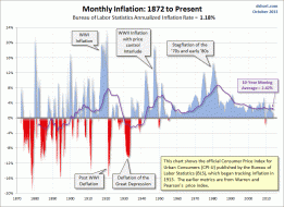
The Consumer Price Index: Headline and Core CPI
Long-term inflation
2013 Stock Market an Exact Repeat of 1954?


ISM Non-Manufacturing Index
ISM Non-Manufacturing Business Activity:
Significantly Slower Growth Rate

Sentier Research: Monthly Household Income
The illusion of prosperity
2

The Consumer Price Index: Headline and Core CPI
A long-term look at inflation

The 21st Century Decline of the Core Labor Force
The 21st Century Decline of the Core Labor Force

dshort Featured Charts
Equity Assets to Money Market Assets Ratio Hits All-Time Highs

NYSE Margin Debt and the Market Charts
NYSE Investor Credit

dshort Featured Charts
Who Really Owns the U.S. National Debt?
2

dshort Featured Charts
’’Apple & the Nikkei Have Something in Common Right Now’’

Stunning Demographic Trends in Employment
Federal loans to students - an insane rise recently

dshort Featured Charts
Wilshire 5000
dshort Featured Charts
Attention please!

1
Current Market Snapshot
Good 'ol Serge
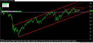
BIG Red Doji candle on the S&P Weekly Chart.... Might be Bearish Engulfing, too.
dshort Featured Charts
The Secular Bear Market in Stocks Is Over
The Secular Bear Market in Stocks Is Over
The Secular Bear Market in Stocks Is Over
1

Click to View
In nominal terms, home prices are about where they were in mid-2003. In "real" inflation adjusted terms, this time...

1

dshort Featured Charts

dshort Featured Charts

Social Security Cliff in Sight
Social Security Cliff in Sight

dshort Featured Charts
Social Security Payouts Per Worker

dshort Featured Charts
Russell 2000 Makes All-Time Highs

dshort Featured Charts
Moving back to what messages the emerging markets are signaling, it appears the USD Index is on the verge of breaking...

Consumer and Small Business Sentiment
Small Business Sentiment:
"Confidence Plunges More than Five Points"

dshort Featured Charts
dshort Featured Charts
As a consequence, the U.S. — compared to many other industrialized, developed democracies — has a more complicate...

dshort Featured Charts
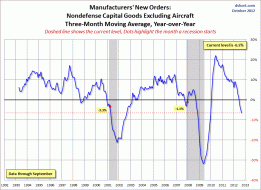
The chart below is the YoY of a 3-month moving average of the complete series. This is the data manipulation used...
Click to View

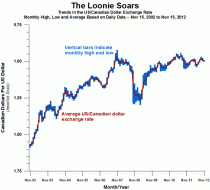
Our Neighbor to the North

Puplava-121113-Fig-5.png (500×472)
Money is pouring into highly rated U.S. corporate bonds at an even faster pace than Treasury debt, according to fu...

You Know Your Government Is in Trouble When...
I would say that Europe reached the "BANG" moment back in 2009 first with Greece and then the greater part of Euro...
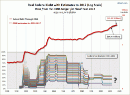
Debt-to-GDP Charts
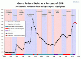
Debt-to-GDP Charts
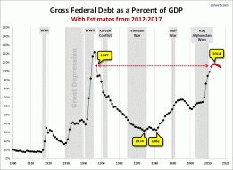
Debt-to-GDP Charts
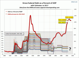
Debt-to-GDP Charts
dshort Featured Charts
The Great Long Bond

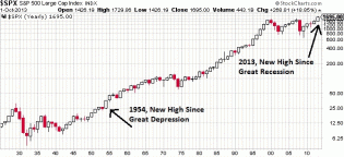
Three U.S. Indexes Since 2000
S&P 500, Dow and Nasdaq Since Their 2000 Highs
dshort Featured Charts

dshort Featured Charts
1

dshort Featured Charts

The Nikkei and the S&P 500
Japan's 10 year government bond and the discount rate for the past quarter-century

The Nikkei and the S&P 500
Nikkei 225 and the discount rate

The Nikkei and the S&P 500
Japan's Post-Bubble Market Rallies

dshort Featured Charts
Contributions to Percent Change in Real Gross Domestic Product.

Consumer and Small Business Sentiment
Michigan Consumer Sentiment: Slightly Below Consensus
But Highest Monthly Final Since September 2007
dshort Featured Charts
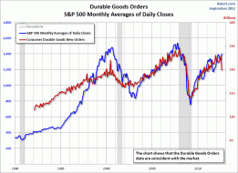
Core CAPEX as a Recession Indicator
1

dshort Featured Charts
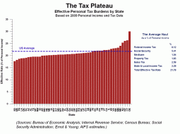
Where your tax dollars go.........

Wall Street Journal Survey of Economists: GDP as of October 2012
What do the economists see for Q4? We won't get the Advance Estimate from the BEA until late January. But the WSJ...
Current Market Snapshot
From http://advisorperspectives.com/dshort/updates/Current-Market-Snapshot.php

1
Click to View
From http://advisorperspectives.com/dshort/guest/Serge-Perreault-Weekend-Update.php

dshort Featured Charts
Housing, exports, and equipment as components of GDP

dshort Featured Charts
Housing starts
dshort Featured Charts
US Dollar Index at a Major Crossroad
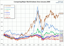
World Markets: Selected Chart Overlays
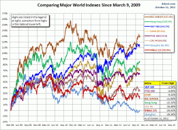
World Markets: Selected Chart Overlays

dshort Featured Charts
Major market tops and bottoms since 1950
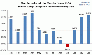
SPX-behavior-of-the-months.gif (640×385)
Stock performance in calender months

dshort Featured Charts

dshort Featured Charts
The magical way that the BLS "disappears" people from the employment rolls, which explains why the unemployment ra...

dshort Featured Charts
Full time employment versus the population; well less than half of us are actually working!

dshort Featured Charts
Three different ways to measure unemployment (naturally, the government prefers the red method)

dshort Featured Charts
Quantity of people that want a job but aren't in the labor force

dshort Featured Charts
The "money illusion" of the past five decades
1

A Closer Look at the September Employment Report

Unemployment in the U.S.

Three U.S. Indexes Since 2000
S&P 500 total return on a $1,000 investment at the 2000 high.

Three U.S. Indexes Since 2000
The S&P 500, Dow and Nasdaq Since Their 2000 Highs

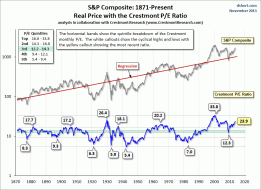
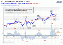
Q Ratio Charts
The Q Ratio and Market Valuation:
Monthly Update
Click to View

dshort Featured Charts
Click to View

dshort Featured Charts
dshort Featured Charts
dshort Featured Charts
1
Treasury Yield Snapshot

dshort Featured Charts
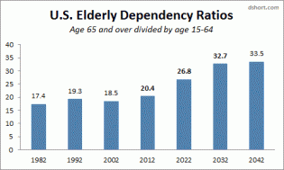
Boomer Demographics: The Shift Ahead
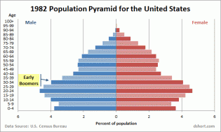
Click to View
Click on the chart to go to more population pyramids

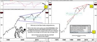
Sixteen Dow Rcoveries Illustrated with Charts

Sixteen Dow Rcoveries Illustrated with Charts