Source: slopeofhope: Weekly Analysis by Dr.G – Introduction | Slope of Hope
Weekly Analysis by Dr.G – Introduction | Slope of Hope
DR. G
Hello Slopers,
I’ve been hanging around for a long time time and have decided to contribute a weekly analysis. I am not new at this sort of thing as I’ve written weekly reports for family and friends. Those reports are much too long for a blog format (and took too much of my time) so I had to reconsider what I was doing. Also, in the same vein as “Nature abhors a vacuum”, the Universe abhors complex systems and I wanted to simplify my charts before posting here. For the purposes of brevity and getting started, I am doing this post to introduce myself, show some example charts and give a short description of the indicators I follow.
IntroductionI am a Director at a technology company but I follow the markets every day. I have been studying the markets for about 10 years. It’s something I love to do. I am focused on macro, statistics and risk. This suits my personality as my education is in the sciences (I have a Doctorate of Philosophy in Electrical and Computer Engineering – my PhD thesis is littered several hundred pages of statistics). So I’m the analytical type. I do not day trade. Instead, I look at the larger trends on weekly and monthly charts and where warranted, a daily chart. This makes me a statistical position trader (or technical investor). The weekly charts are still useful to most day traders because they identify the longer-term picture. Knowing when you have the wind at your back is helpful no matter what time frame you are looking at. More of my approach to the markets will come through in subsequent posts but largely, Generally, I am looking three things: trend, value and risk.
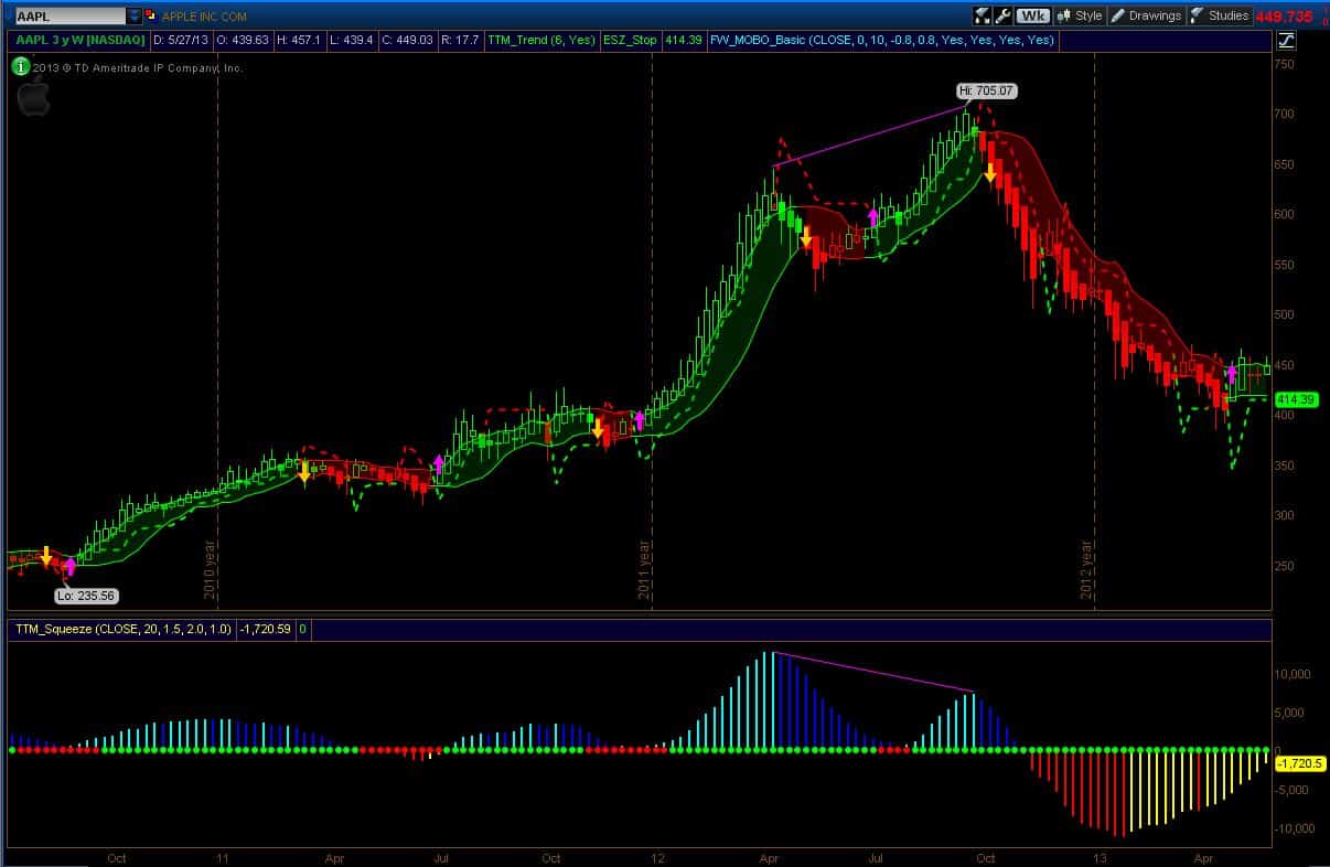
Example ChartsBelow is a weekly chart of Apple. I don’t usually look at individual stocks but Apple is interesting to a lot of people and it’s a good example of some of the indicators I use. Below the chart, I will briefly describe what I see. Since this is an introductory post, I won’t go into a lot of detail. The appendix in this post contains more detail on the indicators.
 (please click on image for full-size version)
There are numerous indicators on this chart but to keep this post short, I will simply describe the analysis. The Heikin Ashi candles indicate a positive trend developing which is consistent with the coloring of the candles as imposed by the trend indicator. The last momentum breakout was positive (the magenta arrow) and occurred four weeks ago. Risk is either the bottom of the momentum band or the stop (dashed line). Both indicators are currently around $415. Selling pressure, as indicated by the yellow lines on the momentum oscillator in the lower panel, has been abating for many weeks. The squeeze indicator, the green dot, suggests that price action is trending (red is no trend). Value is in the middle of the momentum band (I have a different value indicator which I will show another time).
That’s the current analysis. From a historical perspective, it is interesting to note the obvious price/momentum divergence between the April and October peaks last year. During the last peak in October, the stop had you out of the trade at $670 and then a week later, the momentum breakdown signal (magenta arrow) confirmed the move (as did the Heikin Ashi candle and the trend color).
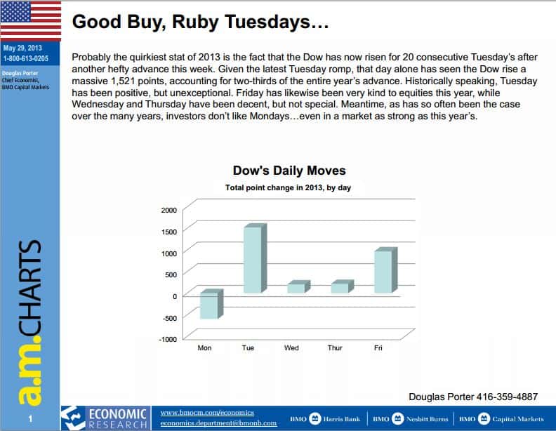
I will occasionally post other interesting macro charts like the one below from BMO Nesbitt Burns. This is not a public chart but I have permission from the author to show it here. I don’t need to say much about the it other than it falls into the category of anything can and will happen in the markets!
 (please click on image for full-size version)
I will post my weekly charts later this weekend and the monthly charts on Monday.
Good Trading,
Dr.G
————————————————————————————————————————–
Appendix
Heikin-Ashi CandlesThese candles are described in an article by Sylvain Vervoort published in “Technical Analysis of Stocks and Commodities” in 2008. They are averaging candles based on the current and previous bar. They are not pure price action – they are a short term average of the pure price action. The rules for HA candles are:
Hollow candles with no lower “shadows” indicate a strong uptrend: Stay long until there’s a reason to exit. Hollow candles are and early warning for an uptrend: you might want to add to your long position, and exit short positions. One candle with a small body surrounded by upper and lower shadows indicates a possible trend change. Filled candles are and early warning for a downtrend: you might want to add to your short position, and exit long positions. Filled candles with no higher shadows identify a strong downtrend: stay short until there’s a reason to exit.Momentum BandsThese are the green and red cloud bands around price action. There are many varieties of bands and I am using the ones were popularized by David Elliot. They are 0.8 standard deviation bands with a 10 bar look-back. A close above or below the bands signifies a statistical break-out (the Magenta and Goldenrod arrows).
Trend IndicatorIf the candles are RED then the trend is down. If the Candles are green, then the trend is up. It is based on a Modified Heikin Ashi arithmetic chart pattern. HA candles are averaging candles based on the previous bar. If you have a look-back of say six bars and the price of the last bar is above say the 50% price of the previous five average bars, then the trend is up and the bar is colored green.
SqueezeThere are many squeeze-type indicators out there. Most are based on the difference between the Bollinger Bands (a statistical indicator using standard deviations) and the Keltner channel (a measured price-action channel created using some multiple of Wilder’s ATR). The indicator I am showing in the lower panel is the squeeze indicator popularized by John Cater and described in his book “Mastering the Trade”. Green dots means the market is trending as indicated by the Bollinger Bands being outside the Keltner Channel. Red dots are the opposite and are interpreted as a market that is choppy and not trending. The histogram is a momentum oscillator. Carter suggests that a two bar color change in the histogram indicates a possible trend change.
Stops (Risk)I am showing Elder Safe Zone stops as described in Alexander Elder’s book “Come into my Trading Room”. When entering a trade, use this level as your risk. You can also use the opposite momentum band level – whichever is more suitable for your style. The Safe Zone stop is a mathematical indicator that is based the number of penetrations of the 22 EMA. It’s and algorithmic indicator as opposed to the statistical momentum band indicator. Typically, during the initial entry point, the Safe Zone stop is furthest away. As the trend progresses, both stop levels will be approximately the same. As the trend matures, the Safe Zone stop will move inside the momentum band and get closer to the price action. A violation (based on closing price) of the Safe Zone will exit you from a mature trend at a more optimal level than the momentum band.
Comments
No comments yet.

