The Correlations feature on Slope of Hope allows you to enter a set of ticker symbols, or use the tickers from a watch list, to create a grid of correlation values. The grid is color-coded for easy readability, and you can create a grid up to 20 by 20 symbols large. This feature is available only to Silver, Gold, and Platinum users. You can upgrade your membership to get immediate access by clicking here.
To access this feature, choose it from the Equities menu:

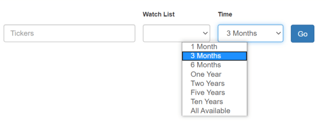
This takes you to the Correlations page, and you will have the opportunity to either type in some equity symbols manually or, much faster, choose a watch list of your own. Here is a very simple example:
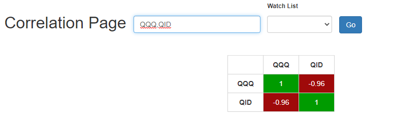
You can see how this grid works. When the symbol is compared to itself (QQQ versus QQQ, QID versus QID) the correlation is a perfect 1. QQQ versus QID, however, is -.96, since the QID is designed to move in the opposite direction of QQQ.
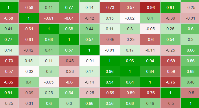
For ease of viewing, we color the correlations ranging from bright red (for the negatively correlated -1) to bright green (for perfectly correlated +1), with white in the middle for 0, no correlation at all. You can see how much this helps when you are examining a grid:
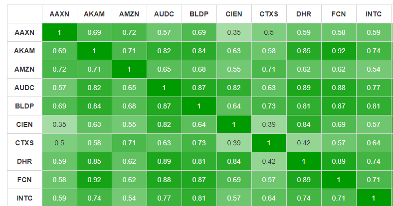
As a different example, here is the grid for the “Bull Pen” watch list, which has 18 symbols. Since these are all normal U.S. equities, they are all fairly well correlated, so it’s a sea of green.
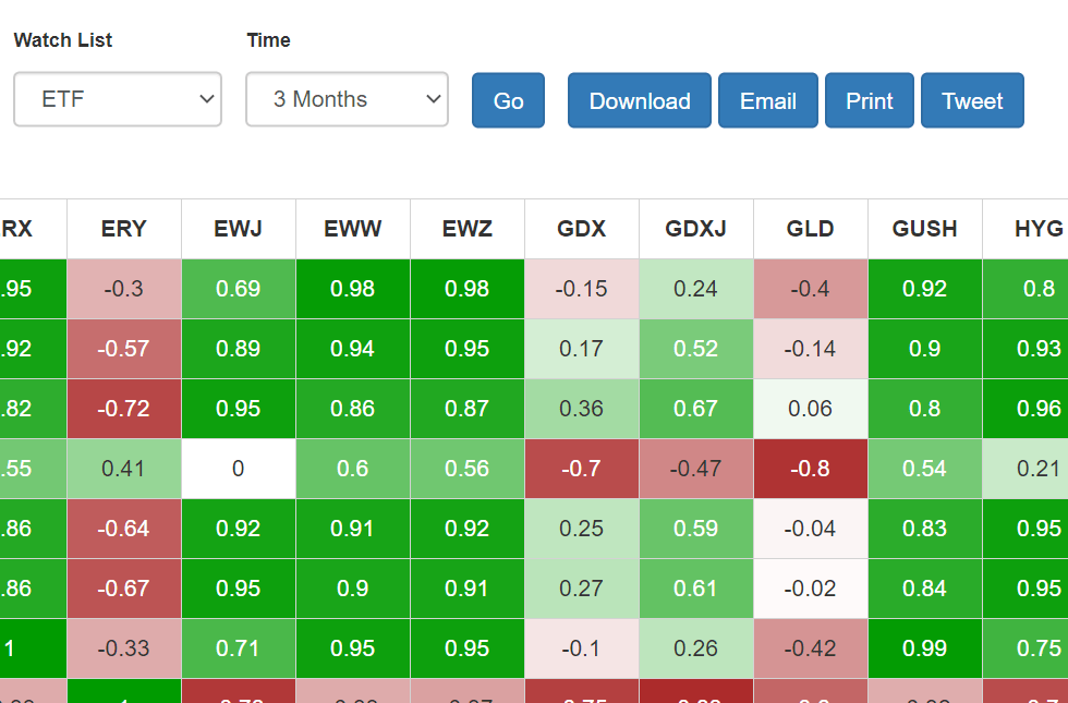
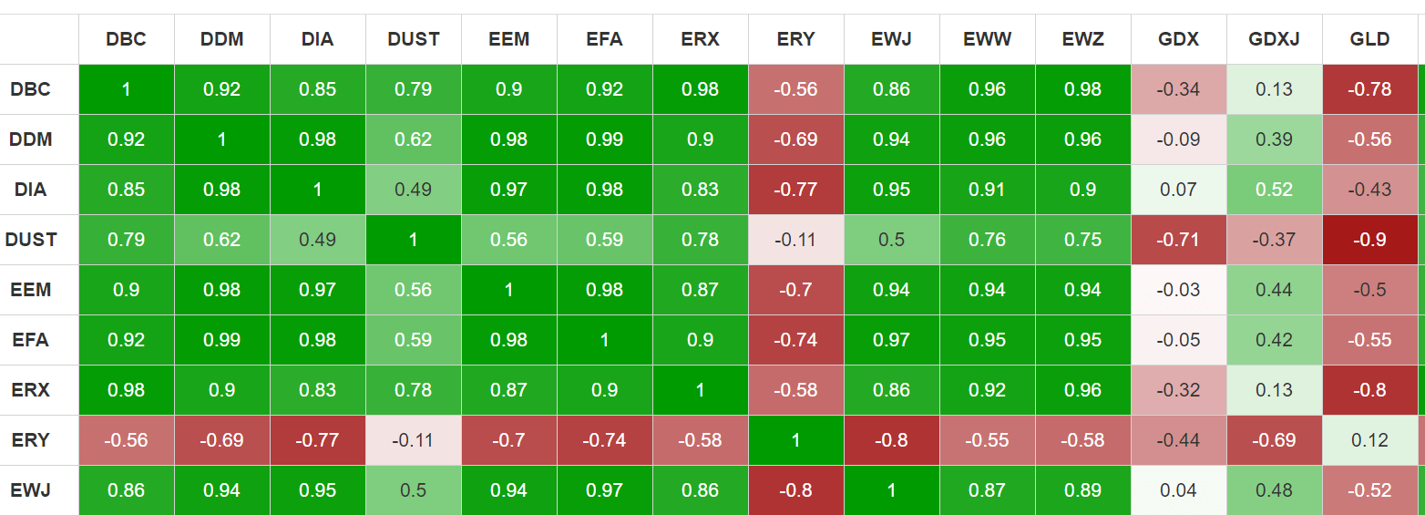
As a more diverse example, below is an ETF list. which has a diverse array of correlations, since a variety of industries are represented, as well as some “short” style ETFs.

The amount of historical used for the correlation computation is 3 Months, but you can choose a shorter or much longer range of information for your own calculations.
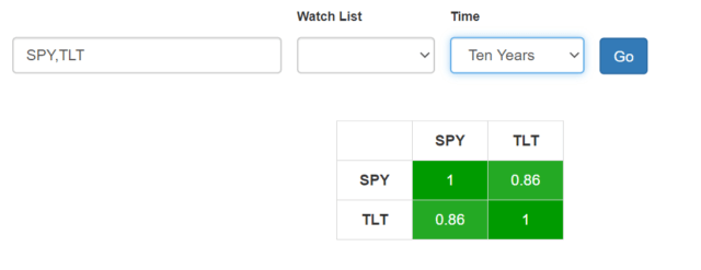
You can instantly see what a big difference this makes. Here, for instance, is the correlation between the S&P and bonds over the past decade:
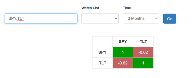
Change it to 3 months, and you get a very different picture:
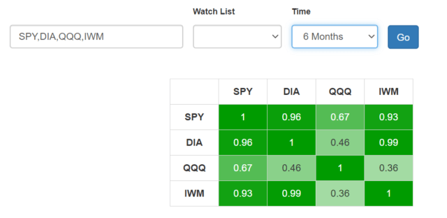
One would assume that the major U.S. equity ETFs would have correlations very close to 1, but this isn’t the case at all over the past half-year:
Here’s a beefier example with the ETF watch list:
Lastly, the Correlations page features the ability to Download, Email, Print, and Tweet your correlation grid so you can share this information with others or use it for your own work.