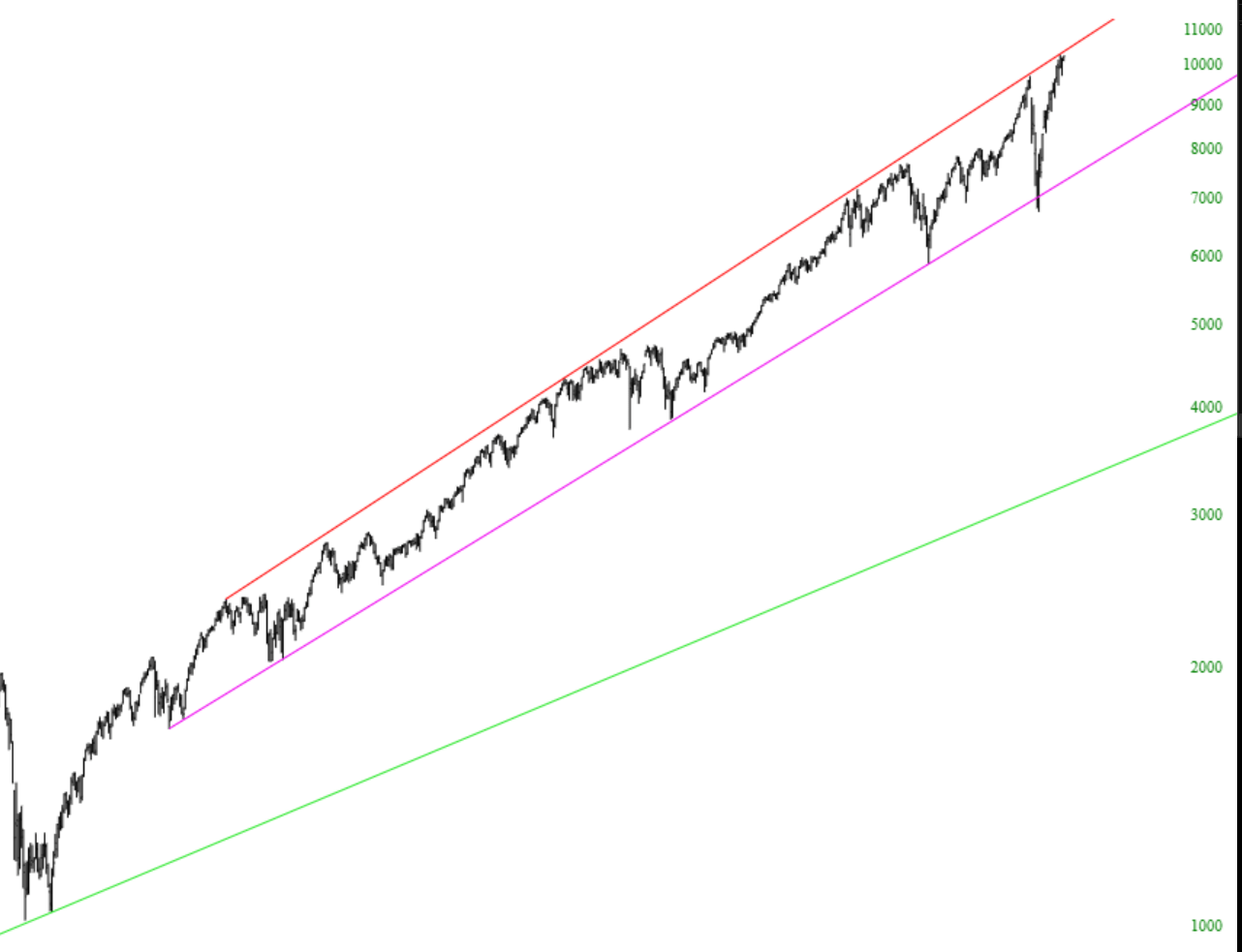
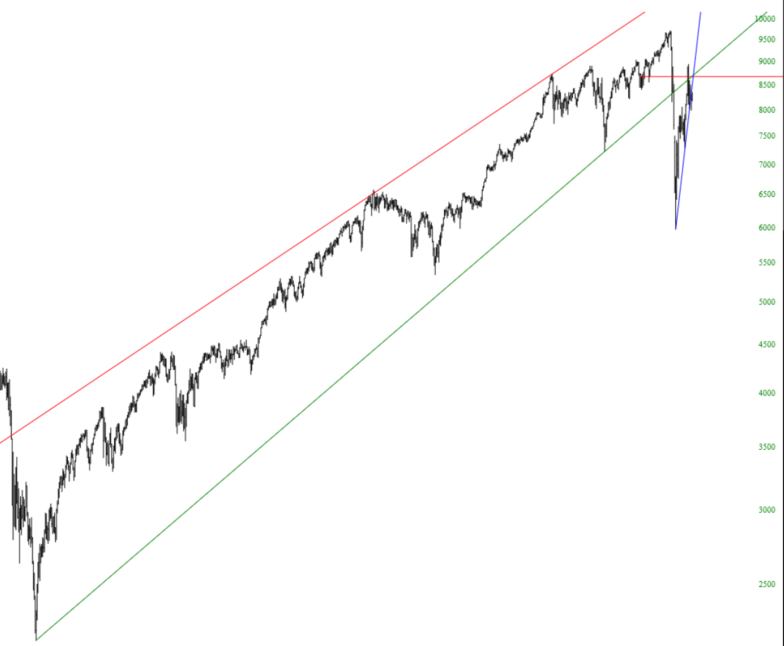
The trendline is one of the most important yet simple tools available among the drawn objects. It connects two anchor points together on a chart and, if you like, can extend rays to the left and right of those anchor points to indicate support, resistance, and breakthroughs.
To draw a trendline, choose this icon:
As shown in the animation below, you click one anchor point, move the mouse to the second anchor point, and click again. As with all drawn objects, you can right-click on it and change its style, color, and other properties.
To see what other Slopers have said about trendlines over the years, click the Knowledge Base link here.
You can right-click on any trendline and choose Change Style, which will bring up the dialog box shown below.
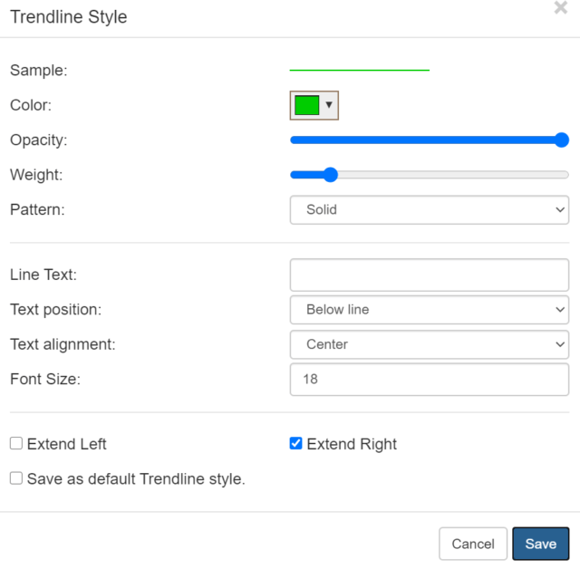
The Change Styles box lets you control:
- The color of the trendline;
- The opacity (how much you can see through it);
- The weight (or thickness);
- Whether the pattern is solid, dashed, or dotted;
- What text you want associated with the trendline, if any;
- Whether any text is above or below the line;
- Whether any text is left-, center-, or right-aligned;
- The font size of the text, if there is any;
- Whether the line extends to the left, right, or both;
- Whether your settings should be preserved as the default for all future Trendlines that you will draw
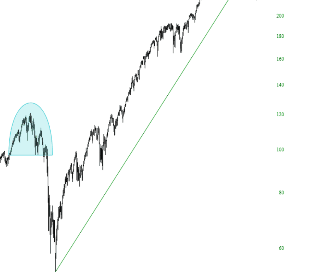
Here are some trendline examples on stock price charts: