One of the most time-saving features in Chart Lab is the presence of the Economics DB block, which gives you direct access to Slope’s incredibly deep database of long-term financial data from all over the world. The inclusion of this data block lets you integrate all kinds of time-series price data into your creations, including data that goes back literally hundreds of years.
Two of the big benefits that this data block provides is the ability to give it an alias (which makes the insane symbols much easier to understand) and the capability to search data sets within the Chart Lab work area.
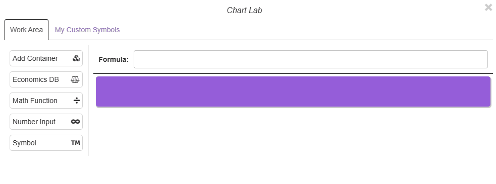
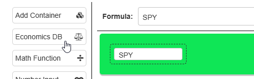
To use the economics database block, point at it and drag it wherever you want in the workspace.
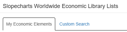
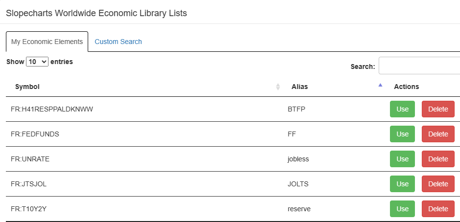
When you release the mouse button, a dialog box will appear with two tabs. The default tab, My Economic Elements, preserves the aliases you have created for different kinds of economic data (which, at first, will have no entries). The second tab, Custom Search, lets you type in words as the basis for searching for a particular kind of data.
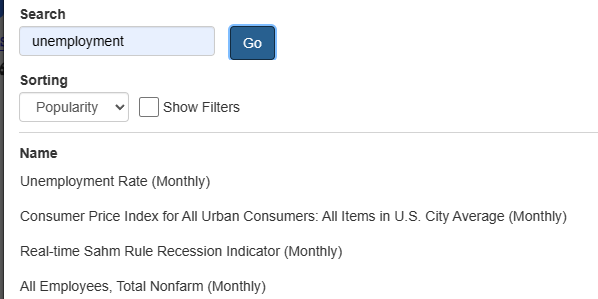
When you are new to Chart Lab, you will not have any of your own economic elements created, so you will want to create some by way of searching for data. The do a search, just type the words you want to seek. It is usually best to keep the search string as simple as possible.
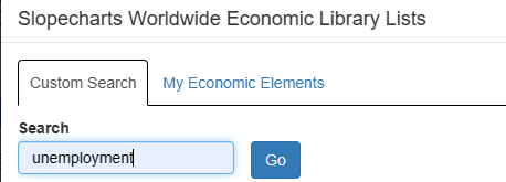
Based on this example, searching the word “unemployment“, a long list of possibilities will be presented, with the most likely choices at the top. There are many ways to filter and fine-tune your search, but those are covered thoroughly on a separate page here on Slope. When you see the item you would like to use from the list, click on it.
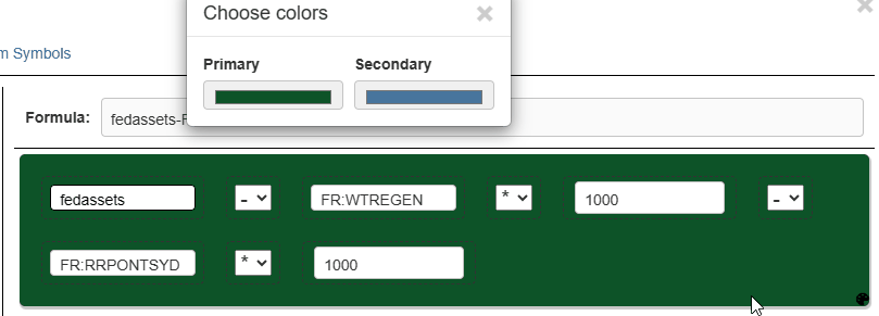
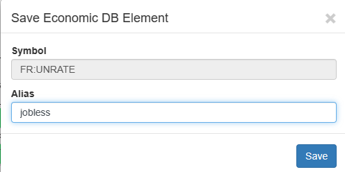
After you click on a choice, a new dialog box will appear with the symbol already in the Symbol field. In the Alias field you can, if you choose to do so, enter a “nickname” for the data so that it is easier for you to know what you are looking at. In this instance, the user would like the information in the block to be labeled “jobless” as opposed to the confusing FR:UNRATE symbol. (It should be noted that FR:UNRATE is probably one of the easiest and clearest symbols in the database, so we encourage you to make use of the “alias” feature in Chart Lab.)
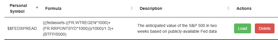
As you create these aliases, they will be retained in the My Economic Elements tab for later use. To do so, you would click the Use button. You can also permanently remove the entry by clicking Delete. You are welcome to use any combination of uppercase and lowercase letters. The goal is to make your alias clear and obvious to you with respect to the purpose of that particular data element in your formula.
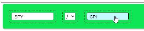
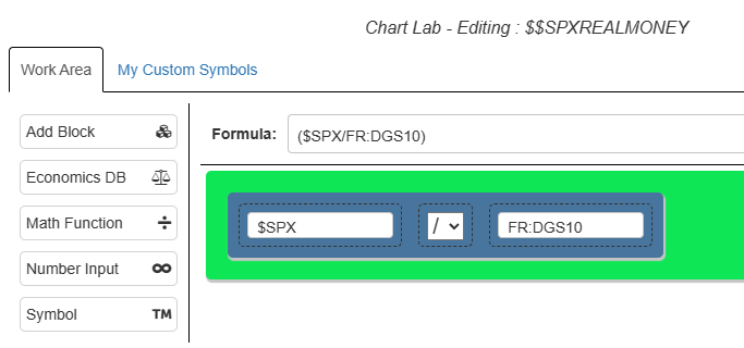
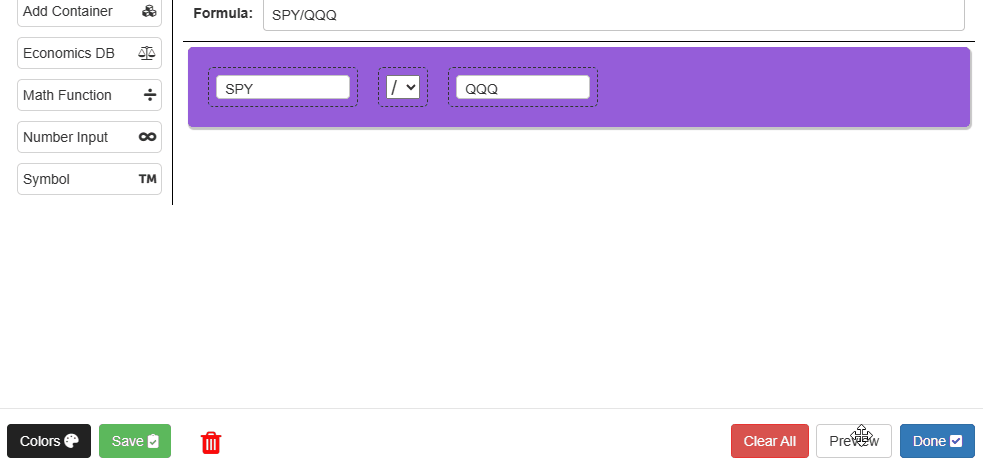
Once you have finished choosing the data element, it will appear in a block, just like a normal symbol. The key difference is that, unlike the Symbol block, you cannot freely type inside an Economics block. Instead, it acts like a button, so if you click on it, the system will let you change either the data being used or the alias. In the example below, a Symbol block (with the common symbol “SPY“) is being divided by the consumer price index, which here has been given the alias “CPI“.