The automatic trendline feature is available to Silver, Gold, and Platinum users. You can upgrade your membership to get immediate access by clicking here. Auto-Trendline is accessed from the Tools menu at the top of SlopeCharts.
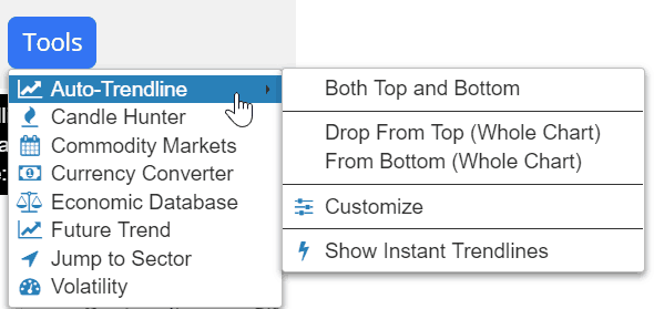
You can also access it by right-clicking anywhere on the chart, which provides you more choices.
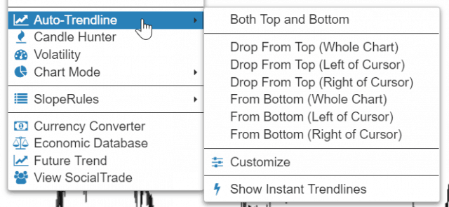
There are six different functions to this tool: three of them are to drop trendlines “from top” and three “from bottom”.
Imagine a ruler sliding from the top (or bottom) of the chart toward the center to picture how this works, as it seeks out the two best anchor points.
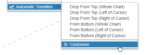
To have a trendline automatically drawn, right-click anywhere on the chart and choose Automatic Trendline from the menu (alternately, you can select it from the Tools menu):
Often you’ll want to have this function use the entire width of the chart to determine its anchor points, but there are plenty of times you’ll want to just “drop” the imaginary ruler from the cursor’s location toward the right of the screen or, alternately, left.
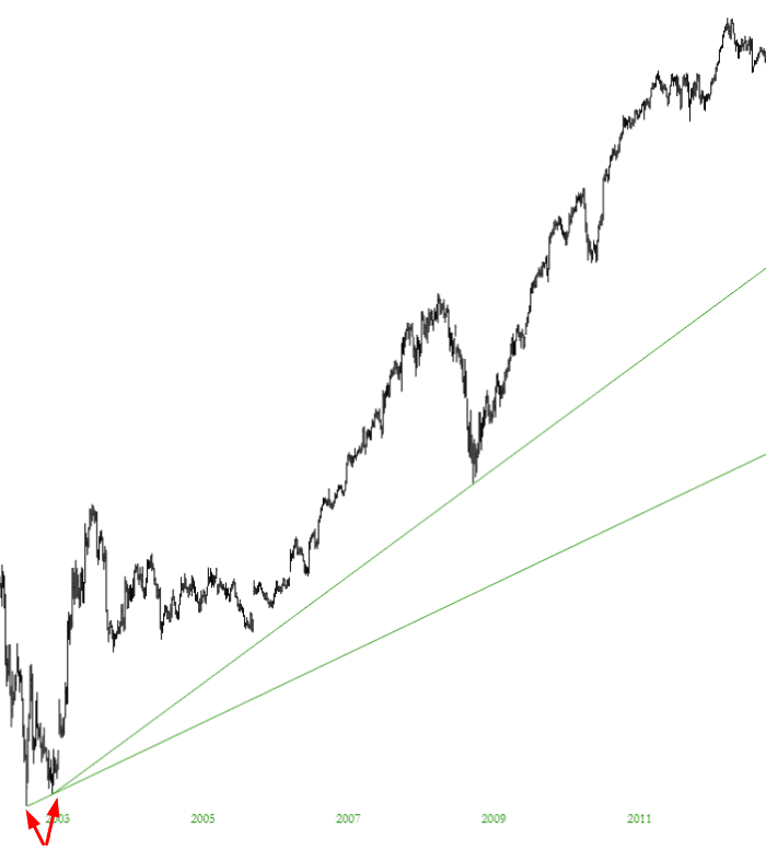
An example will help clarify this: below is a chart where I put an auto trendline from the bottom using the entire chart. It found the two lowest anchor points (see arrows) and put the trendline there. In this instance, the trendline is pretty useless. So I pointed the cursor to the point between those arrows that I’ve drawn and put the auto trendline down to the “Right of Cursor“, which established a much more useful line illustrating the long-term uptrend.
In any case, I’ve used these auto trendlines, and they are a huge time-saver. It takes literally one second to accomplish what normally takes about half a minute (including the inevitable moving of the anchor point that takes place).
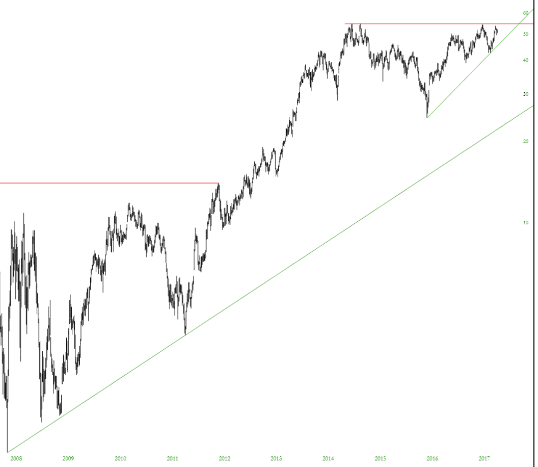
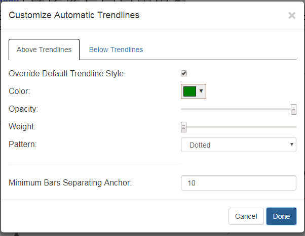
You can also customize the auto trendlines. Suppose, for instance, you wanted all the trendlines “from the top” to be red (suggesting resistance) and all the trendlines “from bottom” to be in green (suggesting support). It would be a pain in the neck to change these individual lines one by one as you laid them down, so now you can control the styles of these lines.
Just choose this menu item:
And you will see this spiffy new dialog box, which is pretty self-explanatory:
One other item you might have noticed at the bottom is “Minimum Bars Separating Anchor“. On some charts that automatic trendlines would attach to bars that were far too close together (perhaps the stock had been in a very narrow range early in its history). Changing this value lets you establish some breathing room between anchor points so that the trendlines are much more likely to be helpful.


