The Slope of Hope is delighted to make available something extraordinarily rare: high quality, easy-to-use charts of options. This is an exclusive feature provided to Platinum premium members of the service. To access this page, choose Options Charts from the Options menu on the website:

Alternately, you can select this item from the Options menu within SlopeCharts:

There are a few important things to know:
-
- Presently, the chart does not include the current day’s information until a couple of hours after the market closes. Shortly after the closing bell, the database is appended with the latest options data.
- The options chart shows the closing bid and ask for the specific instrument being displayed, which is almost always more useful than the open/high/low/close data, since the vast majority of options are exceptionally-thinly traded. The mid is also displayed, which is the average of these two.
- You need to fill in the form from left to right, as shown in the next portion of this help page, since you need to clearly define precisely what it is you want to chart.
Once you are at the options chart page, you will be presented with a form that has these elements:

From left to right:
-
- Overlay provides two dropdowns, allowing you to mix and match various kinds of stock and options data onto the same chart or, most simply, see the historical bid/ask data for the entire history of the financial instrument in question.
-
- Symbol is where you enter the underlying root symbol (the site supports U.S. equities);
-
- Expiration Date provides the eight nearest-term expiration dates, unless you click Show All, in which case all the expiration dates will be available;
-
- Type lets you choose between Call and Put;
-
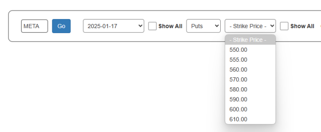
- Strike Price provides the strike prices that are closest to the present price of the stock; if you want to see every possible strike price, which can sometimes be an exceptionally long list, you can click Show All;
-
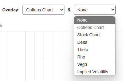
- Overlay provides two dropdowns, allowing you to mix and match various kinds of stock and options data onto the same chart or, most simply, see the historical bid/ask data for the entire history of the financial instrument in question.
The dropdown is automatically filled with the next eight expiration dates for the root symbol you have entered. If you want to see expiration dates farther in the future, or expiration dates from the past, click the Show All checkbox, and all the expirations in the database will be available to you.
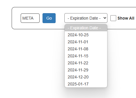
After you choose an expiration date, you choose whether you want to see a Put or a Call.

Based on the root, options type, and expiration date, the page figures out what the nearby strike prices are. As with the expiration dropdown, if the item you want is not in the default list, you can choose the Show All checkbox to see many more choices, but most people are interested in the default values.
Once the form is complete, you will then be presented with a chart showing the bid (in blue), ask (in red), and the midpoint of those two (in green). You can zoom in to any portion of the chart by swiping the portion you want to see, and you can double-click anywhere inside the chart to unzoom.

There are five buttons on the chart. Save preserves the chart to your watch list, Bought and Sold allow you to designate dates at which you bought and sold the option, Download saves the image to your local storage, and Tweet lets you send out the chart via the x.com website.

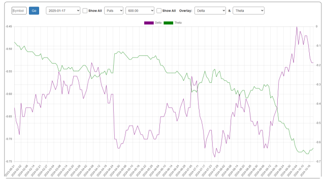
You are not limited to the individual option chart that you create. There are seven different kinds of information you can display. You have two dropdowns (each of which have the same choice) from which you can choose.
Here, for instance, is the Delta and the Theta chart:
And here is Implied Volatility and Delta. Any combination is acceptable:
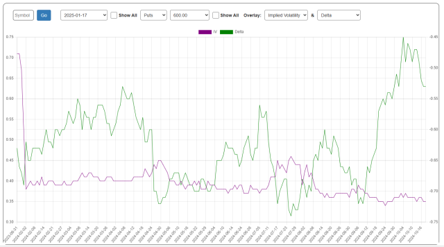
You can also augment a chart with the Bought and Sold markers. These allow you to specify a date at which you purchased or sold a specific option, and those dates will be marked with green and red lines, respectively.

To establish when you bought or sold an option, just click on the appropriate button and select the date corresponding to the buy or sell date.

When you’ve marked a point at which you Bought an option, you can mouse over it and see what the change-to-date is, based on the most recent price.

If you are looking at an archived trade in which you have both a Bought and a Sold, then mousing over the Bought will show you whatever the “closed” profit (or loss!) was between those two points.

You can also mouse over the Sold to see what the price did after you got out of the position, for better or worse.

The Watch List provides a time-saving way of preserving the options you want to chart (typically options in which you have a position). Just click the Save button to preserve the current chart to your watch list. You can delete any selection from the list by clicking the Delete button.

One extra feature specifically for the watch list is the Archive button. It preserves the symbol at the bottom of the dropdown, beneath a dividing line. This gives you a way to keep an eye on positions you’ve sold so you can monitor its progress afterward. Also note that the numbers in the dropdown provide a sum total of the options that you’ve saved (at the top of the dropdown) and archived (at the bottom).

As an added bonus, you will be able to see all of Tim’s open positions by using the same dropdown:

There is an auxiliary page on the site separate from the Options Chart called the Options Volume and Open Interest Analysis page. What this provides is a simple, easy-to-understand presentation showing where the concentration of volume and open interest is for any given symbol and expiration date.
To use it, you punch in a symbol, press Enter (or click Go) and then select an Expiration Date. Those are the only inputs. After that, you can just choose whether you want the Volume or Open Interest chart and select from any of three chart styles offered.

Here, for example, is as line chart. The green represents call options, and the red is for put options. You can zoom in to any portion of any chart in the same way you do in SlopeCharts: just swipe the piece you’d like to see.

Here is the area style of chart, which is especially vivid. Since I’ve had my share of frustrations with thinly traded instruments, it’s nice to have a means by which I can see where the meat of trading is.

As you mouse over a given chart, it will present to you a “tool tip” style box that highlights the strike price you are examining as well as the quantity of calls and puts contained for that price. You will also see the standard Download and Tweet buttons in case you want to preserve or share your chart.

