The Slope of Hope system calculates each day the number of stocks that increased in value, the number that decreased in value, what the sum total of those values is, and what the “running” total is back to the beginning of its calculation, many years ago.
This data comprises the Advance/Decline data set, and it can be viewed in SlopeCharts by way of the Statistics data panel.
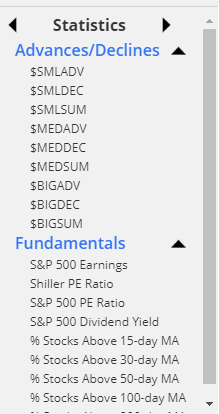
There are three kinds of data (advances, declines, and summation) for three different thresholds of stock volume (small, medium, and big), resulting in nine distinct symbols. The three different groups of stocks are dictated by these rules:
- The “small” threshold means that almost all the stocks are counted; they simply have to have volume greater than 250,000 shares on any given day (we dismiss stocks with lower volume as unhelpful “noise” in the data set);
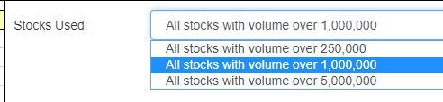
- The “medium” threshold covers a smaller set of stocks, since it sets the cut-off point at 1,000,000 shares.
- The “big” threshold is the most restrictive, since it only counts stocks with volume greater than 5,000,000 shares.
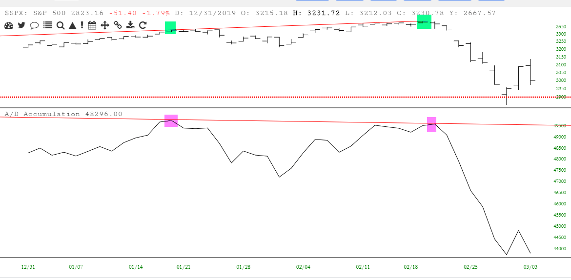
The principal value in this information is the “SUM” symbols: that is, the summation of advance/decline data. What you want to seek out is divergences. If stocks are moving lower while the A/D line seems to be uptrending, it could be marking an important bottom.
Conversely, if stocks are pushing to new highs, yet A/D seems to be downtrending, it could suggest that the advance is narrowing in breadth and the market overall could soon be heading lower.
Here is a specific example from the first quarter of the year 2020. The upper pane shows how stocks where making higher highs (indeed, the highest prices in history). Yet the A/D summation in the lower pane indicates a lower high. This divergence illustrated that the participation in the rally was becoming thin. Almost immediately thereafter, stocks entered into an historic plunge.
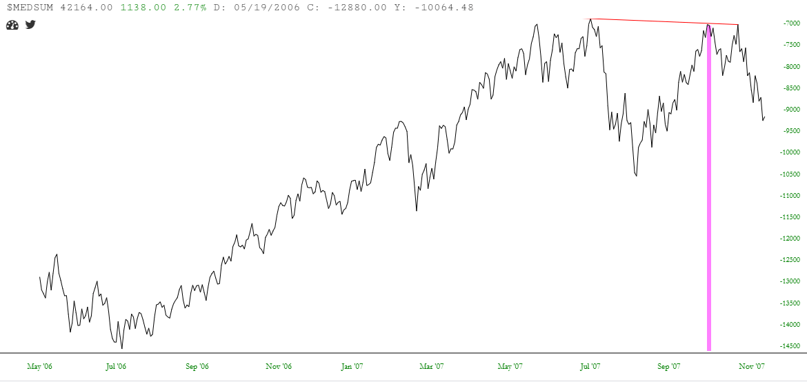
Looking at just the A/D summation without the stock price data, here we have the period in 2007 when stocks were reaching what, at that time, were the highest levels in history. As would be the case in 2020, the summation was making a lower high, which marked literally the day when the market peaked, and it would enter a major bear market the next year.
You can use the Statistics panel to plot this information or, if you prefer it be in an independent pane, you can use the Technical Studies and choose the A/D Summation. When you do, you are presented with three choices, so that you can dictate which set of data you want used for the summation line chart.