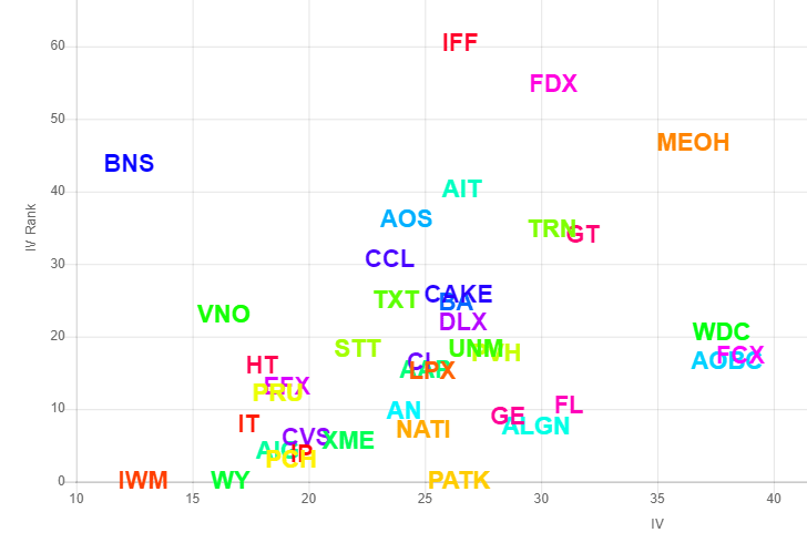
The volatility matrix will take whatever equity symbols you provide and place each of them on a grid, with the location on the x-axis representing that symbol’s latest implied volatility and the location on the y-axis representing the symbols’ IV Rank. This feature is exclusively for Slope of Hope Platinum members.
To use this feature, enter one or more equity symbols to see them placed on a grid illustrating their relative position with respect to implied volatility and IV Rank. After you enter the symbols, our system fetches the implied volatility as well as the IV Rank for every symbol you entered and puts them on a grid.
The y-axis is based on the IV Rank (the higher it is, the more volatile it is, relative to itself) and the x-axis is based on the IV alone. What you get is a representation of prospective trading ideas, or at least a good sense of the volatility landscape.
Besides entering one or more symbols directly, you can also choose the watchlist dropdown so that all of the symbols from your chosen watchlist are submitted at once.
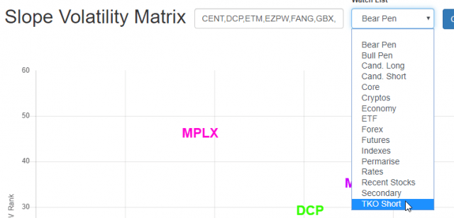
What this means is that you can instantly populate the volatility matrix with all the symbols from any of your watchlists.
There are also buttons near the top of the page that will let you Tweet the image to your Twitter followers or to stack the grid you just created to the SocialTrade database.
