This is an overview of SlopeMATRIX, which is another premium feature built for Silver, Gold, and Platinum users. You can upgrade your membership level to get immediate access to the page.
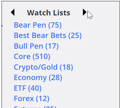
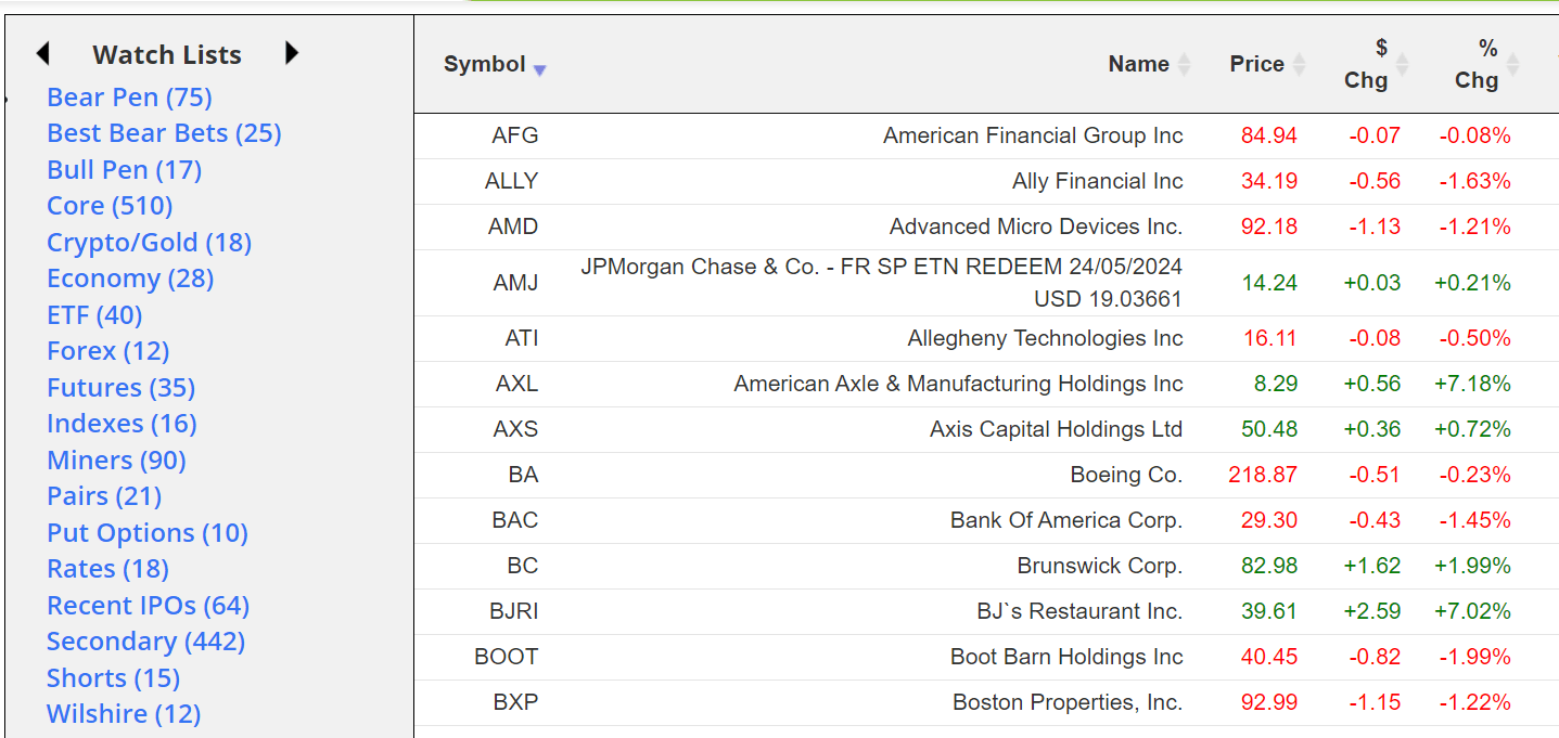
You can sort any list by symbol, name, price change, or percentage change. Clicking the top of any given column will sort (and subsequently reverse-sort) the contents. This is a great way to instantly see where the big action is taking place on any given day for any particular list. The percentage change column is of particular interest.
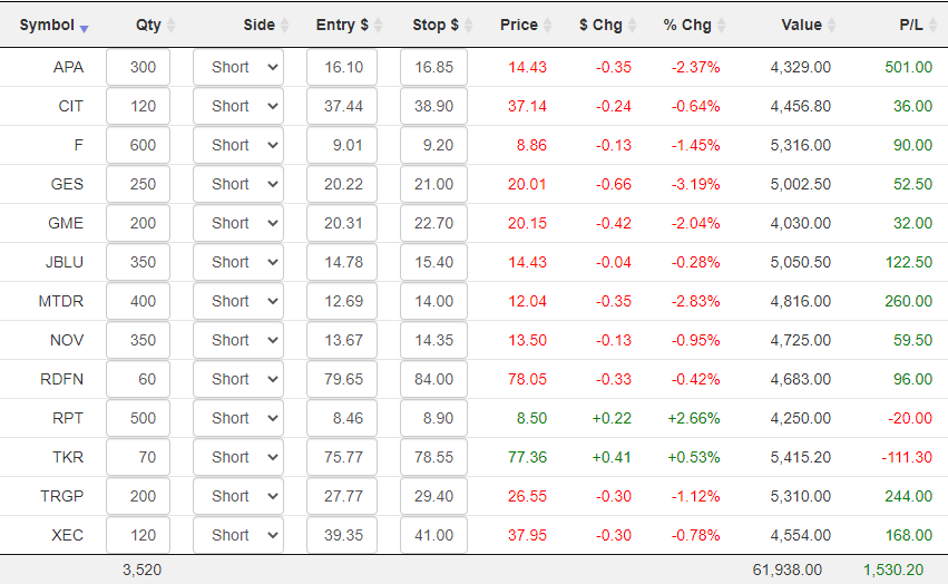
The most useful thing about this product is how well integrated it is with all of Slope’s watch lists (both your own as well as the ready-made ones).
The left side of MATRIX has the same panel of lists that you use in SlopeCharts, and by clicking the left and right arrows at the top of the panel, you can move to different classes of information for instant view of the quotes therein. Just click on any specific list to view its quotes.
On the right side of the screen are icons which let you go to a “super summary” page, see the market meter for that symbol, delete that symbol, and perform other functions.
![]()
In almost all of these cases, a small window will appear on top of your browser, meaning you need not abandon the page you are on just to get more information, such as the Market Meter….

……..the opportunity to create a SlopeAlert…………

…….the relative rotation graph………..

………and the earnings reaction graph. All four of these show up in DIV windows so that you don’t abandon the Matrix page.

The Portfolio mode brings a whole new dimension of utility to the product, because it lets you enter the details of your actual holdings so you can have up-to-the-second information on your profits and losses. Whether you keep your actual positions in a watch list of their own or not is up to you, although it’s somewhat cleaner visually if you do. Regardless, in Portfolio mode, you will see some new columns that do not exist in Matrix mode:

Even if you have a large number of positions, you can swiftly go through them just as you would a spreadsheet, pressing Tab to leap from one field to the next. Specifically, you would fill in:
- Quantity: how many shares you were long or short;
- Side: whether you were Long or Short;
- Entry $: the dollar price of your entry;
- Stop $: the value of your stop-loss price, if any (if a stop is hit, the row is highlighted so your attention is drawn to it)
Once you’ve entered that information, you will see the position value, its P/L, and the totals at the bottom.

Assessing risk and rewards for any given positions is crucial to success in trading. Perhaps the most important mode available in SlopeMATRIX is Risk Mode, which focuses on these two tasks.

It features:
- A column in which you can enter a target price for the position (this is optional);
- The S/L $ Risk column, which tells you in dollar terms what the risk is for your position (based on current price levels) if it were to hit its stop price.
- The S/L % Risk column, which tells you in percentage terms what the risk is for your position (based on current price levels) if it were to hit its stop price.
- The Tgt $ Reward column, which tells you in dollar terms what the opportunity is for your position if it goes all the way to your target price
- The Tgt % Reward column, which tells you in percentage terms what the opportunity is for your position if it goes all the way to your target price
As usual, every single column is sortable, which is a fantastic way to get answers to such questions as:
- Am I taking too much risk in a given position?
- What are the biggest and smallest profit opportunities?
- What are the biggest and smallest risks based on position?
- Do I need to tighten or loosen any of my stop-loss prices in order to make adjustments for too-large or too-small levels of risk? Or perhaps I should change the size of my position for the same goal.
As dry as the word “Fundamentals” sounds, it has some of the most fascinating information available, particularly for high-flying issues. What it shows for each of the symbols in your watch lists are:
- Market Capitalization
- Profit Growth
- Revenue Growth
- P/E Ratio
- Forward P/E
- Price/Sales Ratio
- Price/Book Ratio

As with other modes, clicking the column title will sort it either ascending or descending.
There is so much information available for equities, we have provided a separate tab to let you view and sort statistical data. This includes, for the symbols in your list:
- Beta
- 52-week High
- 52-week Low
- 50-Day Moving Average
- 200-Day Moving Average
- Shares Outstanding
- Average Volume traded per day

As with other modes, clicking the column title will sort it either ascending or descending.


