
Happy Canada Day to Canadian friends and Happy Independence Day to American friends!
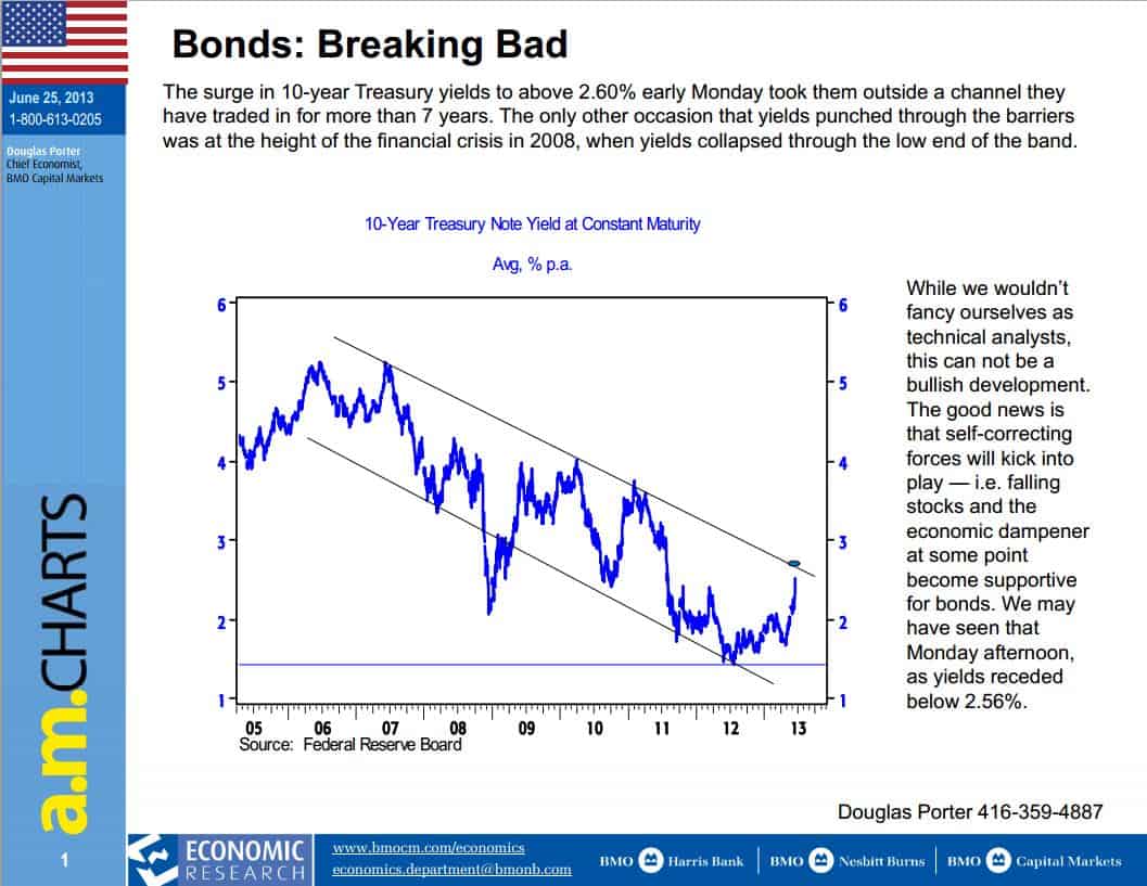
The Macro chart that caught my attention this week was on Bonds and is shown below. It’s pretty self explanatory. We have a good 7 year channel in place with many tests to the upper and lower trend lines. The break outside the channel is a warning flag that something is changing. Price will likely fall back into the channel but breaks outside of well established channels require consideration.
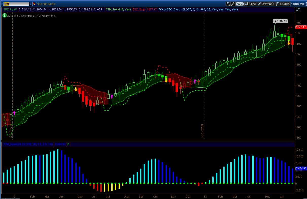
Last week I highlighted the new signals for the breakdown in the SPX after 25 weeks of trending up. This week we have further confirmation of a directional change in the market with the trend indicator now bearish which painted the candle red. (Note: the candles are painted according to a trend indicator – it is not price-based coloring). Buying momentum is still declining. These signals are setups. How you enter the trade will vary according to individual style. For me, once I have a weekly setup, I start positioning during the following week and then add to it on subsequent weeks if the trend looks to be developing. The chart of SPX below gives the upper channel (first stop) and the Safe Zone stop (last-chance stop). I use the stops to manage risk. If I want to start a pilot position and I want to risk $100, I look at the stop level I am willing to tolerate and I buy (or short) the appropriate number of shares. Or I use options where the risk will be around $100 if I am wrong. This week, I started a pilot short position on the broad market because I have a short setup. I am only using a small position initially because the monthly backdrop on the broad market is bullish (if the monthly picture was Bearish I would handle the trade differently).
Also, previous short set-ups have been shallow retracements. Since I cannot predict the future, I use prior history as an indicator of what might happen. I also managed my long position in a retirement account. Specifically, on Friday, I purchased August 29 calls on SH for $0.90 as my short bet. The most I can loose on a full lot is $90 but I won’t because I will close out the position before expiry if it’s not working (i.e., my stop levels are triggered or too much time has passed and the market is moving sideways). I am comfortable with option analysis and I am comfortable losing $90 per full lot. During the coming week, if the position is working, I will increase my short line using whatever method looks best at the time. The other thing I did was to significantly reduce long exposure in a retirement account. I considered hedging it but given that we are in the slow summer months I would rather just be out.
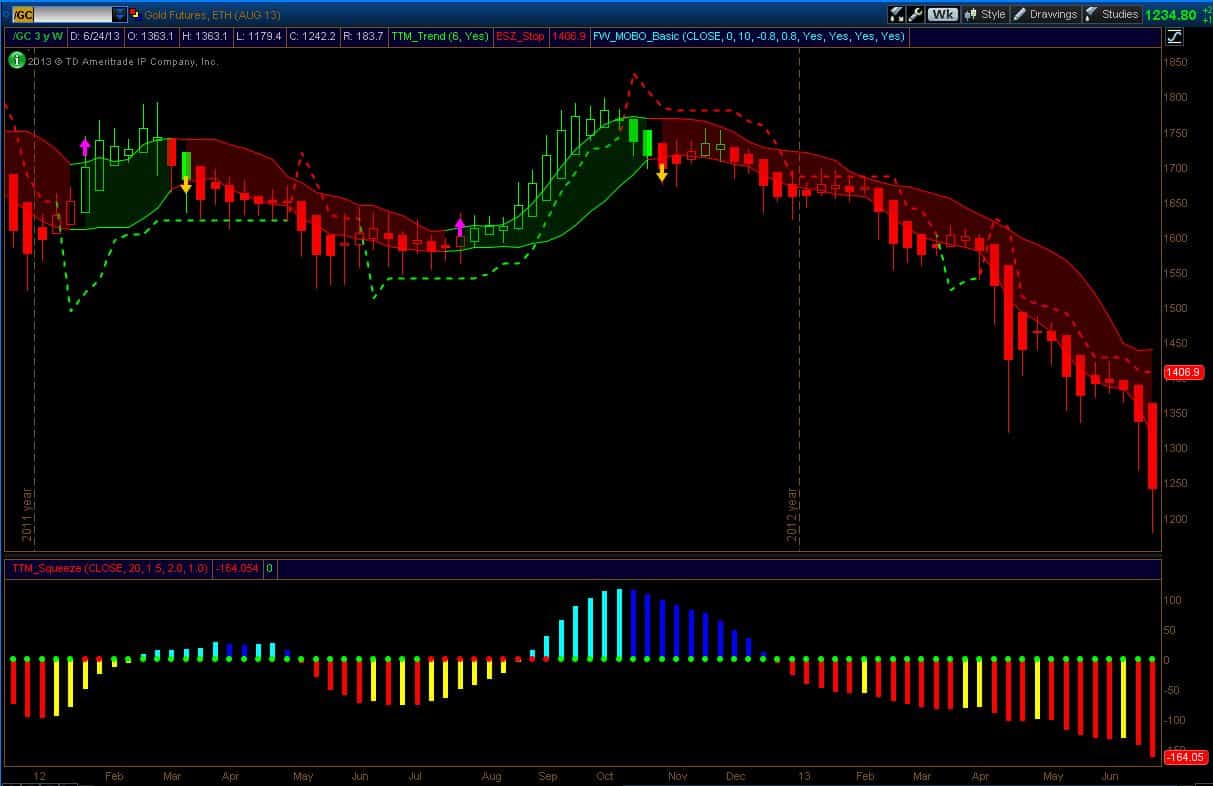
Gold really tweaks people. I am fascinated by the mass psychology of the gold trade. I have friends who are in serious pain in this trade too. Gold really nose-dived this last week and so the media is abuzz with opinions. We have people calling for $7000 and $10000 Gold – that would be like oil trading at $600-$800 per barrel from present day prices. Pretty fanciful numbers but guaranteed to get you coverage in the news I guess. We have stories of a floor in price due to $1200 production costs. These are gross misstatements since some mines have much lower costs (including negative costs due to input credits from other extracted materials) and some mines are much higher (those mines are not economic and will be shuttered). The production cost argument is specious. It reminds me of the argument in Natural Gas several years back when it fell from $15.
The media was full of “experts” who said it couldn’t fall below $5 because that was the cost of production. Being in Calgary, the oil and gas capital of Canada, I heard numerous fundamental arguments like this. Natural gas fell to below $2. The market will do what the market wants to do. I have my opinions on gold price potential but I follow the charts. Since I started posting here on Slope of Hope, I have noted that there are no buy signals in gold or the miners. That is still the case today. It’s a falling knife.
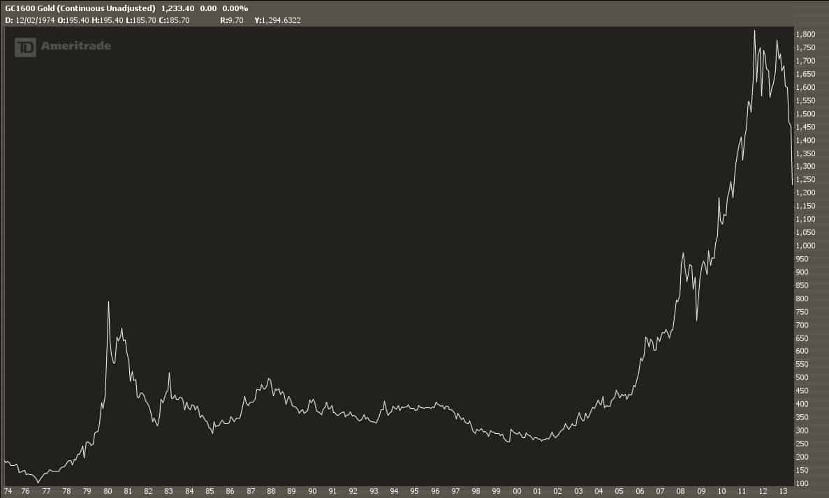
Below is a long-term chart of Gold. You can see the exponential run-up in the 80’s and subsequent blow-off (exponentials never end nicely). And you can also see the exponential run-up in recent years which we are now blowing-off. I can’t predict how far down this will go or how long it will take. My charts give me statistical guidance based on recent price action and that’s the best tool I have right now.
You can see from the chart below that the $1200 and $1000 area looks supportive. And so does the $600-$650 area which is an interesting area because of historical precedent. $600-$650 was the gold price in 2007. The broad market has recovered to 2007 pricing so if gold corrects to match the recovery in the broad market, Gold still has a long way to fall.
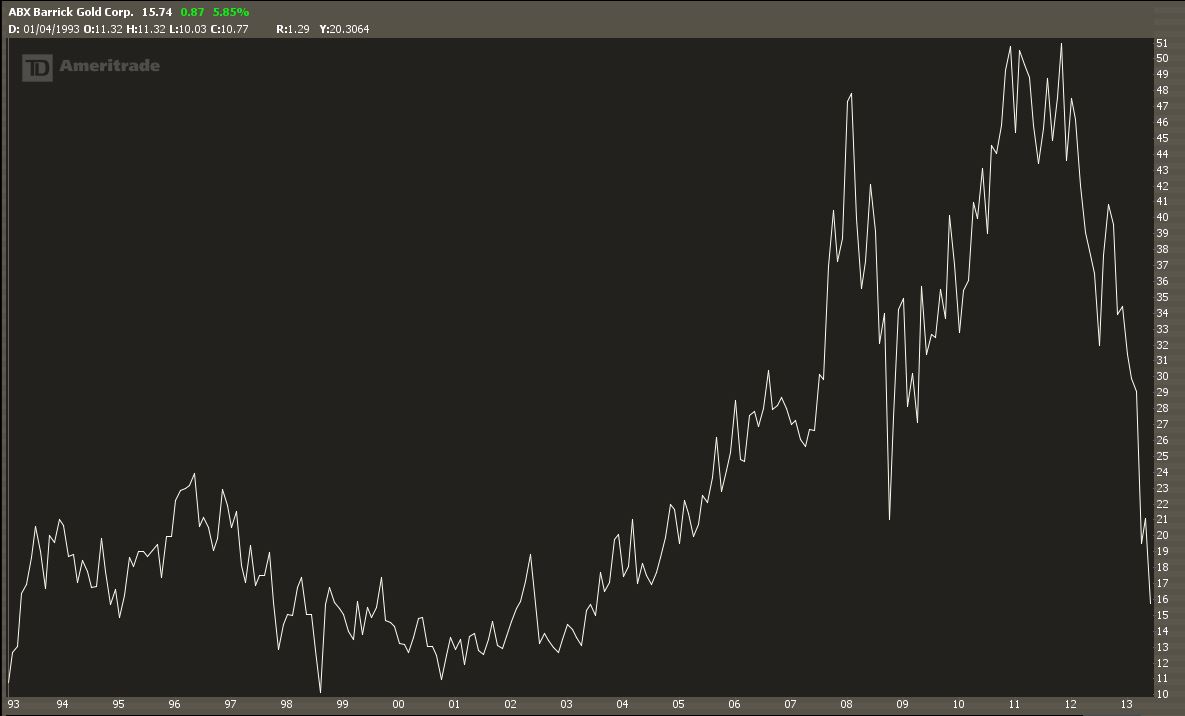
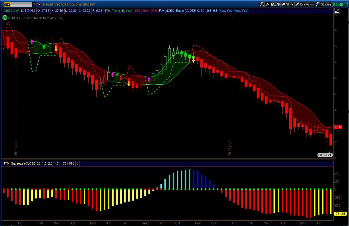
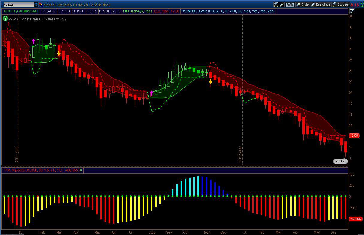
What I now find really interesting is the potential generational opportunities. We are seeing pricing not seen in 20 years or more. We are seeing Juniors getting killed and there are 100’s of dead Juniors out there trading on the exchanges – they just haven’t been put down yet. Even the seniors are now at amazing prices. For example, the world’s largest gold producer Barrick (ABX) is now trading on the Toronto Stock exchange at life time lows. This is a result of the exchange rate on the Canadian dollar. But still, I can buy Barrick today at a better price than at any other time in the last 20 years. And it isn’t far off that on the US exchange as evidenced in the chart below.
It is time to wrap this up. The three charts I have been showing for weeks (GC, GDX, and GDXJ) are shown below. There is no evidence of buying power coming into the market (Friday’s quarter-end price action is probably just a single day of window dressing for the quarter). Indeed, the down trend is still significant as evidenced by the long red bar on GC.
Have a good Holiday Week!
-Dr.G
