


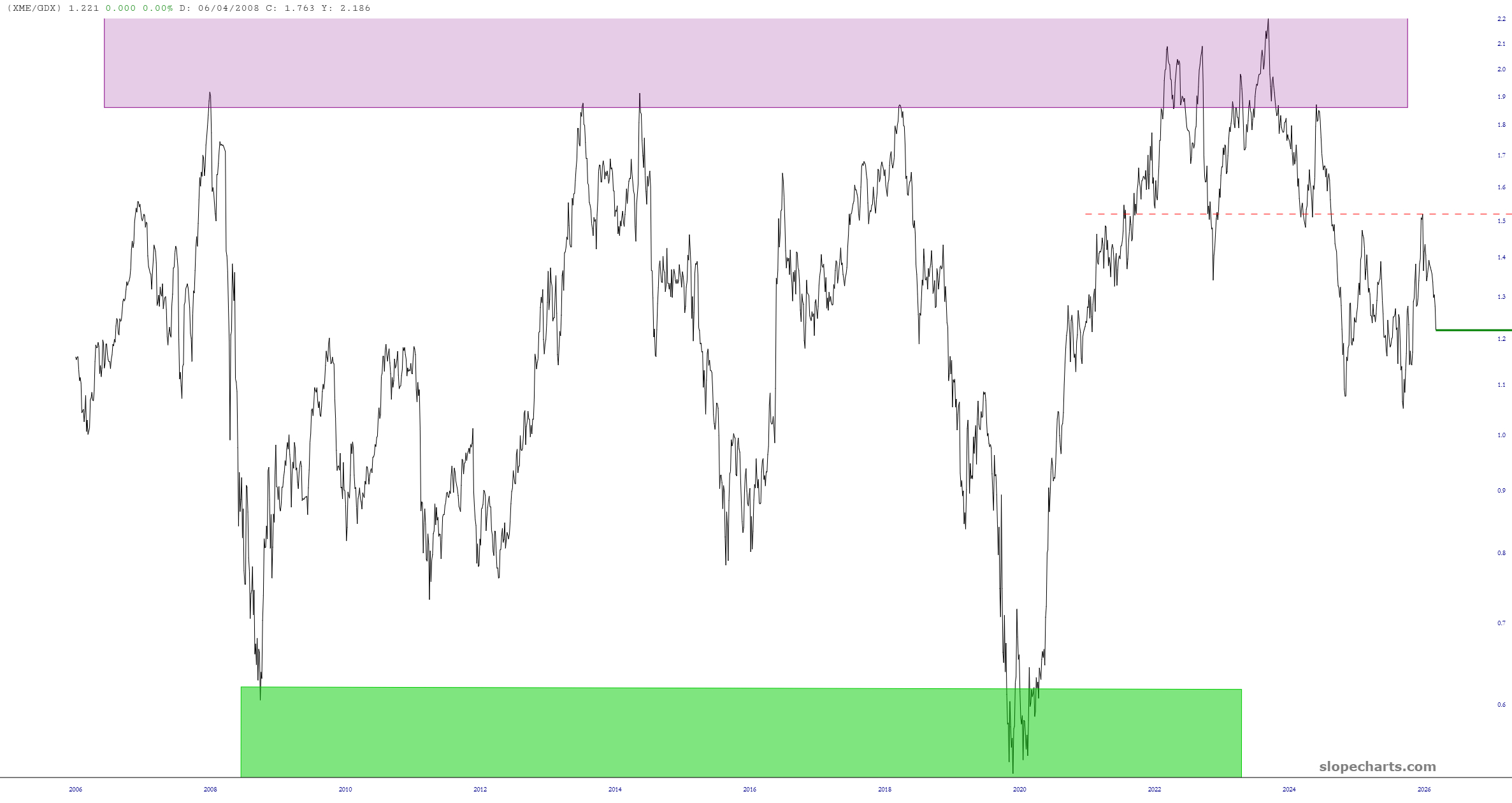
I wanted to make a point, and the best way to do it is by way of this XME/GDX ratio chart.

Slope initially began as a blog, so this is where most of the website’s content resides. Here we have tens of thousands of posts dating back over a decade. These are listed in reverse chronological order. Click on any category icon below to see posts tagged with that particular subject, or click on a word in the category cloud on the right side of the screen for more specific choices.
2025 was a stellar year for the precious metals, as gold bucked the bearish market trends of late winter and spring, followed by the miners and eventually, silver. After silver wrestled leadership from gold it was up up and away for the precious metals, critical minerals and other commodities. Right into a very high risk situation. Risk was realized, as expected.
Then came the anticipated “multi-month correction”. It lasted about 5 months. Check.
Then came…
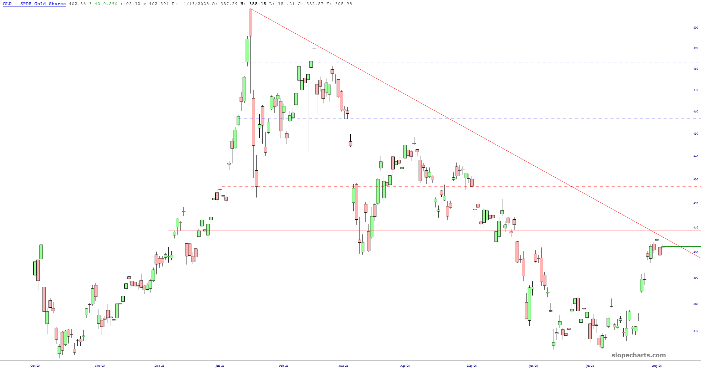
(more…)Gold, by way of GLD, is just below both a descending trendline as well as a major price gap. I’d say this price rise is done for now.
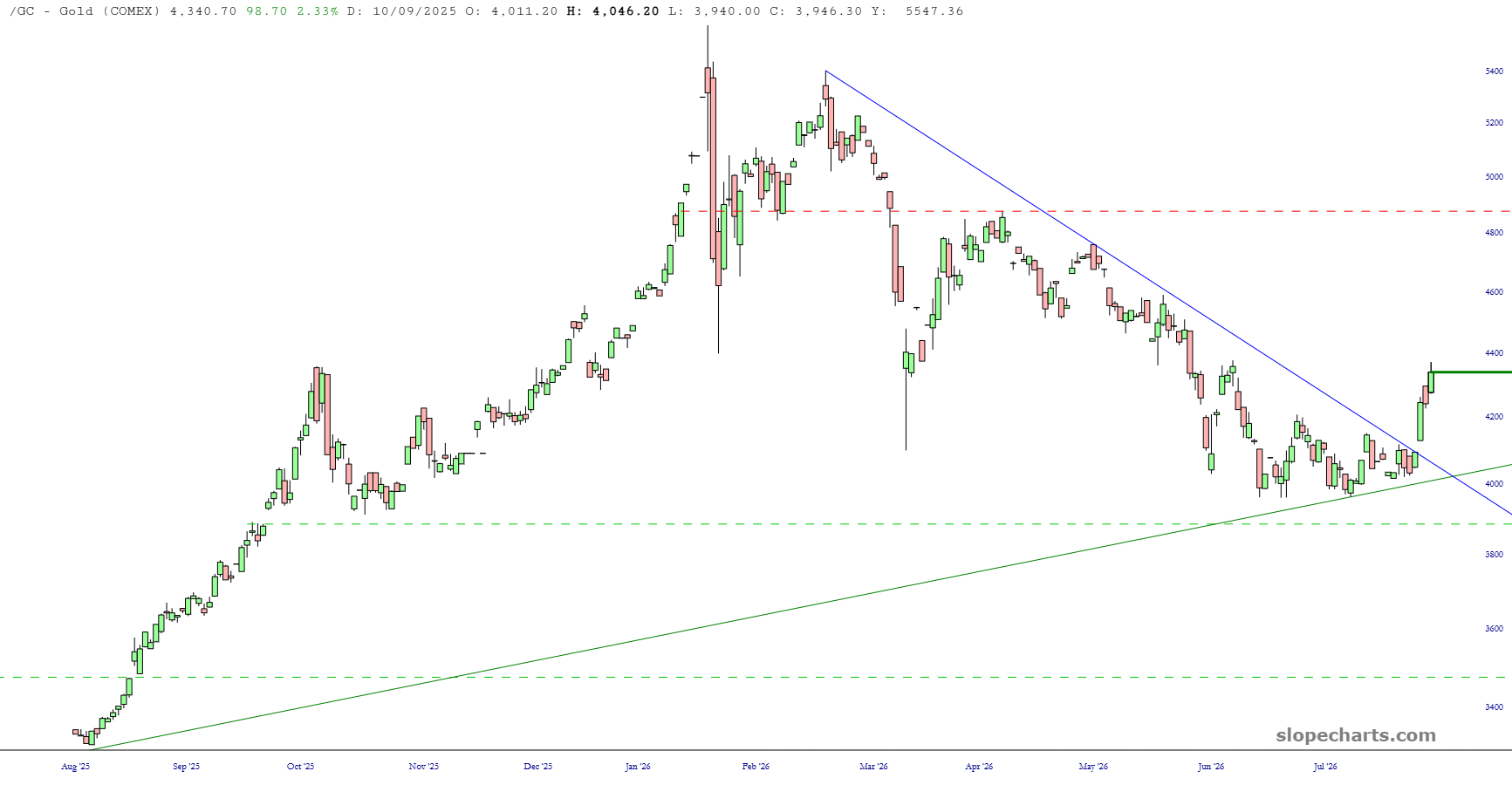
I’d like to share two bullish charts on a sector that I’ve been persistently bullish on for the long haul: preecious metals.
The first, gold, blasted above its descending trendline on Wednesday morning. Any weakness down to $4,200 would be a very appealing buying opportunity.
It’s all been bullish after the summer swoon, as anticipated. While one reliable indicator we track (a smoothing of the Equity Put/Call ratio using moving averages) has failed to crack SPX into a proper correction, indexes like the SOX and NDX did crack hard. SPX internally rotated its way out of trouble.
From AI-driven Semiconductors to a Software bottom, base and rally. From big Tech (especially AI Hyperscalers) cycling back in, to Healthcare segments like BioPharma and Medical Devices. From gold, silver and gold stocks… to the commodities that they lead. *
(more…)