My goal here is to get you to download the free Socialtrade Live mobile app for either your Android or iPhone devices on this page. I use it every day, and I absolutely love it. There are no ads, there is no cost, and it’s beautifully-made. Get it!

Slope initially began as a blog, so this is where most of the website’s content resides. Here we have tens of thousands of posts dating back over a decade. These are listed in reverse chronological order. Click on any category icon below to see posts tagged with that particular subject, or click on a word in the category cloud on the right side of the screen for more specific choices.
My goal here is to get you to download the free Socialtrade Live mobile app for either your Android or iPhone devices on this page. I use it every day, and I absolutely love it. There are no ads, there is no cost, and it’s beautifully-made. Get it!
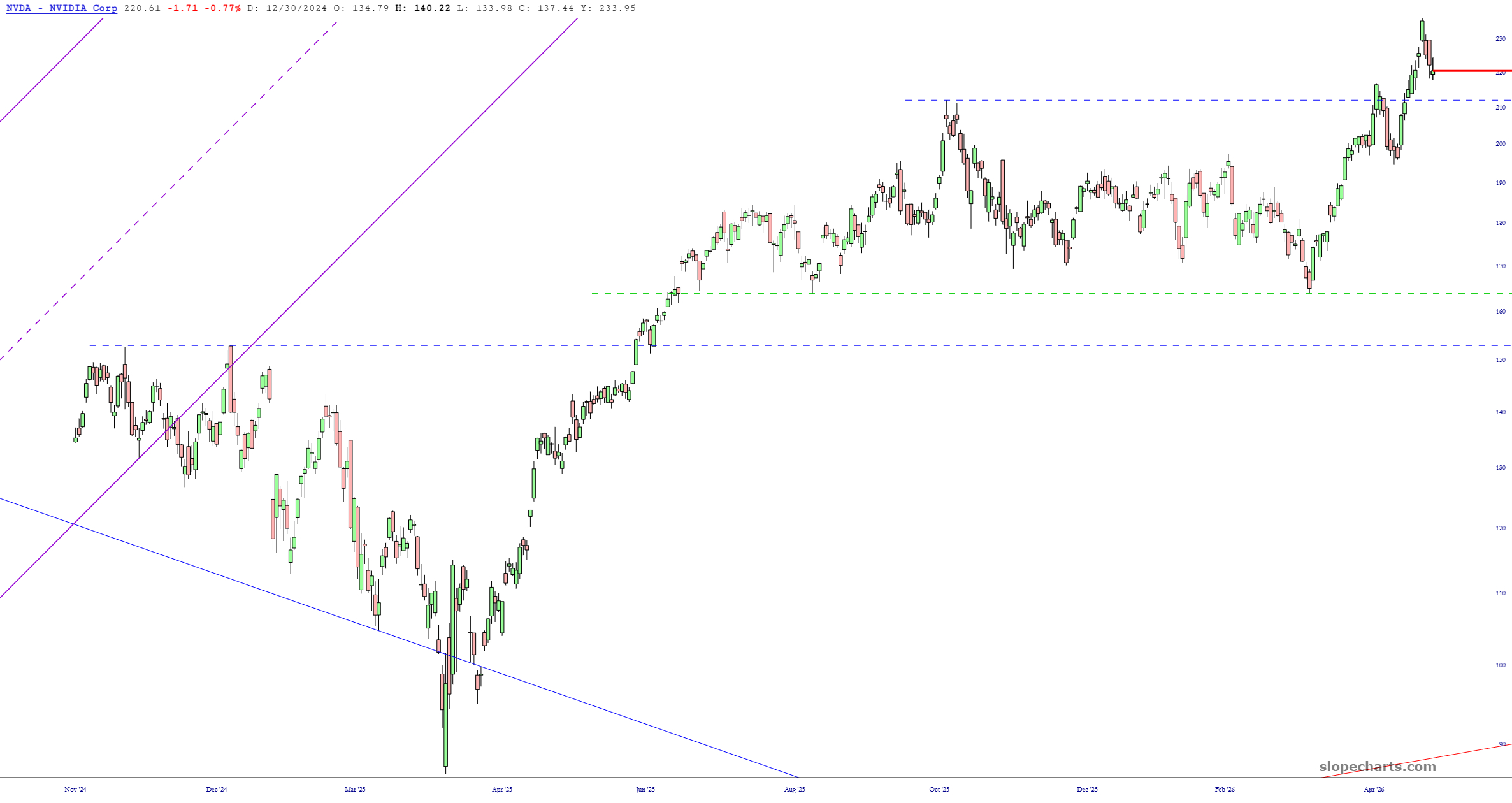
Since the Main Event this week is coming up soon (NVDA earnings after the close), I thought I’d share some Slope of Hope charts featuring this one symbol. I’ve described them in the captions.
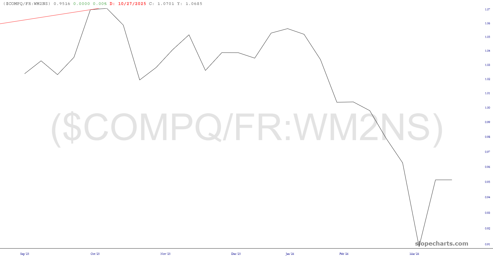
One of my favorite features in SlopeCharts, a product I used constantly, is the custom symbols. This is a special feature for our beloved Gold and Platinum members, and we’ve just made a huge improvement that I dreamed up a week ago. As a starting point, look at some of these charts I just made:
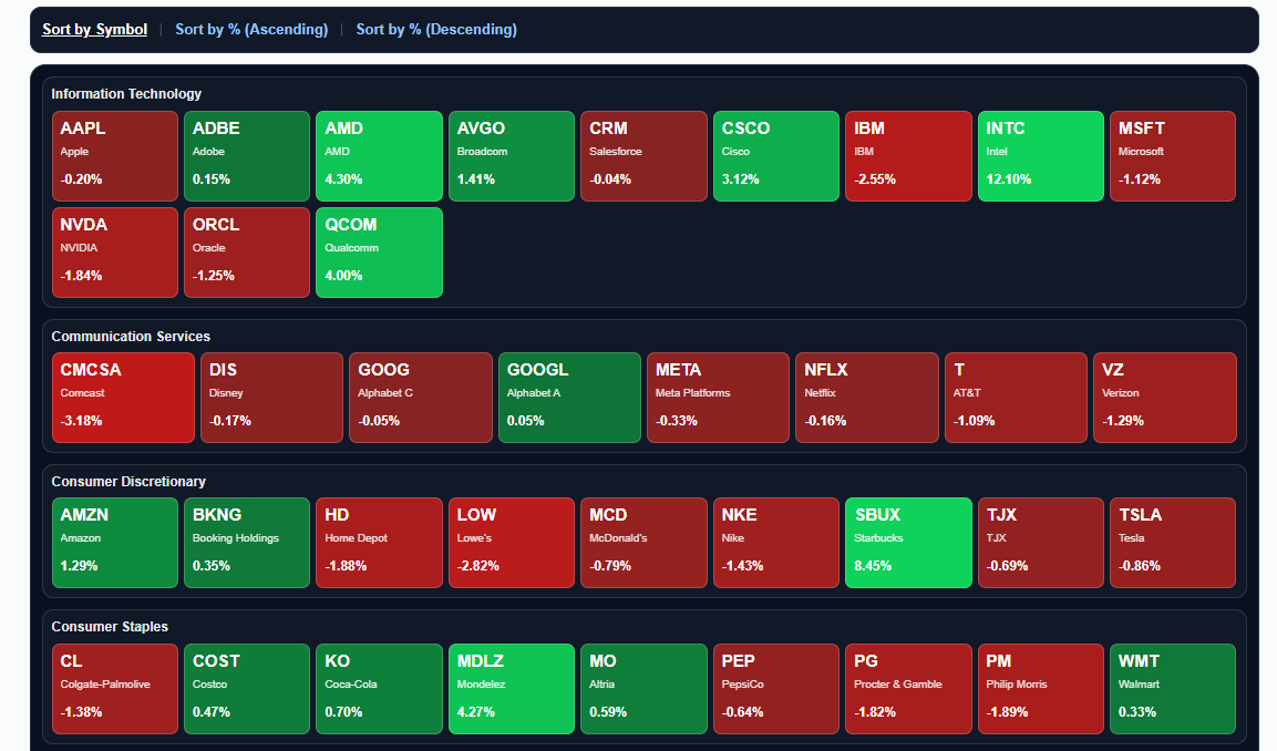
We are pleased to announce another feature on Slope, the Heatmap page.
It provides you a colorful presentation of all components of the S&P 100 with three sort choices: by symbol, by percentage change (highest to lowest) or, alternately, lowest to highest.
Besides all that, you can click on any symbol’s rectangle and invoke a Super Summary page with that symbol’s chart and key information.
Enjoy!
Even though Slope is full of powerful and one-of-a-kind tools, one of the simplest and most vanilla features on any financial website has been missing this whole time: the ability to look at quotes for your watch lists.
We’ve got it now: