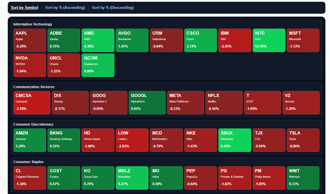
We are pleased to announce another feature on Slope, the Heatmap page.
It provides you a colorful presentation of all components of the S&P 100 with three sort choices: by symbol, by percentage change (highest to lowest) or, alternately, lowest to highest.
Besides all that, you can click on any symbol’s rectangle and invoke a Super Summary page with that symbol’s chart and key information.
Enjoy!