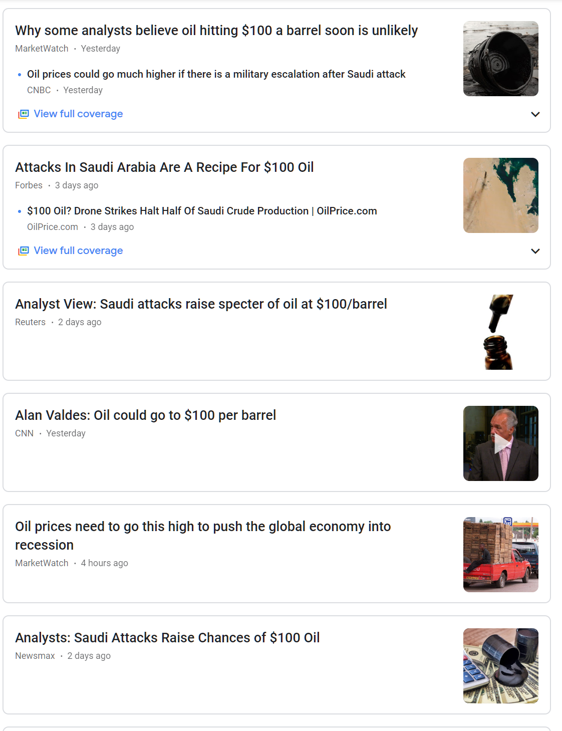
Slope of Hope Blog Posts

Slope initially began as a blog, so this is where most of the website’s content resides. Here we have tens of thousands of posts dating back over a decade. These are listed in reverse chronological order. Click on any category icon below to see posts tagged with that particular subject, or click on a word in the category cloud on the right side of the screen for more specific choices.

US Bond Bubble Or Equity Bubble?

By -

Based on purely technical reasons, which I’ll explain below, I’d hazard a guess that US bonds are not in a bubble. If anything, equities look more like their bubble is about to burst.

The price on the following monthly charts of US 2-yr, 5-yr, 10-yr, and 30-yr bonds is currently trading around their respective regression channel medians, after a lengthy move up over the past year off very oversold lows (around the channel -2 deviation level).

(more…)

The Biggest Winners

By -

This is a survey of the biggest winners, on a percentage basis, over a number of time-spans. Below I have created galleries in SlopeCharts of the best gainers for 2019, the past five years, the past ten years, and the past twenty years. I want to emphasize two things: (1) even though I just told you, I’ll say again these are percentage charts, not normal charts; (2) if you want to see the big version of any chart, click on the thumbnail. Unfortunately, the left/right arrows don’t let you navigate the entire set, so you need to click on any specific chart to see it.

(more…)